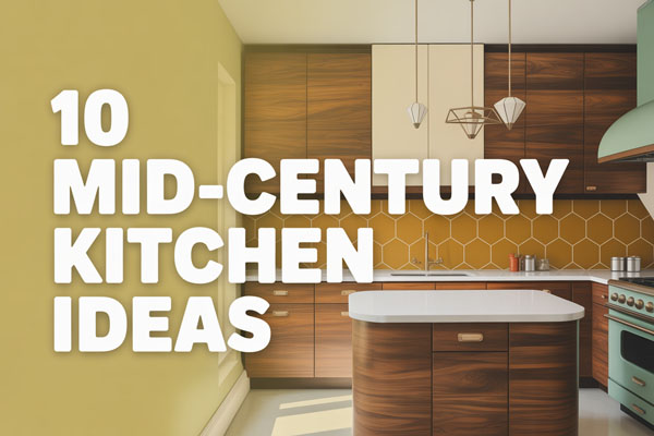
11 Modern Kitchen Wall Tiles Ideas for Style
Good tile decisions solve more kitchen problems than most people realize. The right wall finish protects against splashes, simplifies cleaning, and quietly sets the tone for the entire space.
Cabinets and countertops get the attention, but tiles often do the heavy lifting.
Small changes on the wall can shift a kitchen from basic to polished without tearing everything out. I’ve seen bland kitchens turn sharp just by swapping dated backsplashes for something intentional.
Let’s talk about tile ideas that actually make sense in real homes.
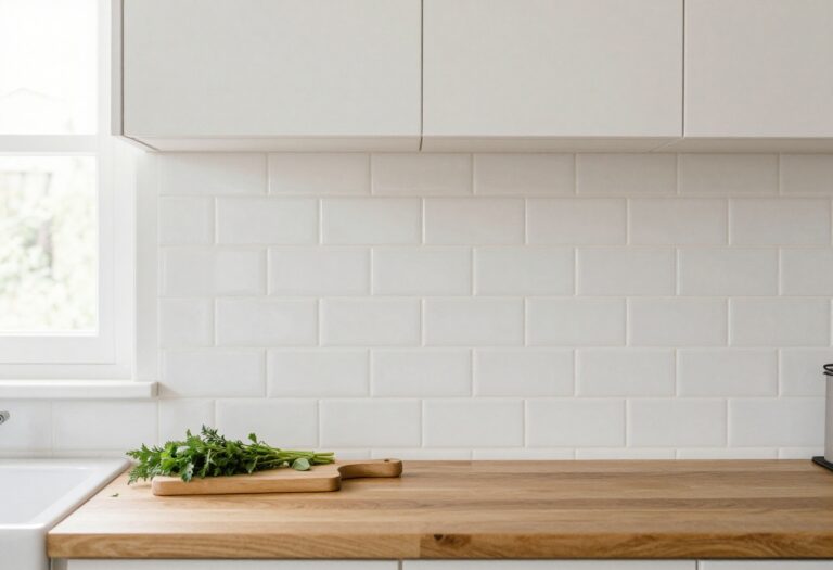
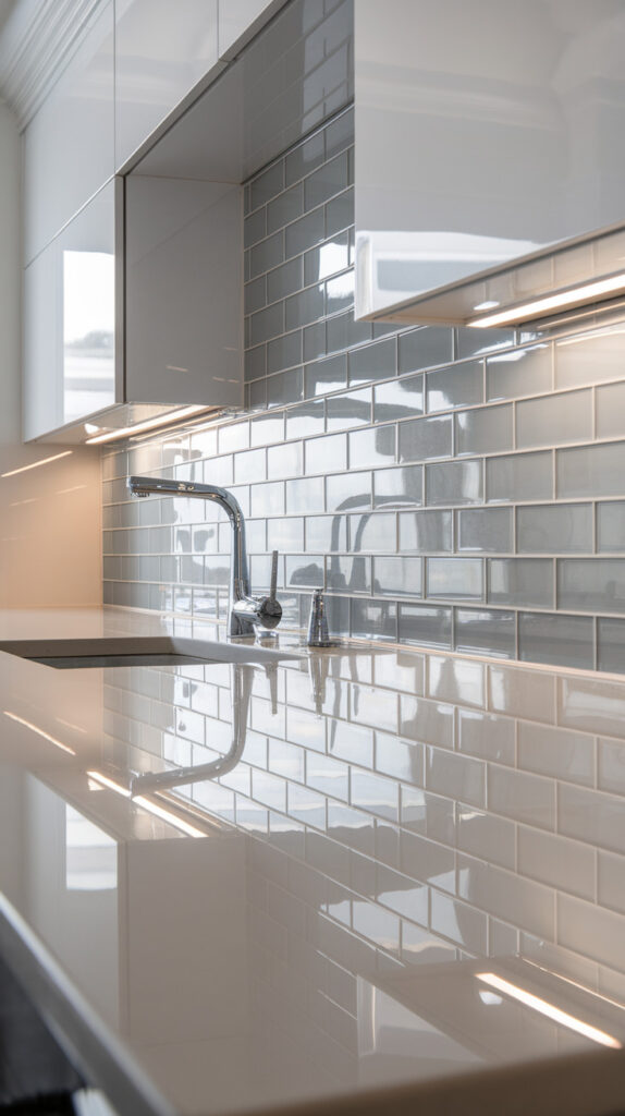
1. Sleek White Subway Tiles with Dark Grout
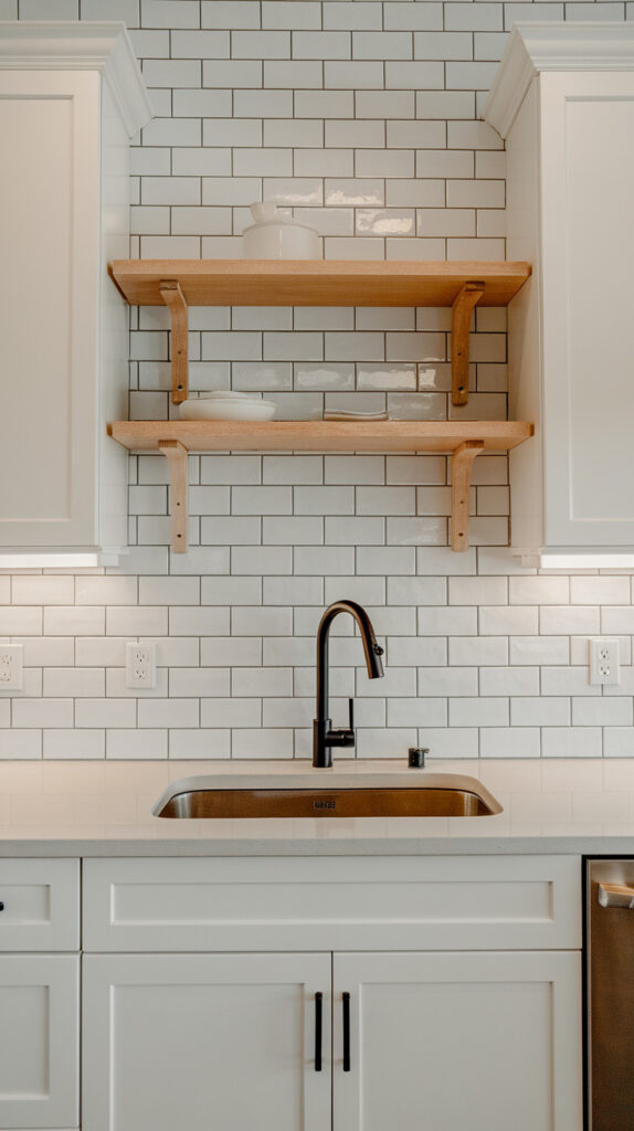
Basic white backsplashes often look flat and forgettable. Plain white grout makes everything blend together, and after a few months it starts looking tired. Switching to dark grout instantly adds contrast and hides everyday stains.
I’ve used this combo more than once because it feels clean without being boring. The sharp grid created by the darker lines adds structure, especially in smaller kitchens. It’s simple, but it doesn’t feel lazy.
Why This Works
The contrast between white tiles and dark grout creates definition. It frames each tile, which adds subtle texture without needing patterns or bold colors.
Dark grout also hides cooking splatters better than white. That alone makes it practical for busy kitchens.
How to Do It
- Choose classic rectangular subway tiles in glossy white. Gloss reflects light and makes cleaning easier.
- Pick a charcoal or soft black grout instead of bright white. It adds contrast without feeling harsh.
- Lay the tiles in a traditional brick pattern. The stagger keeps it timeless and forgiving.
- Seal the grout properly. This step prevents discoloration over time.
Style & Design Tips
Pair this look with matte black hardware for a modern edge. If cabinets are white too, add warm wood shelves to avoid a sterile vibe.
Avoid super high-contrast grout in tiny kitchens with poor lighting. Soft charcoal usually looks more refined than jet black.
Pro Tip or Budget Hack
Standard subway tiles are affordable and widely available. Spend a little extra on good grout and proper installation instead of premium tiles.
2. Full-Height Marble Slab Look Tiles
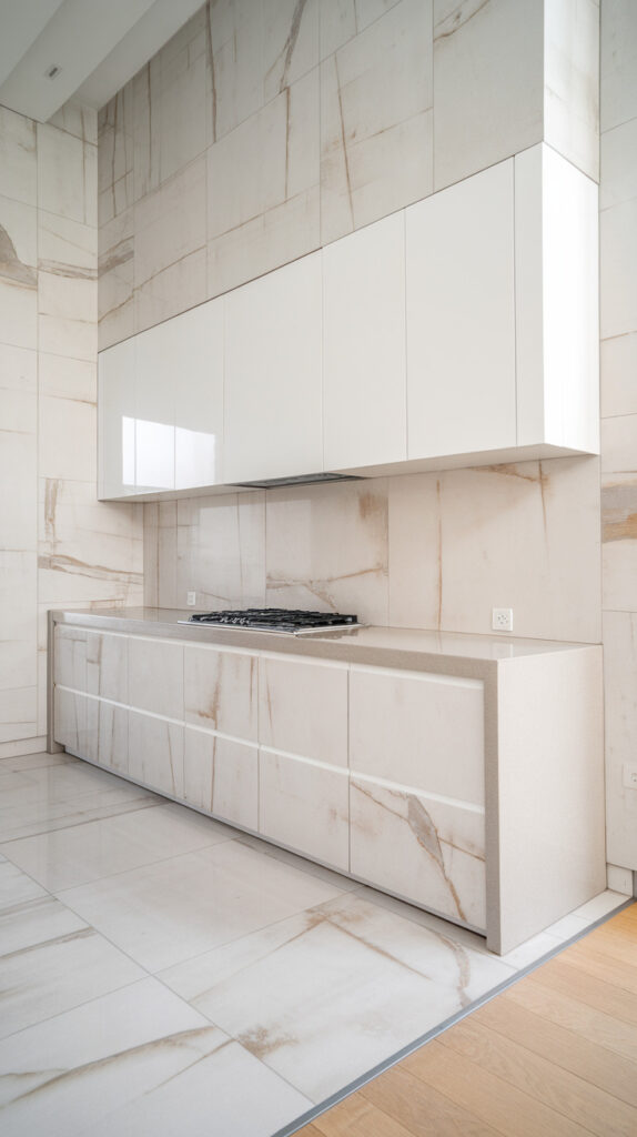
Short backsplashes sometimes feel incomplete. When the wall stops halfway, it can break the visual flow. Extending marble-look tiles from counter to ceiling changes everything.
I love this in kitchens with open shelving. It turns the wall into a feature without adding clutter. The space feels taller instantly.
Why This Works
Large-format marble-look tiles create fewer grout lines. Fewer lines mean less visual interruption and easier cleaning.
Running tiles full height draws the eye upward. That trick makes ceilings feel higher than they are.
How to Do It
- Choose large porcelain tiles with subtle marble veining. Porcelain is durable and budget-friendly compared to real marble.
- Measure carefully to minimize awkward cuts. Large tiles require planning.
- Use thin grout lines to maintain a seamless look.
- Extend the tile all the way to the upper cabinets or ceiling.
Style & Design Tips
Keep countertops simple if the tile has bold veining. Too many patterns can compete.
Choose soft gray or beige veining for warmth. Super dramatic veins work better in bigger kitchens.
Pro Tip or Budget Hack
Instead of real marble slabs, go for high-quality marble-effect porcelain. It looks luxe without the maintenance stress.
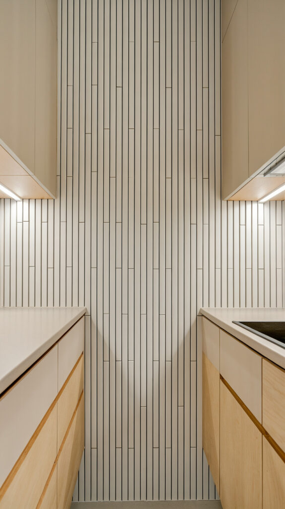
3. Vertical Stacked Tiles
Traditional horizontal layouts feel safe, but sometimes too safe. Turning tiles vertically adds a subtle twist without shouting for attention.
I tried this in a narrow kitchen once, and it changed the proportions. The walls looked taller, and the space felt less boxed in.
Why This Works
Vertical lines guide the eye upward. That visual trick creates height in smaller kitchens.
Stacked layouts also feel modern because they skip the classic brick pattern.
How to Do It
- Choose slim rectangular tiles for a sleek effect.
- Align them directly on top of each other in a straight stack.
- Use thin grout lines to maintain clean lines.
- Check alignment constantly during installation. Straight stacks show mistakes easily.
Style & Design Tips
This layout pairs beautifully with handleless cabinets. The clean geometry complements minimalist designs.
Avoid mixing too many textures nearby. Let the vertical lines be the quiet statement.
Pro Tip or Budget Hack
Even basic white tiles look upgraded when installed vertically. You don’t need expensive materials to get this effect.
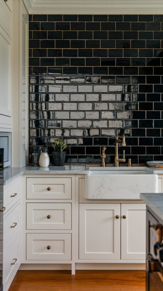
4. Matte Black Statement Tiles
White kitchens sometimes lack depth. Adding a matte black backsplash introduces drama without repainting everything.
I won’t lie, black tiles scared me at first. But in the right kitchen, they look bold and intentional.
Why This Works
Black creates contrast and anchors lighter cabinets. Matte finishes absorb light slightly, reducing glare.
They also hide stains surprisingly well compared to glossy light tiles.
How to Do It
- Choose matte black ceramic or porcelain tiles.
- Use matching black grout for a seamless finish.
- Keep lighting strong to prevent the space from feeling too dark.
- Balance with lighter countertops or cabinets.
Style & Design Tips
Mix black tiles with brushed brass hardware for warmth. The contrast feels modern yet inviting.
Avoid pairing with dark cabinets unless the space gets plenty of natural light.
Pro Tip or Budget Hack
Use black tiles only behind the stove area if you’re nervous. A focused statement wall costs less and feels less risky.
5. Textured 3D Wall Tiles
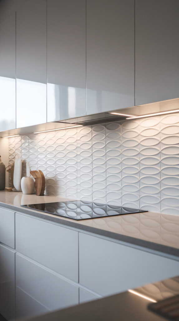
Flat surfaces sometimes lack personality. Textured tiles add dimension without relying on bold colors.
I’ve seen subtle wave-pattern tiles transform basic kitchens into something memorable. It’s understated but impactful.
Why This Works
Texture plays with shadows and light. Even neutral colors feel dynamic when the surface isn’t flat.
It adds visual interest without cluttering the space with decor.
How to Do It
- Choose subtle patterns rather than exaggerated shapes.
- Install under-cabinet lighting to highlight texture.
- Use matching grout to keep focus on the surface movement.
- Test a small sample before committing to a full wall.
Style & Design Tips
Keep cabinets simple when using textured tiles. Let the wall do the talking.
Avoid overly busy countertops. Minimal styling keeps the effect elegant.
Pro Tip or Budget Hack
Use textured tiles only in a small section like behind open shelves. You’ll get the impact without overspending.
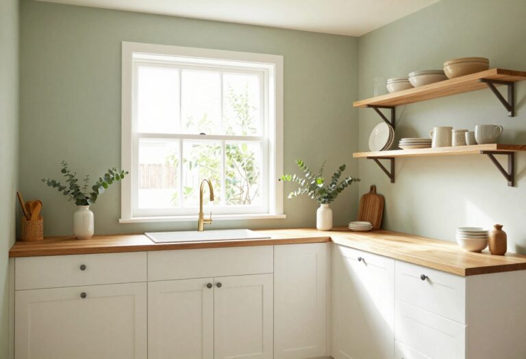
6. Soft Pastel Tiles for a Fresh Feel
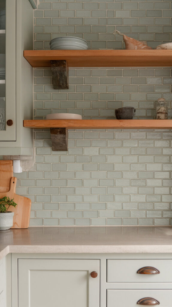
All-white kitchens can feel predictable. Soft pastel tiles introduce color gently without overwhelming the space.
I once used muted sage tiles in a rental kitchen upgrade. The transformation felt fresh but still calm.
Why This Works
Pastels add warmth and personality while staying light. They reflect enough brightness to keep kitchens airy.
Muted tones blend well with wood and white cabinetry.
How to Do It
- Choose soft shades like sage, dusty blue, or pale blush.
- Pair with neutral grout for cohesion.
- Test color samples in different lighting.
- Balance with neutral countertops.
Style & Design Tips
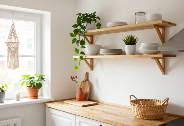
Combine pastel tiles with natural wood accents. The mix feels organic and modern.
Avoid mixing multiple pastel shades together. Stick to one main tone for clarity.
Pro Tip or Budget Hack
Use peel-and-stick tiles for rentals or quick updates. They’re not forever, but they work surprisingly well.
7. Herringbone Pattern Tiles
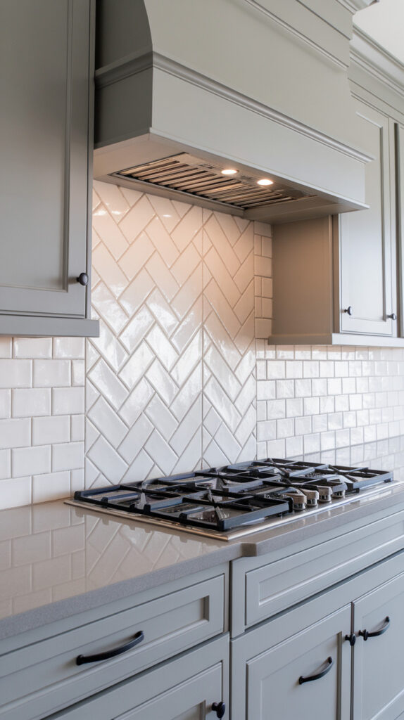
Straight layouts sometimes lack energy. Herringbone introduces movement while keeping things classic.
I love this pattern behind a range because it draws attention naturally. It feels custom without being flashy.
Why This Works
The angled layout creates visual flow. It adds texture even with simple tile colors.
Herringbone also feels upscale compared to standard brick patterns.
How to Do It
- Use rectangular tiles for best results.
- Start from the center to keep symmetry balanced.
- Use a level constantly during installation.
- Keep grout color subtle to avoid overwhelming the pattern.
Style & Design Tips
White herringbone tiles look stunning with gray cabinets. The pattern becomes the focal point.
Avoid busy countertops. Let the pattern breathe visually.
Pro Tip or Budget Hack
Install herringbone only in a defined section like above the stove. It saves time and labor costs.
8. Metallic Finish Tiles
Some kitchens need a bit of shine. Metallic tiles reflect light and add a contemporary edge.
I wouldn’t cover an entire kitchen in them, but used strategically, they look sharp.
Why This Works
Reflective surfaces bounce light around. That’s helpful in compact or darker kitchens.
Metallic accents feel modern without being over-the-top.
How to Do It
- Choose brushed or muted metallic tones.
- Limit installation to a backsplash strip or feature wall.
- Pair with simple cabinets.
- Clean regularly to maintain shine.
Style & Design Tips
Combine metallic tiles with matte surfaces nearby. The contrast keeps things balanced.
Avoid high-gloss metallic with busy patterns. Subtle shimmer works best.
Pro Tip or Budget Hack
Mix a few metallic tiles within neutral ones for a custom look at lower cost.
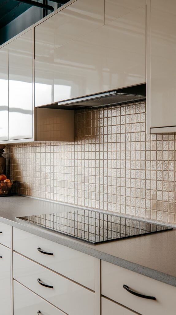
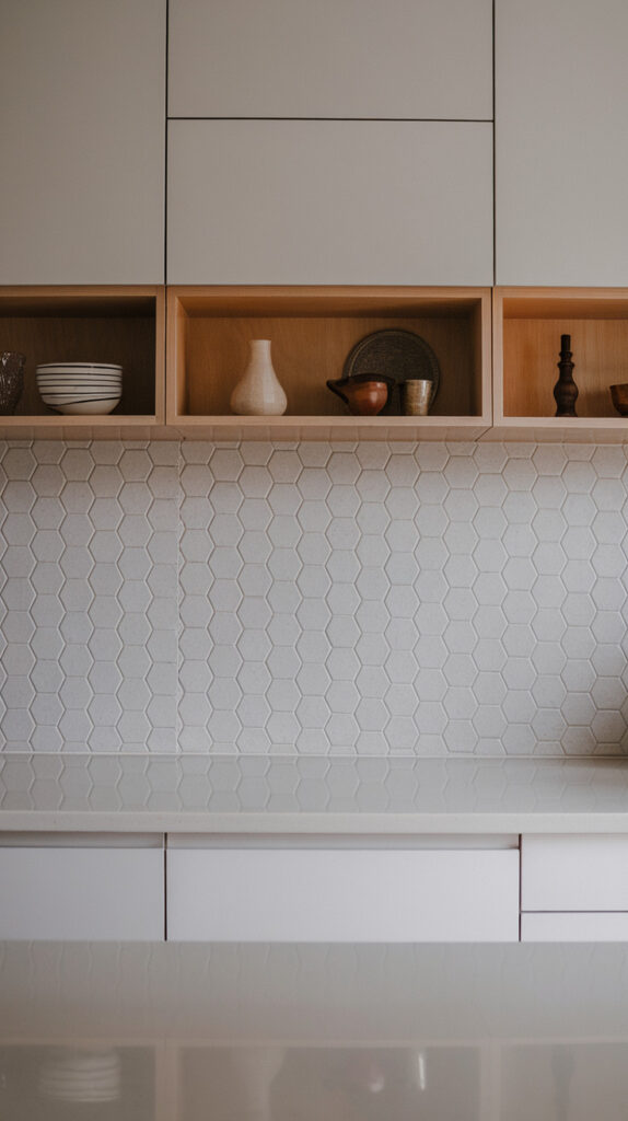
9. Large Hexagon Tiles
Small tiles create many grout lines. Large hexagon tiles offer geometry without visual clutter.
I used oversized hex tiles in a friend’s kitchen, and they instantly felt contemporary.
Why This Works
Hex shapes break monotony while staying structured. Larger pieces mean fewer grout lines.
They balance modern design with subtle pattern.
How to Do It
- Choose medium-to-large hex tiles.
- Keep grout color close to tile shade.
- Align carefully to maintain symmetry.
- Seal grout thoroughly.
Style & Design Tips
Neutral colors like soft gray work beautifully. The shape adds enough interest on its own.
Avoid mixing with too many other geometric patterns. One strong shape is enough.
Pro Tip or Budget Hack
Use hex tiles only behind the sink area to reduce costs while keeping the style impact.
10. Glossy Glass Tiles
Dark kitchens sometimes need more light bounce. Glossy glass tiles reflect light better than ceramic.
I like using them in smaller apartments where every bit of brightness helps.
Why This Works
Glass reflects and amplifies light. It makes tight spaces feel larger.
It’s also resistant to stains and easy to wipe clean.
How to Do It
- Choose neutral or light shades.
- Use matching grout to avoid harsh lines.
- Install carefully to prevent uneven reflections.
- Keep surfaces clean for maximum shine.
Style & Design Tips
Pair glass tiles with under-cabinet LED lighting. The reflection enhances the glow.
Avoid overly bright colors unless the rest of the kitchen is neutral. Balance matters.
Pro Tip or Budget Hack
Use glass tiles only as a border accent. It adds shine without a full wall investment.
11. Terrazzo-Inspired Tiles
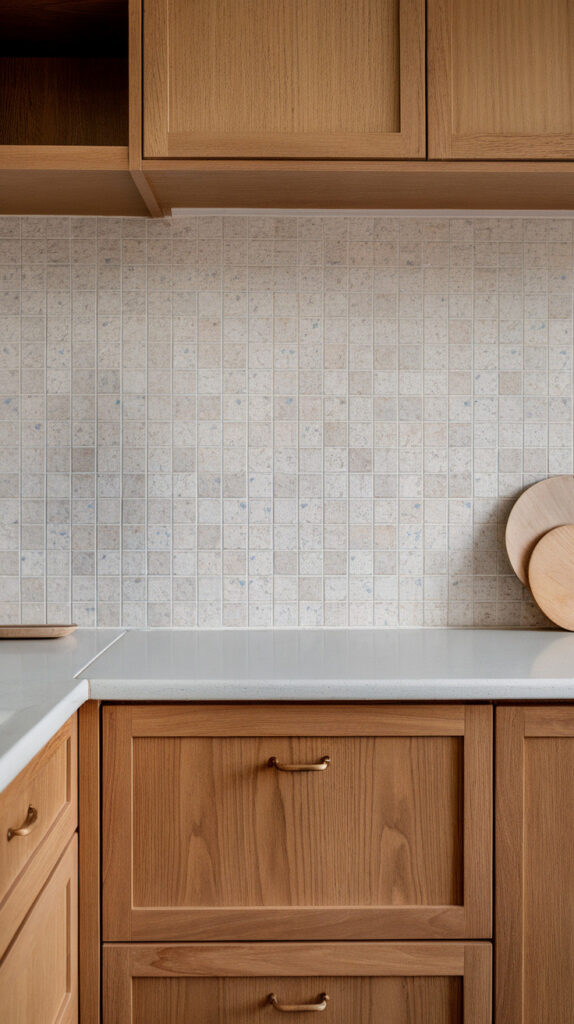
Plain walls sometimes feel too safe. Terrazzo-inspired tiles add speckled character without being chaotic.
I’ve grown to love terrazzo because it hides small stains and crumbs surprisingly well.
Why This Works
The multi-color flecks disguise imperfections. That’s practical in high-traffic kitchens.
It also blends easily with various cabinet colors.
How to Do It
- Choose tiles with subtle, not oversized, flecks.
- Pair with simple countertops.
- Keep grout neutral to avoid clashing.
- Test samples before full installation.
Style & Design Tips
Terrazzo pairs beautifully with warm wood tones. The mix feels playful yet controlled.
Avoid pairing with heavily patterned countertops. Keep one surface calm.
Pro Tip or Budget Hack
Look for ceramic terrazzo-look tiles instead of real terrazzo slabs. They’re lighter and easier to install.
Modern Kitchen Tile Strategy & Design Foundation
Tile choices should support how the kitchen actually functions before they try to impress anyone visually. Grease splashes, steam, heat, and daily wiping all affect longevity, so material selection needs to come first. Style sits on top of durability, not the other way around.
Start by identifying the highest-impact wall zones. The area behind the stove and sink usually takes the most abuse, while side walls might be purely decorative. Splitting functional and aesthetic zones lets you allocate budget wisely.
Lighting also changes how tiles behave. Glossy finishes bounce light and brighten small kitchens, while matte finishes reduce glare in well-lit spaces. Testing samples under your own lighting prevents expensive surprises.
Scale matters more than most people realize. Large-format tiles reduce grout lines and simplify cleaning, while smaller tiles add texture and detail. Choose based on maintenance tolerance and the overall visual weight of cabinets and countertops.
Finally, think long-term. Trendy patterns may look exciting now, but timeless layouts tend to age better and help resale value. A balanced decision blends personality with practicality.
Material Comparison Guide for Kitchen Wall Tiles
Different tile materials perform differently under kitchen stress. Ceramic works well for light-duty backsplashes and offers budget flexibility. Porcelain is denser and more water-resistant, making it ideal for heavy cooking zones.
Glass tiles reflect light beautifully and resist stains, but they require precise installation. Natural stone looks luxurious but demands sealing and ongoing maintenance. Understanding upkeep expectations prevents frustration later.
Surface finish also plays a role. Glossy surfaces clean easily but show fingerprints, while matte finishes hide smudges yet require slightly more scrubbing. Matching finish to lifestyle makes the difference between loving your kitchen and constantly wiping it down.
Grout choice is just as important as tile. Sanded grout suits wider joints, while unsanded grout works for narrow lines. Always seal grout properly to avoid discoloration.
Common Mistakes to Avoid
Choosing tiles based only on appearance is the most common mistake. A stunning tile that stains easily or chips under heat becomes a regret quickly. Always confirm durability ratings before purchasing.
Ignoring grout color is another oversight. Grout defines the overall look more than most people expect, and the wrong shade can make tiles look busy or flat. Test grout samples against tile before committing.
Overloading the kitchen with competing patterns creates visual chaos. If countertops have heavy veining, keep wall tiles subtle. Let one feature dominate and allow the others to support it.
Skipping proper surface preparation leads to uneven installations. Walls must be flat and clean before tiling, or the final result will show imperfections. Rushing this stage costs more in the long run.
Underestimating lighting impact also causes disappointment. Tiles can look dramatically different in warm versus cool lighting. Always review samples in both natural and artificial light.
Budget Planning & Cost Breakdown
Kitchen tile projects vary widely in cost depending on material, layout complexity, and labor. Straight horizontal layouts cost less than intricate patterns like herringbone due to installation time. Large-format tiles may reduce labor costs because of fewer pieces.
Material price per square foot is only part of the budget. Adhesives, grout, sealant, trim pieces, and installation tools add to the total. Planning for 10–15% extra material prevents delays if cuts or breakage occur.
DIY installation can save money, but only if done carefully. Precision layouts demand experience, especially with stacked or geometric designs. Hiring a professional for complex patterns often prevents costly rework.
Strategic splurging works well. Investing in high-quality tiles for focal areas and using simpler tiles elsewhere balances cost and impact.
Maintenance & Longevity Guide
Regular cleaning keeps kitchen tiles looking new for years. Mild detergent and warm water handle most daily messes without damaging finishes. Avoid harsh abrasive cleaners on glossy or glass tiles.
Sealing grout annually protects against discoloration and moisture absorption. High-splash zones benefit most from routine sealing. This small maintenance habit extends lifespan significantly.
Inspect tile edges and corners occasionally for cracks or loose grout. Addressing small issues early prevents moisture from penetrating behind tiles. Preventative care costs less than repairs.
Ventilation also helps preserve tile integrity. Proper airflow reduces moisture buildup and prevents mold formation behind backsplashes.
Frequently Asked Questions
1. What is the most durable tile option for kitchen walls?
Porcelain tiles are generally the most durable choice. They resist moisture, heat, and stains better than standard ceramic. They also require minimal maintenance compared to natural stone.
2. Are glossy tiles better than matte tiles for kitchens?
Glossy tiles reflect light and are easier to wipe clean. Matte tiles hide fingerprints better and reduce glare. The best choice depends on lighting and personal preference.
3. How high should a kitchen backsplash go?
Standard backsplashes typically extend 4 inches above the countertop. Modern designs often run tile up to the bottom of cabinets or even ceiling height. The decision depends on style goals and budget.
4. Do large tiles make a small kitchen look bigger?
Yes, large-format tiles reduce grout lines and create a more seamless surface. Fewer visual breaks make walls appear larger. Proper lighting enhances this effect further.
5. How do I choose the right grout color?
Match grout to tile for a seamless look. Choose contrasting grout to highlight patterns or shapes. Always test small samples before full installation.
6. Can I install kitchen wall tiles myself?
DIY installation works for simple layouts if you have patience and proper tools. Complex patterns or large-format tiles require precision and may benefit from professional installation. Careful preparation is essential either way.
Final Thoughts
Kitchen wall tiles do more than fill empty space. They protect, define, and quietly shape how the entire kitchen feels. Small changes here often deliver bigger impact than repainting cabinets.
The trick is choosing something that fits how the kitchen actually functions. Pick one idea that makes sense, commit to it, and execute it cleanly. I’ve learned that thoughtful tile choices rarely regret themselves.