11 Budget-Friendly Kitchen Wall Color Ideas for a Fresh, Pulled-Together Look
A fresh coat of paint can do wonders for a tired kitchen, and it doesn't have to cost a fortune. Whether you're renting or own, changing your wall colour is one of the quickest ways to breathe new life into the heart of your home. The best part?
You can tackle it in a single weekend. With a little planning and the right shade, you can create a space that feels brighter, bigger, and more pulled together.
No need for a full renovation—just a roller, some painter's tape, and a colour that speaks to you. Ready to get inspired?
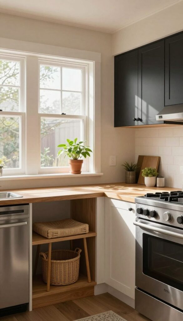
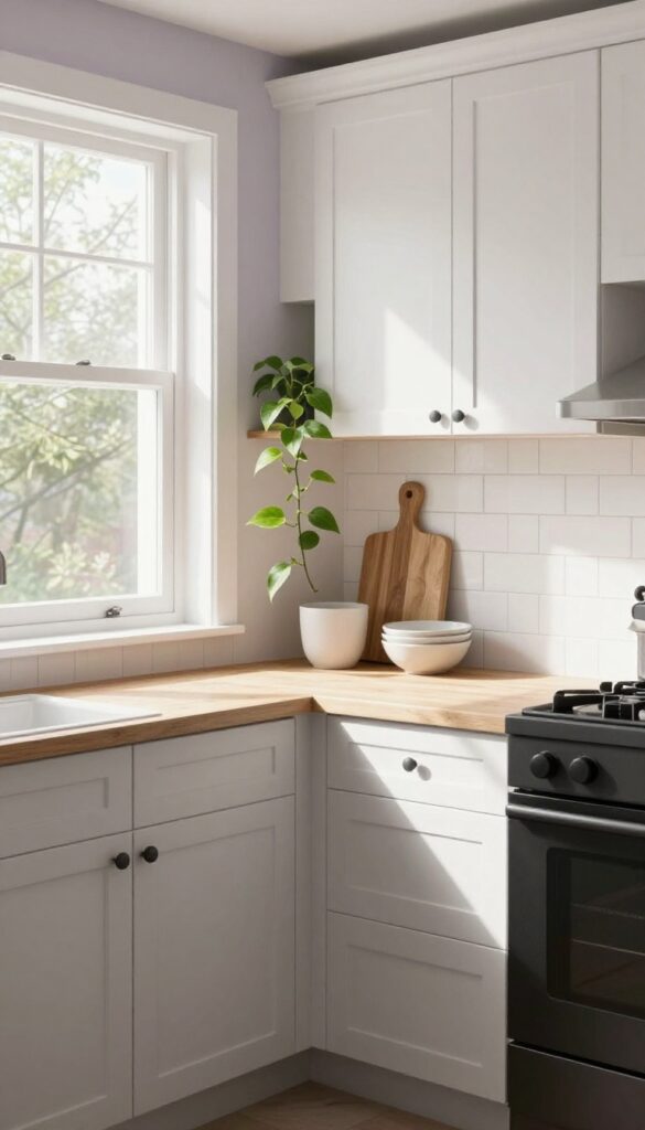
1. Warm White for a Clean, Airy Base
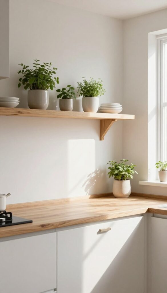
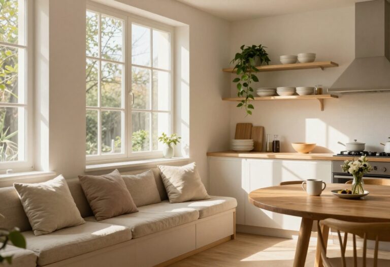
A coat of warm white paint works wonders in a kitchen that needs a quick refresh. Unlike stark white, which can feel clinical, warm white has a soft, inviting glow that makes the space feel bigger and brighter without losing coziness. It’s the kind of backdrop that lets your cabinets, countertops, and decor shine—no major renovation required.
Why It Works
Warm white reflects light beautifully, making even small kitchens feel open and airy. It’s also incredibly forgiving when it comes to hiding dust and fingerprints, so your kitchen looks fresh longer between cleanings.
Best For
This shade is perfect for kitchens with limited natural light or those with dark cabinets that need a lighter contrast. It also works well in rental kitchens where you want a neutral upgrade that appeals to anyone.
Styling Tip
Pair warm white walls with natural wood accents—like a butcher block countertop or open shelving—to add warmth and texture. An eggshell finish is ideal because it’s easy to wipe down without being too shiny.
2. Soft Sage Green for a Touch of Nature
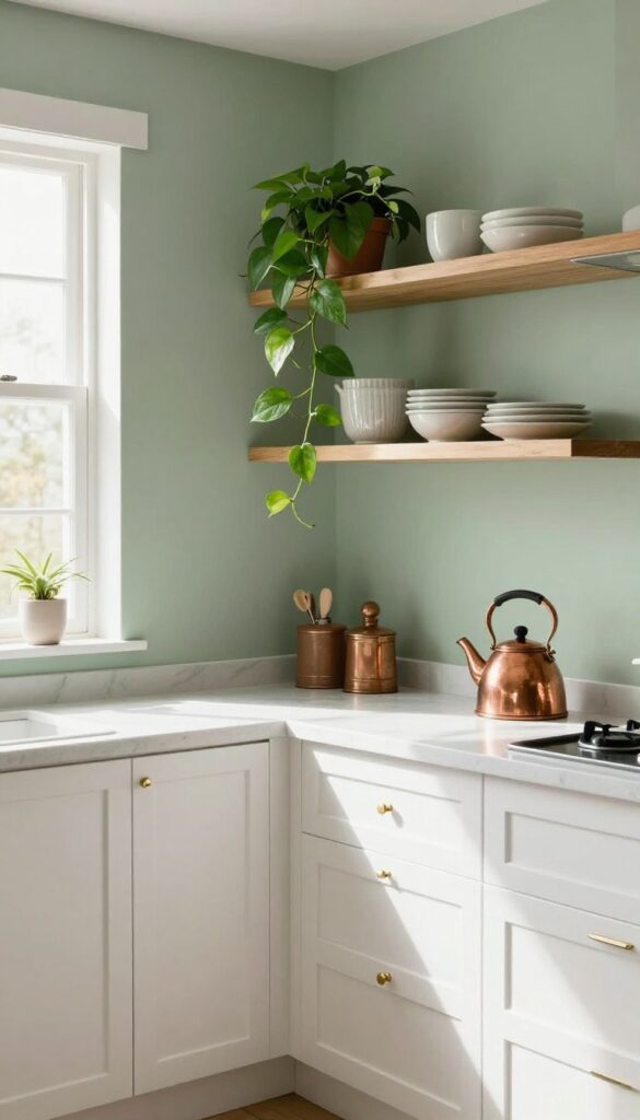
Sage green has a way of making a kitchen feel grounded without going full earthy. It’s not too bold, not too pastel—just a gentle nod to the outdoors that pairs effortlessly with wood tones, white trim, and even warm metals. On a weekend refresh level, painting your walls or just an accent wall in sage green instantly softens the room and hides everyday smudges better than you’d expect.
The color stays fresh and inviting, never feeling heavy or dated.
Why It Works
Sage green is forgiving—it masks fingerprints, splatters, and minor marks from daily cooking, so your kitchen looks cleaner longer. Its natural undertone also balances warm and cool elements in the room, making it a versatile backdrop for both modern and rustic decor.
Best For
This shade is ideal for kitchens that get a lot of use and need a color that feels calm but not boring. It works especially well in galley kitchens, breakfast nooks, or open-plan spaces where you want the kitchen to blend into living areas.
Styling Tip
Pair sage green walls with open wood shelving and white countertops for a clean look. Add a few trailing plants on the shelves to echo the organic vibe, and use brass or copper hardware to bring warmth without clashing.
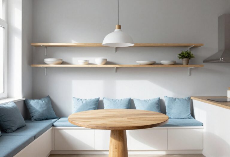
3. Pale Blue for a Serene Vibe
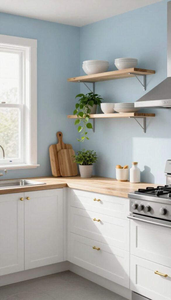
A pale blue wall can make a small kitchen feel open and airy. It pairs nicely with stainless steel appliances and white cabinets. Add a few plants to enhance the tranquil atmosphere.
Why It Works
Pale blue is a cool, calming color that visually expands the space. It reflects natural light well, making the kitchen feel brighter and more spacious without overwhelming the senses.
Best For
This works especially well in small kitchens or galley layouts where you want to avoid dark, heavy colors. It's also great for kitchens with limited natural light, as the blue helps keep the room feeling fresh.
Styling Tip
Balance the cool tones with warm wood accents or brass hardware. A simple open shelf with a few ceramic dishes and a trailing plant completes the look without clutter.
4. Butter Yellow for a Sunny Disposition
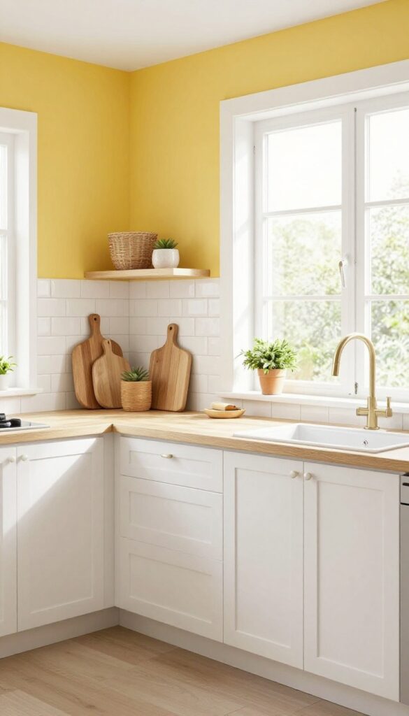
Butter yellow is like a soft hug for your kitchen. It brings warmth and cheer without screaming for attention, making it perfect for spaces that could use a little extra brightness. In kitchens with limited natural light, this gentle hue can make the room feel airier and more inviting, almost like the sun is always shining through the window.
Why It Works
Butter yellow sits in that sweet spot between energizing and calming. It lifts the mood without overwhelming the senses, and it pairs beautifully with neutral tones like white, beige, and warm grays. The color reflects light well, so even a small or north-facing kitchen can feel brighter and more open.
Best For
This shade is ideal for kitchens that lack natural light or feel a bit cold or sterile. It’s also great for galley kitchens or breakfast nooks where you want to create a cozy, welcoming vibe. If your cabinets are white or light wood, butter yellow walls will add just the right amount of personality without clashing.
Styling Tip
Keep countertops and backsplashes neutral—think white subway tile or a soft marble look—so the yellow stays the star. Add warmth with wooden cutting boards, woven baskets, and a few green plants. Avoid adding too many other bright colors; let the butter yellow set the cheerful tone all on its own.
5. Light Gray for Modern Neutrality
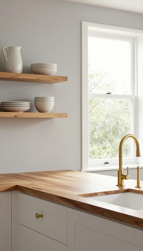
Gray doesn't have to feel cold or dreary—especially when you pick a warm-toned light gray for your kitchen walls. It acts like a blank canvas that lets your cabinets, countertops, and decor shine without competing for attention. This shade brings a calm, collected vibe that feels both modern and approachable, perfect for a weekend refresh that doesn't require a full renovation.
Why It Works
Light gray is incredibly forgiving—it hides minor smudges and everyday wear better than white, yet it still keeps the space feeling airy and open. Its neutrality means you can switch up your accent colors seasonally without repainting, making it a smart long-term choice.
Best For
This works beautifully in kitchens with lots of natural light, where the gray will read as soft and sophisticated rather than dull. It's also ideal if you love colorful dishware or open shelving, because the gray backdrop makes those items pop.
Styling Tip
Pair warm light gray walls with natural wood elements—a butcher block countertop or wooden floating shelves—to add warmth. Then bring in brass or gold hardware for a touch of elegance that keeps the look from feeling too flat.
6. Dusty Rose for Subtle Romance
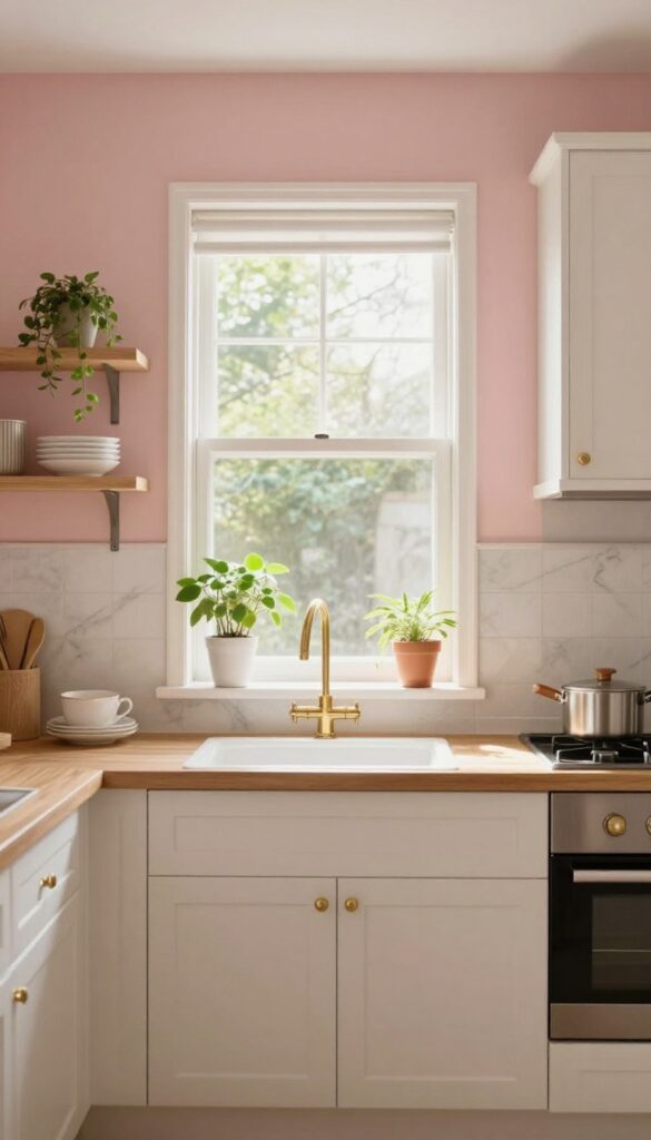
Dusty rose is one of those shades that feels unexpected in a kitchen but instantly softens the space. It's not a loud pink—it's muted, almost dusty, with a warmth that makes the room feel more inviting. This color works especially well in kitchens that get good natural light, where it can shift from a soft blush in the morning to a deeper mauve by evening.
It brings a sense of calm without being boring, and it pairs beautifully with natural materials like wood and stone.
Why It Works
Dusty rose is forgiving—it doesn't show scuffs or splatters as easily as lighter neutrals, and it hides wear well over time. The muted tone also makes it easy to change accessories without repainting, so your kitchen can evolve with your style.
Best For
This color is ideal for kitchens that want to move away from all-white or gray without going bold. It works great in galley kitchens, breakfast nooks, or open-plan spaces where you want the wall color to feel like a gentle backdrop rather than a statement.
Styling Tip
Pair dusty rose walls with brass cabinet hardware and a marble backsplash to play up the romantic side. Add open shelving with white dishes and a few trailing plants to keep the look fresh and grounded.
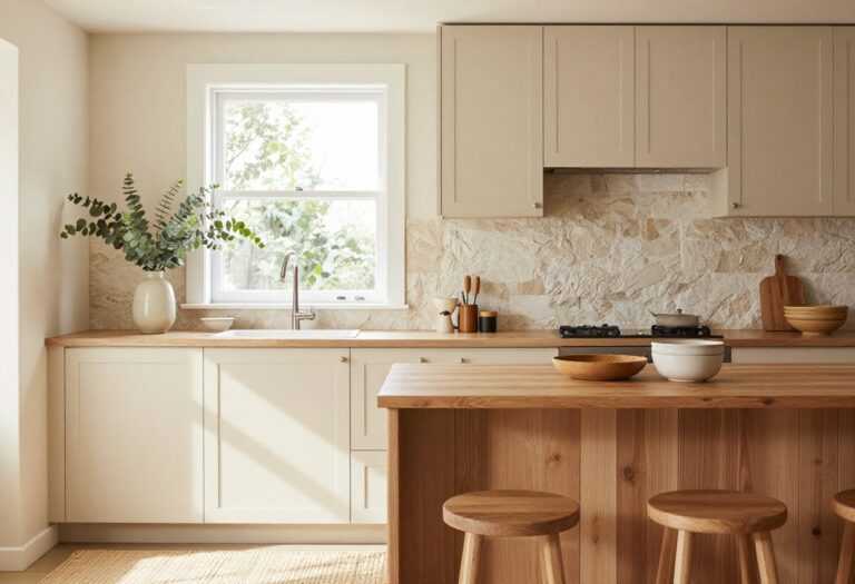
7. Creamy Beige for Timeless Comfort
Some colours just feel like a warm hug the moment you walk into the room, and creamy beige is exactly that. It wraps your kitchen in a soft, neutral glow that never feels cold or sterile. This shade has staying power—it adapts to changing trends without looking dated, making it a smart choice for a weekend refresh.
Why It Works
Creamy beige reflects light gently, making small kitchens feel more open while keeping the space cozy. Its warmth balances cool countertops and stainless steel appliances, creating a harmonious backdrop that lets other elements—like wood shelves or greenery—stand out naturally.
Best For
This colour shines in kitchens with lots of natural light, where it amplifies the sunny feel. It's also perfect for rentals or homes where you want a neutral that feels intentional and inviting rather than boring.
Styling Tip
Pair creamy beige walls with white trim and warm wood accents for a layered look. Add matte black cabinet hardware or woven bar stools to introduce contrast without breaking the calm vibe.
8. Mint Green for Retro Charm
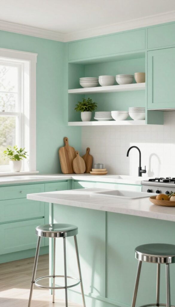
Mint green is having a quiet comeback, and it’s easy to see why. This soft, pastel shade brings a playful yet soothing energy that instantly makes a kitchen feel more inviting. It’s not as bold as teal or as sugary as pink—just the right amount of color to add personality without overwhelming the space.
In a weekend refresh, painting one wall or even just the backsplash in mint green can completely shift the mood of the room.
Why It Works
Mint green works because it taps into nostalgia without feeling dated. It pairs beautifully with chrome fixtures, black hardware, and warm wood tones, creating a balanced look that feels both fresh and grounded. The color also has a natural coolness that keeps small kitchens from feeling cramped or stuffy.
Best For
This idea is perfect for smaller kitchens, breakfast nooks, or galley layouts where you want to add character without going dark or dramatic. It’s also great for rental kitchens where you can use peel-and-stick tile or removable wallpaper to get the look without permanent changes.
Styling Tip
Balance mint green with crisp white trim and open shelving to keep things airy. Add chrome bar stools or a black faucet for contrast, and bring in plants or wooden cutting boards for warmth. Stick to two accent colors—like black and white—to avoid a busy look.
9. Charcoal Accent Wall for Drama
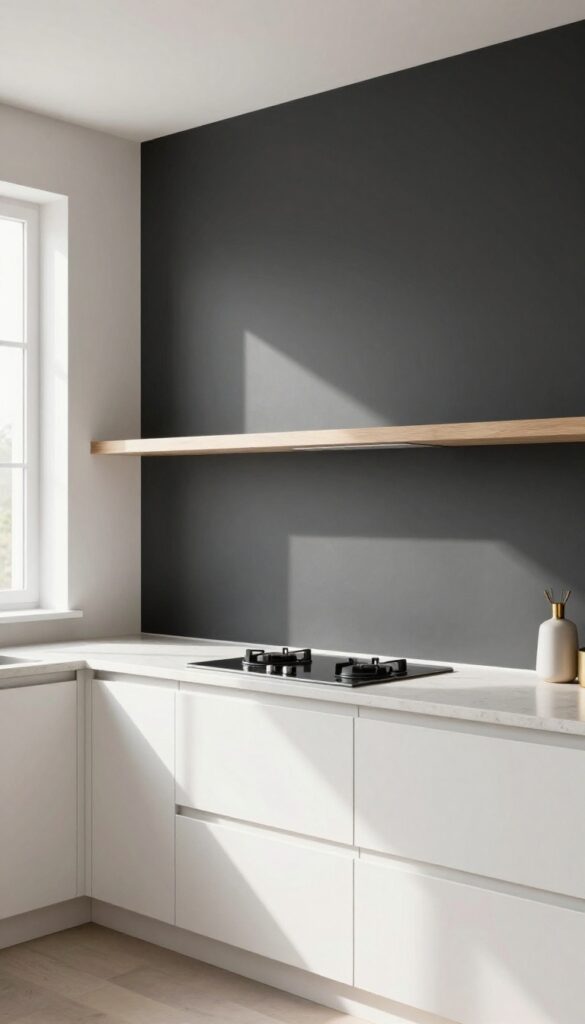
A single charcoal wall can shift the entire mood of your kitchen without demanding a full renovation. It brings a grounded, almost architectural feel that makes the space look intentional and curated. Against lighter cabinets or pale countertops, that dark backdrop creates instant contrast and visual weight—exactly the kind of low‑effort upgrade that feels like a big change.
Why It Works
Dark paint is one of the cheapest ways to add drama, and because you’re only covering one wall, it stays budget‑friendly. The charcoal acts like a neutral anchor, making everything around it feel more polished. Plus, it hides smudges and splatters better than white or pastel walls.
Best For
This idea works especially well in kitchens with good natural light or where you want to define a specific zone—like behind a range or along a breakfast bar. It’s also great for galley kitchens or L‑shaped layouts where one wall naturally becomes the focal point.
Styling Tip
Keep the rest of the walls in a warm white or soft cream so the dark wall doesn’t shrink the room visually. Add open shelving with light wood tones or brass accents on that charcoal wall to break up the darkness and add layers of texture.
10. Terracotta for Earthy Warmth
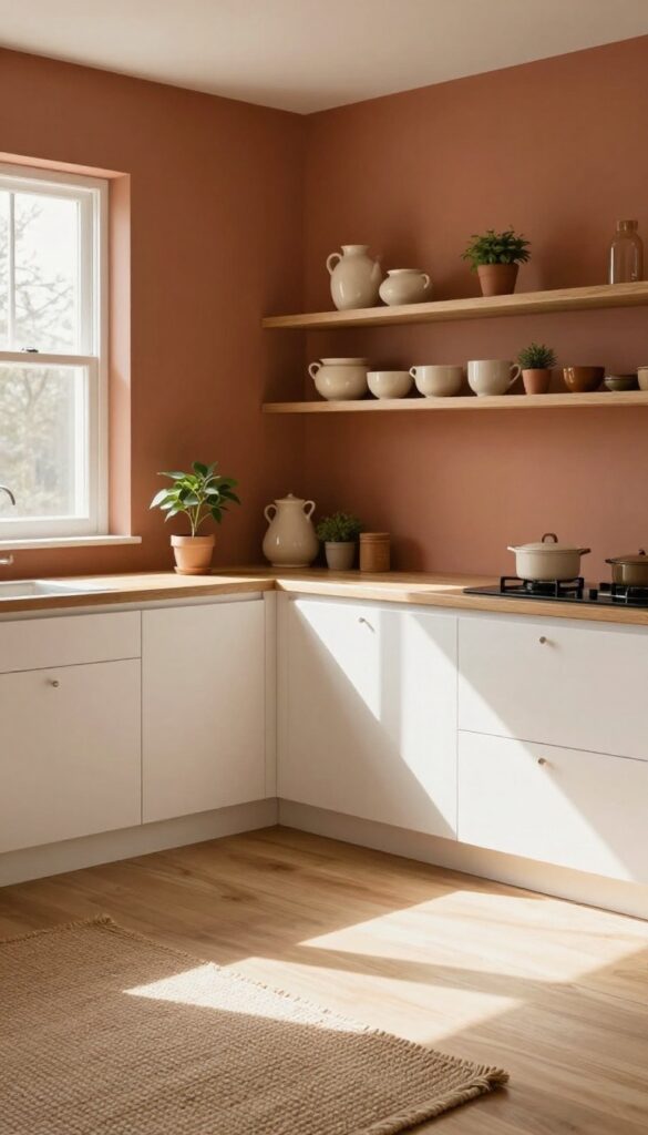
Warm, grounded, and full of character—terracotta walls bring an earthy richness that makes a kitchen feel instantly more inviting. This isn't a loud or trendy color; it's a timeless hue that wraps the room in a cozy, sunbaked glow. The key is balancing it with plenty of natural light and airy accents so the space stays warm without feeling heavy or closed in.
Why It Works
Terracotta has a natural depth that pairs beautifully with raw materials like wood, stone, and linen. It creates a cohesive, organic look that feels both relaxed and intentional—perfect for a kitchen that doubles as a gathering spot.
Best For
This color shines in kitchens that get good daylight, especially those with white cabinets or open shelving to keep things bright. It's also ideal if you love a rustic, Mediterranean, or Southwestern vibe but want something more subtle than bold red or orange.
Styling Tip
Balance terracotta walls with light wood countertops or open shelving in pale oak. Add touches of cream and soft green through ceramics or plants to keep the look fresh and layered without clashing.
11. Lavender for a Unique Twist
Lavender might not be the first color that comes to mind for a kitchen, but it brings a soft, unexpected charm that feels both calming and playful. This pale purple works beautifully in kitchens with plenty of natural light, where it can read as a gentle wash of color rather than an overwhelming statement. Paired with crisp white trim and warm gray cabinets, lavender walls create a space that feels fresh and slightly whimsical—like a breath of fresh air without trying too hard.
Why It Works
Lavender sits in that sweet spot between cool and warm, so it doesn't make a kitchen feel cold or sterile. It adds just enough personality to keep the room interesting while still feeling serene and approachable. The color also plays nicely with natural materials like wood and stone, making it easy to layer in textures without visual clutter.
Best For
This shade is ideal for kitchens that get good natural light, especially those with south- or west-facing windows. It's also a great pick if you love soft, romantic details but want something more original than pastel pink or baby blue. Smaller kitchens can handle lavender well because it opens up the space when paired with light neutrals.
Styling Tip
Balance lavender walls with plenty of white or off-white on cabinets, trim, and ceilings to keep the look airy. Add warmth with wooden cutting boards, open shelving with ceramic dishes, and a few trailing plants like pothos or ivy. For a subtle contrast, bring in matte black hardware or light brass fixtures—they'll pop against the purple without competing.
FAQ
What is the most budget-friendly way to change kitchen wall color?
Painting yourself is the most cost-effective method. Buy quality paint on sale, use painter's tape for clean lines, and invest in a good roller. You can often refresh a small kitchen for under $100.
How do I choose the right finish for kitchen walls?
Eggshell or satin finishes are ideal for kitchens because they are easy to clean and resist moisture. Avoid flat finishes as they can stain easily and are harder to wipe down.
Can I paint my kitchen walls if I'm renting?
Yes, but check your lease first. Some landlords allow painting if you restore the original color when you move out. Alternatively, use peel-and-stick wallpaper or removable wall decals for a temporary change.
What colors make a small kitchen look bigger?
Light colors like white, pale blue, soft gray, and cream can make a small kitchen feel more spacious. They reflect light and create an airy atmosphere. Avoid dark colors on all walls unless you have high ceilings.
How long does it take to paint a kitchen?
A typical weekend is enough for a small to medium kitchen. Plan one day for prep (cleaning, taping, priming) and one day for painting two coats. Drying time between coats is about 2-4 hours.
Conclusion
Updating your kitchen walls with a fresh color doesn't have to be expensive or time-consuming. With these 11 budget-friendly ideas, you can give your kitchen a whole new personality over a single weekend.
Whether you go for a soft neutral or a bold accent, the key is to choose a shade that makes you happy every time you walk in. Grab a brush, pick your favorite, and enjoy the transformation.