13 Eye-Catching Kitchen Flooring Tile Ideas That Look Thoughtful, Not Overdone
Kitchen flooring sets the stage for everything else in the room. It’s the surface you walk on every day, so it needs to handle spills, foot traffic, and the occasional dropped pan—but that doesn’t mean it has to be boring. The trick is finding tiles that add character without screaming for attention.
A thoughtful kitchen floor feels grounded and warm, like it belongs. Whether you lean toward subtle textures or gentle patterns, the best choices are the ones that make the space feel layered and lived-in.
Think less about trends and more about what makes you want to linger over morning coffee. Here are 13 tile ideas that hit that sweet spot between eye-catching and understated.
1. Warm Terracotta Hexagons for a Sunbaked Feel
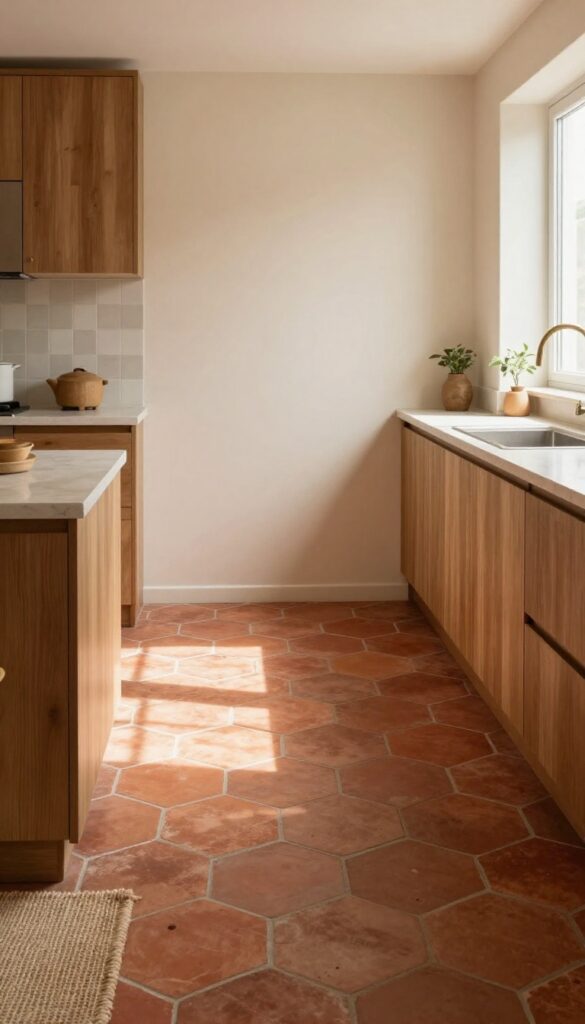
Hexagonal terracotta tiles in earthy reds and oranges bring a cozy, Mediterranean warmth to your kitchen. The shape adds subtle geometry without overwhelming the space, and the natural clay tones pair beautifully with wooden cabinets and creamy walls. It’s a look that feels both grounded and inviting—like a sunbaked patio brought indoors.
Why It Works
Terracotta’s rich, warm hues naturally make a kitchen feel more lived-in and welcoming. The hexagon pattern introduces visual interest without being too busy, and the material’s slight texture hides daily wear and tear well. Plus, it complements a wide range of cabinet colors and countertop materials.
Best For
This flooring is ideal for kitchens that get plenty of natural light, as the terracotta tones really glow in the sun. It’s also a great fit for homes with a rustic, farmhouse, or Mediterranean style, but can work in modern spaces when paired with sleek fixtures and neutral walls.
Styling Tip
Balance the warmth with cool accents like sage green cabinets or a pale blue backsplash. Add natural textures like a jute rug and woven baskets to reinforce the earthy vibe. For a cohesive look, carry the same tile into a nearby mudroom or pantry.
2. Soft Gray Herringbone That Whispers Elegance
Herringbone is one of those patterns that instantly adds character without shouting for attention. When done in a soft matte gray, it becomes the kind of floor that feels quiet but intentional — like it was always meant to be there. The angled lines create a subtle sense of movement, drawing the eye across the room and making the space feel a little larger and more connected.
It's a look that works especially well in kitchens where you want a foundation that feels refined but not stiff.
Why It Works
The herringbone pattern breaks up the monotony of a standard straight lay, adding visual texture that feels custom and thoughtful. Matte gray is forgiving with crumbs and smudges, so it stays looking clean between mops. The neutral tone also plays nicely with warm wood cabinets or brass fixtures, giving you a calm base that lets other elements shine.
Best For
This flooring is ideal for open-concept kitchens where you want a seamless flow into adjacent living areas. It's also a great pick for galley kitchens or smaller spaces because the diagonal lines can make the room feel more expansive. If you lean toward a modern farmhouse or Scandinavian aesthetic, this tile will fit right in.
Styling Tip
Pair the gray herringbone with natural textures like a jute runner, woven bar stools, or a butcher block island. Add warmth with soft white or cream upper cabinets and a few matte black accents — think faucet, cabinet pulls, or pendant lights. Keep the walls light to let the floor pattern take center stage without overwhelming the room.
3. Creamy Zellige-Inspired Squares for Handcrafted Charm
There’s something about a floor that doesn’t try too hard. Zellige-style tiles, with their subtle unevenness and soft cream tones, bring that kind of effortless character. They catch the morning light differently in every square, making your kitchen feel warm and lived-in without looking messy.
It’s the kind of floor that feels like it’s been there forever, in the best way.
Why It Works
The slight irregularities in zellige tiles create a textured surface that hides everyday wear and tear beautifully. In a busy kitchen, that means less stress about scuffs or crumbs showing between sweeps. The creamy palette also bounces light around the room, making even a compact kitchen feel airy and open.
Best For
This tile works wonders in kitchens that lean rustic, Mediterranean, or modern farmhouse. It’s especially lovely in spaces with lots of natural wood or warm brass accents. If your kitchen gets plenty of sunlight, the handmade look will really shine.
Styling Tip
Pair these tiles with matte black cabinet hardware and a simple sisal runner for a relaxed, layered feel. Keep grout lines thin and in a matching cream tone so the surface reads as one continuous, organic plane. Add a few woven baskets and a wooden fruit bowl to reinforce the natural vibe.
4. Deep Blue Encaustic Tiles for a Touch of Drama
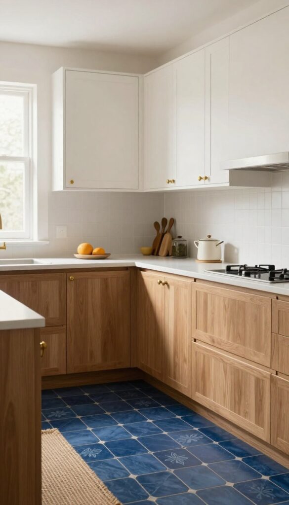
Navy blue encaustic tiles bring a quiet drama that feels both grounded and artistic. The deep hue anchors the kitchen, while the subtle patterns—floral or geometric—add texture without overwhelming the space. It's a look that feels intentional and layered, like a room that has evolved over time rather than been styled in one go.
Why It Works
The dark base hides everyday wear and spills remarkably well, making it a practical choice for busy kitchens. Meanwhile, the intricate motifs catch the light from different angles, creating visual interest that changes as you move through the room. It's a floor that feels both timeless and personal.
Best For
This works beautifully in kitchens with plenty of natural light or warm wood cabinetry, as the contrast keeps the space from feeling too heavy. It's also a great fit for open-plan layouts where you want the kitchen to have its own distinct personality without clashing with adjacent rooms.
Styling Tip
Pair these tiles with warm brass or unlacquered brass hardware and soft white or cream upper cabinets to keep the look balanced. Add a runner in a natural fiber like jute to break up the pattern and introduce a cozy, tactile element.
5. Large-Format Marble-Look Porcelain for Sleek Continuity
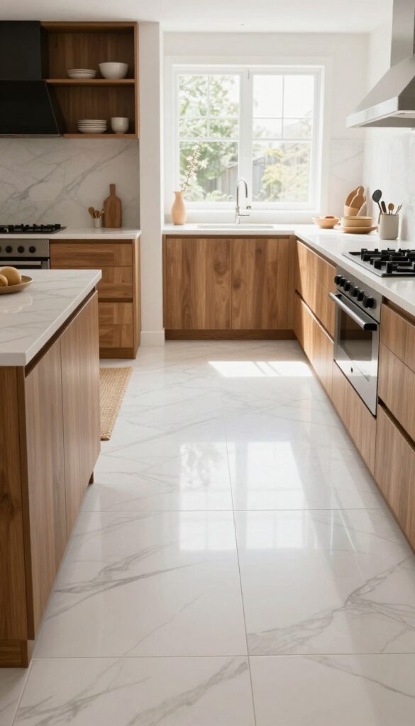
There’s a reason marble-look porcelain keeps showing up in dream kitchens. The large-format version takes that appeal a step further by minimizing grout lines and creating an almost seamless surface. It feels airy and open, especially when the veining stays soft and natural rather than stark or dramatic.
That subtle elegance makes the space feel thoughtful without tipping into cold or formal.
Why It Works
Big tiles trick the eye into seeing more square footage, which is a huge plus for open-plan kitchens. The continuous look helps the floor flow right into adjacent living areas, making the whole home feel larger and more connected. Plus, porcelain is tough, stain-resistant, and easy to clean—perfect for the busiest room in the house.
Best For
Open-concept kitchens where you want a seamless transition between cooking and living spaces. It’s also ideal for kitchens with lots of natural light, because the soft marble pattern reflects brightness without being glare-y. If your style leans modern but warm, this tile fits right in.
Styling Tip
Balance the smooth, cool surface with warmer textures elsewhere. Think natural wood cabinets, a chunky woven rug in the seating area, or open shelving with ceramic dishes. A few matte black or brass fixtures add just enough contrast to keep the look grounded.
6. Sage Green Subway Tiles with a Twist
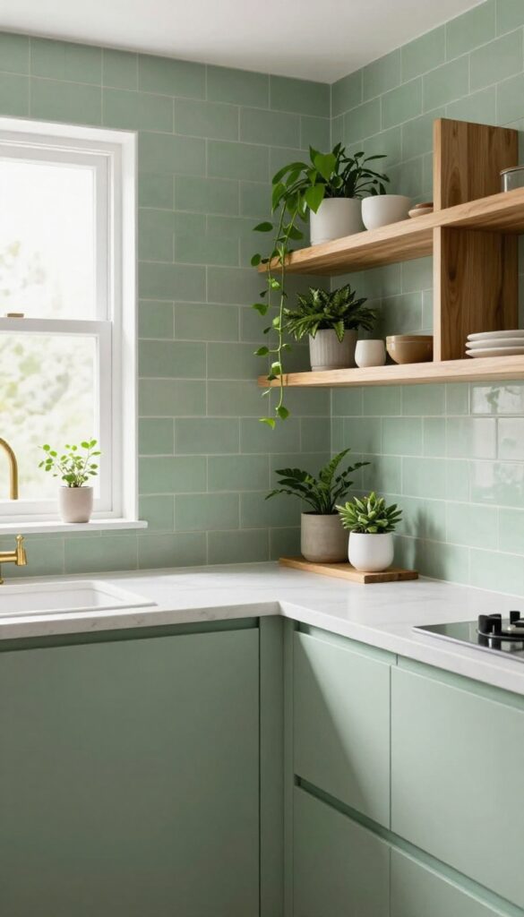
Subway tiles are a kitchen classic, but swapping the usual white for a muted sage green changes the whole energy. This shade feels soft and grounded, like a breath of fresh air in a busy kitchen. Lay them in a vertical stack or herringbone pattern, and you instantly get a look that's both familiar and unexpected.
It’s cozy without being dark, and it brings a subtle garden-inspired calm that makes cooking feel a little more peaceful.
Why It Works
Sage green is a neutral with personality. It’s warm enough to feel inviting but cool enough to keep the space airy. The vertical or herringbone layout adds visual movement without overwhelming the eye, so the tile feels like a deliberate design choice rather than just a background surface.
Best For
This idea shines in kitchens that get good natural light, where the green can shift from soft sage to almost silvery depending on the time of day. It’s also perfect for galley kitchens or smaller spaces, because the vertical stacking draws the eye upward, making the room feel taller.
Styling Tip
- Pair these tiles with unlacquered brass fixtures and open shelving in warm wood tones. The brass will warm up the green, and the wood adds texture. Keep countertops simple—white quartz or butcher block—so the tile stays the star.
- A few trailing plants on the top shelf will tie the whole garden vibe together.
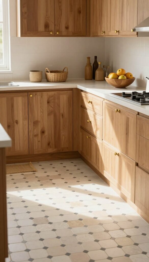
7. Black and White Checkerboard for Vintage Nostalgia
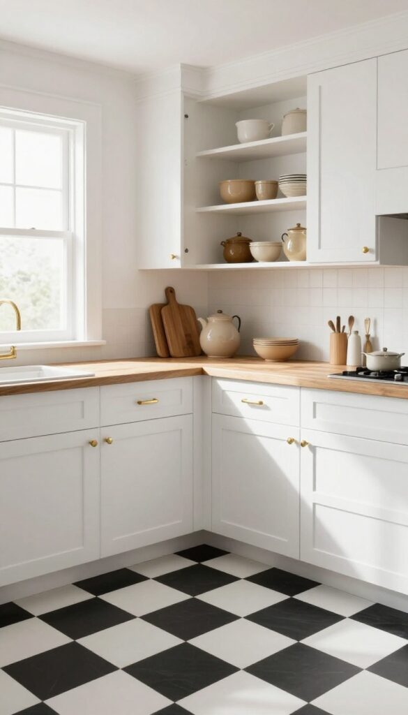
A classic checkerboard floor in matte black and white brings a sense of retro charm without tipping into costume territory. The key is keeping the squares large—think 12×12 inches—for a more modern, grounded scale. Let the rest of the kitchen stay clean and simple so the floor can do the talking, creating a look that feels both nostalgic and fresh.
Why It Works
The high contrast adds visual energy and a graphic punch, while the matte finish keeps it from feeling glossy or overdone. It’s a timeless pattern that plays well with warm wood tones, brass hardware, and soft textiles, making the whole space feel layered and lived-in.
Best For
This flooring shines in kitchens with plenty of natural light and a relatively neutral palette—white cabinets, open shelving, and maybe a butcher block counter. It’s also a great fit for galley kitchens or smaller spaces where the pattern can add a sense of depth and character.
Styling Tip
Balance the bold floor with soft, cozy elements like a vintage runner, linen curtains, or a few ceramic pieces in warm earth tones. Avoid adding too many other patterns—let the checkerboard be the star.
8. Rustic Slate Look for an Industrial Edge
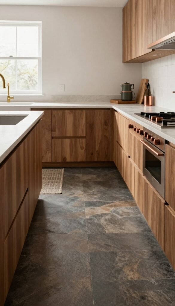
Slate-look porcelain tiles in charcoal and brown tones bring a rugged, natural texture that feels both grounded and stylish. They hide dirt well and add a cozy, cabin-like feel when paired with warm wood and soft lighting. This is the kind of floor that makes you want to kick off your shoes and stay a while.
Why It Works
The matte finish and slight unevenness of slate-look tiles mimic real stone without the maintenance. They resist scratches and stains, making them ideal for a busy kitchen. The dark tones also create a nice contrast with lighter cabinets or open shelving, adding depth without overwhelming the space.
Best For
This look shines in kitchens with rustic or industrial elements—think exposed brick, metal stools, or butcher block counters. It also works well in open-concept layouts where you want the kitchen to feel distinct from a lighter living area. If you love a warm, earthy vibe with a bit of edge, this is your tile.
Styling Tip
Balance the dark floor with plenty of natural light and warm wood accents. Add a runner in a neutral pattern to break up the expanse of tile, and use soft white or cream on upper walls to keep the room from feeling too heavy. A few copper or brass fixtures will pick up the warm brown tones in the tile.
9. Penny Rounds in Warm White for Playful Texture
Small round tiles in warm white create a surface that’s full of subtle texture. The circular shape softens the room and feels playful without being childish. Great for adding visual interest to a small kitchen.
Why It Works
Penny rounds break up large expanses of flooring with gentle, repetitive curves. The warm white tone keeps things light and airy, while the texture adds depth without overwhelming the space.
Best For
This idea shines in small kitchens or galley layouts where you want to avoid busy patterns but still crave character. It also works well in breakfast nooks or kitchen islands for a touch of whimsy.
Styling Tip
Pair penny rounds with simple white cabinetry and natural wood accents to keep the look grounded. Add a soft runner in a muted neutral to define the main work zone.
10. Terrazzo with Muted Chips for Modern Whimsy
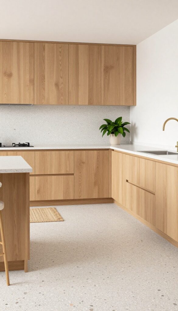
Terrazzo has come a long way from its retro roots. Today’s versions feel fresh and playful, especially when the chips are kept soft and subtle. A warm gray or beige base with tiny flecks of blush, sage, and cream gives your kitchen floor a gentle speckled look that’s anything but boring.
It’s a style that feels both modern and cozy, adding texture without overwhelming the space.
Why It Works
The muted palette keeps the floor from feeling busy, so it pairs well with natural wood cabinets or warm white walls. And because the pattern is speckled, it hides crumbs, dust, and daily wear better than a solid surface. Plus, terrazzo is incredibly durable and easy to wipe clean—perfect for a busy kitchen.
Best For
This tile is ideal for kitchens that get a lot of foot traffic, especially if you have kids or pets. It also works beautifully in open-concept layouts where you want the floor to feel cohesive with adjacent living areas.
Styling Tip
Balance the speckled floor with solid-colored cabinets and simple hardware. Add warmth with a natural fiber rug in the prep zone and a few leafy plants on the counter. Keep countertops clean and uncluttered to let the floor be the star.
11. Wide Plank Wood-Look Tile for Cozy Warmth
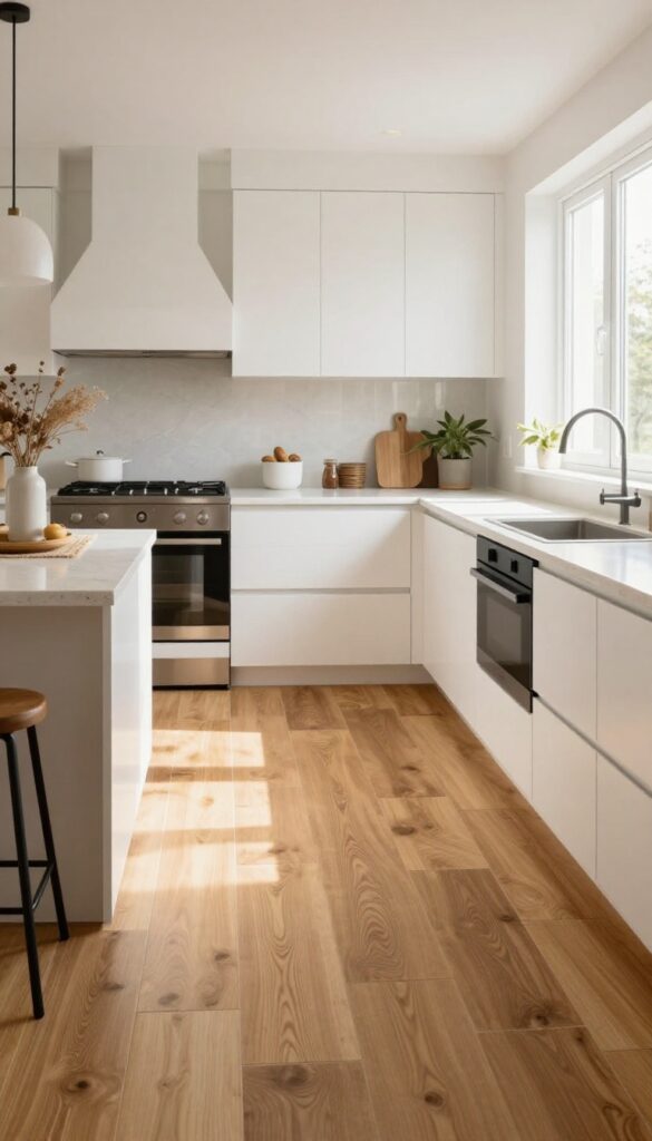
Nothing says cozy quite like the look of wide, sun-bleached wood planks underfoot. Wood-look porcelain tiles in honey or walnut tones give you that warm, rustic feel without the worry of water damage or scratches. The wide planks visually expand the space, making even a compact kitchen feel airy and inviting.
The natural grain patterns add organic texture that softens the hard surfaces typical of a kitchen.
Why It Works
Porcelain tile is incredibly durable and easy to clean, which is essential in a high-traffic kitchen. The wood look brings warmth and a natural element that balances out sleek cabinets and stone countertops. Wide planks reduce the number of grout lines, creating a smoother, more seamless look that feels both modern and timeless.
Best For
This flooring works beautifully in open-concept kitchens where you want a cohesive flow into adjacent living areas. It's also a great choice for kitchens with lots of natural light, as the warm tones will glow without feeling dark. If you love the look of hardwood but need something more practical for a busy family kitchen, this is your match.
Styling Tip
Pair the warm wood tones with soft white or cream cabinetry and matte black hardware for a cozy, modern farmhouse vibe. Add a woven runner in a neutral pattern to define the cooking zone and bring in another layer of texture. Keep countertops simple—a light quartz or butcher block will complement without competing.
12. Hand-Painted Spanish Tiles for Artistic Flair
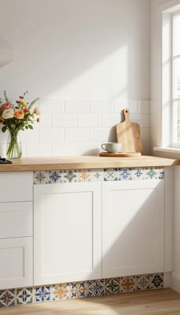
There’s something about hand-painted Spanish tiles that feels both timeless and personal. The intricate patterns in muted blues, greens, and ochres add an artistic touch without screaming for attention. When used sparingly—as a border or in a small section—they bring a curated, collected-over-time feel that keeps the kitchen from looking chaotic.
Why It Works
The muted color palette keeps the tiles from overwhelming the space, while the hand-painted quality adds texture and depth. They create a focal point that feels intentional and artistic, not busy or random.
Best For
This works beautifully in kitchens with neutral cabinetry and countertops, where the tiles can stand out as the main decorative element. It’s also great for adding character to a kitchen island or backsplash without committing to a full tile installation.
Styling Tip
Pair the tiles with warm wood tones and natural stone to enhance the earthy, handcrafted feel. Keep surrounding surfaces simple—think white or cream walls and minimal hardware—so the tiles remain the star.
13. Matte Black Herringbone for Bold Sophistication
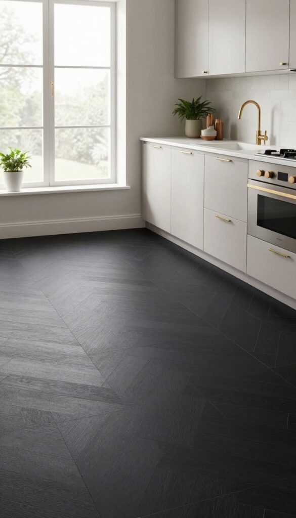
Imagine a kitchen floor that feels both grounded and glamorous. That is what you get with matte black tiles laid in a classic herringbone pattern. The dark hue adds weight and drama without being flashy, while the matte finish keeps things soft and glare-free.
It is a bold move that somehow feels cozy and layered, especially when balanced with lighter elements above.
Why It Works
The herringbone pattern brings texture and movement to the floor, making the space feel dynamic even with a single color. Matte black hides dirt and scuffs better than glossy or light tiles, which is a huge plus in a busy kitchen. The overall effect is sophisticated without being cold, thanks to the warmth of the wood-like pattern.
Best For
This idea shines in kitchens with plenty of natural light and light-colored cabinetry. It also works well in open-plan layouts where the floor needs to anchor the space without overwhelming it. Avoid in very small or dark kitchens unless you plan to add extra lighting.
Styling Tip
Keep countertops and backsplashes light—think white quartz or soft marble—to let the floor stand out without making the room feel cave-like. Add warm metal accents like brass or copper in hardware and light fixtures to balance the cool dark tiles. A few open shelves with plants or ceramics will soften the look even more.
FAQ
What kitchen tile flooring is easiest to maintain?
Porcelain and ceramic tiles are the most low-maintenance options. They resist stains, moisture, and scratches, and cleaning is as simple as sweeping and mopping. Glazed finishes add extra protection.
Can I mix different tile patterns in one kitchen?
Absolutely, but keep it intentional. Use one pattern as the main floor and a complementary pattern for a backsplash or accent area. Stick to a cohesive color palette to avoid visual chaos.
What tile shape makes a small kitchen look bigger?
Large-format tiles (like 12×24 or bigger) and diagonal layouts help a small kitchen feel more spacious. Light colors also reflect light and open up the room.
Are matte or glossy tiles better for kitchen floors?
Matte tiles are generally safer because they offer better slip resistance. They also hide smudges and water spots better than glossy tiles, which can show every footprint.
How do I choose a tile color that won't go out of style?
Stick with natural, earthy tones like warm grays, soft whites, beiges, and muted greens or blues. These colors tend to stay timeless and pair well with changing decor trends.
Conclusion
Choosing kitchen flooring is one of those decisions that pays off every single day. The right tile can make the room feel more inviting, more functional, and more like your own.
Whether you go for the warmth of terracotta or the quiet elegance of herringbone, the key is picking something that feels good underfoot and fits your lifestyle. Take your time, gather samples, and imagine how each option will look with your cabinets and countertops.