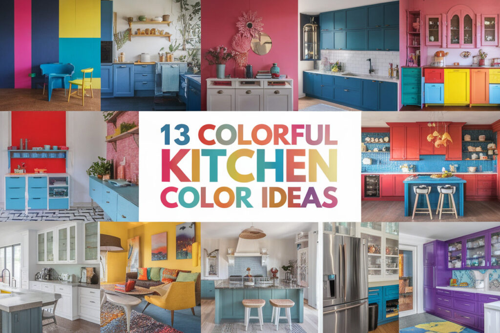
13 Kitchen Color Ideas for a Fresh Vibrant Cooking Space
You know that moment when you walk into a kitchen and instantly feel like cooking something impressive even if it’s just toast? That feeling almost always comes down to color.
I’ve repainted more kitchens than I care to admit, messed up a few walls along the way, and learned what actually makes a kitchen feel fresh instead of flat.
If your kitchen feels dull or dated, these color ideas will wake it right up without turning it into a design experiment gone wrong.
Why Kitchen Color Choices Matter More Than You Think
Color controls the entire mood of your kitchen, whether you notice it or not. I’ve cooked in all white kitchens that felt like hospitals and in dark kitchens that made me lose my appetite, so trust me on this one. When you choose the right color, your kitchen feels bigger, cleaner, and way more inviting.
Color also affects how you use the space every single day. Bright tones energize morning routines, while softer shades calm you down during late night snack runs, and yes, those matter too. Ever wondered why some kitchens feel cozy even when they’re small? The color usually does the heavy lifting.
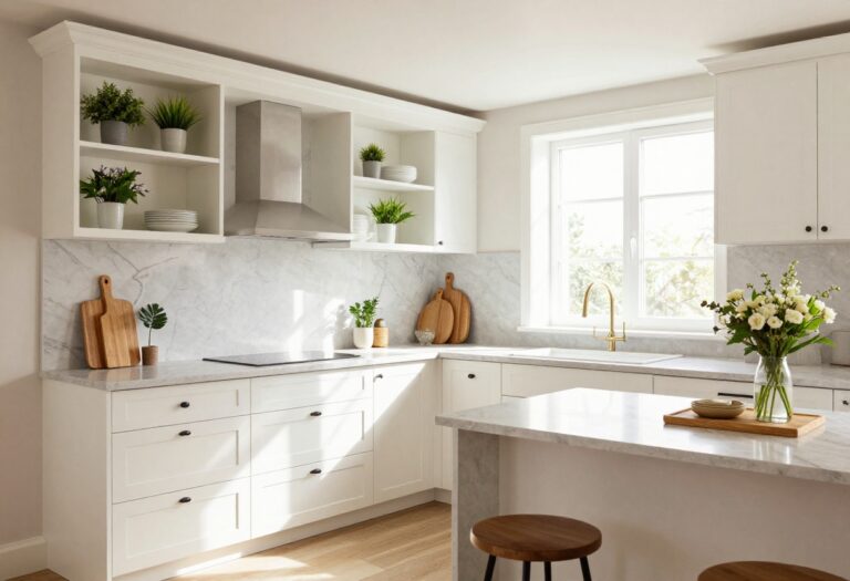
1. Crisp White With a Warm Twist
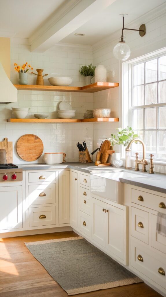
White kitchens never die, but plain white can feel boring fast if you don’t warm it up. I always lean toward creamy or soft white shades instead of stark white because they feel lived in, not sterile. Add warm wood shelves or brass hardware and suddenly white feels intentional.
This combo works especially well in smaller kitchens where light matters most. White reflects light like a champ, which makes tight spaces feel open and airy. IMO, white only fails when people forget to add texture.
2. Soft Sage Green for Calm Energy
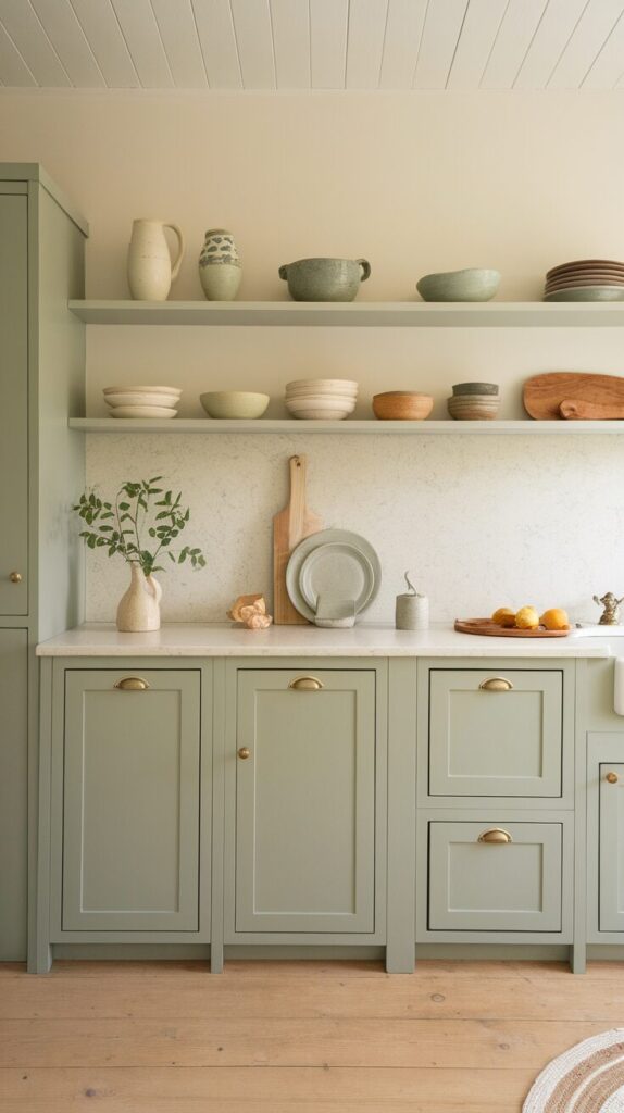
Sage green brings that calm, earthy vibe without feeling dull. I used this color in a kitchen that barely got natural light, and it still felt fresh every time I walked in. It pairs beautifully with white cabinets and natural stone countertops.
This color works because it feels connected to nature without screaming “I love plants.” Sage green also hides smudges better than white, which feels like a small miracle in busy kitchens.
3. Sunny Yellow That Feels Happy Not Loud
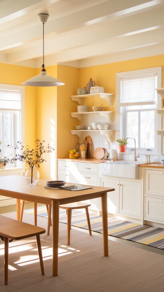
Yellow gets a bad reputation because people go too bright and regret it instantly. When you choose a soft, buttery yellow, the kitchen feels warm and welcoming instead of blinding. I once painted a breakfast nook yellow, and suddenly everyone wanted to sit there every morning.
Yellow boosts energy, which helps on slow mornings when coffee hasn’t kicked in yet. Keep cabinets neutral and let yellow shine on the walls or backsplash for balance.
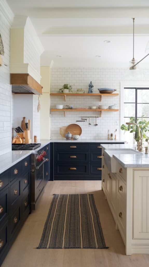
4. Navy Blue for Bold Confidence
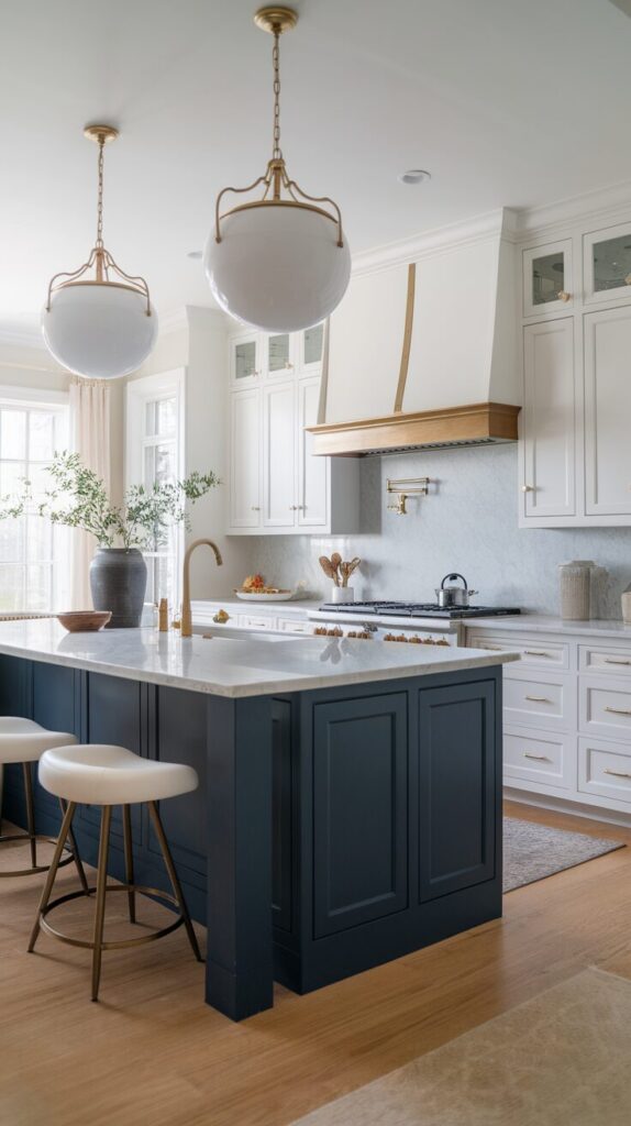
Navy blue kitchens feel rich, stylish, and surprisingly timeless. I love using navy on lower cabinets while keeping upper cabinets light to avoid a heavy look. This color screams confidence without trying too hard.
Navy pairs incredibly well with gold or brass hardware. If you want a kitchen that feels designer level without designer prices, navy delivers every time.
5. Warm Terracotta for Earthy Charm
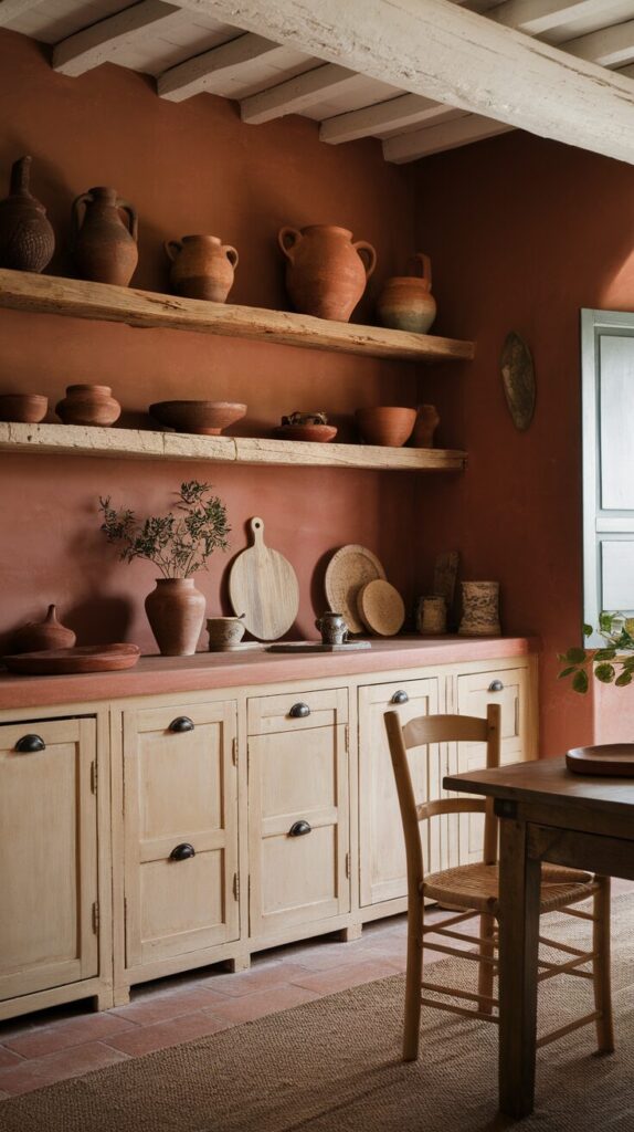
Terracotta brings warmth and personality in a way few colors can. I’ve seen terracotta kitchens feel cozy, rustic, and modern all at once, which sounds impossible but somehow works. This color loves natural light and textured surfaces.
Pair terracotta walls with cream cabinets or open wooden shelving. The result feels grounded and soulful, not trendy for five minutes.
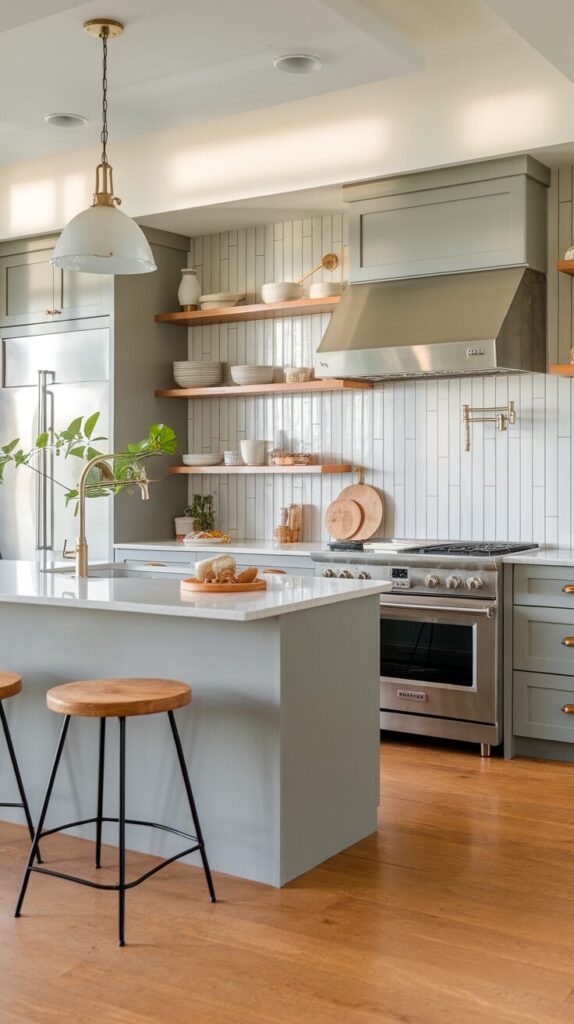
6. Soft Gray That Still Feels Alive
Gray gets blamed for killing personality, but the right shade actually adds sophistication. I always avoid cool gray and lean into warm gray tones with beige undertones. These shades feel calm without feeling cold.
Gray works beautifully in open kitchens that flow into living spaces. It creates visual continuity without stealing attention from furniture or decor.
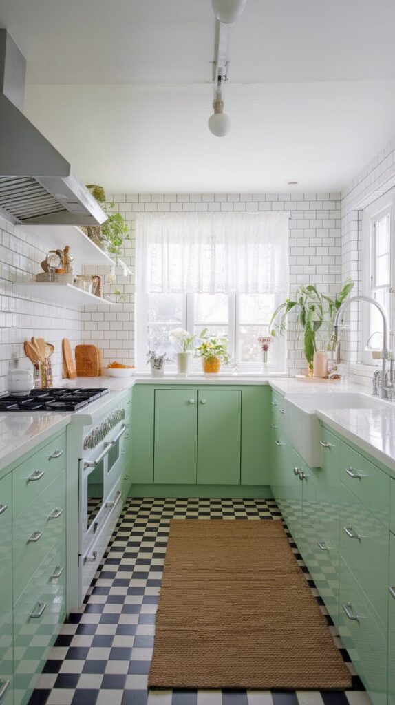
7. Mint Green for Fresh Retro Vibes
Mint green feels playful and refreshing without going overboard. It reminds me of vintage diners but still works in modern kitchens when used thoughtfully. I especially love mint on cabinets with white countertops.
This color brightens the space and feels youthful. If your kitchen feels tired, mint injects instant energy without overwhelming the room.
8. Charcoal Black Used the Right Way
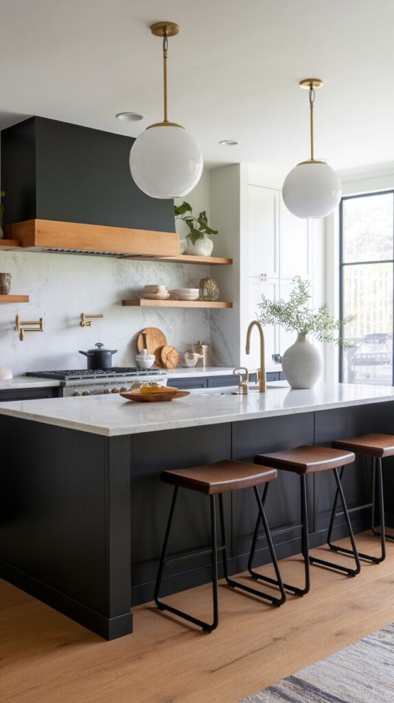
Black kitchens scare people, but charcoal black feels sleek and dramatic when balanced well. I recommend using it on an island or lower cabinets rather than everywhere. This approach adds depth without making the room feel like a cave.
Charcoal pairs beautifully with white marble and warm wood. When done right, black feels luxurious, not gloomy.
9. Powder Blue for Light and Airy Spaces
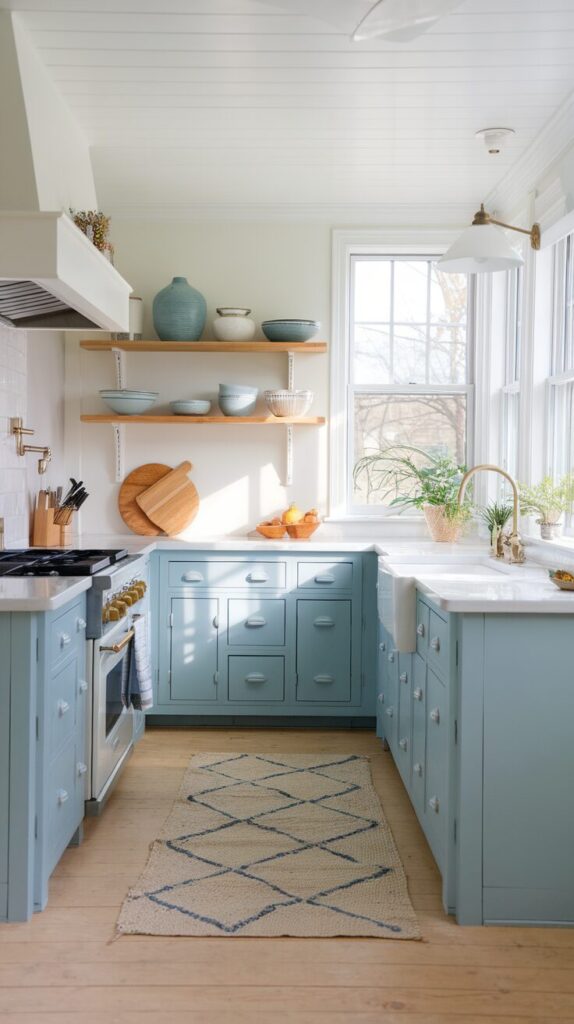
Powder blue creates a breezy, relaxed kitchen atmosphere. I’ve seen this color work wonders in kitchens that face east or south because it plays nicely with sunlight. It feels calm without feeling sleepy.
Use powder blue on cabinets and keep walls neutral for balance. This color feels timeless and works across different design styles.
10. Olive Green for Sophisticated Warmth
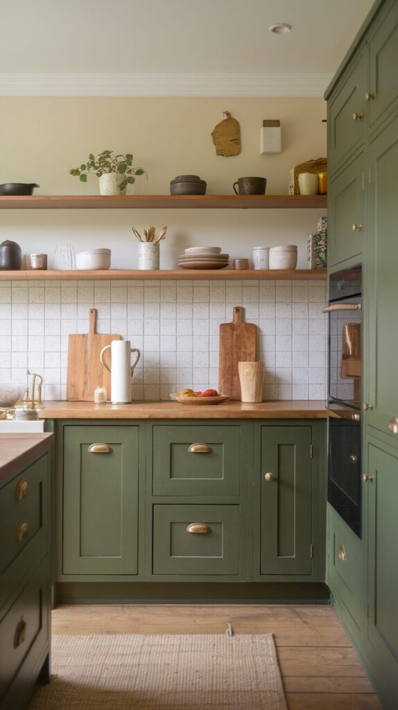
Olive green feels mature and rich without being dark. I like this color because it hides everyday wear and tear better than lighter shades. It pairs especially well with brass fixtures and wooden accents.
This shade works well in both modern and farmhouse kitchens. It adds character while staying grounded and practical.
11. Blush Pink That Feels Grown Up
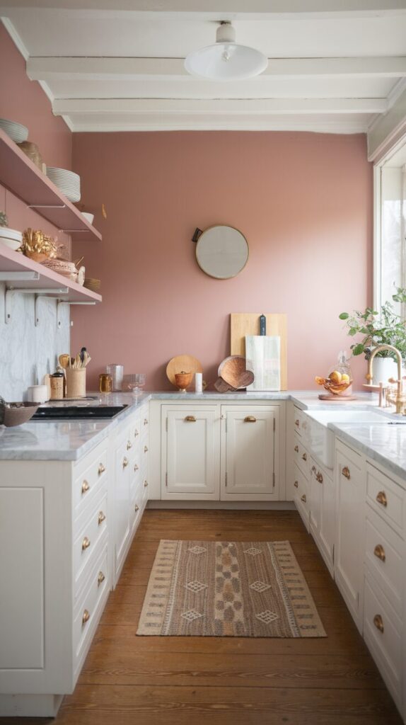
Blush pink in a kitchen surprises people in the best way. When you choose muted pink tones, the space feels warm and stylish instead of overly sweet. I once used blush as an accent wall, and it completely transformed the room.
Pink works beautifully with gray, white, and natural stone. FYI, it also photographs amazingly if you care about that sort of thing.
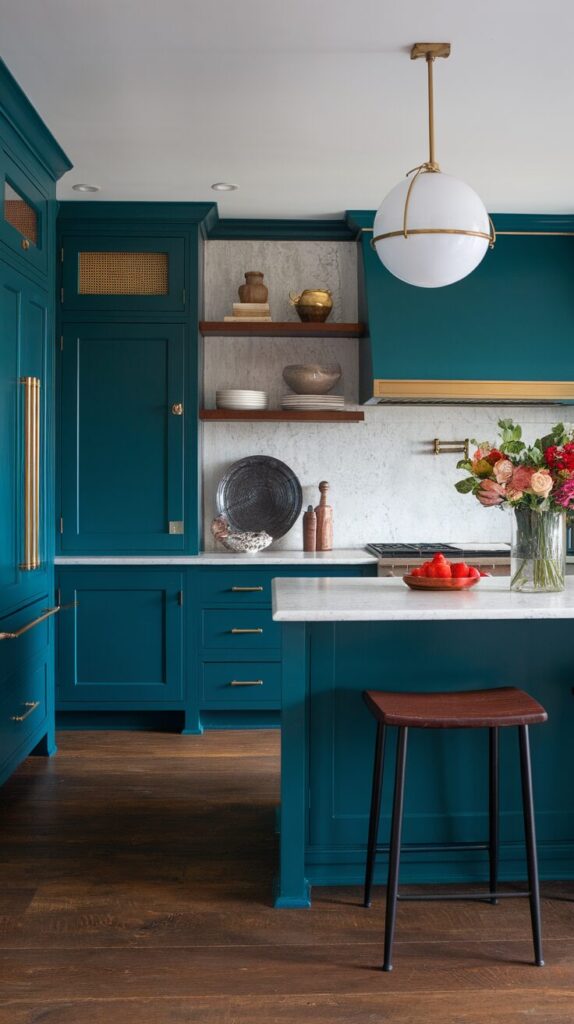
12. Deep Teal for Bold Personality
Teal brings drama without going full dark. I love teal because it changes mood throughout the day depending on lighting. It feels cozy at night and vibrant during the day.
Teal pairs well with gold hardware and white countertops. If you want your kitchen to stand out while still feeling livable, teal nails it.
13. Two Tone Color Schemes That Add Depth
Two tone kitchens feel intentional and stylish when done right. I usually recommend darker lower cabinets and lighter upper cabinets to create balance. This approach adds depth without overwhelming the space.
Popular combos include navy and white, gray and wood, or sage green and cream. Ever noticed how designers use this trick everywhere? It works because it guides the eye naturally.
How to Choose the Right Color for Your Kitchen
Choosing a kitchen color feels overwhelming until you break it down logically. I always start by looking at natural light, cabinet style, and how often the kitchen gets used. These factors matter more than trends.
Before committing, test paint samples on multiple walls. Colors change dramatically throughout the day, and what looks perfect at noon might feel off at night.
Things I Always Consider Before Painting
- Natural light direction and how strong it feels
- Cabinet color and material
- Countertop tone and pattern
- Overall home style and flow
These details save you from repainting six months later, which nobody enjoys.
How to Build a Cohesive Foundation Before You Paint
Before you even open a paint can, you need a clear kitchen color strategy. Random color choices create visual chaos, while a structured approach creates balance and long term satisfaction. I always treat color like a system, not a single decision.
Start by defining your kitchen’s role in your home. Does it function as a high energy family hub or a calm, design focused showpiece? Your answer guides whether you lean toward energizing hues like yellow and terracotta or grounding tones like olive and charcoal.
Next, evaluate your fixed elements because they control more than you think. Flooring, countertops, backsplash, and cabinetry limit your palette, so you must build around them instead of fighting them. When color complements these elements, the entire kitchen feels intentional and professionally designed.
Step by Step Color Planning Framework
- Assess Natural and Artificial Lighting
Observe your kitchen at morning, afternoon, and night. Light shifts tone dramatically, and you need to see how shadows and brightness affect your chosen shade. - Identify Undertones in Existing Materials
Countertops and flooring always carry warm, cool, or neutral undertones. Match your paint color to those undertones for a seamless look. - Choose a Primary and Supporting Color
Select one dominant color and one secondary tone for balance. This prevents visual overload while still adding personality. - Test Samples in Multiple Areas
Paint large swatches on different walls and observe them for several days. This single step prevents costly repainting mistakes.
When you follow this framework, you transform your kitchen with intention instead of guesswork. Strategic planning instantly elevates your design authority and makes the final result feel polished.
Long Term Design Considerations for a Timeless Kitchen
Trends change faster than social media feeds, but your kitchen should not. I always recommend choosing colors that will still look good five years from now because repainting cabinets is not a casual weekend hobby.
Focus on timeless base colors for large surfaces like cabinets and walls. Use bold or trendy shades in smaller areas like an island, backsplash, or accent wall where updates feel manageable.
Durability also matters more than people realize. High traffic kitchens demand washable, high quality paint finishes that resist grease and moisture. Investing in durable finishes protects both your design and your budget.
Best Paint Finishes for Kitchens
- Satin or semi gloss for cabinets due to durability and easy cleaning
- Eggshell or satin for walls to balance softness with wipe ability
- Moisture resistant formulas for areas near sinks and stoves
Choosing the right finish reinforces your authority as a homeowner who plans smart, not impulsively.
Common Mistakes to Avoid
Even the best color ideas fail when people skip the fundamentals. I have seen stunning shades look terrible simply because someone ignored lighting or proportion. Avoiding these common mistakes protects your investment and your sanity.
Overcommitting to Trend Driven Colors
Trendy colors feel exciting at first, but they often lose charm quickly. If you love a bold shade, use it strategically instead of covering every surface.
Ignoring Visual Balance
Dark cabinets paired with dark walls shrink a room fast. Balance heavy tones with lighter elements to maintain openness and contrast.
Forgetting About Flow With Adjacent Rooms
Open concept kitchens demand color harmony with nearby spaces. If your living room features warm neutrals, a cool toned kitchen may clash visually.
Skipping Professional Grade Materials
Low quality paint chips and fades faster in kitchens than anywhere else. Choose durable products that handle heat, steam, and frequent cleaning.
Avoiding these pitfalls ensures your kitchen feels cohesive rather than chaotic.
Enhancing Kitchen Color With Lighting and Texture
Color never works alone. Lighting and texture amplify or mute your chosen shade, so you must treat them as part of the same design equation.
Warm lighting softens bold colors and enhances cozy tones like terracotta and olive. Cool lighting sharpens blues and grays, which works well in modern kitchens.
Texture also plays a powerful role. Wood accents warm up cool palettes, while marble and metal add sophistication to earthy tones. When you layer color with texture, the kitchen gains depth and visual interest without feeling crowded.
Kitchen Color and Resale Value
While you should design for your own enjoyment, resale value still matters. Neutral bases such as soft gray, white, and sage appeal to a wider audience than extremely bold color schemes.
If resale sits on your radar, keep permanent features neutral and experiment with removable or repaintable surfaces. This strategy gives you personality now while protecting long term flexibility.
Frequently Asked Questions
What is the best kitchen color for small spaces?
Light shades such as soft white, sage green, or powder blue reflect more light and make small kitchens feel larger and more open.
Should I paint cabinets or walls first?
Start with cabinets if you plan to change both. Cabinet color anchors the design, and you can then select a complementary wall shade.
How do I know if a bold color will work in my kitchen?
Test large samples in different lighting conditions and observe them for several days. Real world lighting always reveals the truth.
Are dark kitchen colors hard to maintain?
Darker colors hide minor stains better than white, but they show dust and fingerprints more easily, especially in matte finishes.
Can I mix warm and cool tones in one kitchen?
Yes, but balance them intentionally. Pair warm wood with cooler wall tones or use neutral elements to bridge the temperature contrast.
How often should I repaint a kitchen?
High quality paint can last 5 to 10 years depending on traffic and maintenance. Proper preparation and durable finishes extend longevity significantly.
Final Thoughts
A fresh, vibrant kitchen starts with color that fits your lifestyle, not just current trends. The right shade makes cooking feel enjoyable and turns the kitchen into a space people naturally gather in.
Trust your instincts, test samples, and don’t fear color because safe choices rarely spark joy.
If one of these ideas made you smile or imagine your dream kitchen, that’s your sign to grab a paint brush and make it happen.