10 Above Kitchen Cabinet Decor Ideas for Empty Spaces
Empty space above kitchen cabinets collects dust faster than it adds value. Leaving it bare often makes the whole kitchen feel unfinished, like you stopped decorating halfway through.
I’ve seen gorgeous kitchens lose impact just because that upper strip looked forgotten. The good news is, that awkward space can actually become one of the most interesting parts of the room.
Most people either ignore it or overload it with random stuff. Neither works.
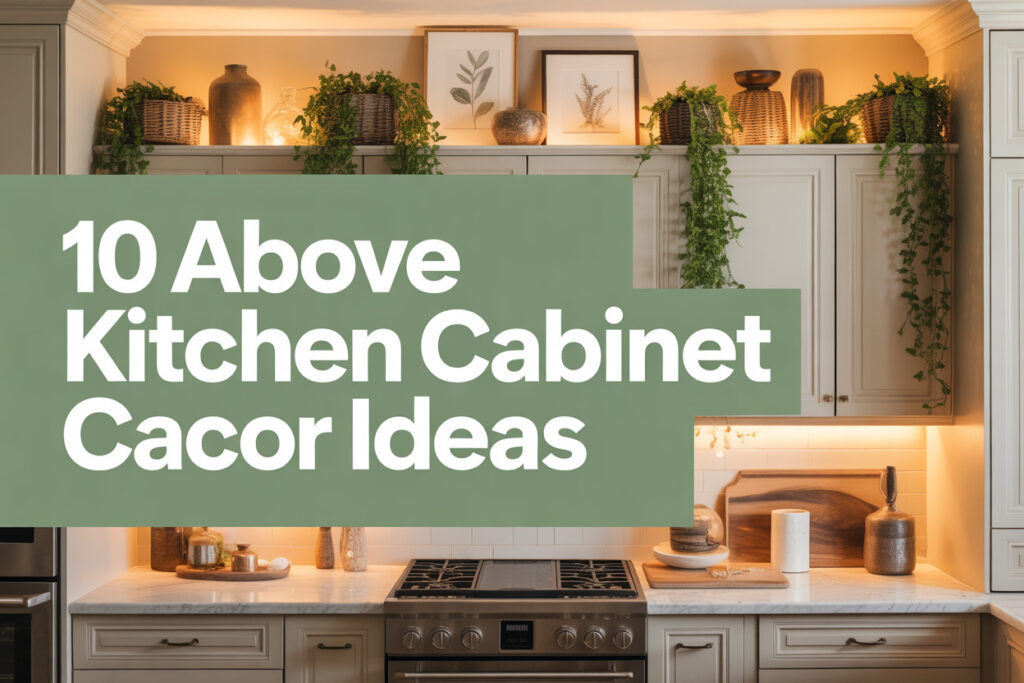
Let’s fix it properly with ideas that feel intentional, stylish, and practical.
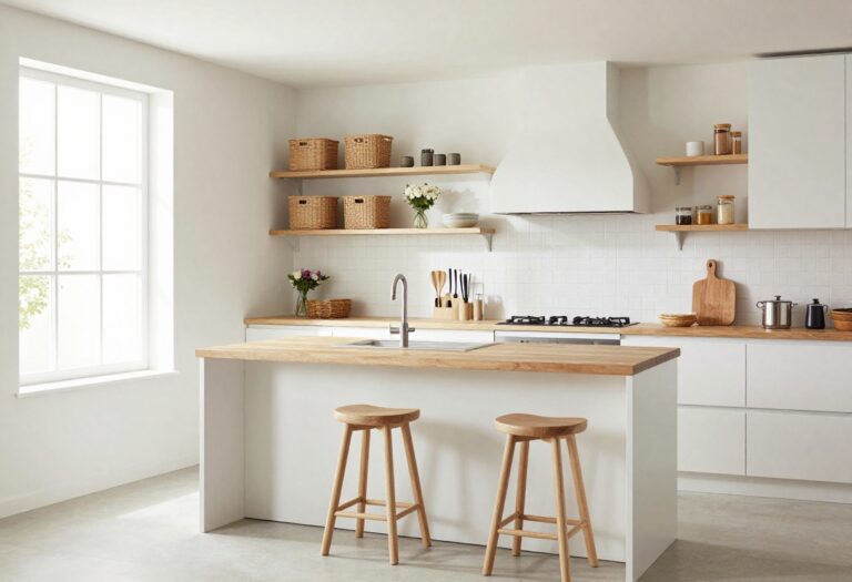
1. Layered Baskets for Warmth and Texture
That dead space above cabinets often feels cold and flat, especially in kitchens with a lot of hard surfaces. Wood, tile, and stone dominate most kitchens, so the room can lean slightly sterile if you’re not careful.
Adding woven baskets up there instantly softens everything without trying too hard. I’ve done this in two kitchens, and both times it made the room feel warmer within minutes.
You don’t need perfect matching sets. In fact, mixing sizes and subtle tones makes the setup feel curated instead of staged.
Why This Works
Baskets add texture, and texture creates visual interest. When everything in a kitchen feels smooth or glossy, your eye gets bored quickly. Natural woven materials break that pattern and balance out sleek cabinetry.
They also visually “fill” vertical space without looking heavy. That’s important because the area above cabinets shouldn’t feel bulky or crowded.
How to Do It
- Measure the height between your cabinets and ceiling before buying anything.
- Choose baskets that leave at least 1–2 inches of breathing room above.
- Mix tall narrow baskets with shorter round ones.
- Stick to neutral tones like warm beige, soft brown, or muted gray.
- Arrange them slightly overlapping for a relaxed look.
Each step matters because proportion is everything here. Oversized baskets will look cramped, and tiny ones will feel lost.
Style & Design Tips
Avoid brightly colored baskets unless your kitchen already leans boho. Neutral woven pieces look timeless and won’t compete with your backsplash.
If your cabinets are white, go for deeper-toned baskets to create contrast. If your cabinets are dark, lighter woven textures will pop beautifully.
Pro Tip or Budget Hack
Check thrift stores or local markets before heading to big home stores. I’ve found some of my best woven pieces secondhand for half the price, and they actually look more authentic than brand-new sets.
2. Oversized Statement Vases
Most kitchens feel bottom-heavy because everything happens on the counter level. That imbalance makes the room look shorter than it is. Tall vases above cabinets stretch the eye upward and create vertical flow.
This works especially well in kitchens with standard-height ceilings where you want to fake a little drama.
Why This Works
Height changes perception. When you add tall decorative objects, your eye automatically travels upward, which makes the room feel taller.
Large vases also create bold focal points without clutter. A few big pieces look intentional, while many small items look messy.
How to Do It
- Choose vases at least 12–18 inches tall.
- Stick to 2–3 per section rather than filling every inch.
- Keep spacing consistent so it feels balanced.
- Use ceramic, matte stone, or glass depending on your style.
- Add dried stems for extra height if needed.
Spacing matters more than quantity. Too many pieces ruin the elegance.
Style & Design Tips
For modern kitchens, go with matte black or textured white ceramic. For farmhouse vibes, lean toward distressed finishes or subtle patterns.
Avoid shiny metallics unless your kitchen already includes warm brass or gold accents.
Pro Tip or Budget Hack
If oversized vases feel pricey, grab simple large pitchers or even tall glass jars. Spray paint them in a cohesive color for a custom look that costs way less.
3. Faux Greenery for Life Without Maintenance
Empty upper spaces can make a kitchen feel flat and lifeless. Plants solve that instantly, but real plants up there become a maintenance nightmare.
I tried real ones once. Climbing up a stool every week to water them got old fast.
Why This Works
Greenery introduces color and softness. Even a small touch of green breaks up neutral cabinets beautifully.
Faux plants today look surprisingly realistic, especially when placed higher up where no one examines them closely.
How to Do It
- Choose high-quality faux trailing plants.
- Place them inside simple neutral planters.
- Let vines gently drape over cabinet edges.
- Keep spacing airy rather than crowded.
- Dust them monthly to avoid buildup.
Good placement keeps them from looking fake. Natural-looking drape is key.
Style & Design Tips
Stick to realistic shades of green. Bright artificial tones instantly give away the illusion.
Combine one trailing plant with one upright faux plant for variation.
Pro Tip or Budget Hack
Mix one real plant at counter level with faux greenery above. The real plant sells the illusion and keeps the upper ones from looking artificial.
4. A Cohesive Cookbook Display
Cookbooks stacked randomly look chaotic. But styled intentionally, they add personality and color above cabinets.
This idea works especially well if you already collect beautiful cookbooks but don’t have shelf space for them.
Why This Works
Books add height and personality. They also create a layered effect when stacked horizontally and vertically.
The key is limiting the number so it feels curated, not cluttered.
How to Do It
- Select books with complementary spine colors.
- Stack some horizontally and stand others vertically.
- Use bookends if needed for stability.
- Leave small gaps between stacks.
- Rotate books occasionally to refresh the look.
Color coordination makes everything feel intentional.
Style & Design Tips
If your kitchen is neutral, let the books add subtle pops of muted color. If your kitchen already has bold tones, stick to neutral spines.
Avoid torn or worn copies up there. Save those for everyday shelves.
Pro Tip or Budget Hack
Remove dust jackets for a cleaner, uniform look. Many hardcover books underneath are neutral and elegant.
5. Decorative Trays and Cutting Boards
Flat cabinet tops often need something structured. Leaning large cutting boards or trays creates instant dimension.
I love this idea because it feels kitchen-appropriate instead of random décor.
Why This Works
Wood boards introduce warmth and relate directly to kitchen function. They don’t look forced or purely decorative.
Vertical leaning pieces also add height without bulk.
How to Do It
- Choose oversized wood boards.
- Lean them against the wall above cabinets.
- Overlap slightly for depth.
- Mix wood tones but keep them harmonious.
- Add one neutral ceramic piece in front for balance.
Layering creates that designer feel.
Style & Design Tips
Stick to natural wood finishes rather than stained dark browns. Lighter wood keeps things airy.
Avoid plastic or brightly colored boards. They ruin the aesthetic instantly.
Pro Tip or Budget Hack
Check discount home stores for large decorative boards. Some are labeled as serving boards but work perfectly as décor.
6. Minimalist Art Panels
Blank space sometimes calls for art rather than objects. Leaning framed prints above cabinets can elevate the entire kitchen.
This works best if your cabinets have enough depth to safely support frames.
Why This Works
Art draws attention upward and adds personality. It also ties your kitchen into the rest of your home’s style.
Keeping it minimalist prevents visual overload.
How to Do It
- Choose 2–3 large frames.
- Lean them against the wall.
- Keep spacing consistent.
- Stick to a cohesive theme.
- Secure with museum putty if needed.
Safety matters here, especially if you cook actively below.
Style & Design Tips
Black-and-white prints feel timeless. Soft abstract art works beautifully in modern kitchens.
Avoid tiny frames. They’ll disappear visually.
Pro Tip or Budget Hack
Print downloadable art and use simple affordable frames. You get high-end style without high-end pricing.
7. Matching Storage Boxes
If you need hidden storage, decorative boxes above cabinets solve two problems at once.
They fill space and hide seasonal or rarely used items.
Why This Works
Uniform boxes create clean lines. They feel intentional and organized rather than decorative clutter.
Closed storage also prevents dust buildup inside.
How to Do It
- Measure cabinet width.
- Choose identical boxes.
- Line them evenly across the top.
- Leave slight spacing between each.
- Label discreetly if needed.
Uniformity makes this look sharp.
Style & Design Tips
Stick to linen, canvas, or matte wood finishes. Shiny plastic boxes ruin the effect.
Neutral colors always age better than trendy ones.
Pro Tip or Budget Hack
Buy plain boxes and wrap them in textured wallpaper for a custom look.
8. Vintage Kitchen Finds
Character often gets lost in modern kitchens. Vintage pieces above cabinets bring it back.
I once styled old enamel pitchers up there and instantly loved the personality shift.
Why This Works
Old pieces tell a story. They soften modern cabinetry and add charm.
Mixing eras creates depth and visual interest.
How to Do It
- Visit flea markets or antique stores.
- Choose larger statement pieces.
- Avoid overcrowding.
- Group items in odd numbers.
- Keep a cohesive color story.
Intentional grouping avoids clutter vibes.
Style & Design Tips
Stick to two or three main tones. Too many colors feel chaotic.
Patina looks great, but broken items do not.
Pro Tip or Budget Hack
Even reproduction vintage-style pieces work if they have subtle distressing.
9. Subtle LED Accent Lighting
Dark empty spaces above cabinets can feel heavy. Adding soft LED lighting changes everything.
This idea adds ambiance without adding objects.
Why This Works
Lighting creates depth. It separates cabinets from the ceiling and adds dimension.
Soft light also highlights décor you place above.
How to Do It
- Install warm white LED strips.
- Place them toward the back edge.
- Hide wiring carefully.
- Test brightness before final placement.
- Use a dimmer if possible.
Proper placement prevents harsh glare.
Style & Design Tips
Stick to warm tones rather than cool white. Cool light feels clinical.
Avoid overly bright strips. Subtle glow works best.
Pro Tip or Budget Hack
Battery-operated LED strips work if outlets aren’t available. Just make sure you can access them for replacements.
10. Simple Ceramic Collection
A curated ceramic collection feels timeless and clean. Bowls, pitchers, and sculptural pieces look effortless when styled properly.
I love this option for kitchens that already lean neutral.
Why This Works
Ceramics reflect light softly and add subtle variation. They’re decorative but still feel kitchen-appropriate.
Grouped properly, they create visual rhythm.
How to Do It
- Choose one color family.
- Vary shapes and heights.
- Group in clusters of three.
- Leave breathing room.
- Keep pieces larger than everyday dishware.
Scale makes a big difference here.
Style & Design Tips
Matte finishes look more modern. Glossy ceramics lean traditional.
Avoid busy patterns unless your kitchen style supports it.
Pro Tip or Budget Hack
Mix a few high-end pieces with affordable finds. No one will know the difference once they’re styled together.
The Design Strategy Behind Styling Above Kitchen Cabinets
Most decorating mistakes happen when people treat that upper space like an afterthought. The area above cabinets needs a clear plan, not random fillers placed up there just because it feels empty. When you approach it with structure, the results look intentional instead of improvised.
Start by deciding what role that space will play in your kitchen. It can add warmth, introduce storage, highlight personality, or create height. Once you define the goal, every styling decision becomes easier and more cohesive.
Step 1: Identify Your Kitchen’s Visual Weight
Every kitchen has a visual anchor point. Sometimes it’s the island, sometimes it’s the backsplash, and sometimes it’s bold cabinetry.
If your kitchen already feels busy, go minimal above the cabinets. If it feels flat or too uniform, that’s where texture or contrast can really help.
Step 2: Stick to One Core Theme
Mixing too many styles above cabinets creates visual noise fast. Choose one direction such as rustic warmth, modern minimal, vintage charm, or clean contemporary.
Once you commit to that direction, everything you place up there should support it. Consistency builds authority in design.
Step 3: Think in Layers, Not Clutter
Good styling relies on layering heights and shapes. Flat rows of objects look stiff and unplanned.
Vary tall, medium, and shorter elements while keeping breathing room between them. Space is just as important as décor.
Step 4: Maintain Proportion
Objects that are too small disappear. Pieces that are too large overwhelm the ceiling line.
Always measure before styling and step back frequently while arranging. Your eye will tell you when something feels off.
Common Mistakes to Avoid When Decorating Above Cabinets
Most design fails up there happen for predictable reasons. Avoiding them saves you time, money, and frustration.
1. Overcrowding the Space
Filling every inch makes the kitchen feel heavy. That upper line should feel styled, not stuffed.
Leave negative space. It keeps the room breathing.
2. Using Tiny Decorative Items
Small figurines or knickknacks get lost instantly. They also collect dust and look messy from a distance.
Go bigger and fewer. Larger objects always look more intentional.
3. Ignoring Dust and Maintenance
That area collects dust quickly. Anything you place there needs to be easy to wipe down.
Avoid intricate pieces with lots of grooves unless you enjoy climbing a stool weekly.
4. Mixing Too Many Colors
Clashing tones make the entire kitchen feel chaotic. Stick to a defined palette of two or three main colors.
This keeps everything cohesive instead of accidental.
5. Forgetting Safety
Leaning frames or tall objects must be stable. Cooking activity below can create vibrations.
Use museum putty or non-slip pads if needed.
Choosing Decor Based on Ceiling Height
Ceiling height changes everything when styling above cabinets. What works in an eight-foot kitchen won’t always work in a ten-foot one.
In lower ceilings, keep decor streamlined and lighter in visual weight. Heavy or dark objects will compress the space visually.
In higher ceilings, taller statement pieces help bridge the gap. Without them, the space can look disconnected from the rest of the kitchen.
If the gap is very small, sometimes the smartest move is keeping it clean and minimal. Not every space needs decoration.
Cleaning and Maintenance Considerations
Style means nothing if it becomes a dust trap. Plan décor that you can realistically maintain.
Closed storage boxes reduce cleaning frequency. Smooth ceramics and metal wipe down quickly.
If you choose greenery, commit to regular dusting. A dusty plant instantly ruins the aesthetic.
Create a simple cleaning routine. Wipe surfaces monthly, and rotate items seasonally to prevent buildup.
Seasonal Styling Rotation Strategy
Rotating décor above cabinets keeps the kitchen feeling fresh without buying new pieces constantly. A subtle seasonal shift adds personality while keeping the core layout intact.
For example, warm wood and dried stems work beautifully in cooler months. In warmer months, lighter ceramics and fresh greenery brighten the look.
Store off-season pieces in labeled bins. That makes swapping effortless instead of overwhelming.
Keep the base consistent. Only change accent pieces so the overall theme stays cohesive year-round.
Frequently Asked Questions
Should I decorate above my kitchen cabinets at all?
Not always. If the gap is very small or your kitchen already feels visually busy, leaving it clean can look more modern and intentional.
How do I keep décor from looking outdated?
Stick to neutral tones and classic materials like wood, ceramic, linen, and matte finishes. Trendy colors and novelty items date quickly.
What if my cabinets go all the way to the ceiling?
In that case, skip upper décor entirely. Focus on counter styling, lighting, or backsplash upgrades instead.
How do I stop items from sliding or shifting?
Use museum putty or non-slip pads underneath heavier objects. This adds stability without visible hardware.
Is lighting above cabinets necessary?
It’s not required, but it adds dimension. Subtle warm LED strips can elevate even simple décor arrangements.
How many items should I place above each cabinet section?
Less than you think. Two to four larger pieces per section usually look better than many small items.
Creating a Cohesive Kitchen Design From Top to Bottom
The area above cabinets should connect visually with what happens below. If you use wood tones up top, echo them somewhere else in the room.
Repeating materials builds harmony. A ceramic piece above should feel related to something on your counter or shelves.
Think of your kitchen vertically. When every level supports the same style story, the entire space feels professionally designed rather than pieced together.
Strong design choices always look deliberate. When you approach that upper space with structure and clarity, it stops feeling awkward and starts feeling complete.
Final Thoughts
That empty strip above your cabinets doesn’t need to stay awkward or ignored. A little intention goes a long way, and the right pieces can completely shift how your kitchen feels.
I’ve experimented with most of these ideas over the years, and the difference always surprises me. Pick one approach, keep it cohesive, and trust your instinct. Your kitchen will feel finished in a way that finally makes sense.