10 Green Tile Shower Ideas That Instantly Upgrade Your Space
Green tile showers solve a common problem fast—they add personality without making the space feel overwhelming. Neutral bathrooms often end up looking forgettable, even when everything is technically “nice.” A little color changes that instantly.
Green hits that sweet spot between bold and calming, which is why I keep coming back to it in bathroom projects.
It feels fresh without screaming for attention, and it works with way more styles than people expect. You don’t need a full remodel either—just the right tile choice in the right spot.
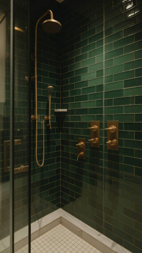
1. Deep Emerald Subway Tile Shower
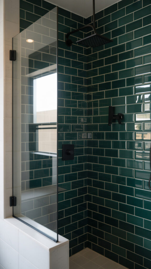
Bathrooms often feel flat when everything blends into the same neutral palette. A deep emerald subway tile fixes that by adding contrast without making the space feel busy. I tried this in a small guest bathroom once, and it instantly made the room feel more expensive than it actually was.
The rectangular shape keeps things structured, while the rich color adds depth and mood. It’s a clean upgrade that still feels stylish years later. You’re basically combining a classic layout with a bold twist.
Why This Works
Subway tiles already have a timeless layout, so the color becomes the star without overwhelming the space. Dark green absorbs light in a way that creates a cozy, grounded feel. It also hides water spots better than lighter tiles, which is a small win you’ll appreciate daily.
How to Do It
- Choose glossy emerald subway tiles for light reflection
- Stack them horizontally for a classic look or vertically for height
- Use light grout if you want contrast, dark grout if you prefer seamless depth
- Pair with simple fixtures so the tile stays the focus
Style & Design Tips
Stick with minimal decor so the wall doesn’t compete with anything else. Brushed gold or matte black fixtures look especially good here because they pop against the green. Avoid overly patterned floors, or the whole space starts to feel chaotic.
Pro Tip or Budget Hack
If full tiling feels expensive, just tile the shower wall and leave the rest neutral. It gives you that high-end look without blowing your budget.
2. Soft Sage Green Minimalist Shower
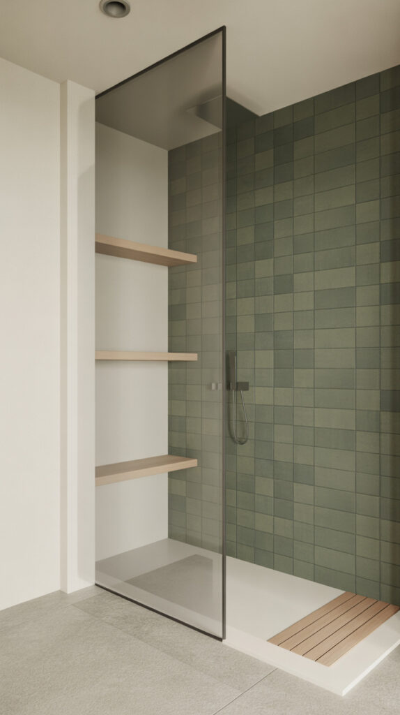
Overly bold bathrooms can feel tiring over time, especially in spaces you use daily. Soft sage green solves that by adding color in a way that feels calm and effortless. I’ve seen this work beautifully in small apartments where you don’t want anything too loud.
This shade sits right between gray and green, which makes it incredibly versatile. It blends into modern, farmhouse, and even Scandinavian styles without forcing a theme. It’s subtle, but definitely not boring.
Why This Works
Sage tones reflect light gently, which helps the bathroom feel open and relaxed. The color doesn’t fight with other elements, so you can layer textures easily. It also pairs well with both warm and cool finishes, which gives you flexibility.
How to Do It
- Choose matte sage tiles for a soft, modern finish
- Use larger tiles to reduce grout lines and keep things clean
- Pair with white or beige walls outside the shower
- Add simple glass panels to keep the space open
Style & Design Tips
Stick to natural materials like wood or stone for accessories. Too much shine can take away from the relaxed vibe. Keep your palette tight—three main colors max works best here.
Pro Tip or Budget Hack
If you can’t find sage tiles in your budget, mix white tiles with sage-painted walls outside the shower. It still gives you that calm look without needing full coverage.
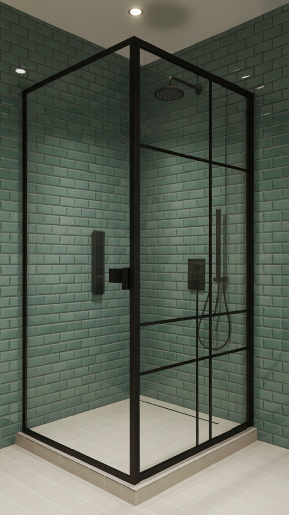
3. Green Herringbone Statement Wall
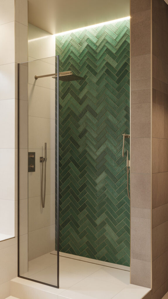
Some bathrooms just need a focal point, otherwise everything fades into the background. A green herringbone wall adds movement and visual interest without adding clutter. I’ve used this in a narrow shower before, and it made the space feel way more dynamic.
The pattern pulls your eye upward and across, which helps break up flat surfaces. It’s detailed but still structured, so it doesn’t feel messy. This is where you go when you want something stylish but not trendy in a bad way.
Why This Works
The herringbone layout adds texture through pattern instead of color overload. Green tones soften the geometric feel so it doesn’t look too harsh. It also creates a subtle sense of luxury without needing expensive materials.
How to Do It
- Choose rectangular green tiles for the pattern
- Lay them in a herringbone layout starting from the center
- Use thin grout lines for a cleaner look
- Keep surrounding walls simple to highlight the feature
Style & Design Tips
Avoid mixing too many patterns in one space. Let the herringbone wall stand on its own. Stick with simple flooring like large neutral tiles or concrete-style finishes.
Pro Tip or Budget Hack
Do the herringbone pattern on just one wall instead of the entire shower. You’ll save money and still get the same visual impact.
4. Forest Green Tile with Gold Fixtures
Plain bathrooms often lack contrast, which makes everything feel a bit lifeless. Pairing forest green tiles with gold fixtures fixes that instantly by creating a rich, layered look. I tried this combo once thinking it might be too much, but it actually balanced out beautifully.
The deep green acts as a strong base, while gold adds warmth and shine. It feels upscale without being overly fancy. You don’t need a massive space for this either—it works surprisingly well in smaller showers.
Why This Works
Dark green grounds the space, while gold reflects light and adds brightness. The contrast between matte and metallic finishes creates visual interest. It also gives a subtle luxury feel without requiring expensive materials everywhere.
How to Do It
- Install forest green tiles across the shower walls
- Choose brushed gold fixtures for a softer shine
- Keep grout lines neat and minimal
- Add a clear glass door to avoid blocking light
Style & Design Tips
Avoid mixing too many metals—stick with gold for consistency. Keep accessories simple so the color and fixtures stay the focus. A white or light floor helps balance the darker walls.
Pro Tip or Budget Hack
If gold fixtures are pricey, use gold-toned accessories like shower caddies or towel hooks. You still get the same effect for less.
5. Green and White Checkerboard Shower
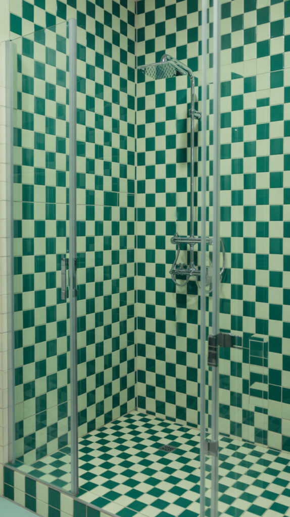
Bathrooms sometimes feel too safe when everything matches perfectly. A green and white checkerboard breaks that pattern in a fun but still controlled way. I’ve always liked how this adds personality without feeling childish.
The contrast between the two colors keeps the design lively. It works especially well in vintage-inspired or eclectic spaces. You get a playful look that still feels intentional.
Why This Works
The checkerboard layout creates rhythm, which makes the space feel more engaging. Green softens the contrast compared to black, so it doesn’t feel harsh. It also helps highlight the structure of the shower area.
How to Do It
- Use equal-sized green and white tiles
- Lay them in a checkerboard pattern
- Keep grout lines consistent for a clean finish
- Pair with simple fixtures to balance the look
Style & Design Tips
Avoid overdecorating the rest of the bathroom. Let the pattern stand out. Stick with neutral tones for towels and accessories.
Pro Tip or Budget Hack
Use peel-and-stick tiles for smaller showers or rental spaces. It’s an easy way to test the look without commitment.
6. Olive Green Textured Tile Shower
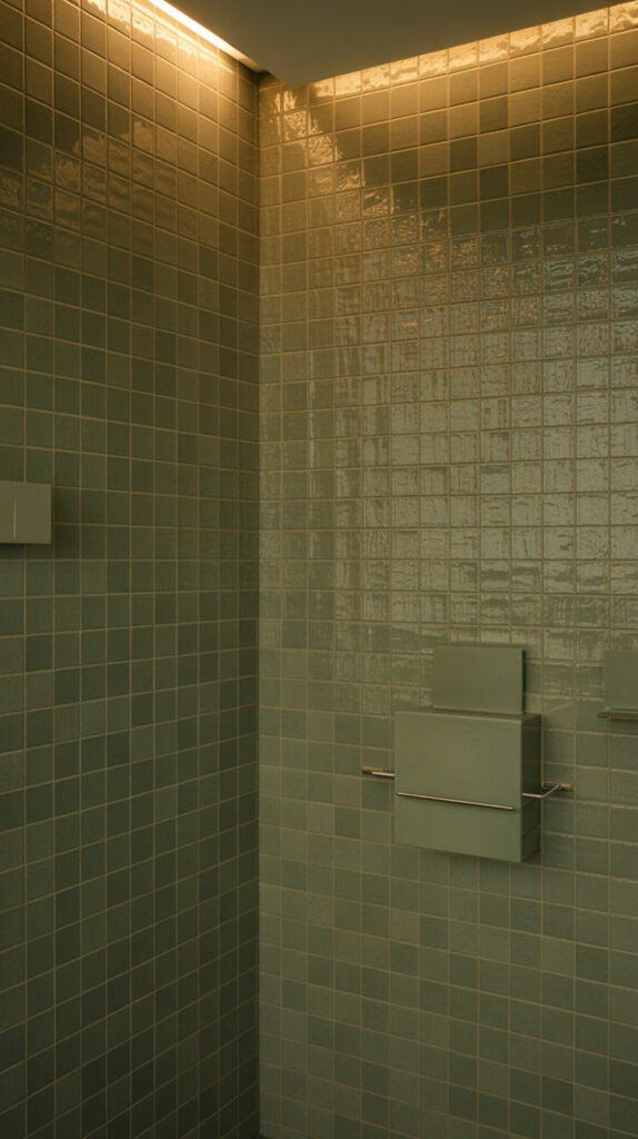
Flat surfaces can make a bathroom feel a bit lifeless. Olive green textured tiles add depth without needing bold patterns or colors. I’ve seen this work especially well in modern homes where everything leans minimal.
The texture catches light differently throughout the day, which keeps the space interesting. It feels subtle but never dull. It’s one of those designs you appreciate more over time.
Why This Works
Texture adds dimension without cluttering the design. Olive tones bring warmth without overpowering the space. It creates a balanced look that feels both modern and comfortable.
How to Do It
- Choose textured olive tiles for the shower walls
- Keep the layout simple to highlight the texture
- Use neutral grout to avoid distraction
- Pair with soft lighting to enhance the effect
Style & Design Tips
Stick with matte finishes for a more natural feel. Avoid glossy accessories that clash with the texture. Keep the color palette earthy and grounded.
Pro Tip or Budget Hack
Use textured tiles only on one wall and smooth tiles on the others. It saves money while still giving you that layered look.
7. Vertical Green Tile for Height Illusion
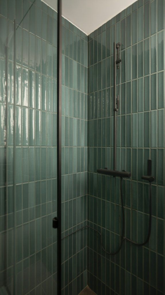
Low ceilings can make a bathroom feel cramped pretty quickly. Vertical green tiles help fix that by drawing the eye upward. I’ve used this trick in a small apartment bathroom, and it genuinely made the space feel taller.
The direction of the tile matters more than people think. Changing the orientation shifts how the room is perceived. It’s a simple move with a big impact.
Why This Works
Vertical lines create the illusion of height. Green tones soften the effect so it doesn’t feel too rigid. It’s a functional design choice that also looks stylish.
How to Do It
- Install rectangular tiles vertically
- Use longer tiles to enhance the effect
- Keep grout lines subtle
- Pair with a tall glass panel or door
Style & Design Tips
Avoid horizontal elements that break the vertical flow. Keep shelves and accessories minimal. Stick with a clean, uncluttered layout.
Pro Tip or Budget Hack
If full vertical tiling isn’t possible, apply it only on the back wall. You still get the height illusion without extra cost.
8. Green Mosaic Tile Accent Strip
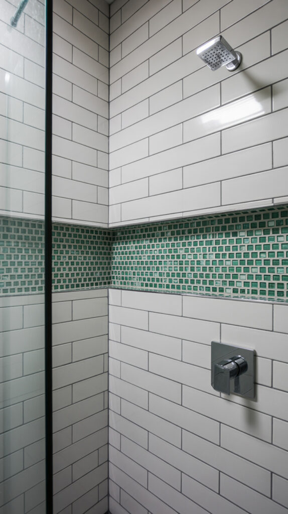
Completely tiled showers can sometimes feel too uniform. A green mosaic accent strip adds detail without overwhelming the space. I’ve used this in a neutral bathroom, and it instantly made everything look more intentional.
The small tiles create texture and variation. It’s a subtle upgrade that still feels thoughtful. Perfect if you want something different but not dramatic.
Why This Works
Mosaic tiles add visual interest through size variation. The green color draws attention without dominating the space. It also helps break up large, plain surfaces.
How to Do It
- Install a horizontal mosaic strip at eye level
- Pair with larger neutral tiles around it
- Use matching grout for a seamless look
- Keep the strip consistent across walls
Style & Design Tips
Avoid placing the strip too low or too high. Keep it aligned with key features like shower fixtures. Stick with simple surrounding tiles.
Pro Tip or Budget Hack
Use leftover mosaic tiles from other projects to create the strip. It’s a great way to reduce waste and save money.
9. Matte Green Tile with Black Accents
Bathrooms often lack definition when everything blends together. Matte green tiles paired with black accents create a sharp, modern contrast. I’ve seen this combo turn basic bathrooms into something way more styled.
The matte finish keeps things grounded, while black adds structure. It feels clean and contemporary without trying too hard. Definitely a go-to if you like a modern look.
Why This Works
Matte surfaces reduce glare and feel more natural. Black accents create clear lines and definition. Together, they create a balanced and polished look.
How to Do It
- Choose matte green tiles for the walls
- Add black fixtures or frames
- Keep grout lines clean and minimal
- Use glass panels to maintain openness
Style & Design Tips
Stick with a limited color palette for a cohesive look. Avoid mixing too many finishes. Keep accessories simple and functional.
Pro Tip or Budget Hack
If black fixtures are expensive, use black-framed mirrors or accessories instead. It still ties the look together.
10. Light Mint Green Spa-Inspired Shower
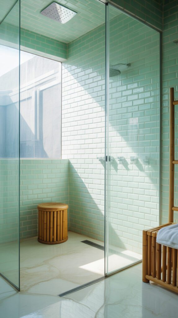
Busy bathrooms can feel stressful instead of relaxing. Light mint green tiles create a spa-like feel that instantly softens the space. I’ve always liked this option for master bathrooms where you want something calming.
The color feels fresh and clean without being too bright. It works well with natural materials and soft lighting. You end up with a space that actually feels relaxing.
Why This Works
Mint green reflects light and makes the space feel open. It creates a calm, airy atmosphere. It also pairs well with whites and light woods.
How to Do It
- Choose light mint tiles for the shower walls
- Pair with white or light stone flooring
- Add soft lighting for a relaxed feel
- Keep the layout simple and uncluttered
Style & Design Tips
Use natural textures like wood or bamboo for accessories. Avoid dark colors that break the calm vibe. Keep everything light and cohesive.
Pro Tip or Budget Hack
If full tiling isn’t possible, combine mint tiles with white walls. It still gives you that spa-like effect without a full renovation.
How to Choose the Right Green Tile Strategy for Your Shower
Jumping straight into tile shopping without a clear plan usually leads to regret later. Green comes in a wide range of tones, finishes, and layouts, so having a direction saves you from ending up with something that looked better in your head than in your bathroom. I’ve made that mistake once, and fixing it was way more annoying than getting it right the first time.
Start by deciding what role you want the tile to play in your space. Some designs act as a bold feature, while others quietly support the overall look without stealing attention.
Understand Your Space First
Room size matters more than people think when choosing tile color and layout. Dark greens can feel rich and cozy, but in a tiny bathroom with poor lighting, they might feel a bit heavy.
Lighter greens like sage or mint open things up visually. If your bathroom is already small, lean toward softer shades or use darker tones only as accents.
Choose Between Feature vs Full Coverage
Not every shower needs full wall coverage with bold tile. A single statement wall often gives you the same visual impact without overwhelming the space.
Full coverage works best when you’re going for a cohesive, immersive feel. If you like a cleaner and lighter look, mix green tiles with neutral walls.
Balance Color with Materials
Green tiles don’t exist in isolation, so everything around them matters. Fixtures, flooring, and accessories should support the tone instead of competing with it.
Warm greens pair well with gold or brass, while cooler greens look better with black or chrome. Mixing tones without intention can make the space feel off, even if each element looks good individually.
Think About Maintenance Early
Glossy tiles look beautiful but show water spots more easily. Matte finishes hide imperfections better but can sometimes feel less vibrant depending on the lighting.
Grout choice also matters here. Lighter grout highlights the pattern, while darker grout hides stains and keeps maintenance simple.
Plan Lighting Alongside Tile
Lighting changes how green actually appears in your bathroom. The same tile can look completely different under warm or cool lighting.
Test samples under your actual bathroom lighting if possible. It saves you from that “why does this look different now?” moment after installation.
Common Mistakes to Avoid
Most bathroom design mistakes don’t come from bad taste, they come from rushing decisions. A few small missteps with green tiles can throw off the entire look.
These are the ones I see (and have personally made) the most.
Choosing the Wrong Shade for Your Space
Not all greens behave the same way in a bathroom. A shade that looks perfect in a showroom might feel too dark or too bright at home.
Always consider lighting, room size, and surrounding colors before committing. Samples are your best friend here.
Overloading the Bathroom with Green
Green is beautiful, but too much of it can feel overwhelming. Covering every surface without contrast often makes the space feel flat instead of stylish.
Break it up with neutrals like white, beige, or light stone. Balance keeps the design breathable.
Ignoring Tile Layout Direction
Tile orientation affects how your space feels. Horizontal layouts widen a room, while vertical ones add height.
Picking the wrong direction can make a small bathroom feel even smaller. Always think about the visual effect before installing.
Mixing Too Many Finishes
Combining glossy tiles, matte tiles, gold fixtures, and black accents all in one space can get messy fast. It might seem like variety adds interest, but it often creates confusion instead.
Stick to one or two finishes and stay consistent. It makes everything feel intentional.
Skipping Grout Planning
Grout might seem like a small detail, but it changes the entire look. High-contrast grout highlights patterns, while matching grout creates a seamless surface.
Not thinking this through can completely change the final result in ways you didn’t expect.
Forgetting Long-Term Practicality
Trendy designs can look great today but feel outdated quickly. Some bold patterns or color combinations don’t age well.
If you’re not planning to renovate again soon, go for something timeless with a slight twist rather than a full trend-driven look.
Best Color Pairings with Green Tiles
Green plays well with a lot of colors, but some combinations just work better in bathrooms. Getting this part right makes everything feel cohesive instead of random.
I’ve noticed that the best pairings usually come down to balance.
White for Clean Contrast
White keeps things fresh and bright, especially when paired with darker greens. It creates a crisp contrast that feels modern and clean.
This is probably the safest combo if you don’t want to overthink things.
Beige and Warm Neutrals for Softness
Beige tones warm up green tiles and make the space feel more relaxed. It’s perfect if you want a cozy, natural vibe instead of something sharp and modern.
This pairing works really well with sage and olive shades.
Black for Modern Edge
Black adds structure and definition to green tile designs. It creates sharp contrast without feeling overwhelming when used in small amounts.
Use it for fixtures, frames, or accents rather than large surfaces.
Gold or Brass for Warm Luxury
Gold tones bring warmth and a slightly luxurious feel to green tiles. The combination feels rich without being over-the-top.
Just keep it consistent and avoid mixing multiple metals.
Natural Wood for Organic Balance
Wood softens the look of green tiles and makes the space feel grounded. It adds texture without introducing new colors.
Light woods keep things airy, while darker woods create a more dramatic effect.
Budget-Friendly Ways to Get the Look
A full bathroom remodel isn’t always realistic, and honestly, it’s not always necessary. You can still achieve a strong green tile look without spending a lot.
A few smart choices can make a big difference.
Focus on One Key Area
Instead of tiling the entire shower, pick one wall to highlight. This gives you a designer look while cutting material and labor costs.
It’s the easiest way to make an impact on a budget.
Use Smaller Tiles Strategically
Mosaic or smaller tiles can be used as accents rather than covering large areas. This reduces cost while still adding detail.
It also gives you flexibility in design without committing to a full layout.
Mix Tile with Paint
Pair green tiles with painted walls in a matching or complementary tone. This stretches your budget while keeping the design cohesive.
It’s a trick I’ve used more than once, and it works surprisingly well.
Look for Tile Alternatives
Peel-and-stick tiles or tile panels can mimic the look for less. They’re especially useful in rentals or temporary setups.
Just make sure to choose good quality options so they don’t look cheap.
Shop Smart and Compare
Tile prices vary a lot depending on where you shop. Checking multiple suppliers or waiting for sales can save you a decent amount.
It takes a bit more time, but the savings are worth it.
FAQ About Green Tile Showers
Is green tile a good choice for small bathrooms?
Yes, especially lighter shades like sage or mint. They reflect light better and help the space feel more open rather than closed in.
What grout color works best with green tiles?
It depends on the look you want. Light grout highlights the pattern, while dark grout creates a more seamless and low-maintenance finish.
Are green tiles trendy or timeless?
Green has been around in design for a long time, so it leans more toward timeless. The specific shade and layout determine how trendy it feels.
Do green tiles work with modern bathrooms?
Absolutely, especially when paired with clean lines, simple fixtures, and minimal decor. Matte greens and black accents work particularly well.
How do I keep green tiles from looking too dark?
Balance them with lighter elements like white walls, light flooring, or good lighting. You can also limit darker greens to one feature wall.
Are green tiles hard to maintain?
Not really, but finish matters. Glossy tiles show water spots more, while matte tiles are easier to maintain on a daily basis.
Final Thoughts
Green tile showers solve that “something feels off” problem without needing a full bathroom overhaul. A small change in color and layout can completely shift how the space feels day to day.
Pick one idea that fits your space and just commit to it. I’ve learned the hard way that overthinking design usually makes things worse, not better.