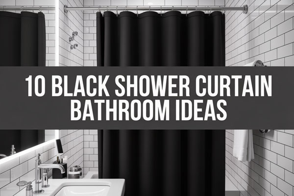
11 Shower Curtain Ideas That Instantly Upgrade Your Space
A shower curtain changes more than most people expect. It controls how finished the bathroom looks, how clean it feels, and whether the whole setup seems intentional or like it got decorated during a rushed cart scroll.
I’ve seen bathrooms with decent tile, solid lighting, and nice hardware still look weirdly unfinished because the curtain choice was doing absolutely nothing. On the flip side, I’ve also seen very average bathrooms look polished fast just because the curtain brought in shape, color, and a little bit of taste.
That’s why I like shower curtain upgrades so much. They’re practical, relatively cheap, easy to switch out, and way less annoying than starting a full bathroom makeover you didn’t ask for.
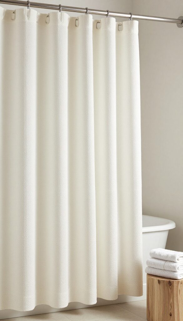
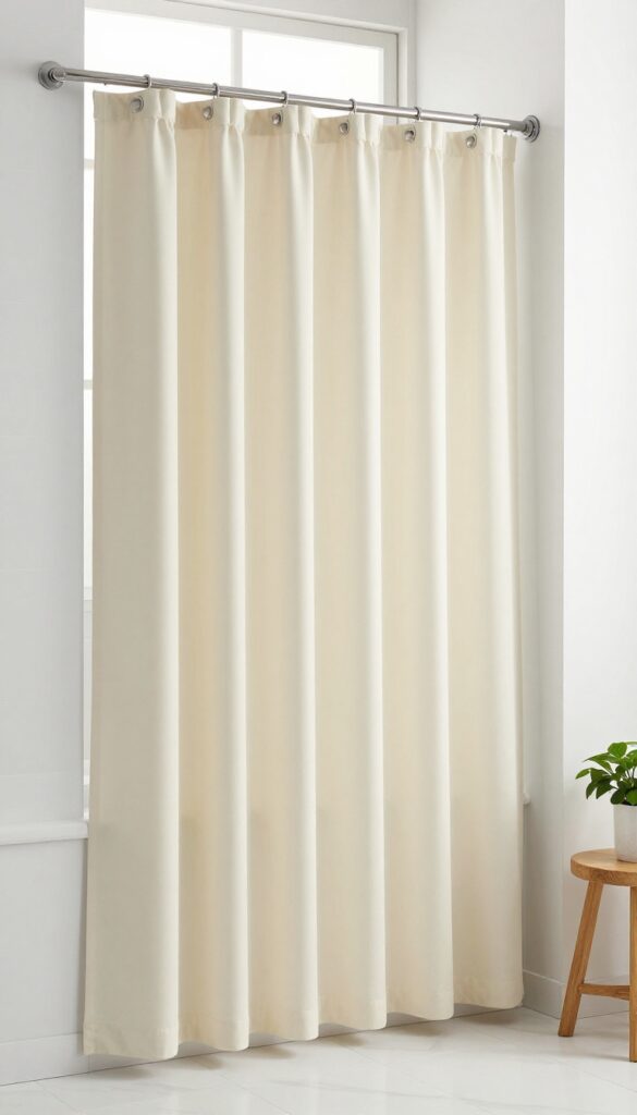
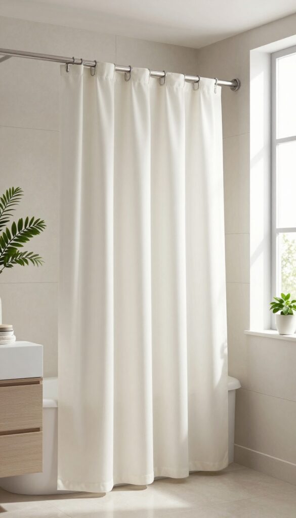
1. Crisp White Hotel-Style Shower Curtain
A lot of bathrooms feel visually busy before you even add decor. If the floor tile, vanity color, mirror frame, and storage bins already compete for attention, a loud shower curtain usually makes the room feel more cramped instead of more styled.
That’s where a crisp white hotel-style curtain earns its spot. It gives the room breathing space, makes everything look cleaner, and adds that simple, pulled-together look that works in almost any bathroom size.
I like this option most in bathrooms that already have decent bones but feel messy for no clear reason. Half the time, the problem isn’t the room itself; it’s that the curtain is trying way too hard.
Why This Works
White reflects light and visually clears the clutter without making the room feel sterile when the rest of the space has some warmth. It also gives towels, wood accents, black fixtures, or brass hardware more room to stand out instead of competing with another strong pattern.
This choice also feels timeless, which matters if you don’t want to swap bathroom decor every few months. A clean white curtain doesn’t trap you into one trend, so you can change the vibe with rugs, art, hooks, or storage instead.
How to Do It
- Pick a fabric curtain instead of a thin plastic one because it hangs better and instantly looks more expensive.
- Choose bright white or soft white depending on your wall color, since super cool white can look harsh against creamy paint.
- Hang the rod slightly higher than standard if possible, because extra height makes the bathroom feel bigger.
- Use simple rings in black, brushed nickel, or brass so the hardware looks intentional and not random.
- Steam or iron the curtain before hanging it, because wrinkles make even a good curtain look cheap.
Style & Design Tips
Keep the rest of the styling clean and structured if you go with this look. Fluffy white towels, a small wood stool, and one or two dark accents usually do more than a pile of decorative extras.
The big mistake here is choosing a dingy off-white by accident. If the curtain looks slightly yellow next to your sink or tile, the whole bathroom starts reading tired instead of fresh.
Pro Tip or Budget Hack
Buy two identical white curtains if you have a wider shower or want a fuller look. That little trick makes the curtain feel custom and more high-end without spending custom money.
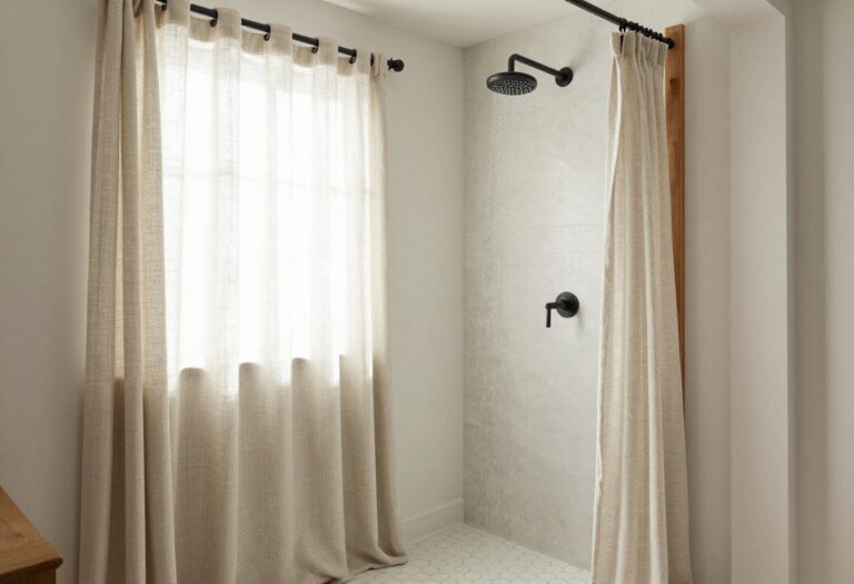
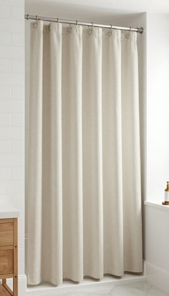
2. Soft Beige or Linen Neutral Curtain
Some bathrooms don’t need bright white because the room already feels cold. If you have gray tile, stark lighting, or a lot of hard surfaces, a soft beige or linen-toned curtain adds warmth without turning the bathroom into a color experiment.
This is one of my favorite choices for creating a relaxed, expensive look on a budget. It feels calm, softens the room, and works especially well when the bathroom needs warmth more than contrast.
I’ve used linen-look curtains in small bathrooms before, and they instantly made the space feel more finished. Not dramatic, not trendy, just quietly good.
Why This Works
Warm neutrals make a bathroom feel layered instead of flat. They bridge the gap between cool tile, white sinks, metal fixtures, and any wood tones you bring in through shelves, frames, or organizers.
They also hide everyday wear a little better than bright white. That matters in real life, especially if the bathroom gets used hard and you don’t want to notice every tiny mark like it personally offended you.
How to Do It
- Look for shades like oatmeal, flax, sand, or warm taupe instead of muddy beige.
- Pair the curtain with a white liner so the overall look still feels fresh and not heavy.
- Add one matching tone elsewhere, like a bath mat or hand towel, so the curtain doesn’t feel disconnected.
- Use wood or woven accents nearby if you want the room to lean spa-like.
- Keep the wall art simple so the curtain remains part of a calm palette instead of getting lost.
Style & Design Tips
This curtain works best when the rest of the room stays restrained. Cream, soft white, tan, and muted black usually create a bathroom that feels calm instead of beige-on-beige in the boring way.
Avoid pairing this with too many shiny accessories or strong cool grays. The warmth of the curtain will fight the coldness of everything else, and the room can end up looking confused.
Pro Tip or Budget Hack
Skip real linen if the price feels rude. A polyester blend with a linen texture often gives the same look once it’s hanging, and most people are not inspecting your shower curtain like museum fabric experts.
3. Bold Black-and-White Stripe Curtain
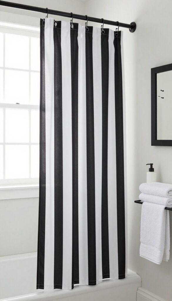
Some bathrooms need structure more than softness. If the space feels plain, builder-grade, or a little forgettable, a black-and-white striped curtain can add instant definition without requiring a full decor reset.
This idea works especially well when the bathroom has simple finishes and not much personality. The stripes add movement, contrast, and a strong focal point that makes the room feel styled on purpose.
I like this look when someone wants impact but doesn’t want to commit to color. It’s bold, but it still behaves.
Why This Works
Stripes create order fast. They bring in pattern while staying classic, which helps the bathroom feel sharper and more designed without sliding into trendy-for-two-weeks territory.
Black and white also plays nicely with most metal finishes. Whether you have chrome, matte black, or brass, that contrast usually makes the hardware look more intentional and upgraded.
How to Do It
- Choose wide stripes if you want a more modern look and narrower stripes if you want something slightly more traditional.
- Keep the walls and rugs simple so the curtain stays the main statement.
- Repeat black details elsewhere through a frame, mirror, soap pump, or hook set.
- Use white towels to balance the contrast and stop the space from feeling too heavy.
- Make sure the stripe print hangs straight, because crooked stripes look messy fast.
Style & Design Tips
A striped curtain looks best when paired with clean shapes and uncluttered surfaces. Simple storage, minimal countertop items, and one or two graphic accents usually keep the look sharp instead of chaotic.
The mistake here is adding too many other patterns. If the floor, rug, art, baskets, and shower curtain are all trying to make a statement, the bathroom starts to feel like it needs a nap.
Pro Tip or Budget Hack
If you love the look but want it softer, try thin charcoal stripes on an ivory background instead of bright black on white. You still get definition, but the overall effect feels less aggressive in a small bathroom.
4. Subtle Vertical Stripe Curtain
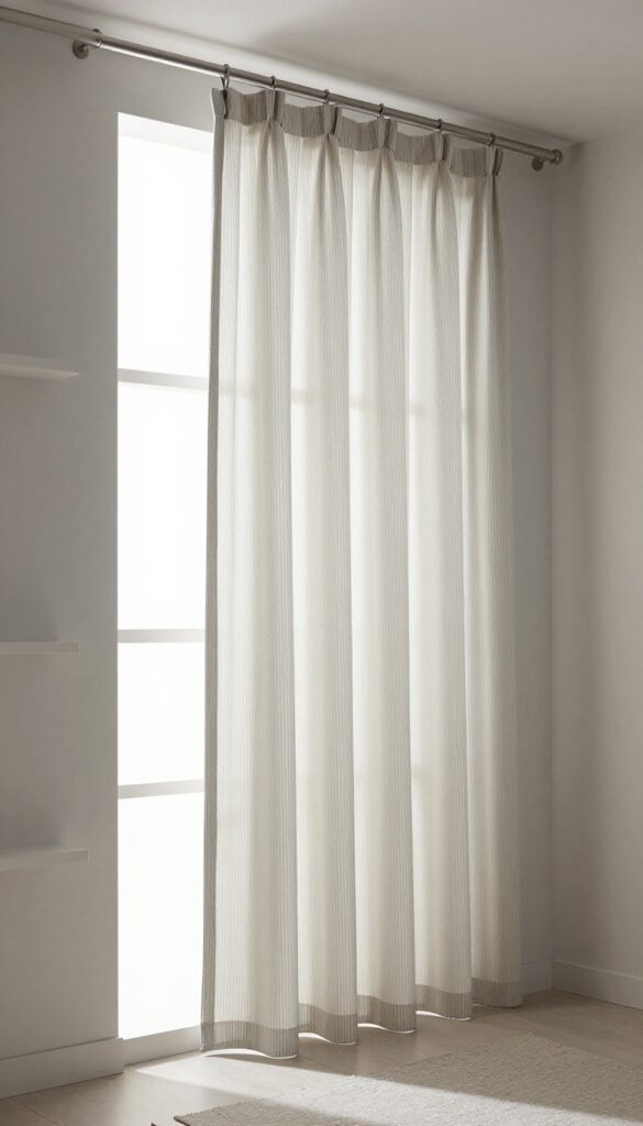
A low ceiling can make a bathroom feel boxed in fast. When that happens, a vertical stripe curtain helps pull the eye upward and gives the room a taller, cleaner look without touching the architecture.
This is such an easy visual trick, and honestly, it works better than a lot of fancy upgrades people spend too much money on. The right stripe can make a plain bathroom feel more refined in about ten minutes.
I especially like this idea for apartment bathrooms where permanent changes aren’t happening anytime soon. You work with what you’ve got, and this one actually helps.
Why This Works
Vertical lines create height, which is useful in tight bathrooms with standard ceilings and bulky fixtures. They also feel more subtle than big horizontal prints, so the curtain adds pattern without stealing the whole room.
This style has range too. Thin ticking stripes feel relaxed and classic, while wider tonal stripes can look modern and polished.
How to Do It
- Pick a stripe color that already exists somewhere in the room, like gray, black, navy, or beige.
- Hang the rod higher and wider if possible, because that improves both height and fullness.
- Choose a soft fabric so the curtain drapes instead of sticking out stiffly.
- Keep nearby storage slim and tidy so the room doesn’t feel crowded.
- Add a solid rug rather than another patterned one to keep the balance right.
Style & Design Tips
Go for tone-on-tone stripes or muted contrast if the bathroom is small. That gives you the height effect without making the curtain feel too loud for the room.
Avoid super busy vertical patterns that start looking like wallpaper having a meltdown. The point is to stretch the room visually, not create visual static.
Pro Tip or Budget Hack
If you find a striped curtain that’s a little too short, use curtain clip rings to gain a bit of extra drop. It’s a small adjustment, but it can make the whole setup look more custom and less off-the-shelf.
5. Botanical or Leaf Print Curtain
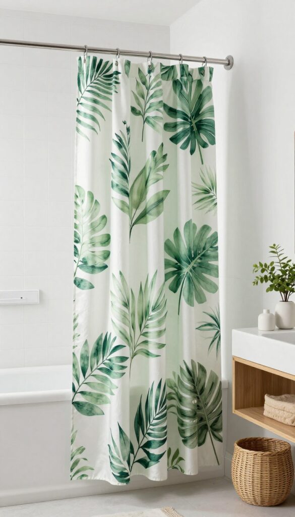
A bathroom can feel hard and flat when every surface is tile, glass, porcelain, or metal. A botanical or leaf print curtain brings in softness and movement, which helps the room feel fresher without needing actual plant care skills.
This is a good choice when the bathroom feels plain but you still want something calm. The print adds life, but it usually reads softer than geometric patterns or bold color blocking.
I like leafy prints that look airy rather than tropical-overload. There’s a fine line between fresh and “someone got carried away in the decor aisle.”
Why This Works
Nature-inspired patterns soften the strict edges that bathrooms usually have. They also connect really well with wood tones, woven baskets, white walls, and simple ceramic accessories, which makes the room feel more layered.
Green is especially forgiving in bathrooms. It pairs well with white, beige, black, and brass, so you can style around it without needing some big complicated master plan.
How to Do It
- Choose a print with plenty of background space so it doesn’t look too dense.
- Pull one or two colors from the print into towels or accessories for a cohesive look.
- Keep the countertop clutter low so the curtain remains the soft focal point.
- Add one real or faux plant only if it genuinely fits the space.
- Use a clear or white liner so the curtain print stays the hero.
Style & Design Tips
Botanical curtains work best when the rest of the room stays clean and simple. White walls, wood accents, soft towels, and a little black contrast usually keep the space feeling styled and not themed.
The biggest mistake is piling on too many leaf shapes everywhere else. One plant print curtain plus leafy art plus fake vines plus green rugs is how a bathroom ends up looking like it lost a bet.
Pro Tip or Budget Hack
Try a curtain with muted sage, olive, or eucalyptus tones instead of bright green if you want a more grown-up look. Those softer shades usually feel more expensive and are easier to style long term.
6. Oversized Floral Curtain With Muted Colors
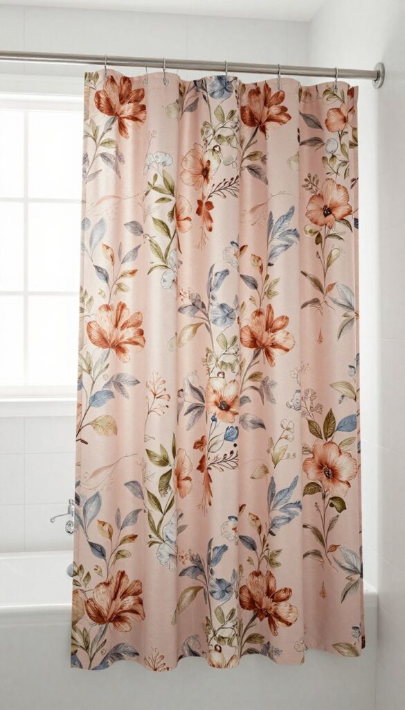
Some bathrooms feel so plain that a subtle curtain won’t move the needle. In that case, an oversized floral print in muted colors can bring personality and softness without feeling fussy or overly sweet.
This works best when the print has scale and breathing room. Tiny floral prints can lean dated fast, but larger blooms in dusty pink, rust, olive, blue-gray, or beige tend to feel fresher and more current.
I used to avoid floral in bathrooms because so much of it looked either grandma-ish or weirdly cheap. Then I saw a few oversized muted versions done right, and yeah, I changed my mind.
Why This Works
Large-scale floral prints create visual interest without looking overly busy when the colors stay soft. They can make a basic bathroom feel styled and personal, especially if the rest of the room is fairly simple.
Florals also soften rooms that feel too boxy or hard-edged. If you have sharp tile lines, plain mirrors, and standard fixtures, this kind of curtain can balance all that structure really nicely.
How to Do It
- Pick a floral print with a light background and muted tones for a more modern feel.
- Match one accent color from the print with your towels or bath mat.
- Use simple hardware so the curtain stays the statement.
- Keep art and shelf decor understated to avoid visual overload.
- Steam the fabric well, because bold prints look much better when they hang smoothly.
Style & Design Tips
Let the floral curtain do the talking. Solid towels, minimal accessories, and clean countertop styling usually make this idea feel intentional instead of overdone.
Avoid pairing floral with a bunch of ornate details unless you’re going for a very traditional look. In most bathrooms, too much decoration around it starts to feel heavy fast.
Pro Tip or Budget Hack
Check tablecloth or window-curtain sections if shower curtain options feel limited. Sometimes the prettiest floral prints show up in other home categories first, and matching fabric can inspire the whole bathroom palette.
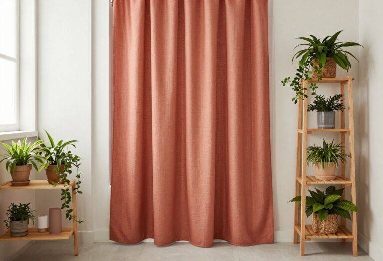
7. Earthy Terracotta or Rust Curtain
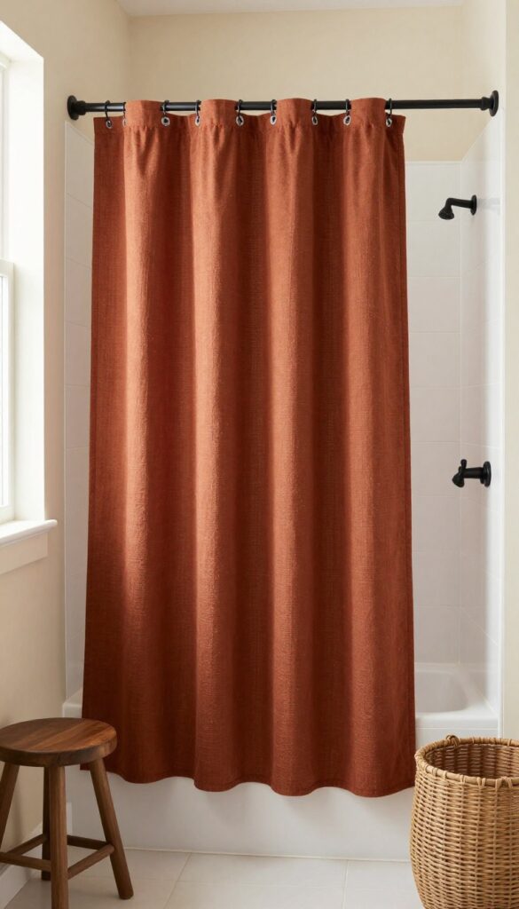
Bathrooms with lots of white and gray can feel cold in a very specific, lifeless way. An earthy terracotta or rust curtain adds warmth and depth fast, which helps the space feel more grounded and less like a waiting room with plumbing.
This color works especially well if you like natural textures, warmer neutrals, or a slightly desert-inspired look. It has personality, but it still feels relaxed and easy to live with.
I’m a big fan of rust tones when they’re a little dusty and muted. Bright orange is another story, and not a good one in most bathrooms.
Why This Works
Terracotta adds warmth without needing bold brightness. It gives a bathroom contrast and richness, especially when paired with white tile, cream walls, black fixtures, or wood accents.
It also feels current without being too trendy. That matters if you want the bathroom to look updated now without having to redo it again the second the internet picks a new favorite color.
How to Do It
- Look for shades like clay, cinnamon, burnt sienna, or dusty rust rather than neon orange.
- Add a few warm supporting tones through baskets, frames, or towels.
- Keep the rest of the bathroom fairly neutral so the curtain doesn’t overpower the room.
- Use matte black or brass hardware if you want the color to look richer.
- Balance the warmth with white elements so the room still feels clean.
Style & Design Tips
This curtain looks great with cream, warm white, sand, olive, and black. That palette feels earthy and relaxed without trying too hard to be trendy.
Avoid mixing this with icy grays and super cool blues unless you really know what you’re doing. The warm-cool clash can make the room feel accidental instead of stylish.
Pro Tip or Budget Hack
If a full rust curtain feels like too much, try one with a cream background and rust detailing. You still get the warmth, but the overall look stays lighter and easier in a smaller bathroom.
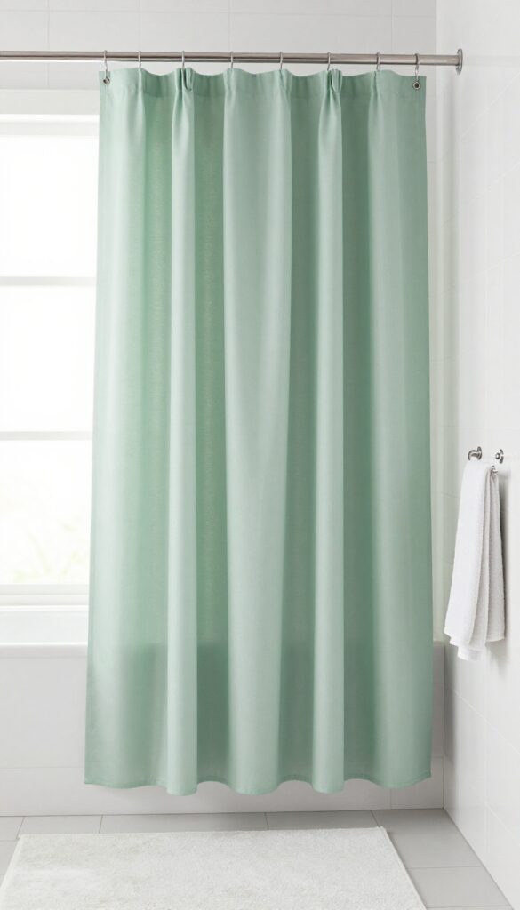
8. Waffle-Weave Spa Curtain
A bathroom that feels cluttered or visually chaotic usually benefits from texture instead of more pattern. A waffle-weave spa curtain adds depth through fabric structure, which makes the room feel elevated without screaming for attention.
This is one of the easiest ways to fake that upgraded, hotel-meets-spa look. It feels clean, soft, and polished, and it works in both modern and more classic bathrooms.
I love this option for people who want the room to look expensive without needing a bunch of decorative stuff. Texture does the heavy lifting quietly, which is honestly ideal.
Why This Works
The waffle texture catches light just enough to add dimension without introducing busy pattern. That makes the bathroom feel layered and intentional, especially when the rest of the palette stays simple.
It also gives a softer, fuller look than flat polyester curtains. Even on a budget, texture usually reads better than a plain shiny fabric that looks like it came free with bad decisions.
How to Do It
- Choose a heavy fabric waffle-weave curtain in white, cream, gray, or taupe.
- Use sturdy hooks or rings so the curtain hangs evenly and feels substantial.
- Pair it with plush towels and one or two natural accents like wood or stone.
- Keep surfaces clean and uncluttered to let the spa feeling come through.
- Wash and dry it according to the label so the texture keeps its shape.
Style & Design Tips
This style shines when the bathroom sticks to a calm palette. Soft neutrals, minimal accessories, and quality-looking basics make the texture feel luxurious instead of plain.
The mistake here is under-styling the rest of the room too much. Texture helps, but if everything else looks random or messy, the curtain can’t save the whole situation by itself.
Pro Tip or Budget Hack
A fabric curtain with visible texture often looks better than a printed one that’s trying to imitate a luxury feel. Spend a little more on the curtain and less on unnecessary countertop decor that nobody needed anyway.
9. Color-Blocked Shower Curtain
Some bathrooms need a focal point but not a full pattern. A color-blocked curtain gives you strong visual shape and contrast while still looking clean, which makes it a great middle ground between plain and busy.
This idea works really well in modern bathrooms or spaces that need a little personality fast. It feels deliberate, graphic, and stylish without being hard to pair with other items.
I like color blocking most when the colors are restrained. Good combinations feel fresh, while random bright panels can make the bathroom look like a rushed school project.
Why This Works
Large blocks of color create structure and visual rhythm. They can help anchor the room, especially when the bathroom has simple finishes that need one strong element to make the whole setup feel finished.
This style also lets you introduce color in a controlled way. Instead of committing to a full printed theme, you get a cleaner look that still adds depth and interest.
How to Do It
- Pick a curtain with two or three coordinated tones rather than too many sections.
- Repeat one of those colors elsewhere through towels, containers, or art.
- Keep your rug simple so the curtain remains the main design feature.
- Use clean-lined accessories that match the modern feel of the curtain.
- Pay attention to where the color breaks fall so they look balanced once hung.
Style & Design Tips
Some of the best color-block combinations are cream and black, beige and rust, sage and white, or navy and ivory. Simple pairings usually look more expensive than loud multicolor versions.
Avoid choosing a color-block curtain with tones that don’t connect to anything else in the room. That’s when it starts feeling like a random object instead of part of a designed space.
Pro Tip or Budget Hack
If you already own a plain curtain and know basic sewing or iron-on hemming tape tricks, you can create a custom blocked look with fabric panels. It takes more effort, but the result can look surprisingly high-end for less money.
10. Subtle Geometric Print Curtain
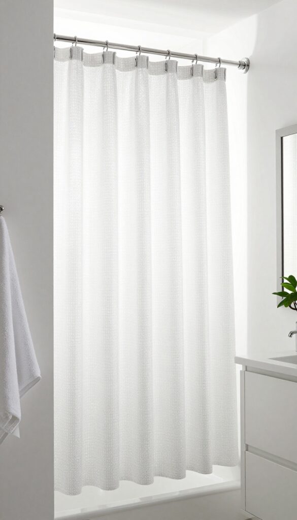
A bathroom sometimes needs pattern, but floral feels too soft and stripes feel too obvious. A subtle geometric curtain gives the room shape and movement while keeping the overall look modern and clean.
This is a solid choice for people who want a little design interest without committing to something loud. It adds polish, especially in bathrooms with simple finishes and minimal decor.
I’m picky with geometric prints because some of them look cheap fast. The good ones are usually understated, evenly spaced, and easy on the eyes.
Why This Works
Geometric patterns bring order and repetition, which helps a bathroom feel intentional. They work especially well when the print is soft enough to read like texture from a distance and detail up close.
This kind of curtain also pairs well with modern hardware and simple accessories. It gives the room a designed feel without demanding a whole matching collection of stuff around it.
How to Do It
- Choose a pattern with soft contrast such as gray on white, beige on cream, or black on ivory.
- Stick to one or two accent colors elsewhere so the room stays cohesive.
- Keep other patterns out of the room unless they are very subtle.
- Use clean storage solutions so the geometric look feels sharp, not cluttered.
- Step back and check the scale before buying, because tiny prints can look busy in a small space.
Style & Design Tips
Geometric curtains shine in bathrooms with straight lines and simple shapes. Frameless mirrors, sleek lighting, and minimal accessories usually support the pattern without fighting it.
Avoid overly trendy shapes that might date the room fast. A classic diamond, grid, or small repeating arch tends to age better than something overly complicated.
Pro Tip or Budget Hack
Pick a print that blends from far away if you want flexibility. That kind of curtain gives you enough personality to feel styled but won’t boss around every future decor change.
11. Custom Look With Extra-Long, Full Draped Curtains
A lot of shower curtains look cheap because they’re too short, too flat, or barely wide enough. Even a nice fabric looks underwhelming when it hangs like a stretched sheet instead of a full, tailored curtain.
That’s why an extra-long, fuller shower curtain setup makes such a difference. The bathroom looks taller, more polished, and way more intentional, even if the curtain fabric itself is simple.
This might be my favorite upgrade on the whole list because it changes the feel of the room immediately. It’s one of those small design moves that makes people think you spent more than you did.
Why This Works
More height and more fullness create a custom look. The curtain feels closer to drapery, which adds softness and makes the bathroom read more like a styled room and less like a purely functional corner.
This also improves proportion. A higher rod and longer drop visually stretch the walls, which helps especially in smaller bathrooms that need every possible trick working in their favor.
How to Do It
- Measure from the raised rod height to where you want the curtain to fall before buying anything.
- Choose an extra-long curtain or combine two panels for a fuller look.
- Mount the rod a few inches higher and slightly wider than the shower opening if possible.
- Use a simple liner inside so the outer curtain stays looking soft and decorative.
- Make sure the bottom clears the floor enough to stay neat and practical.
Style & Design Tips
This look works beautifully with solid colors, subtle textures, and refined patterns. Full folds, clean hems, and quality hardware matter more here than bold print or trendy color.
The mistake is hanging a fuller curtain on a flimsy rod with cheap rings. Once you upgrade the scale, the support pieces need to look decent too or the whole effect drops fast.
Pro Tip or Budget Hack
If extra-long shower curtains are limited where you shop, check curtain panels in the home section and adapt them with liner hooks or clip rings. That move can give you a much more expensive look for the same kind of budget.
Shower Curtain Rules That Matter Before You Buy
Pretty is nice, but proportion matters first. A great curtain in the wrong length, width, or color temperature can make the bathroom look off even when the curtain itself is technically cute.
Start by checking the bathroom’s actual problem before choosing a style. Some bathrooms need warmth, some need height, some need softness, and some just need one item to stop making the whole room feel chaotic.
Match the curtain to the room’s existing finishes instead of shopping in a vacuum. Tile color, vanity tone, hardware finish, wall paint, and lighting all affect whether the curtain looks expensive or completely out of place.
Fabric matters more than people think. A curtain with some weight and texture usually hangs better, photographs better, and makes the bathroom feel more finished than a thin shiny option that sticks to itself like it’s stressed.
Don’t ignore fullness and rod placement. Hanging the curtain a little higher and giving it enough width can do more for the room than buying a trendier print.
Common Shower Curtain Mistakes to Avoid
The biggest mistake is choosing a curtain that fights everything else in the room. If your bathroom already has strong tile or bold flooring, the curtain should support the look, not start a second argument.
Another common issue is picking a curtain that’s too short. That awkward gap above the rod or weird high-water hem at the bottom makes the bathroom feel cheaper instantly.
Too many patterns can also wreck the look fast. A patterned curtain, printed rug, busy floor, and decorative wall art can make a small bathroom feel cramped and visually noisy.
Wrinkles are another easy problem that people ignore. Even a good curtain looks bad when it comes straight out of the package and gets hung like nobody had two minutes and a steamer.
Cheap hooks and bad liners also drag the whole setup down. The small pieces matter because bathrooms are compact, and every detail gets noticed whether you meant for it to or not.
FAQ
1. What color shower curtain makes a bathroom look bigger?
Light colors usually make a bathroom look bigger because they reflect more light and feel less visually heavy. White, soft beige, pale gray, and light taupe are especially good if the bathroom is small or dark.
2. Should the shower curtain match the towels exactly?
No, and exact matching often makes the bathroom look too stiff. It’s better when the towels coordinate with the curtain through one or two shared tones rather than copying it exactly.
3. Are fabric shower curtains better than plastic ones?
For style, yes, absolutely. Fabric curtains hang better, look softer, and usually make the bathroom feel more elevated, while a liner inside handles the practical side.
4. How high should I hang a shower curtain rod?
A little higher than the standard setup usually looks better if your space allows it. That added height helps the bathroom feel taller and gives even a simple curtain a more custom look.
5. What kind of shower curtain works best in a small bathroom?
That depends on what the room needs most, but light solids, subtle vertical stripes, and soft textured curtains are usually safe wins. They add style without making the space feel more crowded.
6. How do I make a cheap shower curtain look more expensive?
Steam the wrinkles out, use better hooks, hang it higher, and make sure it has enough fullness. Those four moves fix a shocking amount of cheap-looking bathroom problems without costing much.
Final Thoughts
A shower curtain can change the whole bathroom faster than most small decor swaps. The best choice usually isn’t the loudest one, but the one that fixes what the room is missing.
I’d start by figuring out whether the bathroom needs warmth, softness, height, or contrast. Once that part is clear, picking the right curtain gets a whole lot easier, and honestly, that’s when the space starts looking like someone with taste actually lives there.