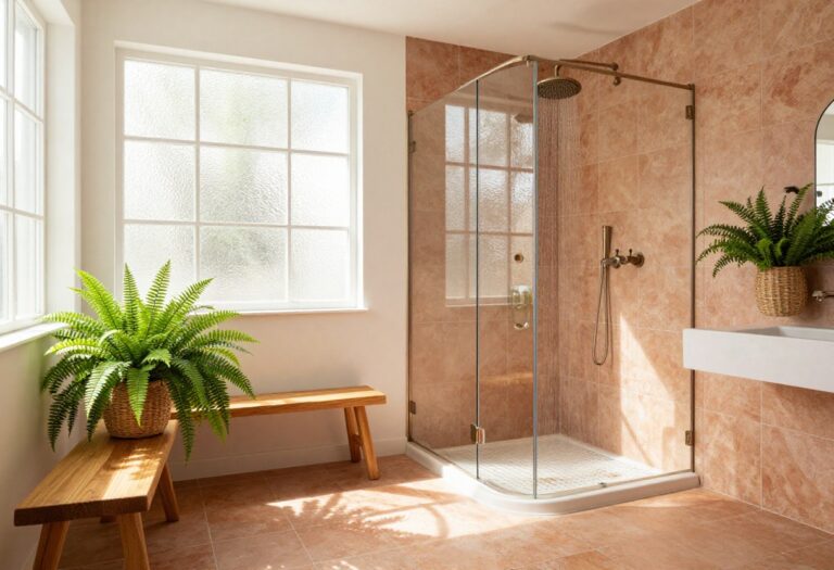
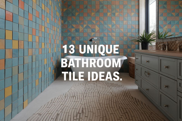
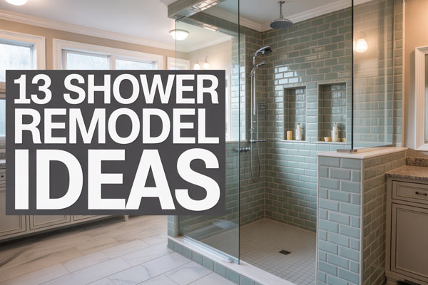
9 Shower Tile Ideas That Feel Fresh and Stylish
Good shower tile choices usually solve two problems at once: they make the bathroom look better, and they make daily use less annoying. That balance matters more than people think, because a shower can look gorgeous in photos and still be a pain to clean, slippery underfoot, or visually chaotic in real life.
A lot of bathrooms start feeling dated because the tile tries too hard or doesn’t try at all. I’ve seen both extremes, and honestly, the sweet spot is usually a design that looks intentional, cleans up well, and still feels good six months later when the excitement wears off.
The best shower tile ideas also work with the size of the room instead of fighting it. That’s where smart layout, color, grout choice, and texture come in, and those little decisions often matter more than the actual tile itself.
1. Vertical Stacked Subway Tile
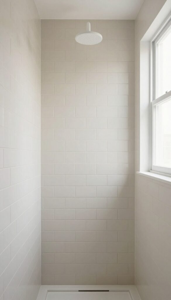
A lot of showers still use the classic horizontal subway tile layout, and there’s nothing wrong with it, but it can start feeling a little too expected. Vertical stacked subway tile fixes that fast because it keeps the tile simple while giving the whole shower a cleaner, taller, more current look.
This idea works especially well in small bathrooms that need visual height without extra clutter. I like it because it feels modern without getting weird about it, which is honestly a rare win in bathroom design.
The straight vertical lines pull the eye upward and make the shower feel taller than it actually is. That effect matters even more when the ceiling is low or the bathroom already feels boxed in.
Why This Works
Vertical stacked tile gives a regular, affordable shape a more polished layout. Instead of using a trendy tile that might feel dated later, this setup updates the space through pattern and direction, which is usually the smarter move.
It also creates a cleaner visual rhythm because the lines stay crisp and organized. When the grout color is close to the tile color, the whole wall feels smoother and less busy, which helps the shower look bigger.
How to Do It
- Pick a standard subway tile in white, soft beige, pale gray, or muted sage for an easy starting point. These shades keep the layout looking fresh instead of harsh.
- Lay the tile in a straight stacked pattern from floor to ceiling instead of offsetting it. That clean grid is what gives the look its modern edge.
- Use narrow grout lines so the vertical layout feels sleek rather than chunky. Wide grout can make the whole thing look heavier than it needs to.
- Continue the tile all the way up if possible. Stopping early can make the wall feel cut off and kind of awkward.
Style & Design Tips
Matte tile usually looks more relaxed and expensive here than super shiny tile. A soft finish plus matching grout creates that calm, upscale look people keep trying to fake with overly complicated designs.
Avoid pairing this layout with too many decorative inserts or random accent bands. Those little extras often break the clean line effect, and that’s the whole reason this idea works in the first place.
Pro Tip or Budget Hack
Use basic ceramic subway tile and spend a little more on good installation instead of splurging on a pricey designer version. A cheap tile in a sharp layout usually looks better than an expensive tile installed badly, and that’s just the annoying truth.
2. Zellige-Look Tile for Soft Texture
Some showers look flat even when the color is nice, and that usually happens when every surface feels too perfect. Zellige-look tile adds texture, movement, and that slightly imperfect handmade feel, which makes the shower look richer without needing bold color or complicated shapes.
Real zellige can cost a lot, so I’m a fan of porcelain versions that mimic the same uneven glaze and surface variation. You get the charm without signing up for a high-maintenance relationship with your tile, which feels like a fair deal.
This style works beautifully in both modern and traditional bathrooms because the texture does most of the talking. Even a simple white or sand shade feels layered and interesting once the light hits those uneven surfaces.
Why This Works
The variation in tone and finish keeps the shower from feeling sterile. Bathrooms have a bad habit of looking cold when every material is too smooth and uniform, so this tile adds warmth in a very natural way.
It also helps a plain color feel more thoughtful. Instead of relying on a loud pattern, the beauty comes from surface depth, which tends to age better and feel less trendy over time.
How to Do It
- Choose a porcelain tile with a handmade or zellige-inspired finish in white, cream, warm blush, olive, or dusty blue. Subtle color variation is the point, so don’t choose one that looks too flat.
- Use the tile on the main shower walls and keep other bathroom finishes simple. That lets the texture stand out without turning the whole room into a design competition.
- Pair it with simple fixtures in chrome, brushed nickel, or warm brass. Clean hardware balances the organic tile nicely.
- Test grout samples before committing. The wrong grout can flatten the whole effect or make the tile look dirtier than it is.
Style & Design Tips
This tile looks best when the room has some breathing space around it, even in a small bathroom. Let the texture be the star and skip fussy mosaics, heavy borders, or loud patterned floors that fight for attention.
Avoid going too dark unless the bathroom has strong lighting and enough room to handle it. A deep glossy textured tile can look amazing, but in a cramped shower it can also start feeling like a dramatic cave, and not in a fun way.
Pro Tip or Budget Hack
Use zellige-look tile only on the shower walls and choose a simpler coordinating tile for the bathroom floor. That gives you the high-end feel where it matters most without forcing your budget to cry in the corner.
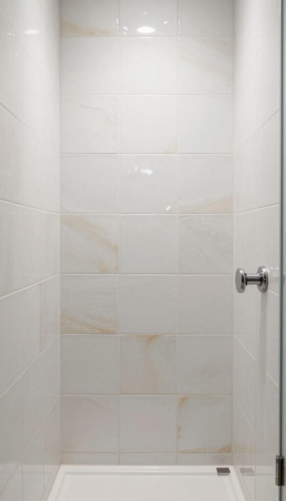
3. Large-Format Stone-Look Porcelain Tile
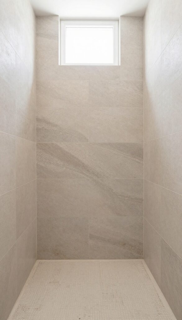
Grout lines can make a shower feel busy fast, especially if the bathroom is already small or full of visual stuff. Large-format stone-look porcelain tile solves that by giving the walls a calmer, more seamless appearance while still adding a natural texture that feels warm and expensive.
This is one of my favorite options for people who want the look of stone without the maintenance headache. Real stone can be beautiful, sure, but some of it also acts like it has emotional needs, and I do not want that from a shower wall.
The larger tile size helps the space feel more open because there are fewer interruptions across the surface. That makes the shower read as cleaner, simpler, and way more polished.
Why This Works
Fewer grout joints mean the walls look less chopped up and easier to maintain. That’s not just about appearance either, because less grout usually means fewer places for soap residue and grime to hang around.
The stone-look finish also adds softness that plain solid-color tile sometimes lacks. It gives the room a grounded feel, which works really well in bathrooms that need a little warmth without going rustic.
How to Do It
- Pick a large-format porcelain tile in a stone look like limestone, travertine, slate, or marble-inspired beige. Go for something with gentle veining or texture instead of a super dramatic print.
- Use it on the shower walls and keep grout lines thin and close in color to the tile. That creates the smooth, expanded look you’re after.
- Choose a coordinating smaller tile or mosaic for the shower floor to handle slope and grip better. Large tiles on shower floors can be tricky and not always practical.
- Plan niche placement carefully before installation. Big tiles look best when cuts are minimized and the layout feels intentional.
Style & Design Tips
Warm beige, greige, soft taupe, and pale gray all work beautifully here. Natural-looking tones help the shower feel timeless, while icy gray can sometimes make the bathroom feel colder than necessary.
Don’t mix this tile with a super busy countertop or loud wallpaper unless you really know what you’re doing. This idea works because it creates visual calm, and too many competing surfaces ruin that pretty quickly.
Pro Tip or Budget Hack
Use the large-format tile on the main shower walls and skip extending it across the whole bathroom if money is tight. That one focused application still gives the room a more custom feel without forcing you into a full renovation budget spiral.
4. Penny Tile on the Floor with Simple Walls
A lot of showers get the wall tile right and then completely ignore the floor, which is a missed opportunity. Penny tile adds texture, grip, and subtle pattern underfoot, and when you pair it with simple wall tile, the whole shower feels more finished and thought-through.
I really like this combo because it gives the shower personality without making the room feel crowded. The walls stay calm, the floor does a little more work, and the balance ends up feeling easy instead of showy.
This works especially well in smaller showers that need detail but can’t handle too many competing finishes. The tiny tile scale on the floor also helps with drainage and slope, which is not the glamorous part of design, but it absolutely matters.
Why This Works
Penny tile brings texture and traction where you actually need it most. It’s practical first, but it also adds a soft vintage-meets-modern touch that makes even a plain shower look more custom.
Keeping the walls simple stops the floor from overwhelming the room. That contrast between quiet vertical surfaces and detailed flooring creates a nice layered effect without turning the shower into a tile sampler board.
How to Do It
- Choose penny tile in white, black, soft gray, pale green, or warm beige depending on the mood you want. Matte finishes usually feel more current and safer underfoot.
- Pair the floor with simple wall tile like subway tile, stacked rectangle tile, or large-format porcelain. The goal is contrast in scale, not chaos in style.
- Use grout that supports the look and the maintenance level you want. Mid-tone grout often hides dirt better than bright white on a shower floor.
- Seal grout well and clean regularly. Tiny tile means more grout joints, so upkeep matters more here than with large wall tile.
Style & Design Tips
This floor looks best when the color palette stays controlled. One interesting floor plus one simple wall almost always feels sharper than mixing three bold tile ideas and hoping they become friends.
Avoid using penny tile in a super shiny finish if the shower gets a lot of use. Gloss can look cute at first, but it tends to highlight residue faster and can feel more slippery than necessary.
Pro Tip or Budget Hack
Use penny tile only on the shower floor and niche back, then keep the rest of the tile basic and affordable. That little repeat detail makes the design feel intentional, and it costs a lot less than turning every surface into a mosaic project.
5. Marble-Look Herringbone Accent Wall
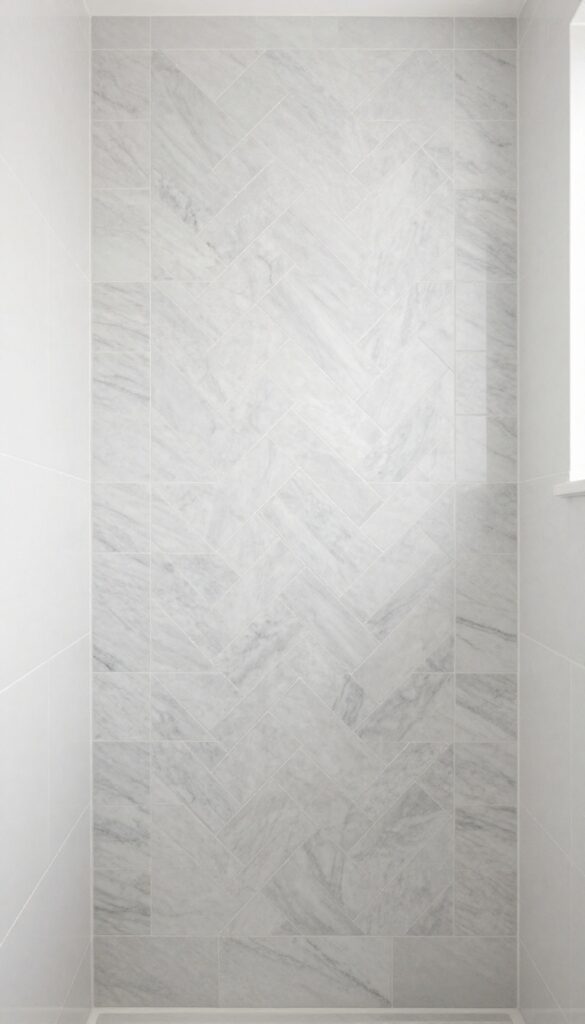
Sometimes a shower needs one focal point, not five. A marble-look herringbone accent wall brings pattern and movement in a controlled way, which makes the shower feel elevated without loading every surface with detail.
I usually like this best on the back wall of the shower or inside a large niche. It gives the eye somewhere to land, and when the rest of the tile stays simple, the whole room feels more expensive than it probably was.
The herringbone layout adds motion, while the marble look keeps it soft and classic. That combination works especially well in bathrooms that want a little elegance without tipping into formal hotel lobby territory.
Why This Works
An accent wall creates visual interest without overwhelming the room. Since the pattern stays contained, it feels intentional rather than chaotic, which is a line a lot of bathrooms fail to notice before crossing.
Marble-look porcelain also gives you the refined appearance of marble with easier upkeep. That makes it more realistic for everyday life, especially in family bathrooms where people are not exactly treating the walls like museum pieces.
How to Do It
- Choose a marble-look porcelain tile with gentle veining and a size that suits a herringbone layout. Smaller planks or rectangles usually work best.
- Use the herringbone pattern on one shower wall only. That keeps the feature strong without making the entire space visually exhausting.
- Pair it with plain tiles on the surrounding walls in white, ivory, or pale gray. Simple companion tile helps the accent stand out properly.
- Keep fixtures and trim clean and minimal so the layout stays the focus. Too much decorative metalwork can make the wall feel fussy.
Style & Design Tips
This idea looks strongest when the veining is soft, not loud. Subtle movement beats dramatic swirls here, because the pattern already adds enough energy on its own.
Avoid combining herringbone with another strong floor pattern unless the room is large and very carefully planned. In most regular bathrooms, that combo ends up feeling busy fast, and busy bathrooms rarely feel relaxing.
Pro Tip or Budget Hack
Instead of doing a full accent wall, use the herringbone tile only inside a recessed niche or a narrow vertical panel. You still get that high-end custom detail, but with way less material and installation cost.
6. Soft Green Tile for a Calm, Collected Look
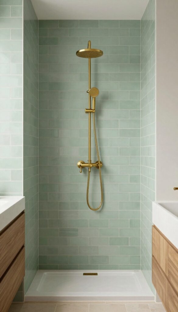
White showers are safe, but sometimes safe turns into bland before you even finish caulking. Soft green tile adds color without shouting, and it brings a calm, fresh quality that works beautifully in bathrooms that need a little life.
I’m talking about muted greens here, not anything neon or overly trendy. Sage, eucalyptus, mossy gray-green, and soft olive all tend to age well and play nicely with wood tones, brass fixtures, and neutral countertops.
This idea suits people who want color but still want the bathroom to feel restful and easy to style. It has personality, but it doesn’t demand constant attention like some bolder tile choices do.
Why This Works
Green reads as natural and grounding, which makes a bathroom feel more balanced. In a room filled with hard surfaces, that softness matters a lot more than people expect.
It also pairs well with both warm and cool materials, so it’s flexible. That means you can update mirrors, hardware, or paint later without the shower suddenly feeling like it belongs in another decade.
How to Do It
- Choose a soft green tile in a matte or satin finish for a more relaxed feel. The color should look muted, not sugary or overly bright.
- Use it in one consistent shape like subway tile, square tile, or vertical rectangle tile. Keeping the shape simple lets the color do the work.
- Pair it with neutral floors and light grout if you want an airy effect, or medium grout for a little more definition. Both can work depending on the overall bathroom style.
- Test the tile against your lighting before buying in bulk. Green can shift a lot depending on natural light, bulbs, and nearby finishes.
Style & Design Tips
Soft green looks especially good with warm white paint, brushed brass, natural wood, and creamy stone tones. Muted palettes feel richer than high-contrast black-and-white in this setup, because the whole point is a calm, collected vibe.
Try not to add too many leafy prints or obvious nature-themed accessories around it. Once the tile already brings that fresh feeling, the rest can stay understated unless you want the bathroom to start cosplaying as a greenhouse.
Pro Tip or Budget Hack
Use green tile only on the shower walls and keep the rest of the room neutral with paint and simple accessories. That gives you a color moment where it counts without locking the entire bathroom into a strong palette.
7. Checkerboard Shower Floor for Classic Contrast
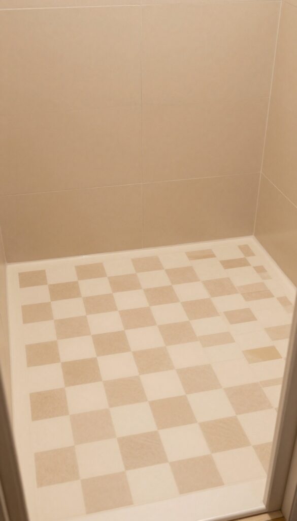
A checkerboard floor has been around forever for a reason: it works. In a shower, a small-scale checkerboard layout can look playful, classic, and surprisingly fresh when the wall tile stays simple and the colors stay soft.
This isn’t the same as doing a loud retro floor in the middle of an already busy bathroom. A shower checkerboard works best when it feels refined, not theatrical, because nobody needs their morning routine to come with stage lighting energy.
I like this look in black and white, but softer combinations can be even better. Cream and taupe, pale gray and white, or beige and ivory often feel more updated and less harsh.
Why This Works
The pattern adds interest at floor level, which grounds the shower visually. Since the walls remain quieter, the room still feels balanced instead of crowded.
It also gives a bathroom some personality without relying on trendy colors or odd shapes. That makes it easier to live with long term, which matters because retiling a shower is not exactly a casual weekend hobby.
How to Do It
- Choose small square tiles or mosaic sheets in two complementary shades. Slight contrast usually looks more elegant than extreme contrast in smaller bathrooms.
- Keep the pattern limited to the shower floor. That helps it feel like a smart detail rather than an overwhelming theme.
- Pair it with plain wall tile in a matching undertone. Warm checkerboard floors need warm walls, and cool floors need cool walls.
- Use a grout color that ties both floor shades together. This keeps the pattern crisp without making it look overly busy.
Style & Design Tips
A soft checkerboard floor works beautifully with simple vertical tile, plain subway tile, or large-format walls. Classic pattern plus quiet walls is the formula that keeps the room feeling stylish instead of gimmicky.
Avoid piling on more geometric patterns elsewhere in the bathroom. A checkerboard floor already gives you enough shape, so adding hex wallpaper or loud graphic rugs can tip the whole space into visual overload.
Pro Tip or Budget Hack
Use mesh-mounted mosaic sheets to simplify installation and save labor time. You still get the checkerboard effect, but the installer doesn’t have to place every tiny square by hand, which is better for your budget and everyone’s patience.
8. Full-Height Tile to the Ceiling
A shower that stops tile partway up the wall often looks unfinished, even when the materials are nice. Running tile all the way to the ceiling instantly makes the shower feel more custom, more polished, and honestly more expensive than it probably was.
This is one of those upgrades that changes the feel of the whole bathroom without requiring a dramatic tile choice. Even plain tile starts looking intentional when it fills the space properly instead of cutting off at an awkward height.
I’m a big fan of this move in both small and large bathrooms because it makes the architecture feel stronger. The shower becomes part of the room instead of looking like a separate box someone tiled halfway and then lost interest.
Why This Works
Full-height tile draws the eye up and gives the room a more finished vertical line. That visual height makes the bathroom feel bigger, especially when the wall color above the tile would otherwise break the space awkwardly.
It also offers more practical protection in damp areas. Bathrooms deal with humidity constantly, so extending tile upward helps with durability while also improving the overall design.
How to Do It
- Choose a tile you truly want to see in full view, because this approach gives it a lot more surface area. Simpler tile often works best for that reason.
- Plan the layout so cuts near the ceiling look intentional and even. A balanced top row makes a big difference in the final look.
- Keep grout lines consistent from bottom to top. That helps the walls feel longer and cleaner.
- Pair full-height tile with minimal trim and uncluttered fixtures. Too many extras interrupt the strong vertical effect.
Style & Design Tips
This idea looks especially sharp with stacked layouts, large-format tile, or lightly textured finishes. Height becomes the design feature, so you don’t need to force extra drama through color or busy pattern.
Avoid stopping and restarting different tile styles halfway up the shower unless you have a very clear design plan. Mixed heights and random transitions are usually what make bathrooms look messy and dated in the first place.
Pro Tip or Budget Hack
If taking the entire tile to the ceiling isn’t possible on every wall, prioritize the main visible wall first. That single move still upgrades the room visually, especially if the shower is the first thing seen when walking in.
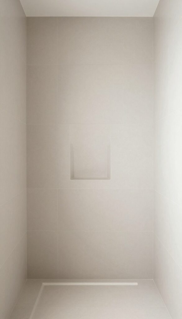
9. Niche Tile Contrast That Feels Intentional
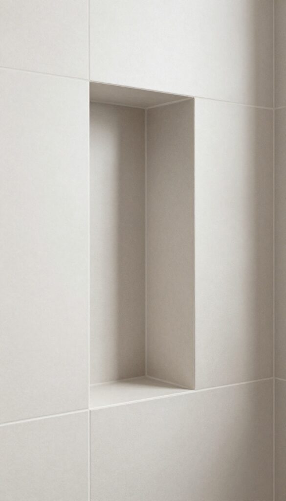
A shower niche can either look like a smart design detail or like an afterthought cut into the wall five minutes before grout. Using a contrasting tile inside the niche adds depth, makes storage feel more integrated, and gives the shower a custom finish without reworking the whole space.
This is one of the easiest ways to add personality without committing to a bold full-wall treatment. I love it because it feels subtle from a distance, but up close it makes the shower look much more considered.
The contrast can come from color, texture, pattern, or even shape. It doesn’t need to scream for attention either, because a small difference is often enough to make the niche feel special.
Why This Works
The niche naturally draws the eye because it breaks the flat wall surface. Adding a contrasting tile emphasizes that feature and turns a practical storage spot into a built-in design moment.
It also helps separate the products visually from the rest of the wall. That sounds minor, but it can make the shelf area look more organized and less messy, especially when bottles inevitably start multiplying like they pay rent there.
How to Do It
- Choose one contrast element only, such as a different shape, a slightly darker tone, or a textured surface. Keeping the contrast focused helps the niche feel intentional instead of random.
- Use the accent tile only on the niche back or on the full inside of the niche depending on the look you want. A niche back detail feels subtle, while full interior coverage feels more decorative.
- Coordinate the accent tile with another small bathroom finish like the floor tile or vanity color. Repeating one connection makes the design feel cohesive.
- Keep shelf sizing practical so the niche still works well. Pretty storage means nothing if the shampoo bottles don’t fit.
Style & Design Tips
A niche accent looks best when the main wall tile stays fairly simple. Small contrast, big payoff is the goal here, so let the niche add the interest instead of turning every surface into its own statement.
Avoid using a wildly different tile that has no connection to the rest of the room. Contrast should feel deliberate, not like leftover material from another project that mysteriously wandered into the shower.
Pro Tip or Budget Hack
Buy a small amount of feature tile and use it only inside one or two niches. That gives the shower a custom designer detail for a relatively low cost, which is exactly the kind of bathroom math I can get behind.
What Actually Matters Before Choosing Shower Tile
A pretty tile can still be the wrong tile if it doesn’t match the bathroom’s size, lighting, and daily use. Before picking a style, it helps to think about how the shower needs to function, because design decisions usually go better when reality gets invited to the meeting.
Start with maintenance, because that’s where a lot of regret begins. Tiny grout lines, glossy finishes, and heavily textured surfaces can all look amazing, but they may also demand more cleaning than most people realistically want to do.
Scale matters just as much as color. Large-format tile often helps small showers feel calmer, while smaller tile works better on floors, curves, and feature details that need flexibility.
Lighting changes everything, especially with whites, grays, and greens. Always test samples in the actual bathroom, because a tile that looks warm and lovely in a showroom can turn cold, flat, or weirdly yellow once it meets your bulbs.
Grout deserves more respect than it usually gets. The color and width of the grout can completely change how a tile reads, and I’ve seen beautiful tile jobs lose half their charm because the grout choice went sideways.
Common Mistakes That Can Make Shower Tile Look Dated Fast
One of the biggest mistakes is mixing too many statement elements in one small shower. Bold floor tile, dramatic wall tile, shiny niche tile, and high-contrast grout all fighting together usually create stress, not style.
Another common issue is choosing tile based only on trend photos. A look might seem stunning online, but if it doesn’t work with the room’s size, lighting, or cleaning habits, it can get old really fast.
People also forget how much layout affects the final result. The same tile can look average in one pattern and amazing in another, which is why direction, spacing, and ceiling height matter so much.
Bad transitions are another problem that quietly age a bathroom. Random tile height changes, awkward cut edges, and niche placement that ignores the wall layout can make even expensive materials feel sloppy.
FAQ
1. What shower tile color makes a bathroom look bigger?
Light and mid-tone colors usually make a bathroom feel more open than very dark shades. Soft white, warm beige, pale gray, and muted green tend to reflect light nicely without making the space feel cold.
2. Is large-format tile better for a small shower?
In many cases, yes. Large-format tile reduces grout lines, which helps the walls look less busy and makes the shower feel calmer and more spacious.
3. What tile works best for shower floors?
Smaller tile usually works best on shower floors because it handles slope better and provides more grip through extra grout joints. Mosaic sheets, penny tile, and small squares are all solid choices.
4. Should shower wall and floor tile match?
They don’t have to match exactly, and honestly they often look better when they don’t. They should coordinate in tone and style, though, so the shower feels connected rather than patched together.
5. What grout color is easiest to maintain in a shower?
Mid-tone grout is usually the easiest to live with because it hides dirt and residue better than bright white. Very dark grout can also work, but it needs to make sense with the tile color and overall style.
6. Are textured tiles harder to clean?
Some are, yes. Light texture can add warmth and interest, but heavily textured or uneven surfaces may hold onto residue more easily, so it’s smart to balance style with maintenance.
Final Thoughts
The best shower tile ideas don’t just look fresh for a week. They keep working over time, which is really the whole point when the shower gets used every single day.
A smart layout, the right scale, and a little restraint usually beat flashy choices that age badly. I’ll take a well-planned shower over a trendy one any day, and that opinion gets stronger every time I see a bathroom trying way too hard.