13 Charming Kitchen Cabinet Color Ideas for a Fresh, Pulled-Together Look
Your kitchen cabinets take up a lot of visual real estate, so the color you choose really sets the mood. Whether you're planning a full weekend project or just dreaming of a change, picking the right shade can make the whole space feel fresh and pulled together. The best part?
You don't need a total renovation to make a big impact—sometimes a new coat of paint is all it takes. We've rounded up 13 charming cabinet color ideas that are perfect for a weekend refresh.
These aren't just pretty colors—they're practical choices that work with different styles and budgets. From soft neutrals to bold statements, there's something here for every kitchen.
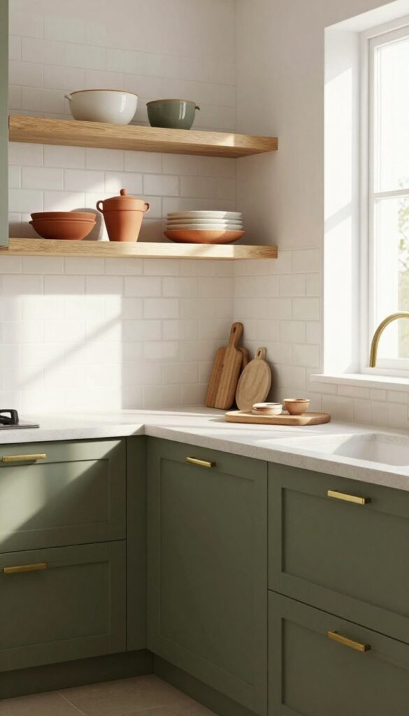
1. Soft Sage Green
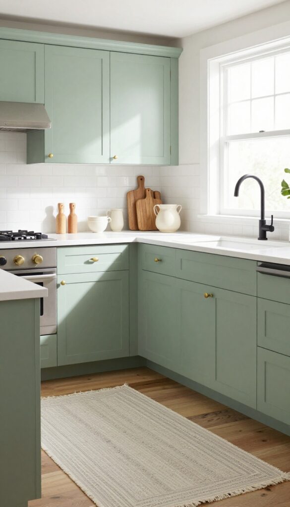
Sage green is having a serious moment in kitchens, and for good reason. It’s one of those colors that feels instantly calming—like a deep breath after a long day. Unlike bolder greens, soft sage stays grounded and subtle, making it a perfect pick for a weekend refresh.
Pair it with white countertops and natural wood accents, and you’ve got a kitchen that feels both earthy and pulled together without trying too hard.
Why It Works
Sage green works because it hits that sweet spot between trendy and timeless. It’s neutral enough to let your countertops and backsplash shine, but still adds a pop of personality. The soft undertones also hide everyday smudges better than stark white cabinets, which is a win for busy kitchens.
Best For
This shade is ideal for kitchens that get plenty of natural light, where the green can shift from muted gray-green to a warmer sage depending on the time of day. It’s also a great choice if you love bringing nature-inspired tones into your home but want something more sophisticated than mint or olive.
Styling Tip
To keep the look fresh, balance sage cabinets with warm brass or matte black hardware. Add open shelving with wooden cutting boards and a few ceramic pieces in cream or terracotta to reinforce that organic feel. A simple runner in a neutral pattern can tie the whole space together.
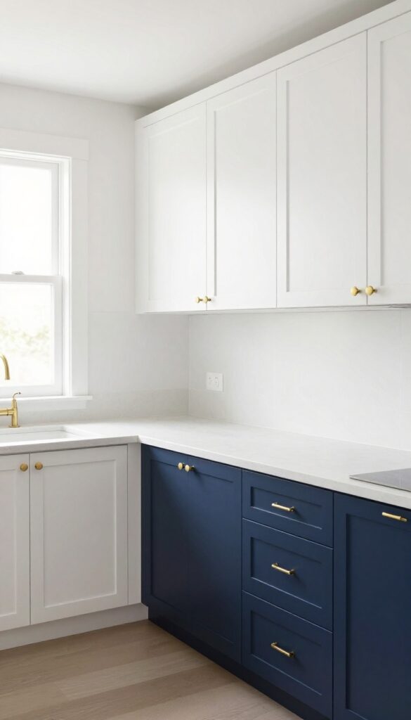
2. Classic Navy Blue
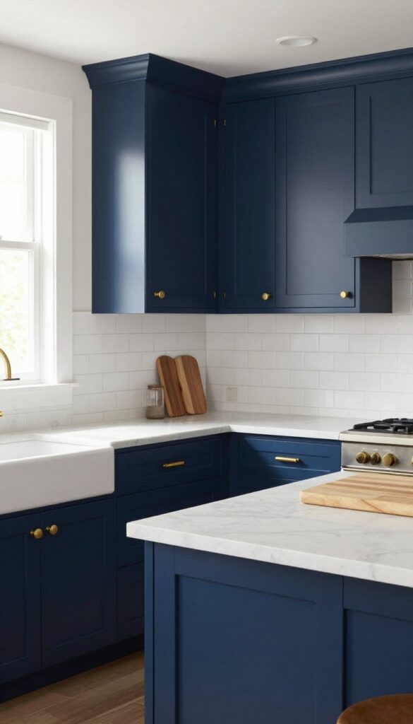
Navy blue cabinets bring a sense of depth and sophistication to a kitchen without feeling cold or formal. It's a color that feels both grounded and refined, especially when paired with warm brass hardware and creamy marble countertops. For a weekend refresh, this is a shade that makes a bold statement but still feels approachable and inviting.
Why It Works
Navy acts as a neutral in its own right—it anchors the room and allows other elements like open shelving or natural wood accents to pop. Unlike black, it doesn't absorb all the light; instead, it adds richness that makes the space feel curated and cozy.
Best For
This color shines in kitchens with good natural light or plenty of under-cabinet lighting. It's ideal for traditional, transitional, or even modern farmhouse styles where you want a touch of drama without going too dark.
Styling Tip
Balance navy cabinets with lighter elements—think white subway tile backsplash, pale quartz countertops, or a light wood island. Add brushed brass pulls and a matte black faucet for contrast that feels intentional.
3. Warm Buttercream
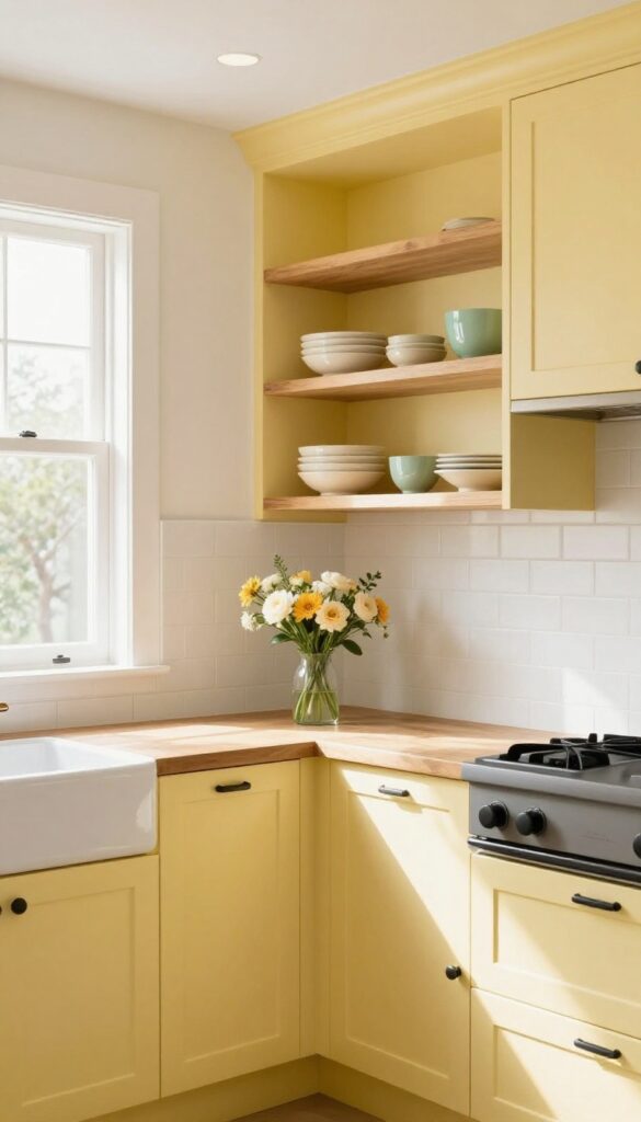
Buttercream yellow lands somewhere between white and a full-on sunny yellow. It’s soft enough to feel neutral but carries just enough warmth to make a kitchen feel cozy without going full country. This shade works especially well in kitchens that get limited natural light, because it reflects brightness while adding a gentle golden glow.
Pair it with warm wood tones or crisp white trim for a look that feels both cheerful and grounded.
Why It Works
Buttercream is forgiving with everyday messes—fingerprints and smudges don’t show as easily as they would on stark white cabinets. It also plays nicely with a wide range of countertop materials, from butcher block to white marble, making it a flexible choice for weekend refreshes.
Best For
This color is ideal for kitchens that lean traditional or transitional, especially if you want to introduce color without committing to something bold. It also works beautifully in rental kitchens where you want to warm up the space without painting the entire room.
Styling Tip
Keep hardware simple—matte black or brushed brass knobs let the cabinet color take center stage. For backsplash, try a classic subway tile in white or off-white to maintain a clean backdrop. Add open shelving with a few ceramic pieces in cream or pale green to reinforce the soft palette.
4. Dusty Rose
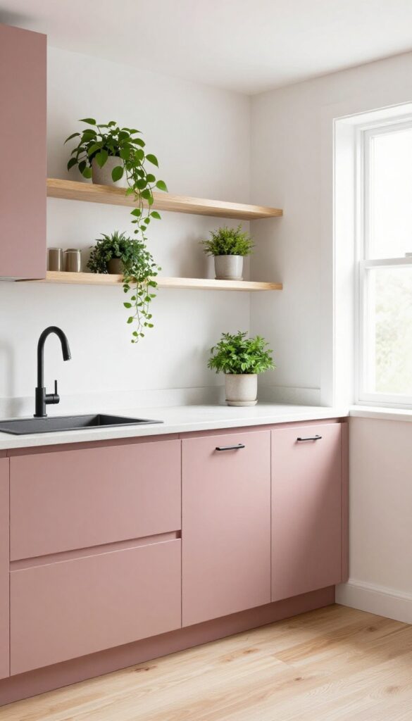
If you're craving a little color but don't want anything too loud, dusty rose is your sweet spot. It's soft enough to feel neutral but has enough personality to make your kitchen feel intentional and curated. This shade brings a romantic, modern energy that pairs beautifully with matte black fixtures and light wood floors for a look that's both trendy and grounded.
Why It Works
Dusty rose is incredibly forgiving—it hides smudges better than white, but still keeps the space feeling light and airy. It also plays well with other popular finishes like brass, copper, and natural wood, so you can switch up hardware or decor without repainting.
Best For
This color shines in kitchens that get good natural light, especially those with white or cream countertops. It's also great for open-concept homes where you want a subtle color connection between the kitchen and adjoining living areas.
Styling Tip
Balance the pink by using matte black cabinet pulls and a black faucet. Add warmth with open shelving in light oak or walnut, and bring in greenery with small potted herbs or a trailing pothos on top of the cabinets.
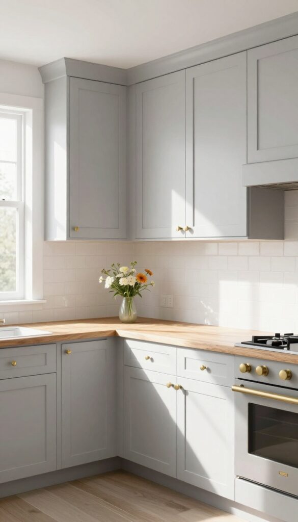
5. Charcoal Gray
Charcoal gray is a bold neutral that grounds a kitchen without feeling heavy. It strikes that perfect balance between dramatic and approachable, especially when paired with bright white backsplashes and open shelving. In a weekend-refresh project, painting your lower cabinets charcoal can completely transform the space without a full renovation.
Why It Works
Charcoal reads as sophisticated and modern, but it's surprisingly forgiving. It hides everyday smudges and splatters better than lighter shades, so your kitchen stays looking fresh between cleanings. The deep tone also creates visual depth, making the room feel anchored and intentional.
Best For
This color shines in kitchens with lots of natural light or where you want to create contrast against white or light wood elements. It's ideal for modern, industrial, or transitional styles, and works especially well on lower cabinets paired with lighter uppers.
Styling Tip
Keep the rest of the palette light to let the charcoal stand out. Use a white subway tile backsplash and natural wood open shelves. Add warm metals like brass or copper for hardware and fixtures to keep the look from feeling too cool.
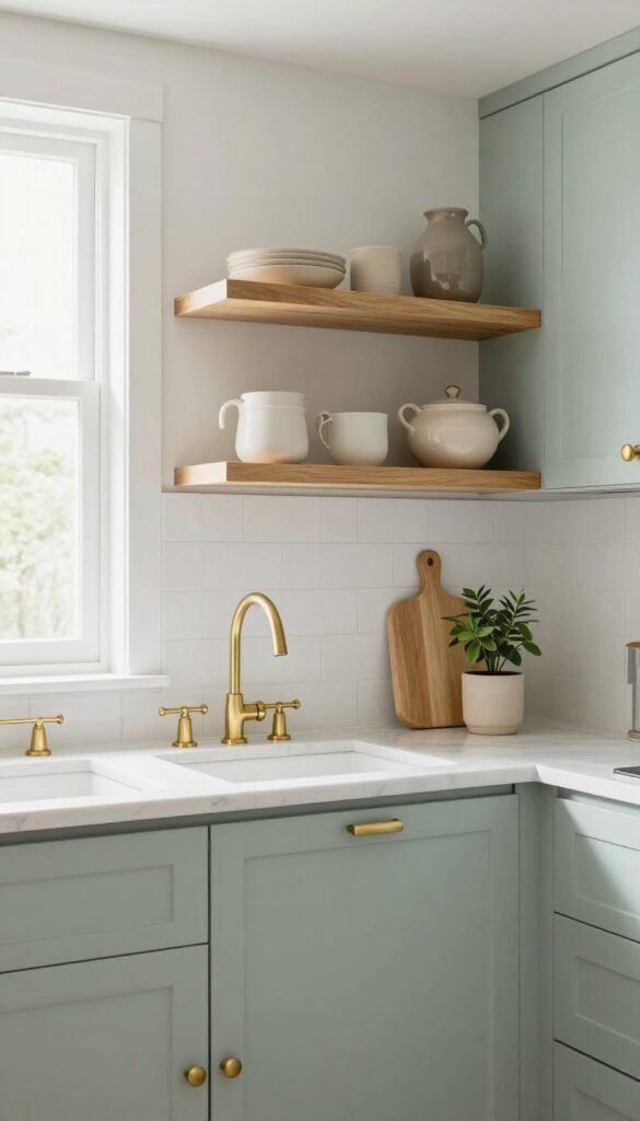
6. Pale Blue
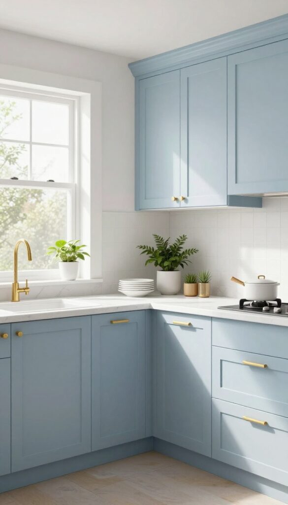
There’s a reason pale blue is a go-to for kitchens that need a breath of fresh air. It’s soft, calming, and instantly brings to mind breezy coastal mornings—even if your kitchen faces a brick wall. The color works like a charm in smaller spaces because it bounces light around, making the whole room feel more open and airy.
Plus, it’s one of those shades that feels both classic and current, so you won’t get tired of it next season.
Why It Works
Pale blue reflects natural and artificial light, which helps small or dark kitchens feel bigger and brighter. It also pairs effortlessly with white trim, marble countertops, and natural wood accents, creating a cohesive look that’s anything but cold.
Best For
This shade is perfect for kitchens that lack natural light or have a compact footprint. It’s also ideal if you want a subtle pop of color without committing to something bold—pale blue stays serene and sophisticated.
Styling Tip
Balance pale blue cabinets with warm brass or gold hardware to keep the space from feeling too cool. Add open shelving with white dishes and a few green plants for texture and life.
7. Olive Green
Olive green cabinets bring a grounded, earthy richness that feels both timeless and current. This shade sits comfortably between sage and forest green, offering depth without overwhelming the space. It’s the kind of color that makes a kitchen feel instantly more collected and intentional, especially when paired with warm metals and natural textures.
Why It Works
Olive green has a natural warmth that plays well with both cool and warm tones. It doesn’t compete with wood or stone the way brighter greens might, so it creates a cohesive, layered look. The muted quality also hides smudges and splatters better than lighter colors—practical for a busy kitchen.
Best For
This color is ideal for kitchens with lots of natural light, where the olive can shift from deep to almost golden depending on the sun. It also works beautifully in open-concept spaces, tying together living and dining areas with its organic vibe.
Styling Tip
Pair olive green cabinets with unlacquered brass hardware and a warm white or cream backsplash. Add open shelving with terracotta pots or ceramic dishes to echo the earthy feel. A simple linen runner and wooden cutting boards complete the look without overdoing it.
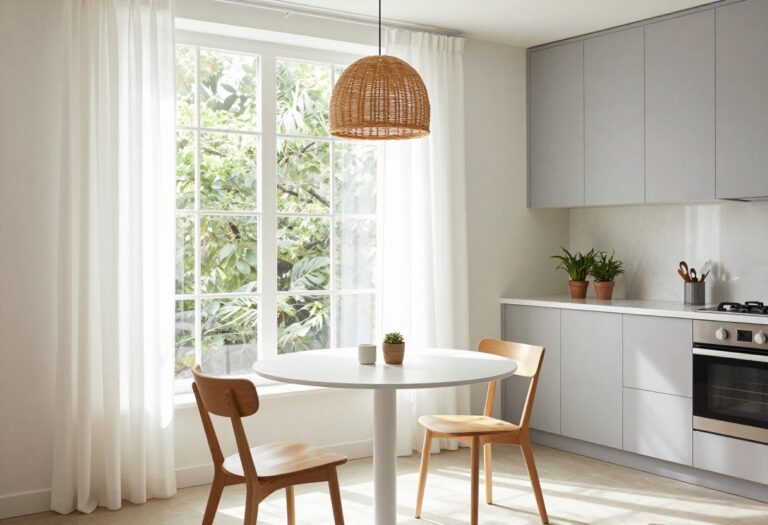
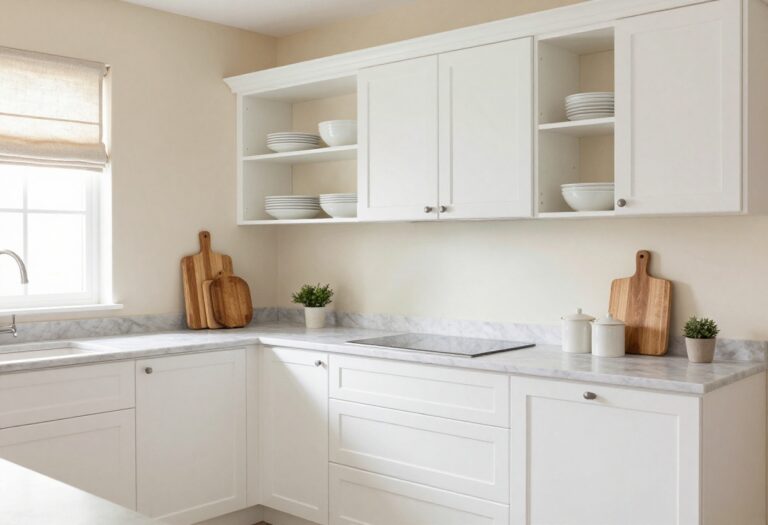
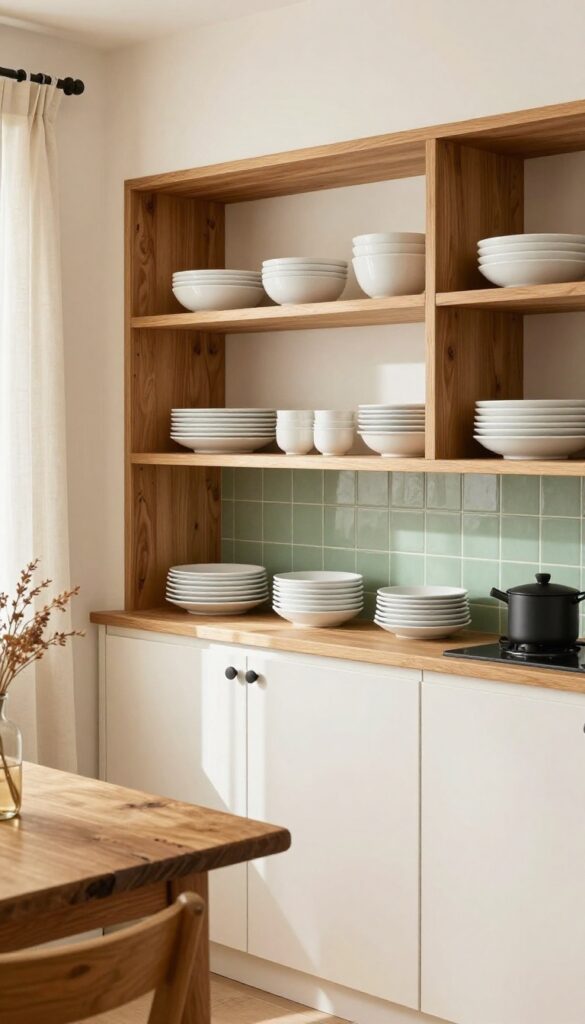
8. Crisp White
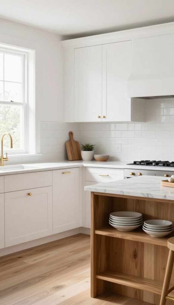
White cabinets are the little black dress of kitchen design—always in style and endlessly versatile. They bounce light around the room, making even a compact kitchen feel airy and open. The trick to keeping white from feeling sterile is layering in texture and warmth through your hardware, backsplash, and countertops.
Why It Works
White reflects light, which instantly brightens the space and makes it feel larger. It also creates a neutral backdrop that lets other elements—like a colorful backsplash or warm wood floors—take center stage without competing.
Best For
This look is perfect for anyone who wants a timeless kitchen that won't feel dated in five years. It's especially great for small or dark kitchens that need a light boost, but it works just as well in larger spaces when you want a clean, cohesive foundation.
Styling Tip
To add depth, choose shaker-style doors for subtle shadow lines or incorporate glass-front uppers to break up solid cabinetry. Pair with brushed brass or matte black hardware for contrast, and bring in natural wood accents—like open shelves or a butcher block island—to keep the space from feeling flat.
9. Blush Pink
Blush pink cabinets bring a soft, unexpected warmth to the kitchen. It's a hue that feels both playful and refined—like a favorite cozy sweater that somehow also looks elegant. The key is choosing a muted, dusty blush rather than anything too sweet or bubblegum-bright.
That subtle sophistication makes it surprisingly versatile, pairing beautifully with warm brass, cool marble, and even natural wood tones.
Why It Works
Blush pink reads as neutral enough to ground a busy kitchen but adds a gentle pop of personality. It reflects light nicely, keeping the space feeling airy and open, while its warmth makes the room feel instantly more inviting. Unlike stark white or bold jewel tones, blush feels approachable and easy to live with day to day.
Best For
This color shines in kitchens that get good natural light, where the pink can shift from a soft peachy tone in the morning to a warmer rose in the afternoon. It's ideal for anyone who wants a kitchen that feels feminine without being frilly, or for those looking to soften an all-white scheme without going dark.
Styling Tip
Pair blush cabinets with unlacquered brass hardware and a honed marble countertop for a relaxed glam look. Keep backsplash tiles simple—a classic zellige or subway tile in white or cream lets the cabinets take center stage. Add open shelving with a few ceramic pieces in earthy tones to ground the palette.
10. Dark Forest Green
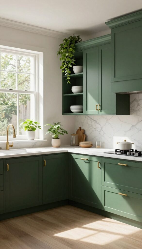
Deep forest green cabinets bring a rich, moody elegance that feels both grounded and luxurious. This isn't a color that fades into the background—it makes a bold statement while still feeling natural and inviting. The deep hue works especially well in kitchens with good natural light, where it can shift from almost black in shadow to a vibrant green in the sun.
It's a look that says you're confident enough to go dark, but smart enough to keep it earthy.
Why It Works
Forest green is inherently calming and connected to nature, which makes a kitchen feel like a retreat rather than just a workspace. The darkness hides everyday smudges better than lighter colors, so it's surprisingly practical for busy households. Plus, it creates an instant focal point without needing expensive backsplashes or countertops.
Best For
This shade is ideal for larger kitchens with plenty of square footage and natural light. It also works beautifully in open-concept spaces where the green can anchor the room without overwhelming it. Avoid using it in tiny, windowless kitchens unless you're prepared to add strong task lighting.
Styling Tip
Pair forest green cabinets with unlacquered brass hardware and fixtures for a warm contrast that ages gracefully. Natural stone countertops like marble or soapstone keep the look organic, while open shelving with white dishes breaks up the darkness. Add a few trailing plants on top of cabinets to echo the outdoor vibe.
11. Light Gray
Light gray cabinets bring a calm, collected feel to the kitchen without washing it out. Unlike stark white, which can feel clinical, or bold colors that demand attention, light gray sits quietly in the background—letting your countertops, backsplash, and decor shine. It's the kind of shade that works just as well in a cozy cottage as it does in a sleek modern apartment, and it makes a weekend refresh feel totally doable.
Why It Works
Light gray is forgiving. It hides smudges better than white and doesn't show every speck of dust, so your kitchen looks cleaner longer. It also reflects light beautifully, making the space feel airy and open without being blinding.
Best For
This color is ideal for kitchens that get moderate natural light—it won't feel too dark or too washed out. It's also a great choice if you love changing up your decor often, since gray plays nicely with almost any accent color.
Styling Tip
Pair light gray cabinets with warm wood tones—like butcher block countertops or open shelving in oak—to keep the look from feeling cold. Add brass or matte black hardware for a subtle pop of contrast.
12. Terracotta
Warm, earthy, and instantly inviting—terracotta cabinets bring a touch of the Mediterranean into your kitchen without requiring a full renovation. This rich, clay-inspired hue works beautifully in spaces that get plenty of natural light, where it can really glow. Pair it with cream or white walls and natural textures like wood and linen for a look that feels both grounded and fresh.
Why It Works
Terracotta adds warmth and character to a kitchen in a way that neutral tones simply can't. It's a natural mood booster, making the space feel cozy and lived-in without being dark or heavy.
Best For
This color is ideal for kitchens with good natural light and an open layout. It also shines in homes with bohemian, rustic, or Mediterranean-inspired decor.
Styling Tip
Balance the warmth of terracotta with cool accents like sage green tiles or matte black hardware. Add open shelving with white dishes to keep the look airy.
13. Two-Tone (Upper and Lower
Splitting your cabinets into two colors is one of those tricks that instantly gives your kitchen a designer feel without a full gut renovation. It breaks up the monotony of a single color and lets you play with contrast in a controlled way. The key is picking two shades that complement each other rather than compete—think light on top to keep the room airy, and a deeper hue below to anchor the space.
Why It Works
Two-tone cabinets add visual interest without being overwhelming. By using a lighter color on the uppers, you draw the eye upward and make the ceiling feel higher, while darker lowers ground the room and hide everyday wear and tear. This balance creates a pulled-together look that feels intentional but not fussy.
Best For
This idea shines in kitchens with an open layout or an island, where the contrast can define zones. It's also great for galley kitchens that need a bit of personality without closing in the space. If you're worried about committing to one bold color everywhere, two-tone is a safe way to dip your toes in.
Styling Tip
Carry your accent color into other elements like bar stools, open shelving, or even a range hood to tie the whole look together. For hardware, stick with one finish throughout—brass or matte black works beautifully against both light and dark cabinets.
FAQ
What is the most popular kitchen cabinet color for 2025?
Soft sage green and navy blue continue to be top choices, along with warm neutrals like buttercream and light gray. Two-tone cabinets are also trending.
Can I paint my kitchen cabinets myself?
Yes, painting cabinets is a popular weekend DIY project. Just make sure to properly clean, sand, and prime them first for a durable finish.
How do I choose the right cabinet color for a small kitchen?
Light colors like pale blue, white, or light gray can make a small kitchen feel larger. Avoid very dark colors unless you have plenty of natural light.
What hardware goes best with colored cabinets?
Brass or gold hardware adds warmth to greens and blues. Matte black works well with dusty rose and charcoal. For white or light cabinets, silver or nickel is classic.
How long does it take to paint kitchen cabinets?
A full DIY paint job typically takes 2-4 days, including drying time between coats. It's a manageable weekend project if you plan ahead.
Conclusion
Updating your kitchen cabinet color is one of the most effective ways to refresh your space without a full remodel. Whether you go for a soft sage green or a bold navy, the right shade can transform the entire room's feel. We hope these 13 ideas have sparked some inspiration for your next weekend project.
Remember, the best color is one that makes you happy every time you walk into the kitchen. Happy painting!