11 Budget-Friendly Kitchen Colour Combinations for a Fresh, Pulled-Together Look
Giving your kitchen a fresh look doesn't have to mean a full renovation or a big budget. Sometimes, all it takes is the right colour combination to make the space feel brighter, bigger, and more put together.
For small kitchens especially, choosing colours that work together can visually expand the room and add personality without cluttering the counters. Whether you're renting or just want a low-commitment update, these 11 budget-friendly colour pairings are designed to be practical, stylish, and easy to pull off.
From paint and accessories to small DIY projects, each idea is simple to execute and kind to your wallet.
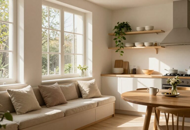
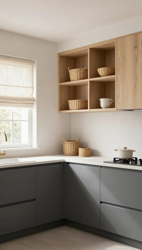
1. Soft White and Warm Wood
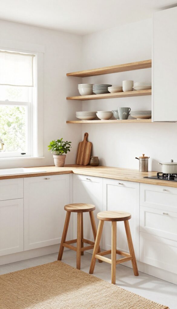
White walls can feel a bit clinical on their own, but bring in warm wood tones and the whole kitchen softens. Think creamy white paint on the walls or cabinets paired with natural wood open shelving, a butcher block countertop, or simple wooden stools. The wood adds texture and warmth without making the space feel heavy or crowded.
It's a look that feels both fresh and grounded—like a cozy café that happens to be your own kitchen.
Why It Works
This combo is a small-space hero because light colors reflect natural light, making the room feel bigger, while the wood adds visual interest without clutter. The contrast between crisp white and organic wood keeps the space from feeling sterile or boring. It's also incredibly forgiving: scuffs and splatters blend into the wood grain, and white surfaces are easy to wipe down.
Best For
Small kitchens, galley layouts, or any kitchen that lacks natural light. It's also perfect for renters who can't paint dark cabinets—just add wood accessories to bring warmth. If you love an airy Scandinavian vibe but worry about it feeling cold, this is your sweet spot.
Styling Tip
Stick to one or two wood tones to keep the look cohesive—oak or bamboo work beautifully with soft white. Add warmth with a woven rug or linen curtains, and keep countertops mostly clear except for a wooden cutting board or a small plant. Avoid mixing too many metal finishes; brushed brass or matte black hardware blends seamlessly.
2. Pale Blue and Brushed Brass
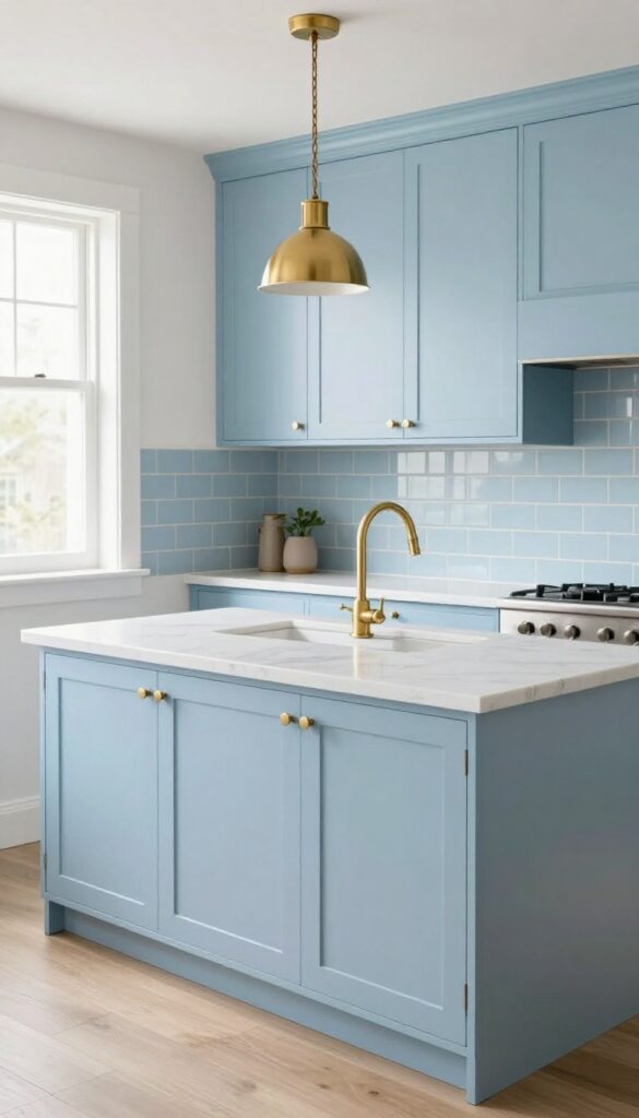
Soft blue kitchen cabinets or a pale blue backsplash bring a breath of fresh air into a small kitchen. This cool, receding shade makes walls feel further away, instantly opening up the room. Pair it with brushed brass hardware and light fixtures, and you get a warm contrast that keeps the space from feeling sterile or cold.
Why It Works
The pale blue visually expands the kitchen, while the brushed brass adds just enough warmth to create balance. It's an elegant combination that doesn't overwhelm—perfect for tight layouts where every design choice has to earn its keep.
Best For
Compact kitchens, galley layouts, and L-shaped spaces that need a light, airy feel without sacrificing personality. Also great for kitchens with limited natural light, as the pale blue reflects what light there is.
Styling Tip
Stick to matte or satin finishes for both the blue paint and the brass to keep things understated. Use brushed brass for cabinet pulls, faucet, and a simple pendant light—avoid going overboard with shiny accents that can feel busy in a small space.
3. Light Grey and Sage Green
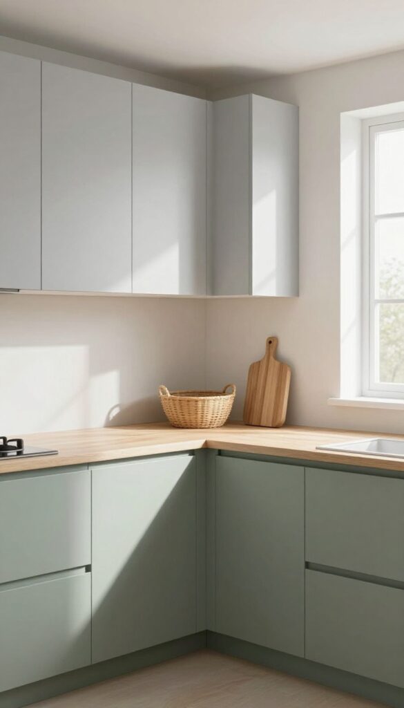
A soft grey backdrop paired with sage green accents brings a sense of calm to any kitchen. The muted tones work together to create a space that feels both airy and grounded, without overwhelming the senses. In smaller kitchens, this combination is especially effective because it keeps the look light while adding just enough color to feel intentional.
Why It Works
Both colors have a low saturation, which means they reflect light rather than absorb it. This makes the kitchen feel more open and less cramped. The contrast between the cool grey and earthy green adds subtle depth without visual clutter.
Best For
This palette is perfect for galley kitchens, L-shaped layouts, or any compact space where you want to avoid dark or busy patterns. It also works well in kitchens with limited natural light, as the light grey helps bounce daylight around.
Styling Tip
Use sage green on lower cabinets or a single accent wall to anchor the room, then keep upper cabinets and walls in light grey. Add warm wood cutting boards or woven baskets to bring in texture and prevent the scheme from feeling too cool.
4. Butter Yellow and White
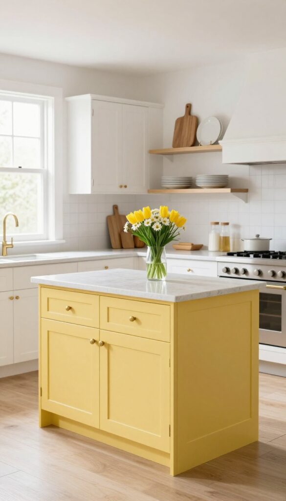
A soft butter yellow is like a spoonful of sunshine for your kitchen. It's warm without being loud, cheerful without feeling childish. Paint just your kitchen island or one accent wall in this gentle hue, and keep the rest crisp white.
The contrast is clean and uplifting, making even a compact cooking space feel airy and bright. Plus, it's one of the most affordable ways to introduce color—you only need a quart of paint and a weekend afternoon.
Why It Works
Butter yellow reflects light beautifully, which helps small kitchens feel larger and more open. White cabinets and countertops keep the look grounded and timeless, while the yellow adds personality without overwhelming the space. It's a low-commitment pop of color that still feels sophisticated.
Best For
This combination is ideal for small kitchens with limited natural light, as the yellow warms up the room. It also works well in rental kitchens where you can't paint all the cabinets—just an island or one wall is enough to transform the vibe.
Styling Tip
Balance the yellow with natural wood cutting boards or open shelving in warm oak tones. Add a few fresh flowers like white daisies or yellow tulips on the counter to echo the color scheme. Keep hardware simple—brass or matte black knobs will complement the sunny hue without competing.
5. Charcoal and Natural Linen
Dark cabinets can feel heavy in a small kitchen, but when you pair charcoal grey with soft natural linen tones, the whole space breathes. The darker shade grounds the room and adds a cozy, intimate feel, while light linen walls or open shelving keep things airy and open. It's a high-contrast look that feels modern without being cold—perfect for kitchens where you want both drama and warmth.
Why It Works
The contrast between deep charcoal and warm linen creates visual interest without clutter. In a small kitchen, this combination tricks the eye into seeing more depth, making the space feel larger than it is. The dark hue hides everyday stains on lower cabinets, while light linen reflects natural light to keep the room bright.
Best For
This pairing is ideal for galley kitchens or L-shaped layouts where you want to define zones without adding walls. It also works beautifully in rental kitchens where you can't paint everything—just focus on one area, like lower cabinets or a backsplash, and let the linen tones do the rest.
Styling Tip
Use matte charcoal on lower cabinets only, then paint upper walls or install open shelving in a warm off-white or oatmeal tone. Add texture with a linen roman shade at the window and woven baskets on top of cabinets for storage that feels intentional.
6. Blush Pink and Terracotta
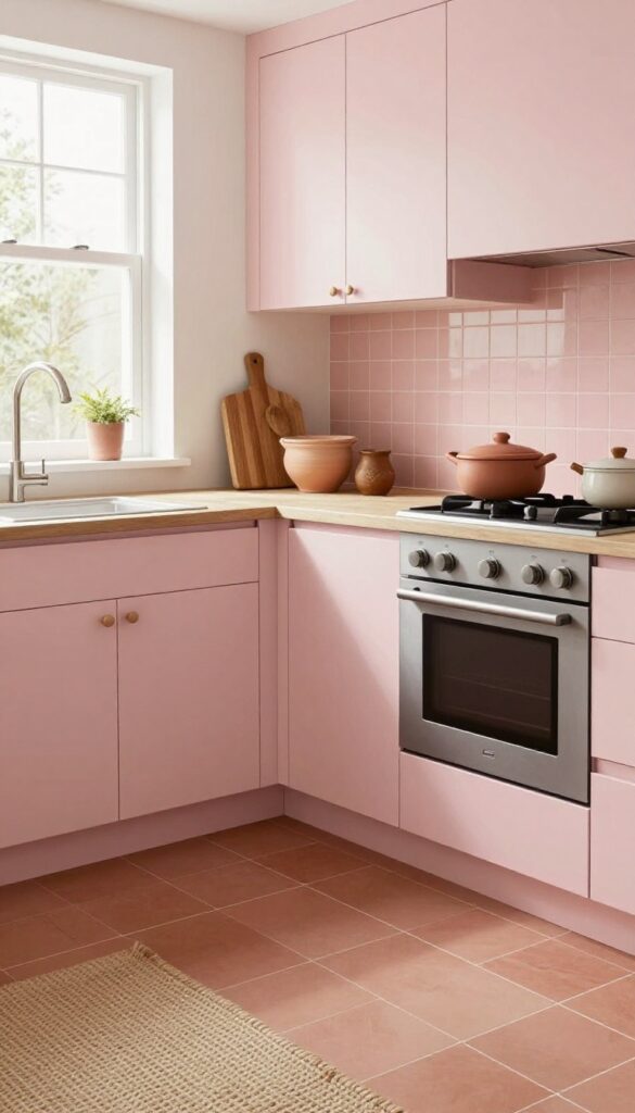
Pairing blush pink with terracotta is like giving your kitchen a warm hug. The soft pink—whether on upper cabinets, a single accent wall, or even open shelving—keeps things light and airy, while terracotta brings in grounded, earthy warmth. In a small kitchen, this combo stops the space from feeling too precious or too heavy; it's feminine without being frilly and rustic without being rough.
Think blush tiles behind the stove and a terracotta-toned runner underfoot, or pink cabinetry with clay pots on the counter.
Why It Works
Blush pink reflects light, making tight kitchens feel bigger and brighter, while terracotta adds visual weight that anchors the room. Together they create a balanced contrast—cool meets warm, soft meets sturdy—that feels intentional but not overdone.
Best For
This combination is ideal for galley kitchens or L-shaped layouts where you want to add personality without overwhelming the space. It also works beautifully in rental kitchens where you can swap in terracotta accessories instead of permanent changes.
Styling Tip
Use matte finishes for both colors to keep the look modern and understated. Add natural textures like a jute rug or wooden cutting boards to tie the palette together. If you're renting, stick to blush peel-and-stick backsplash tiles and swap in terracotta bar stools or a woven basket for storage.
7. Navy Blue and Copper
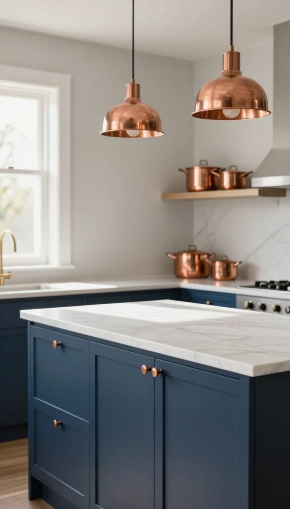
Navy blue might feel like a bold choice for a small kitchen, but when you pair it with warm copper accents, it instantly becomes inviting rather than overwhelming. The deep blue adds a sense of depth and sophistication, while copper brings a soft glow that keeps the space from feeling too dark or heavy. It’s a combination that feels both classic and current, and surprisingly easy to pull off on a budget.
Why It Works
Navy blue acts as a strong anchor in a small kitchen, creating visual weight that makes the room feel grounded rather than cramped. Copper’s warm metallic finish reflects light beautifully, adding brightness and a touch of luxury without needing expensive materials. The contrast between the dark hue and the gleaming metal draws the eye around the space, making it feel more dynamic and thoughtfully designed.
Best For
This idea is perfect for renters or homeowners who want to make a statement without committing to a full renovation. It works especially well in galley kitchens or L-shaped layouts where an accent wall or lower cabinets can define the space without overwhelming it. If you love moody colors but worry about losing light, this pairing gives you the best of both worlds.
Styling Tip
Start small by painting just one wall or the island in navy blue—it’s low-commitment but high impact. Then bring in copper through easy swaps like pendant lights, cabinet knobs, or a simple cookware set displayed on open shelving. Keep countertops and upper walls white or light gray to maintain an airy feel, and let the copper pieces catch the light for that warm, lived-in glow.
8. Mint Green and White
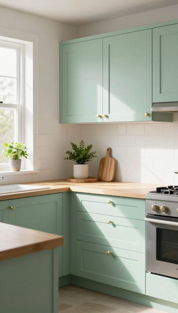
Mint green and white is a color duo that feels both nostalgic and refreshingly modern. The soft green brings a hint of retro charm, while white keeps everything crisp and airy. In a small kitchen, this combination works wonders because it reflects light beautifully, making the space feel bigger and brighter without sacrificing personality.
Why It Works
Mint green has a cool, calming effect that pairs perfectly with white's clean neutrality. The contrast is gentle enough to avoid visual clutter, yet distinct enough to add character. This palette also plays well with natural light, enhancing the sense of openness in compact kitchens.
Best For
This scheme is ideal for small kitchens, galley layouts, or any space where you want to maximize brightness. It's especially great for rental kitchens where you can't change countertops—just add mint via peel-and-stick backsplash tiles or painted cabinet fronts.
Styling Tip
Keep the mint green to one focal area, like a backsplash or lower cabinets, and use white everywhere else. Add warmth with brass or wood accents—think a wooden cutting board on display or brass cabinet pulls—to prevent the look from feeling too cold.
9. Warm Beige and Black
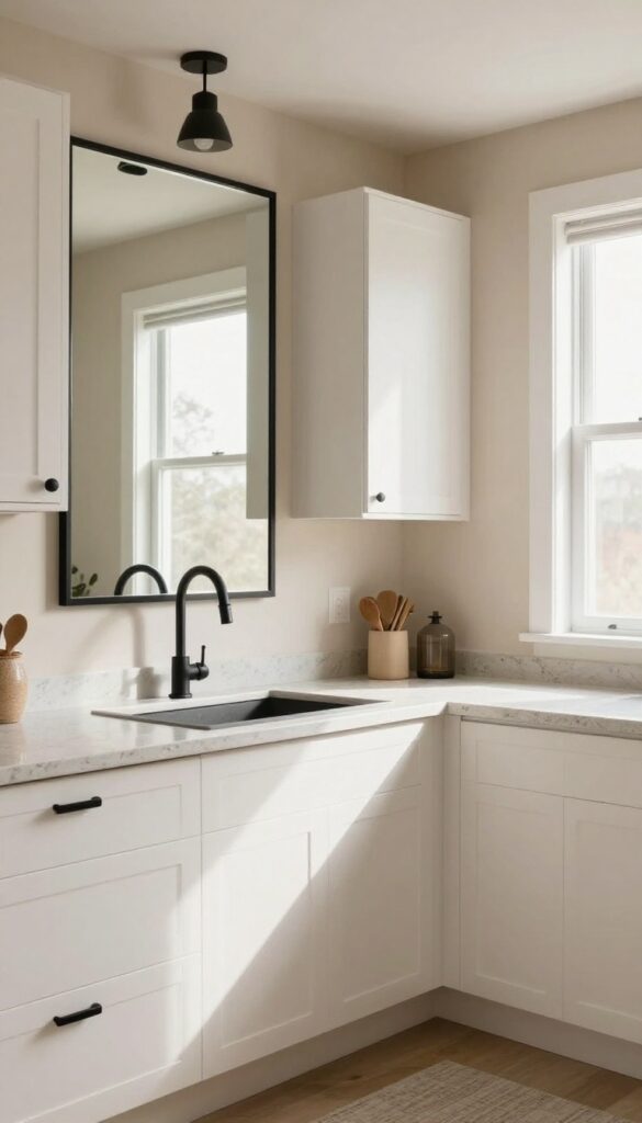
A kitchen that feels both cozy and crisp might sound contradictory, but warm beige and black make it happen. The beige walls wrap the room in softness, while black hardware, light fixtures, or a framed mirror add just enough contrast to keep things sharp. It's a combo that works especially well in smaller kitchens because the beige keeps the space from feeling boxed in, and the black adds visual anchors without overwhelming the room.
Why It Works
Beige is a forgiving neutral that hides smudges and feels inviting, while black creates clear focal points. Together they strike a balance between warmth and structure—exactly what a small kitchen needs to feel pulled together without looking busy.
Best For
This pairing is ideal for galley kitchens or L-shaped layouts where you want to avoid dark cabinets but still crave some drama. It also suits open-plan homes where the kitchen flows into a living area because beige transitions smoothly into other neutrals.
Styling Tip
Stick to matte black finishes for faucets, cabinet pulls, and pendant lights to keep the look modern but not flashy. Add a large black-framed mirror on one wall to bounce light around—it makes the whole kitchen feel bigger without losing its cozy edge.
10. Lavender and Light Oak
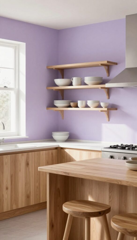
Lavender might not be the first color you think of for a kitchen, but it brings a soft, unexpected charm that feels both calming and fresh. Paired with light oak—think cutting boards, stools, or floating shelves—this combination creates a warm, grounded palette that’s anything but loud. It’s a look that works especially well in small spaces, where gentle colors help the room breathe without feeling busy.
Why It Works
Lavender adds a subtle pop of color without overwhelming the senses, while light oak introduces natural warmth and texture. Together, they strike a balance between cool and warm tones, making the kitchen feel inviting yet airy. The contrast is soft enough to keep the space visually interesting without competing for attention.
Best For
This palette is ideal for small kitchens or galley layouts where you want a hint of personality without sacrificing openness. It also suits homes with lots of natural light, as the lavender can shift from barely-there to gently present depending on the time of day.
Styling Tip
Limit lavender to one accent wall or the backsplash behind open shelving. Layer in light oak elements like a butcher block countertop, bar stools, or wooden utensil holders. Keep countertops clutter-free and let those two colors do the talking—add white or cream dishes to tie it all together.
11. Cream and Olive Green
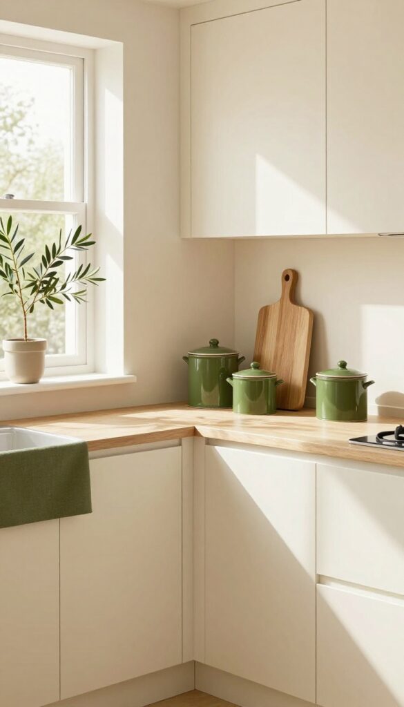
Cream and olive green is a pairing that feels both grounded and fresh, like a breath of fresh air in a small kitchen. The warm neutrality of cream keeps the space feeling open and bright, while olive green adds a layer of natural depth that prevents the room from looking too sterile or one-note. This combination works especially well in compact kitchens because it doesn't rely on bold contrasts that can make a small room feel busy.
Why It Works
Olive green is a muted, earthy tone that brings warmth without overwhelming a small space. Paired with cream, it creates a soft contrast that adds visual interest while maintaining an airy feel. The natural vibe of olive also helps soften the clean lines of modern cabinetry, making the kitchen feel more inviting and lived-in.
Best For
This idea is perfect for small kitchens with limited natural light, as cream helps reflect light and olive adds cozy depth. It's also great for rental kitchens where you can't paint cabinets—just swap in olive accessories like dish towels, a rug, or plants to transform the look without permanent changes.
Styling Tip
Stick to cream as your dominant color on walls or cabinets, then layer olive through textiles and decor. A olive green runner or a set of ceramic canisters on the counter adds just enough color. For extra texture, incorporate natural wood cutting boards or woven baskets to tie the earthy palette together.
FAQ
What are the best colours for a small kitchen to make it look bigger?
Light, neutral colours like soft white, pale grey, light blue, and cream help reflect light and make a small kitchen feel more spacious. Pairing them with one accent colour adds interest without overwhelming the room.
Can I use dark colours in a small kitchen?
Yes, but use them strategically. Dark colours like navy or charcoal work well on lower cabinets or an accent wall, balanced with lighter shades above. This adds depth without making the space feel closed in.
How can I update my kitchen colours on a tight budget?
Focus on paint for cabinets or an accent wall, swap out hardware, add a colourful backsplash with peel-and-stick tiles, or introduce new textiles like dish towels and rugs. These changes are low-cost but high-impact.
What colour combination works best with white cabinets?
White cabinets pair well with almost any colour. For a small kitchen, try soft blue, sage green, or warm wood tones on the walls or accessories. These add personality without clashing.
How do I choose a colour scheme that won't feel dated quickly?
Stick with timeless neutrals for large surfaces like walls and cabinets, and use trendier colours in easily changeable items like accessories, rugs, or small appliances. This way you can update the look without a full redo.
Conclusion
Updating your kitchen with a fresh colour combination doesn't have to be expensive or complicated. With a little paint, some new accessories, or a few swapped-out details, you can completely change the feel of the space—even in a small kitchen.
The key is to choose colours that work with your existing layout and reflect your personal style. Start with one idea from this list that excites you most, and build from there.