17 Pink Living Room Ideas That Look Bold and Elegant
Pink changes a room’s mood faster than almost any color I know. I once swore pink felt too sweet for a living room, then I tried a dusty rose throw and everything shifted.
The space felt warmer, calmer, and oddly more confident, like it finally knew what it wanted to be.
I want to show you pink that feels grown, intentional, and totally livable. We’ll skip the bubblegum overload and focus on choices that look stylish without trying too hard.
Think cozy evenings, good lighting, and pink that actually earns its spot.
1. Blush Accent Walls That Feel Soft, Not Shy
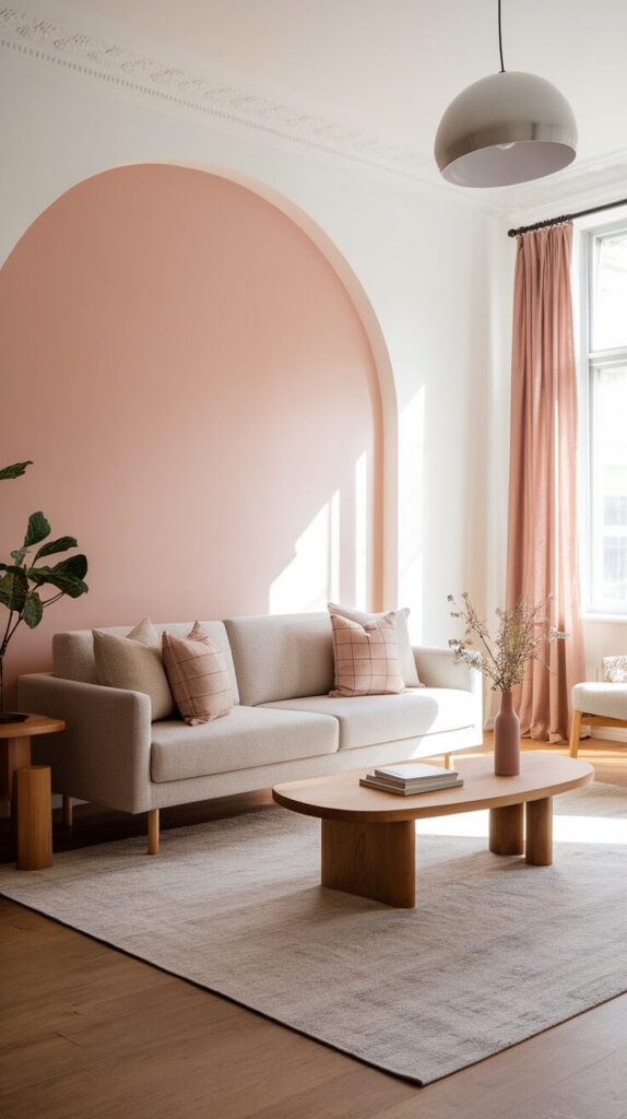
Every living room needs a moment, and a blush accent wall delivers that without yelling for attention. I love how a soft pink wall instantly warms the space while still letting furniture and art shine. If white walls feel boring but bold colors scare you, blush lands right in that sweet spot.
This idea works because blush acts like a neutral with personality. It reflects light gently, so the room feels brighter during the day and calmer at night. The color adds depth without shrinking the space, which matters a lot in average-sized living rooms.
To do it right, start with a muted blush or dusty rose paint. Test samples on different walls and watch how the color changes from morning to evening. Paint only one main wall so the pink feels intentional, not overwhelming.
- Choose a wall behind the sofa or TV for balance.
- Use a matte or eggshell finish for a soft look.
- Keep trim and ceilings clean white for contrast.
Style the wall with warm metals, wood tones, or simple black frames. Avoid pairing blush with icy grays because that combo can feel flat. Soft pink loves warmth, so lean into beige, cream, and natural textures.
Here’s a budget trick I swear by: paint first, then decide on decor. The wall often tells you exactly what the room needs next, and you avoid wasting money on stuff that clashes.
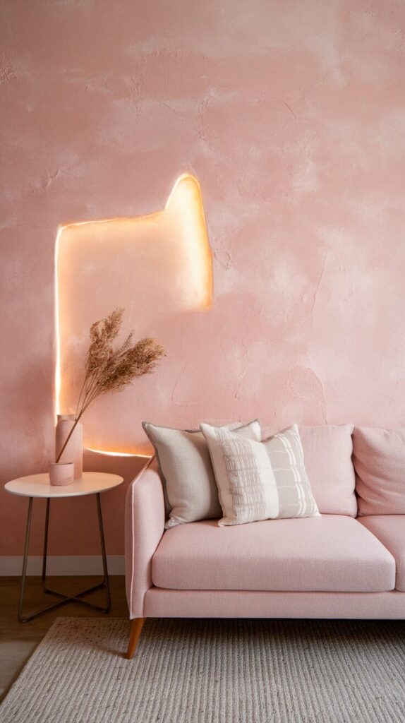
2. Pink Sofas That Steal the Show (In a Good Way)
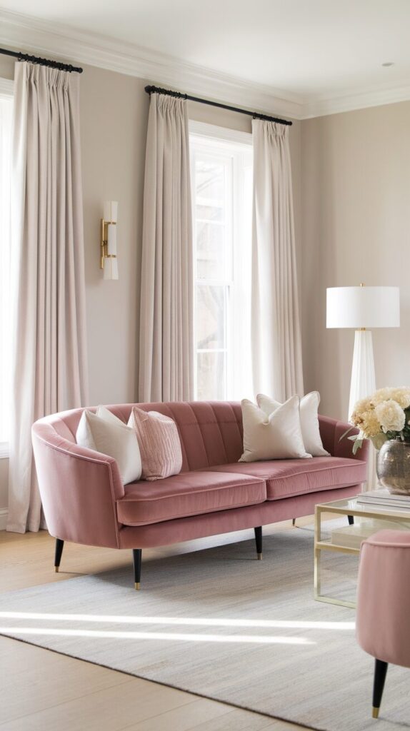
A pink sofa sounds scary until you see one done right. I hesitated for years, then I sat on a dusty rose velvet couch at a friend’s place and instantly wanted one. The room felt bold, cozy, and surprisingly timeless.
This works because a sofa already anchors the living room. When you choose pink, you turn a basic piece into a design statement. Muted pinks feel elegant, not trendy, and they age way better than loud colors.
Start by choosing the right shade and fabric. Velvet, chenille, or textured upholstery gives pink a richer feel. Stick with blush, mauve, or clay pink instead of bright tones.
- Pair with neutral walls to let the sofa shine.
- Add throw pillows in cream, tan, or soft gray.
- Balance the color with wood or black accents.
Design-wise, keep the rest of the room simple. Let the sofa do the heavy lifting so nothing competes with it. One bold anchor always beats five loud details.
If a full sofa feels risky, look for a loveseat or modular piece. You still get the impact without the long-term commitment, and your wallet will thank you too.
3. Layered Pink Throw Pillows for Easy Impact
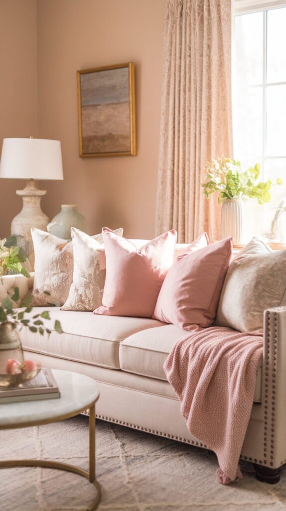
Throw pillows feel basic, but pink pillows can completely shift a room’s vibe. I use this trick whenever a living room feels dull but not broken. It’s fast, flexible, and way cheaper than new furniture.
This idea works because pillows add color exactly where your eye lands. Pink softens hard lines from sofas and coffee tables, which makes the space feel more inviting. You can also swap them seasonally without any guilt.
Start with two or three shades of pink, then mix in neutrals. Play with texture so the color feels layered, not flat.
- Combine linen, velvet, and knit covers.
- Mix solids with subtle patterns.
- Keep pillow sizes varied for depth.
Style tip I learned the hard way: avoid matching sets. Perfectly matched pillows look staged, not lived-in. Slight variation always looks more relaxed and elegant.
For a budget hack, buy pillow covers instead of inserts. You store covers easily, spend less, and change the room whenever you feel bored.
4. Pink Area Rugs That Ground the Space
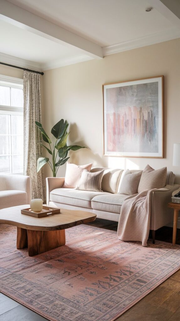
A pink rug sounds unexpected, which honestly makes it even better. I tried one in a neutral living room and suddenly everything felt intentional. The rug tied the furniture together and softened the entire layout.
This works because rugs cover a large visual area. When pink sits under your furniture, it spreads color evenly instead of concentrating it in one spot. Soft pinks also hide wear better than stark white rugs.
Choose a rug with pink mixed into a pattern or faded design. Solid pink can work, but patterns feel more forgiving and practical.
- Look for Persian-style or abstract designs.
- Make sure the rug reaches under front sofa legs.
- Keep surrounding decor simple.
From a design angle, balance matters most here. Pair pink rugs with neutral sofas and natural wood to avoid visual overload. Pink loves breathing room, so don’t crowd it with busy furniture.
Budget-wise, check washable rug brands or low-pile options. You get the look without stressing over spills, which feels like a win in real life.
5. Pink Curtains That Soften Light Beautifully
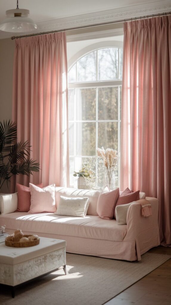
Pink curtains change how light feels in a room, not just how it looks. I noticed this the first time sunlight filtered through sheer blush panels and instantly felt calmer. The room glowed instead of glaring.
This works because fabric color affects light temperature. Pink adds warmth and softness, which makes living rooms feel cozy even on bright days. It also frames windows in a more decorative way than plain white.
To do this well, choose sheer or lightly textured curtains. Heavy, bright pink drapes can feel dated fast.
- Hang curtains higher than the window frame.
- Let fabric skim the floor for elegance.
- Keep rods simple in black or brass.
Design tip you’ll love: pair pink curtains with neutral walls for balance. Avoid matching them exactly to pillows or rugs because too much coordination kills charm.
For savings, buy longer panels and hem them yourself. You often get better fabric and save money with a little DIY effort.
6. Pink Artwork That Feels Modern, Not Sweet
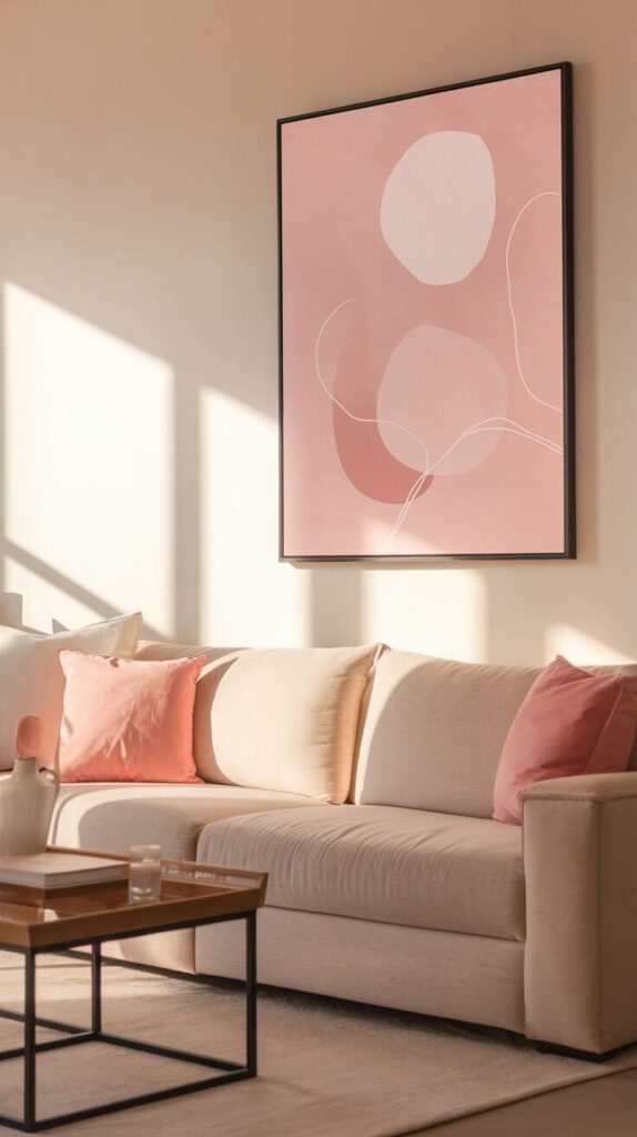
Pink art gives you color without commitment, which makes it perfect if you like flexibility. I rotate art often, and pink prints always bring energy without overwhelming the room. They feel playful yet polished when chosen well.
This works because artwork sits at eye level. Pink draws attention upward, making the room feel taller and more dynamic. Abstract or minimal designs keep the color from feeling childish.
Choose prints with pink mixed with neutrals or darker tones.
- Stick to simple frames in wood or black.
- Hang art at eye level, not near the ceiling.
- Group pieces for a gallery look.
Design-wise, avoid overly literal floral or quote prints if you want elegance. Abstract shapes and soft lines age better and feel more grown-up.
You can save money by downloading digital prints and framing them yourself. Great frames do half the work, IMO.
7. Pink Accent Chairs That Add Personality
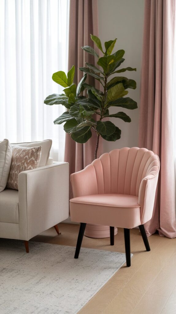
An accent chair gives you permission to experiment. I love using pink here because it feels bold without taking over the room. One chair can change the entire layout’s energy.
This works because accent chairs naturally stand apart. Pink highlights that role and adds contrast against neutral sofas. It also creates a visual pause that makes the room more interesting.
Pick a chair with clean lines and soft upholstery.
- Place it near a window or corner.
- Add a neutral throw for balance.
- Keep surrounding decor simple.
Design tip: avoid overly ornate shapes. Simple silhouettes let pink feel chic, not fussy.
For budget shoppers, check secondhand stores and reupholster. Pink fabric can revive even the saddest old chair.
8. Pink Coffee Tables for Unexpected Style
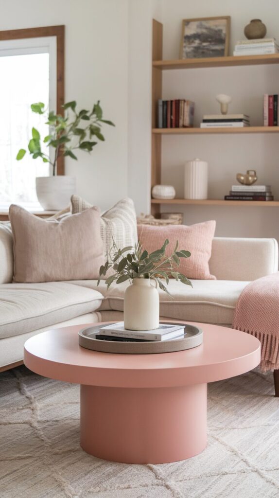
A pink coffee table always surprises people, and that’s half the fun. I once painted an old table blush and instantly loved the result. The room felt playful but still grounded.
This works because coffee tables sit at the center of the room. Pink adds personality where everyone gathers, which makes the space feel intentional. Soft pink also pairs well with wood and metal.
To do this, choose muted pink paint or finishes.
- Keep styling minimal on top.
- Use trays in neutral tones.
- Balance with darker furniture.
Design-wise, avoid glossy finishes unless you love drama. Matte or satin looks more elegant in everyday spaces.
Budget hack: paint what you already own. A small project can deliver big visual payoff.
9. Pink Lamps That Warm Up Corners
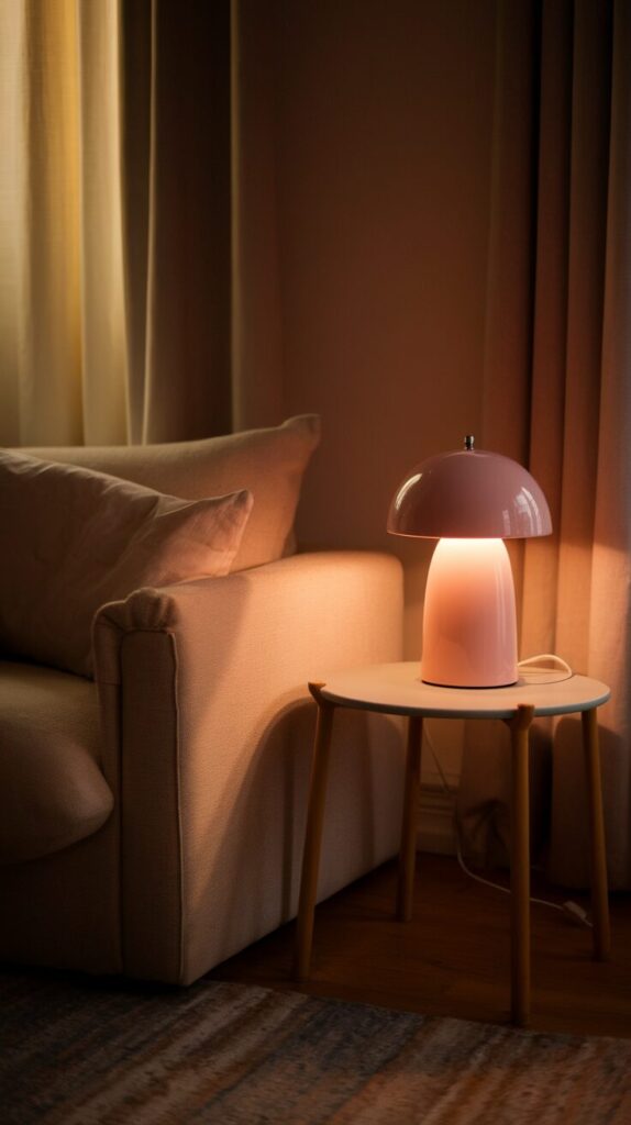
Lighting changes everything, and pink lamps add warmth even when turned off. I keep one in my reading corner because it softens the space instantly. It feels cozy without trying too hard.
This works because lamps sit at different heights than furniture. Pink at this level adds subtle color variation. It also pairs beautifully with warm bulbs.
Choose ceramic or fabric shades in muted pinks.
- Use warm white bulbs only.
- Place lamps at eye level when seated.
- Mix with brass or wood bases.
Style tip: don’t match every lamp. Variation feels collected, not staged.
You can thrift bases and add new shades for less. That combo usually looks custom.
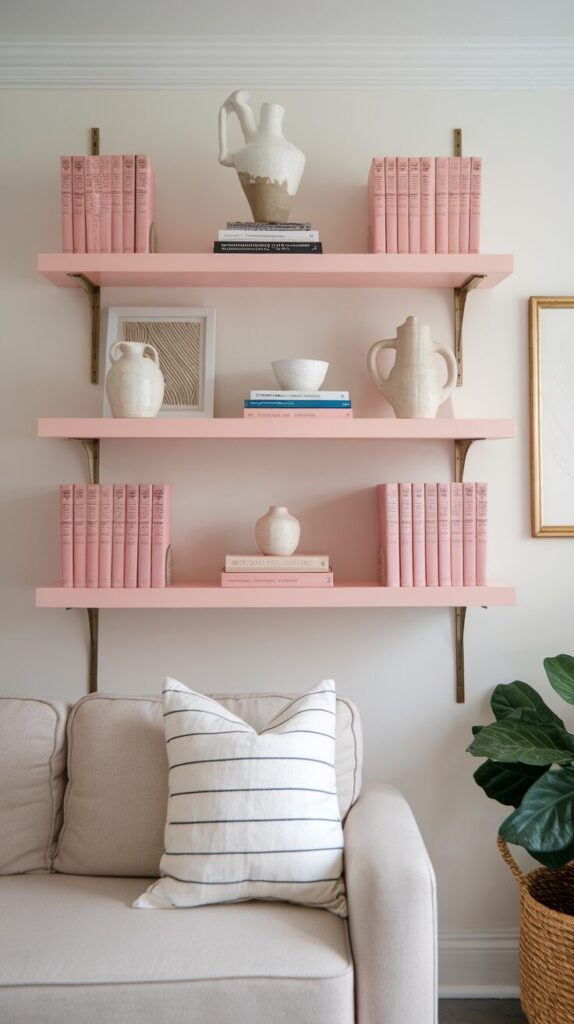
10. Pink Built-Ins That Feel Custom
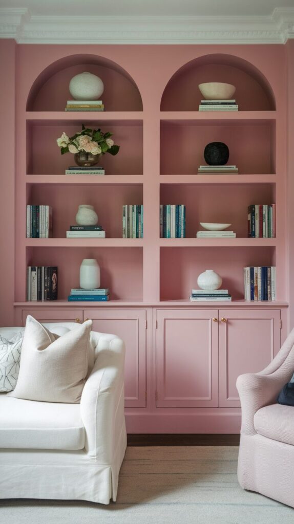
Pink built-ins sound bold, but they feel stunning when done right. I’ve seen dusty rose shelves look more expensive than plain white ones. The color highlights objects instead of hiding them.
This works because built-ins frame decor. Pink creates contrast that makes books and art pop. It also adds depth to flat walls.
Choose muted tones and keep styling minimal.
- Mix books with neutral decor.
- Leave some shelves empty.
- Add subtle lighting if possible.
Design tip: avoid clutter. Pink shelves need breathing room to feel elegant.
If full built-ins feel intense, paint the back of open shelves instead. You get the look with less commitment.
11. Pink Throw Blankets for Cozy Layers
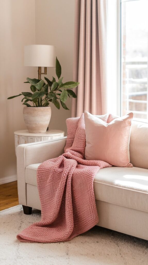
A pink throw blanket feels like an invitation to relax. I drape one over my sofa year-round because it softens the whole setup. It’s simple but effective.
This works because blankets add texture and movement. Pink introduces color in a casual way that never feels forced. You can fold or drape depending on mood.
Choose knits or woven textures.
- Stick to muted tones.
- Layer with neutral pillows.
- Keep folds relaxed.
Design-wise, avoid stiff placement. Casual draping always looks better than perfect folds.
Budget tip: look for off-season sales. Throws get cheap fast.
12. Pink Ceiling Accents for Subtle Drama
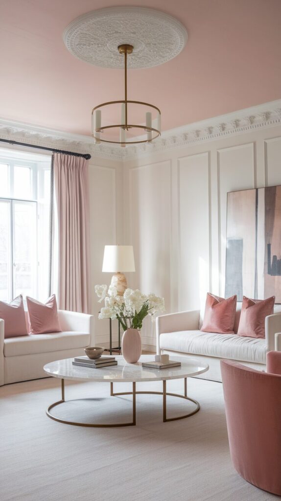
A pink ceiling sounds wild, but hear me out. Soft blush overhead creates a cocoon effect I actually love. It feels intimate without closing in the space.
This works because ceilings often get ignored. Pink there adds depth and surprise. Lighter shades keep it airy.
Use very soft pink tones.
- Keep walls neutral.
- Limit ceiling decor.
- Use warm lighting.
Design tip: test paint first. Ceilings amplify color, so lighter always wins.
If paint feels risky, try pink ceiling medallions or trim instead.
13. Pink Ottomans That Do Double Duty
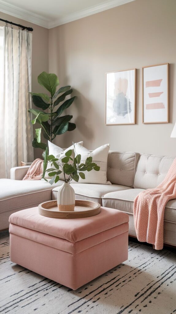
Ottomans already work hard, so why not let them look good too. A pink ottoman adds function and flair. I use one as seating and a coffee table swap.
This works because ottomans move easily. Pink adds flexibility without permanence. It also softens sharp furniture layouts.
Choose sturdy fabric and simple shapes.
- Pair with trays when needed.
- Keep nearby decor neutral.
- Use as extra seating.
Design tip: avoid busy patterns. Solid pink feels more elegant here.
You can DIY this with slipcovers for a cheap upgrade.
14. Pink Trim for Subtle Character
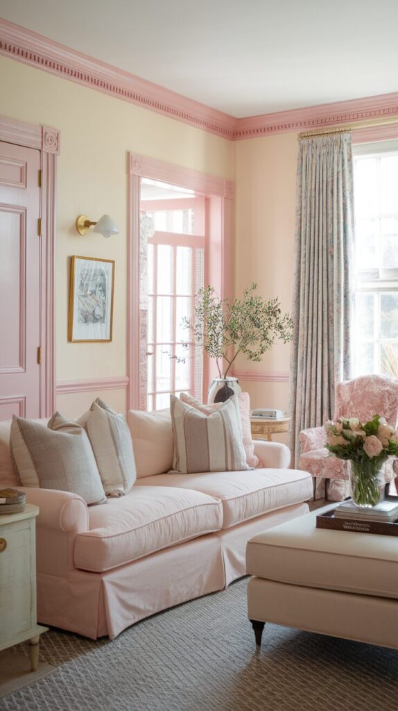
Pink trim feels unexpected in the best way. I saw it once in a magazine and couldn’t forget it. It adds charm without screaming color.
This works because trim frames architecture. Pink highlights those lines gently. It works especially well in older homes.
Use very soft pink shades.
- Pair with white or cream walls.
- Keep furniture simple.
- Avoid high-gloss finishes.
Design tip: less is more. Thin trim looks intentional, not quirky.
Paint samples matter here more than anywhere else.
15. Pink Books and Decor for Styled Shelves
Books count as decor, and pink spines add instant color. I stack them horizontally for a relaxed look. It feels collected, not forced.
This works because small doses of pink spread evenly. Shelves feel styled without effort. It’s also easy to adjust.
Mix books with neutral objects.
- Use odd-number groupings.
- Leave empty space.
- Avoid overcrowding.
Design tip: remove dust jackets if needed. Clean spines look calmer.
You can thrift books cheaply for this exact purpose.
16. Pink Plants and Planters for Fresh Contrast
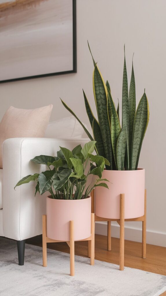
Pink planters with green plants look amazing together. I love that contrast more than almost any color combo. It feels fresh and alive.
This works because green grounds pink. The combo balances softness with energy. Plants also make color feel natural.
Choose matte or ceramic planters.
- Stick to simple shapes.
- Mix sizes.
- Place near natural light.
Design tip: avoid artificial plants. Real greenery makes pink feel grown-up.
Planters often cost less than furniture but change the room more.
17. Pink Textured Walls for Subtle Depth
Textured pink walls feel luxurious without flash. Limewash or plaster finishes add movement I can’t stop staring at. It feels artistic but cozy.
This works because texture breaks up flat color. Pink gains depth instead of looking flat. Light plays beautifully across the surface.
Use soft, earthy pink tones.
- Keep furniture simple.
- Limit wall decor.
- Let texture shine.
Design tip: sample first. Texture changes everything, including color depth.
If full walls feel risky, try a small section or niche.
The Pink Living Room Strategy: How to Use Bold Color Without Regret
Pink works best when you treat it like a design decision, not a random impulse buy. I always start by deciding whether pink will act as the star, the supporter, or the subtle background player. That clarity saves money and prevents the “why does this room feel chaotic” moment later.
First, define your pink level of commitment. A pink sofa equals high commitment, while pillows and art equal low commitment. You avoid expensive mistakes when you match the color’s intensity to your comfort level.
Next, anchor pink with neutrals that calm it down. Beige, cream, taupe, soft brown, and warm white create balance that keeps pink elegant. I avoid pairing pink with too many competing colors because visual noise kills sophistication fast.
Lighting also plays a massive role in how pink behaves. Warm lighting enhances blush and dusty rose, while cool lighting can make pink look flat or gray. Always test samples during both daytime and evening hours before finalizing anything.
Finally, repeat pink intentionally across the room. I follow a simple visual rhythm rule and place the color in at least three spots at different heights. That strategy keeps the room cohesive instead of random.
Choosing the Right Shade of Pink for Your Space
Not all pinks behave the same way, and shade selection changes everything. I always compare blush, mauve, clay pink, rose, and terracotta tones before committing. The undertone determines whether the room feels soft, bold, earthy, or dramatic.
Rooms with lots of natural light handle deeper pinks beautifully. Smaller or darker rooms usually benefit from lighter, muted tones that reflect light. I test paint or fabric swatches against flooring and large furniture before making final calls.
Warm pinks pair beautifully with wood and brass. Cooler pinks lean better toward black, chrome, or gray elements. You gain elegance when your undertones agree instead of fighting.
How to Balance Pink With Other Colors
Pink feels bold, but balance keeps it refined. I use the 60-30-10 rule as a loose guide when styling bold colors. That approach helps the room feel intentional rather than accidental.
Let one neutral dominate around 60 percent of the room. Use pink as roughly 30 percent if you want strong impact, or 10 percent for subtle layering. You create harmony when you avoid giving every color equal attention.
Green plants almost always improve pink spaces instantly. Wood tones ground pink beautifully as well. I avoid pairing pink with overly bright primary colors because that mix often feels chaotic.
Common Mistakes to Avoid
Many people choose a pink that looks great in-store but completely wrong at home. Lighting changes everything, so I always test samples before committing. Skipping this step causes most pink regrets.
Some homeowners over-coordinate every pink detail. Matching pillows, curtains, art, and rugs in identical shades makes the room feel staged. Variation always looks more natural and elevated.
Others forget about texture when using pink. Flat paint with flat fabrics can make the color feel lifeless. Mixing velvet, linen, wood, and metal keeps pink dynamic and interesting.
A lot of rooms suffer from too much saturation. Bright bubblegum tones often overpower living spaces. Muted or dusty pinks almost always age better and feel more sophisticated.
Finally, clutter ruins bold color faster than anything else. Pink needs space to breathe. I always edit decor before adding more color.
Budget Planning for a Pink Living Room Makeover
You don’t need a full renovation to create a bold and elegant pink space. I always suggest starting with soft furnishings before replacing major furniture. Pillows, throws, and art offer high impact with low risk.
Set a clear spending cap before you shop. I divide my budget into anchors, accents, and finishing touches. That structure keeps spending realistic and focused.
If you want a pink sofa but fear the price tag, look for seasonal sales or floor models. You can also refresh older pieces with paint or slipcovers. Strategic upgrades often look better than impulse splurges.
Styling Checklist Before You Call It Done
Before declaring your pink living room complete, step back and evaluate balance. I always scan the room from the doorway first. That view tells you instantly whether color distribution feels even.
Check that pink appears at different heights. You want color near the floor, eye level, and slightly above. This layering creates flow and cohesion.
Look at contrast levels next. Ensure darker elements ground the space so pink doesn’t float awkwardly. Small black or deep brown accents often fix imbalance quickly.
Finally, remove one unnecessary item. Editing sharpens elegance more than adding ever will.
FAQ: Pink Living Room Design Questions Answered
Is pink too trendy for a living room?
Pink feels trendy only when you choose loud or neon shades. Muted blush, mauve, and dusty rose have existed in interiors for decades. Those tones behave like warm neutrals and age gracefully.
What colors go best with pink in a living room?
Beige, cream, taupe, and warm white always work beautifully. Wood tones, brass, and greenery also complement pink naturally. Avoid overly bright competing colors if you want elegance.
Can I use pink in a small living room?
Yes, you absolutely can. Lighter pink shades actually reflect light and make small rooms feel warmer and more inviting. Keep large furniture neutral to avoid overwhelming the space.
How do I make pink look sophisticated instead of childish?
Choose muted tones instead of bright bubblegum shades. Add texture through velvet, wood, and metal finishes. Balance pink with strong neutrals to ground the room visually.
Should I paint all four walls pink?
You can, but softer tones work best for full-room coverage. If you feel unsure, start with one accent wall. Testing smaller sections helps you build confidence before committing.
What’s the easiest way to try pink without a big commitment?
Start with throw pillows, blankets, or artwork. These accents shift the mood instantly without locking you in long term. You can always upgrade later if you fall in love with the look.
Final Thoughts
Pink doesn’t need to feel sweet or childish when you use it with intention. Small choices add up faster than big ones, so start where you feel comfortable. Try one idea, live with it, and let the room guide you from there.
I always say rooms tell you what they need if you listen. Pink just happens to speak softly and confidently at the same time.