10 Warm and Cozy Kitchen Paint Colors That Make Your Home Feel Cleaner and Happier
Your kitchen is the heart of your home, but sometimes it can feel a little cold or sterile.
The right paint color changes everything—it adds warmth, hides daily messes, and makes the space feel truly yours.
Whether you're planning a full remodel or just a weekend refresh, these 10 kitchen paint ideas will help you create a cleaner, prettier, and cozier space you'll love spending time in.
1. Creamy Butter Yellow for a Sunny Welcome
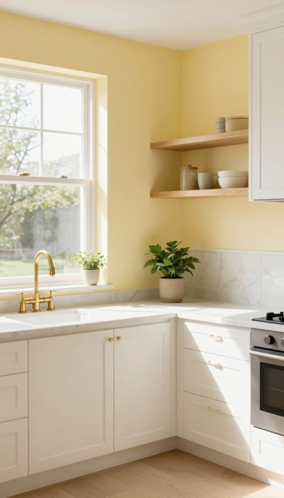
A soft, buttery yellow warms up the kitchen without being overpowering. It pairs beautifully with white cabinets and natural wood accents, making the room feel bright and cheerful even on gray days. This shade strikes that perfect balance between cozy and uplifting, giving your cooking space a gentle glow that feels like a permanent dose of morning sunshine.
Why It Works
Yellow is naturally energizing yet calming in its palest form. It reflects light well, making smaller kitchens feel more open, while its warmth softens hard surfaces like tile and stainless steel. The creamy undertone keeps it from feeling childish or overly bold, so it ages gracefully with your decor.
Best For
This color shines in kitchens that get limited natural light or face north. It also works wonders in open-concept layouts where you want the kitchen to feel connected to adjacent living areas without screaming for attention.
Styling Tip
Pair it with matte black hardware or brushed brass fixtures for a touch of contrast. Add open shelving with white dishes and a few trailing plants to reinforce the fresh, lived-in vibe. Keep countertops clutter-free to let the yellow breathe.
2. Sage Green for a Calm, Natural Vibe
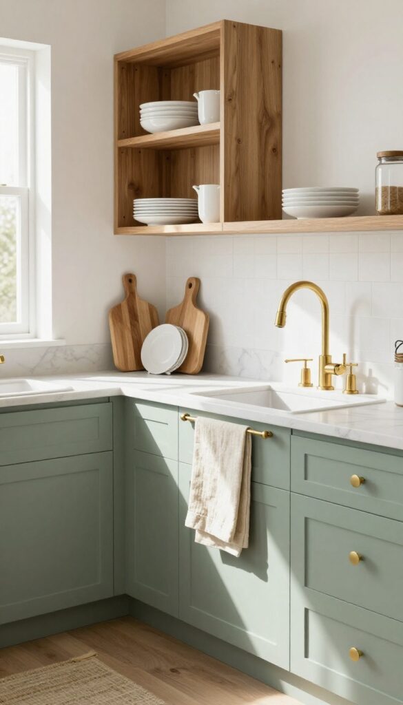
Sage green is having a serious moment in kitchens, and it's easy to see why. This muted, earthy tone brings a slice of the outdoors in without screaming for attention. It's the kind of color that makes your morning coffee feel a little more peaceful and your countertop mess a little less noticeable.
Whether you paint all the cabinets or just an island, sage green adds warmth without weighing down the space.
Why It Works
Sage green is incredibly forgiving—it hides smudges, fingerprints, and everyday wear better than white or dark hues. Its softness also makes the kitchen feel larger and airier, especially when paired with natural light. The color naturally complements wood tones, ceramic dishes, and linen textures, creating a cohesive look that feels both intentional and relaxed.
Best For
This shade shines in kitchens that get plenty of natural light but also works beautifully in smaller spaces where you want a subtle pop of color. It's ideal for open-plan layouts where the kitchen flows into a living area, as it bridges the gap between cozy and clean.
Styling Tip
To keep the vibe warm and lived-in, pair sage green cabinets with warm brass or unlacquered brass hardware. Add open shelving with white ceramic plates and a few wooden cutting boards. Finish with a linen runner or cotton dish towels in cream or soft beige—this keeps the look from feeling too cold or sterile.
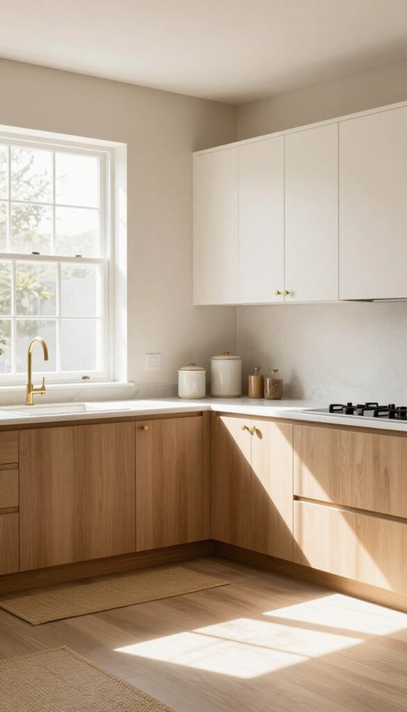
3. Warm Off-White for Timeless Cleanliness
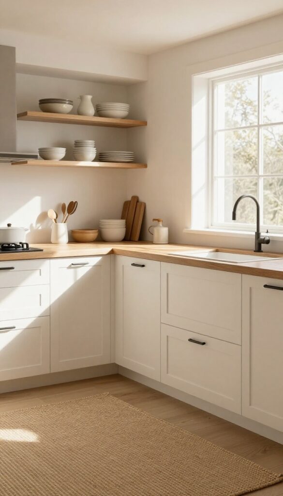
Pure white kitchens can feel sterile and cold, but warm off-white with subtle cream or beige undertones brings a soft, inviting glow. This shade reflects natural light beautifully, making the space feel open and airy without the harsh brightness of stark white. It also has a practical edge—daily dust and crumbs blend in better, so the kitchen stays looking tidy longer.
Why It Works
Warm off-white creates a cozy backdrop that pairs effortlessly with wood tones, brass fixtures, and natural stone. Unlike cooler whites, it doesn't feel clinical—it feels like a lived-in kitchen where meals are shared and memories made. The slight warmth also helps the room feel grounded and welcoming.
Best For
This color is ideal for kitchens that get lots of natural light but still want a soft, relaxed vibe. It's perfect for open-concept homes where the kitchen flows into living areas, as it bridges cooler and warmer tones gracefully. Renters can use it too—it's neutral enough to please landlords while adding personality.
Styling Tip
Pair warm off-white cabinets with matte black or unlacquered brass hardware for contrast. Add a natural wood butcher block countertop or open shelving with ceramic dishes to enhance the cozy feel. A textured jute rug or linen curtains complete the look without overwhelming the space.
4. Terracotta for a Cozy Mediterranean Feel
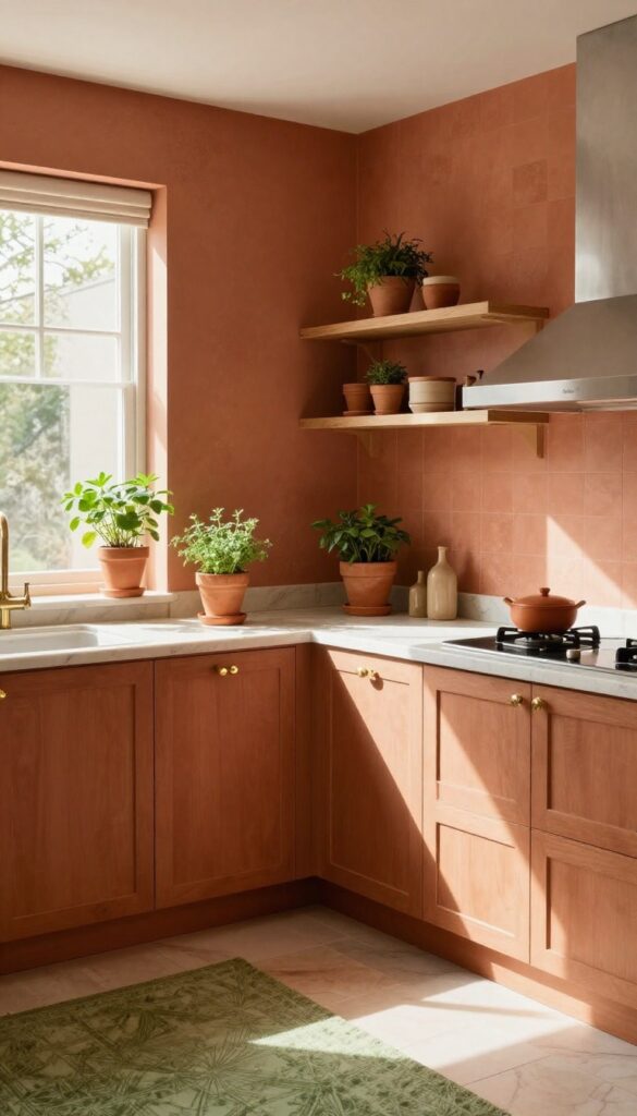
There’s something about terracotta that instantly warms up a kitchen. Its earthy, reddish-brown tones bring to mind sunbaked tiles and rustic villas, making the space feel grounded and inviting. This color works especially well in kitchens with good natural light, where it can really glow without feeling heavy.
Pair it with creamy whites or soft greens for a balanced, lived-in look that’s anything but dull.
Why It Works
Terracotta is naturally warm and rich, creating a cozy backdrop that makes a kitchen feel like the heart of the home. It pairs beautifully with natural materials like wood and brass, adding texture and depth without overwhelming the space. The color also hides everyday smudges and splatters better than stark white, so it’s as practical as it is pretty.
Best For
This idea shines in kitchens that get plenty of daylight, especially those with south- or west-facing windows. It’s also perfect for open-plan spaces where you want the kitchen to feel connected to a living or dining area with similar earthy tones.
Styling Tip
Balance terracotta walls or backsplash with light countertops—think cream marble or warm white quartz—to keep the room from feeling too dark. Add brass cabinet pulls, wooden open shelving, and a few terracotta pots with herbs to reinforce the Mediterranean vibe.
5. Dusty Blue for a Soft, Serene Touch
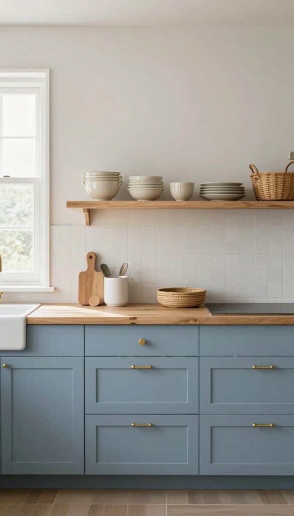
Navy can feel a little heavy for a kitchen, especially if you're after something calm rather than commanding. Dusty blue steps in as the gentler cousin—still rich, but with a muted, almost powdery finish that softens the whole room. It reads as neutral enough to pair with warm woods and brass, yet brings just enough color to keep things interesting.
On lower cabinets or a single accent wall, it creates a grounded, lived-in feel without shouting for attention.
Why It Works
Dusty blue has a natural warmth that stops it from feeling cold or sterile, which is key in a kitchen. Its gray undertone helps it blend seamlessly with other warm neutrals like cream, beige, and worn wood. The color also catches light differently throughout the day—soft and hazy in the morning, deeper and cozier by evening—so the space never feels flat.
Best For
This shade shines in kitchens that get plenty of natural light, where its subtlety can really breathe. It's perfect for open-plan spaces that flow into warm living areas, or for farmhouse-style kitchens that want a hint of color without losing their rustic soul. If you love navy but worry it'll overwhelm a small kitchen, dusty blue is your answer.
Styling Tip
Pair dusty blue cabinets with unlacquered brass pulls and a warm white backsplash—think zellige or handmade subway tile. Add open shelving with creamware dishes and a few woven baskets to keep the look relaxed. For countertops, butcher block or a warm quartzite with caramel veining will tie the whole scheme together.
6. Warm Gray for Understated Elegance
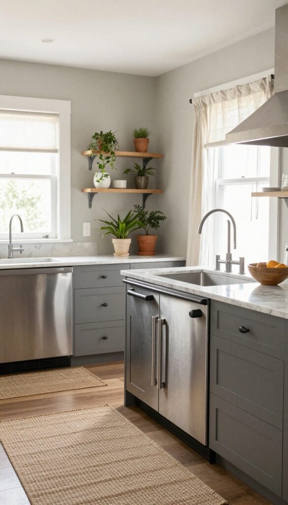
Not all grays are created equal. A warm gray with beige undertones—often called greige—brings a soft, inviting energy to the kitchen without feeling stark or cold. It pairs beautifully with stainless steel appliances and marble countertops, creating a space that feels both polished and lived-in.
This is the kind of color that makes you want to linger over morning coffee.
Why It Works
Greige bridges the gap between cool neutrals and warm earth tones, making it incredibly versatile. It reflects light gently, so the kitchen feels airy without going sterile. The warmth in the undertone keeps the room cozy even when paired with sleek modern finishes.
Best For
This shade is ideal for open-concept kitchens where you want a seamless flow into adjoining living areas. It also works well in kitchens with lots of natural wood elements or brass hardware, as it enhances those warm accents without competing.
Styling Tip
Layer in texture through linen curtains, a woven rug, or matte black fixtures to keep the look from feeling flat. Add a few plants for a pop of green—they really pop against greige walls.
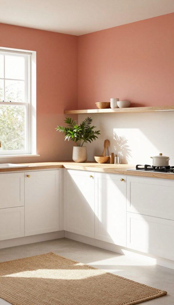
7. Peach Blush for a Hint of Playfulness
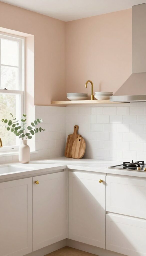
Blush pink isn't just for nurseries—a muted peach blush adds warmth and personality to kitchens. This soft, peachy hue feels like a gentle sunrise, bringing a cheerful yet sophisticated energy to the heart of your home. It pairs beautifully with brass hardware and white subway tile, creating a space that feels both sweet and grown-up, perfect for those who want a kitchen that's anything but boring.
Why It Works
Peach blush is warm without being overpowering, making it an ideal backdrop for daily life. It reflects light softly, making the kitchen feel airy and inviting, while its subtle color adds visual interest without overwhelming the senses. This shade also complements natural materials like wood and stone, grounding the playfulness in a sense of comfort.
Best For
This color works wonders in kitchens that get plenty of natural light, as it enhances the glow. It's especially great for open-concept homes where you want the kitchen to feel connected yet distinct from living areas. If you love a feminine touch but don't want it to feel childish, peach blush is your sweet spot.
Styling Tip
Balance the softness with crisp white trim and warm brass fixtures—think faucets, cabinet pulls, and light pendants. Add open shelving with white dishes and a few wooden cutting boards to keep the look grounded. A simple vase with fresh eucalyptus or dried pampas grass on the counter completes the scene effortlessly.
8. Olive Green for Depth and Character
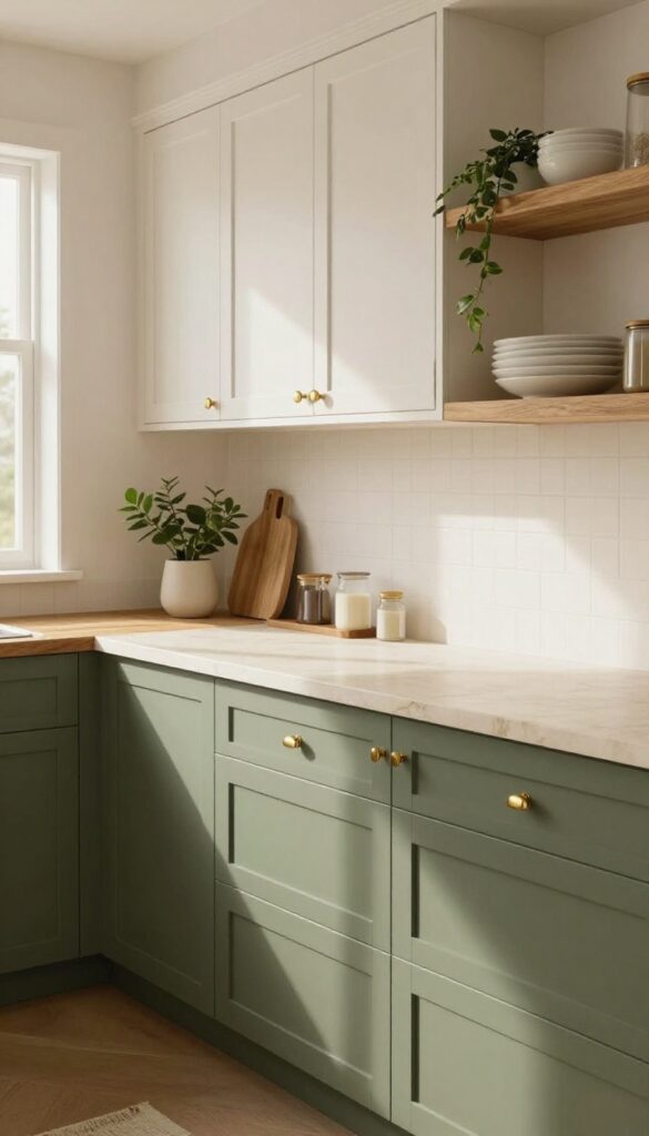
Olive green is that cozy, grounded shade that makes a kitchen feel instantly more inviting. It’s richer than sage and softer than forest green, hitting a sweet spot that brings warmth without overwhelming the space. On a kitchen island or a full wall of cabinetry, this color adds a sense of depth that feels both natural and refined.
Why It Works
Olive green absorbs light in a way that creates visual weight and anchors the room. It pairs beautifully with warm wood tones—think butcher block counters or open shelving in oak—and cream accents keep it from feeling too dark. The result is a kitchen that feels lived-in, balanced, and quietly stylish.
Best For
This idea shines in kitchens with good natural light, where olive green can show off its earthy undertones without turning muddy. It’s especially great for islands, lower cabinets, or a single accent wall, giving you that rich pop of color without committing to an all-over dark scheme.
Styling Tip
Balance olive green cabinets with brass or matte black hardware for a touch of contrast. Add open shelving with white dishes and trailing plants to keep the look airy. A creamy marble or quartz countertop will soften the overall feel while letting the green take center stage.
9. Soft Taupe for a Cozy Neutral Base
Some neutrals feel a little cold or flat, but soft taupe walks that perfect line between warm and grounded. It brings a gentle earthiness that makes a kitchen feel instantly more inviting without going too dark or too light. Think of it as the color version of a favorite worn-in sweater—comforting, timeless, and easy to live with.
Why It Works
Taupe has enough gray in it to stay sophisticated, but enough brown to keep things cozy. It doesn't compete with other colors, so your cabinets, countertops, and decor can shine. Plus, it hides everyday smudges better than stark white or deep charcoal.
Best For
This shade is ideal for kitchens that get lots of natural light—it softens bright sun without dulling the space. It also works beautifully in open-concept homes where you want the kitchen to feel connected to warmer living areas.
Styling Tip
Pair soft taupe walls with creamy white upper cabinets and warm wood lower cabinets for a layered neutral look. Add brass hardware and a woven runner to boost the cozy factor.
10. Muted Coral for a Fresh, Energetic Pop
Coral might sound bold, but a muted version brings just the right amount of energy without overwhelming the space. Use it on a breakfast nook wall or as an accent behind open shelves for a cheerful focal point. The warmth of coral pairs beautifully with natural wood tones and soft whites, making your kitchen feel both lively and grounded.
Why It Works
Muted coral has a unique ability to add warmth and vibrancy without being jarring. It stimulates appetite and conversation, which is perfect for a kitchen, while its softness keeps the room feeling cozy and inviting.
Best For
This shade is ideal for kitchens that get plenty of natural light, as it will glow rather than overpower. It also works well in open-plan spaces where you want to define the kitchen area with a subtle pop of color.
Styling Tip
Balance the coral with neutral cabinetry and countertops, then introduce texture through woven bar stools or a jute rug. Add brass or copper hardware for extra warmth that complements the coral undertones.
FAQ
What is the best paint finish for a kitchen?
For kitchens, go with a satin or semi-gloss finish. They're easy to clean, resist moisture, and hold up well to grease and fingerprints. Eggshell can work on walls if you prefer a softer look, but it's less scrubbable.
How do I choose a kitchen paint color that won't feel dated?
Stick with colors that have a natural, earthy base—like warm whites, sage greens, or soft taupes. These tend to stay timeless because they mimic tones found in nature. Avoid overly trendy hues unless you're ready to repaint in a few years.
Should I paint my kitchen cabinets or just the walls?
It depends on your budget and the look you want. Painting walls is quicker and cheaper, while painting cabinets makes a bigger impact. If your cabinets are in good shape but feel tired, a fresh coat of paint can transform the whole room.
How can I make a small kitchen feel bigger with paint?
Light, warm colors like creamy white, soft beige, or pale sage can make a small kitchen feel more open. Painting the ceiling a shade lighter than the walls also helps the room feel taller. Avoid dark colors on all walls unless you have great lighting.
What paint colors hide kitchen messes best?
Medium-toned colors like sage green, warm gray, or olive green are great at hiding smudges, crumbs, and splatters. Very light colors show every mark, while very dark colors show dust and grease. A satin finish also helps because it's easier to wipe clean.
Conclusion
Choosing the right paint color for your kitchen is one of the simplest ways to make the space feel cleaner, warmer, and more like home. Whether you go with a soft sage or a warm terracotta, the key is picking a shade that makes you happy every time you walk in.
So grab some paint swatches, test a few samples on your wall, and enjoy the process of making your kitchen truly yours.