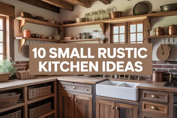
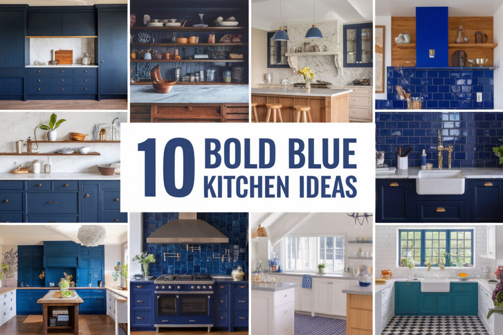
10 Blue Kitchen Ideas for Bold Bright Cooking Spaces
Blue kitchens age better than white, and I will die on that hill. White looks clean for five minutes, then life shows up with coffee splashes and fingerprints.
Blue forgives mess, adds personality, and still feels calm when the sink fills up.
I have tried trends, ignored others, and circled back to blue every single time. Trust me, this color knows how to handle real cooking and real people.
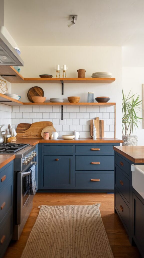
1. Navy Blue Cabinets That Anchor the Room
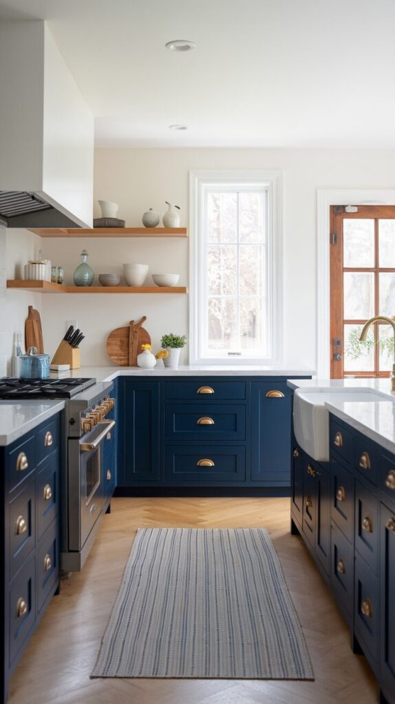
Every kitchen wants a grounding element, and navy cabinets handle that job without acting boring. Most kitchens float visually when cabinets feel too light or blend into the walls.
Navy pulls the room together and makes everything else feel intentional. I love how navy looks rich during the day and cozy at night, which white never quite nails.
Why This Works
Navy creates visual weight at eye level and below, which stabilizes the entire room. Your counters, backsplash, and hardware pop harder because navy plays a supporting role instead of stealing attention. The color hides wear better than lighter shades, which matters in kitchens that actually get used.
How to Do It
- Paint lower cabinets navy and keep uppers light to avoid heaviness.
- Choose a satin or semi-gloss finish for easy wipe-downs.
- Pair with warm metals like brass or brushed gold for contrast.
- Test samples under different lighting before committing.
Style & Design Tips
Avoid cool gray countertops because they fight with navy and make the space feel cold. Warm whites, wood tones, and creamy stone balance navy beautifully. Keep walls light so the cabinets feel intentional instead of overpowering.
Pro Tip or Budget Hack
Paint just the island navy if full cabinets feel scary or expensive. This move delivers impact without the full commitment and still reads designer-level IMO.
2. Soft Blue Walls That Brighten Without Blinding
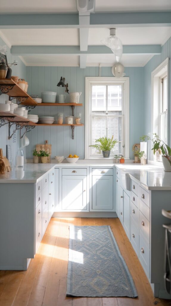
Some kitchens feel aggressive before you even make coffee, and wall color usually causes that mood. Soft blue walls calm the room while keeping it bright and fresh. This shade works especially well in kitchens with limited natural light. I use soft blue when I want color without chaos.
Why This Works
Soft blue reflects light gently and reduces glare from appliances and countertops. The color supports focus and comfort, which matters when you chop, cook, and clean. Blue also pairs well with almost every cabinet color, which keeps options open.
How to Do It
- Choose a muted blue with gray or green undertones.
- Test paint next to cabinets and backsplash tiles.
- Use eggshell or satin finishes for easy cleaning.
- Keep trim crisp white for contrast.
Style & Design Tips
Skip icy blues because they feel clinical fast. Dusty and slightly warm blues feel lived-in and welcoming. Add texture through wood shelves or woven accents to prevent flatness.
Pro Tip or Budget Hack
Paint one main wall blue and leave the rest neutral if budget runs tight. This approach still shifts the mood without buying gallons of paint.
3. Blue Kitchen Island That Steals the Spotlight
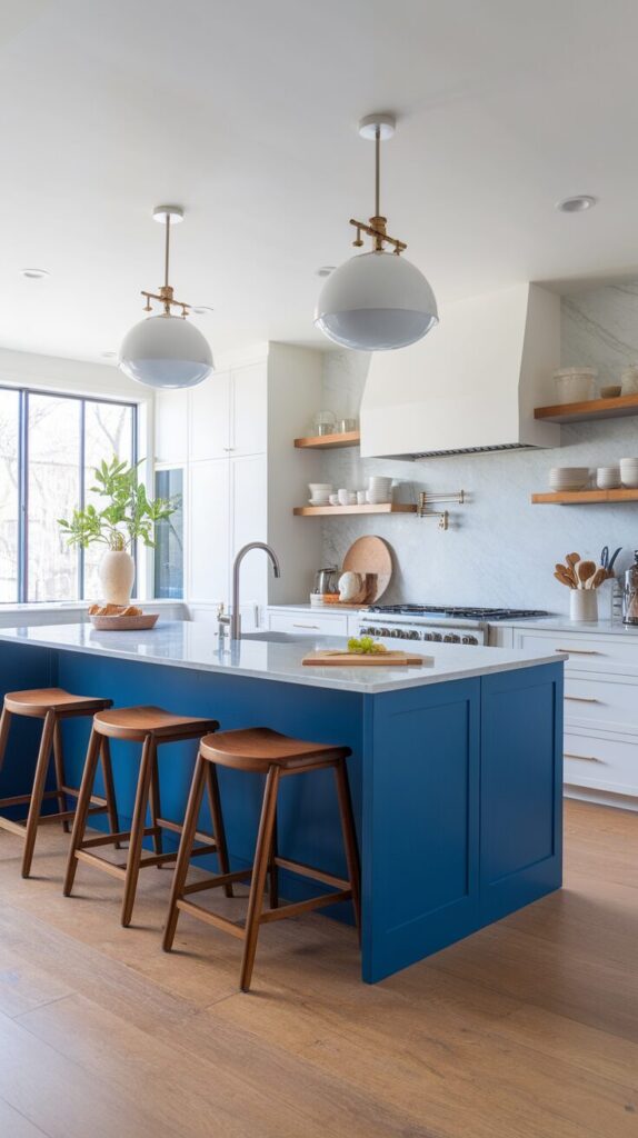
Everyone gathers around the island, so let it earn attention. A blue island adds personality without overwhelming the full kitchen. I treat the island like a statement piece instead of matching furniture. This idea works even in small kitchens.
Why This Works
The island naturally sits at the center of the room, which gives blue a clear moment. Color zoning helps define spaces in open layouts. Blue also hides scuffs from stools and feet better than light colors.
How to Do It
- Paint the island darker or bolder than the cabinets.
- Choose durable paint that handles traffic.
- Add contrasting hardware for definition.
- Balance with neutral counters or backsplash.
Style & Design Tips
Avoid matching island blue to walls exactly because the room feels flat. Contrast creates depth and keeps the island intentional. Add wood stools or woven seats for warmth.
Pro Tip or Budget Hack
Use peel-and-stick paint samples on the island first. This test saves money and stress before full commitment.
4. Blue Backsplash That Adds Depth and Shine
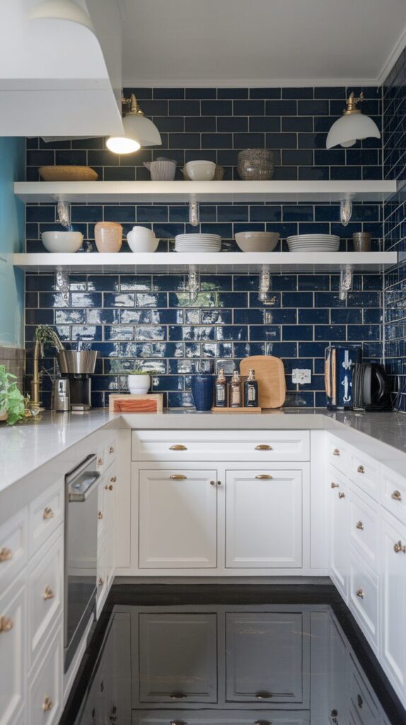
Backsplashes handle mess and style at the same time, so color matters. Blue tile adds dimension and movement without taking over the room. I love how blue tile changes tone throughout the day. This surface works hard and looks good doing it.
Why This Works
Tile reflects light and breaks up solid surfaces visually. Blue backsplash tiles complement both warm and cool kitchens. The color draws the eye upward and adds polish without clutter.
How to Do It
- Choose subway, zellige, or mosaic tiles in blue tones.
- Use light grout for a softer look or dark grout for drama.
- Extend tile to the ceiling behind open shelves.
- Keep counters simple to balance texture.
Style & Design Tips
Avoid too many blue shades unless you want a busy look. Stick to one tile style and let texture do the talking. Mix glossy and matte finishes carefully.
Pro Tip or Budget Hack
Install backsplash only behind the stove or sink first. This partial upgrade still transforms the kitchen while saving cash.
5. Two-Tone Blue and White Cabinets for Balance
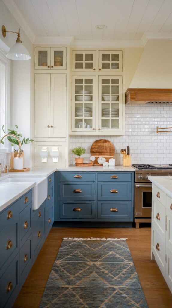
Two-tone kitchens solve the fear of color commitment. Blue lowers anchor the space while white uppers keep things airy. I recommend this setup for small kitchens or low ceilings. The contrast feels intentional and polished.
Why This Works
Light colors above eye level keep the room open. Blue below adds structure and hides wear. This balance supports flow and prevents the kitchen from feeling boxed in.
How to Do It
- Paint lower cabinets blue and uppers white.
- Match hardware across both sections.
- Keep counters neutral for cohesion.
- Use under-cabinet lighting for brightness.
Style & Design Tips
Avoid stark white because it clashes with blue warmth. Creamy whites soften the contrast and feel timeless. Add wood accents to bridge both tones.
Pro Tip or Budget Hack
Paint only the lower cabinets and leave uppers untouched. This move saves money and still delivers a full refresh.
6. Blue Appliances for a Retro or Modern Twist
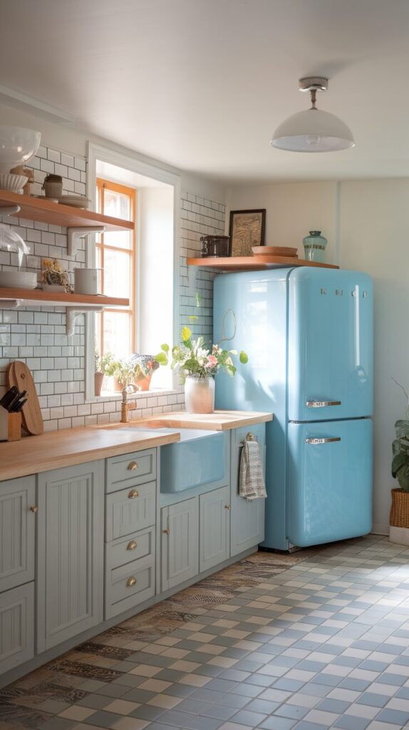
Standard stainless steel feels safe but predictable. Blue appliances inject personality and charm instantly. I love how a blue fridge becomes functional art. This choice works best when the rest stays simple.
Why This Works
Appliances already attract attention through size and placement. Blue turns that attention into style instead of distraction. The color personalizes the kitchen without remodeling.
How to Do It
- Start with one statement appliance like a fridge.
- Choose a shade that complements cabinets.
- Keep surrounding finishes neutral.
- Clean regularly to maintain shine.
Style & Design Tips
Avoid mixing multiple bold appliance colors. One hero piece feels curated while multiples feel chaotic. Pair with simple hardware and clean lines.
Pro Tip or Budget Hack
Use appliance wraps instead of replacements. These wraps cost less and let you change color later.
7. Blue Open Shelving That Feels Light and Fresh
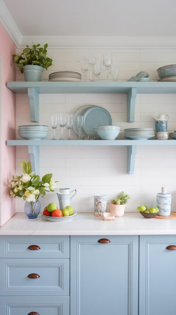
Open shelves scare people, but blue makes them feel intentional. Blue shelving frames dishes and adds depth without clutter. I prefer blue shelves over white because they hide dust better. This option suits renters and DIY lovers.
Why This Works
Color defines shelf boundaries and prevents visual blending. Blue contrasts with plates and glassware for clarity. Shelves feel decorative instead of temporary.
How to Do It
- Paint shelves blue or install pre-colored units.
- Keep items minimal and functional.
- Space shelves evenly for balance.
- Secure studs properly for safety.
Style & Design Tips
Avoid overcrowding shelves because blue amplifies clutter. Leave breathing room and repeat colors intentionally. Add greenery for softness.
Pro Tip or Budget Hack
Paint the wall behind shelves blue instead of the shelves. This trick creates the same effect with less work.
8. Blue Ceiling for Unexpected Drama
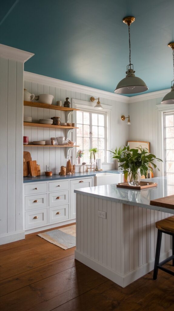
Ceilings rarely get attention, which makes them perfect for surprise. A blue ceiling adds depth and coziness without shrinking the room. I tried this once and never went back. The effect feels bold yet calming.
Why This Works
Color overhead draws the eye up and defines space. Blue ceilings soften harsh lighting and reduce glare. The room feels wrapped instead of exposed.
How to Do It
- Choose a lighter blue for low ceilings.
- Match undertones with wall color.
- Use flat or matte finishes.
- Paint trim to frame the ceiling.
Style & Design Tips
Avoid dark blue in tiny kitchens with no light. Soft blues keep the effect airy and intentional. Pair with warm bulbs for balance.
Pro Tip or Budget Hack
Paint only the tray or recessed portion of the ceiling. This partial approach delivers drama without full coverage.
9. Blue Accents Through Textiles and Decor
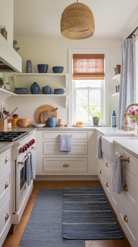
Commitment issues meet their match with blue accents. Rugs, curtains, and dishes introduce color without permanence. I rotate these seasonally for freshness. This idea suits anyone testing blue waters.
Why This Works
Accents layer color gradually and allow flexibility. Blue textiles soften hard surfaces and add comfort. You control intensity through quantity.
How to Do It
- Add a blue runner or mat near the sink.
- Swap dish towels and curtains seasonally.
- Display blue ceramics or glassware.
- Repeat the shade in small doses.
Style & Design Tips
Avoid random shades that clash visually. Stick to one blue family for cohesion. Mix textures to add interest.
Pro Tip or Budget Hack
Thrift stores carry great blue ceramics cheap. A few pieces create impact without overspending FYI.
10. Blue and Wood Combo for Warm Modern Kitchens
Blue alone can feel cool, but wood changes everything. Wood tones warm blue instantly and add depth. This combo feels modern and timeless at once. I use this pairing whenever a kitchen feels cold.
Why This Works
Wood introduces organic texture that balances blue coolness. The contrast feels natural and inviting. This pairing supports both rustic and modern styles.
How to Do It
- Pair blue cabinets with wood counters or shelves.
- Use wood stools or cutting boards.
- Match wood tone across elements.
- Seal wood properly for durability.
Style & Design Tips
Avoid orange-toned woods with cool blues. Neutral or warm woods pair best visually. Keep finishes consistent for polish.
Pro Tip or Budget Hack
Use wood-look laminate instead of solid wood. This option saves money and handles kitchen wear better.
Small Kitchen Layout Strategy: Build the Right Foundation First
Before you buy organizers, shelves, or compact appliances, you need a clear layout strategy. Small kitchens reward planning and punish impulse decisions. I always start with flow, zones, and daily habits before touching décor.
Think about how you move when you cook, clean, and put groceries away. Pay attention to where you naturally reach and where you feel blocked. When you design around real behavior instead of trends, everything starts working together.
Define Functional Zones
Every small kitchen needs clear zones, even if it feels tiny. You still need a prep zone, cooking zone, cleaning zone, and storage zone. When you mix them up, you create traffic jams fast.
Group tools and ingredients near where you use them. Keep knives and cutting boards close to prep areas. Store pots near the stove and dishes near the dishwasher.
Prioritize Flow Over Aesthetics
Pretty kitchens fail when they ignore movement. I always test layouts by pretending to cook a full meal from start to finish. If I feel cramped or forced to step around things, I rethink the setup.
Leave clear walking paths, even if that means reducing decorative elements. Good flow makes a small kitchen feel bigger than any paint color ever will. Function creates beauty in tight spaces.
Measure Twice, Buy Once
Small kitchens leave zero room for sizing mistakes. I measure walls, cabinet depths, appliance clearances, and door swings before buying anything. One oversized piece can ruin the balance.
Use painter’s tape to outline new items on the floor. This simple trick helps you visualize scale before committing. It saves money and regret every single time.
Smart Storage Planning for Long-Term Organization
Storage fixes don’t stick when they ignore daily reality. I plan storage around frequency of use, not just categories. The items you use daily deserve prime real estate.
Store rarely used appliances higher or deeper in cabinets. Keep everyday tools within easy reach and eye level. This simple rule keeps your kitchen functional without constant reorganization.
Use Vertical Space Intentionally
Vertical storage works only when it stays accessible. Install shelves, hooks, or tall cabinets, but make sure you can actually reach them safely. Otherwise, they turn into clutter magnets.
Add a small step stool if needed, and assign upper areas to lightweight or seasonal items. Intentional vertical storage adds space without adding chaos.
Create Visual Breathing Room
Not every inch needs to hold something. Small kitchens benefit from negative space that allows the eye to rest. When everything feels packed, the room shrinks instantly.
Leave a portion of your counter clear on purpose. Keep one wall or section visually simple. This balance keeps the space calm and inviting.
Budget Planning for Mini Kitchen Upgrades
Renovations get expensive fast, especially when you chase every trend. I always rank upgrades by impact versus cost before spending money. Some small changes create massive results.
Lighting, paint, and organization often deliver the biggest return for the lowest investment. Custom cabinetry and structural changes cost more and require long-term planning. Start small and scale up gradually.
Invest Where It Matters Most
Spend money on items you use daily, like quality drawer slides or durable countertops. Save on decorative accessories that you can swap out later. This approach protects your budget.
Focus on upgrades that improve daily function first. A smooth workflow pays off more than trendy finishes. Practical improvements build long-term satisfaction.
Avoid Trend-Driven Decisions
Trends move fast, especially in kitchens. I’ve watched bold tile colors and dramatic hardware lose appeal quickly. Small kitchens feel the impact of dated trends even more.
Choose timeless materials and neutral foundations. Add personality through accessories and smaller details. This strategy keeps your kitchen flexible for future updates.
Common Mistakes to Avoid in Small Kitchens
Small kitchens demand precision, and small mistakes create big problems. I’ve made a few of these myself and learned the hard way. Avoiding them will save you time, money, and frustration.
Overcrowding Every Surface
Many people try to maximize storage by filling every corner. That approach makes the room feel claustrophobic. Leave breathing room and let surfaces stay partially clear.
Clutter reduces functionality and increases stress. A clean counter improves both cooking and visual balance.
Ignoring Lighting Layers
One overhead light never works in a small kitchen. Dark corners make the space feel smaller and harder to use. Add layered lighting from the start.
Combine task lighting, ambient lighting, and subtle accent lighting. Balanced light improves both function and atmosphere.
Choosing Oversized Fixtures
Large pendant lights or bulky stools overwhelm compact layouts. Scale matters more than style in small kitchens. Always measure and visualize before purchasing.
Stick with slimmer, proportional fixtures that match the room’s size. Proper scale keeps everything cohesive.
Skipping Storage Planning
Buying organizers without a clear plan wastes money. Random bins and baskets create more confusion over time. Plan zones and categories first.
Define purpose before buying containers. Storage tools should support your system, not define it.
Mixing Too Many Finishes
Small kitchens struggle with visual overload. Too many colors, metals, or patterns fragment the space. Keep your palette controlled.
Choose two to three primary finishes and repeat them consistently. Cohesion creates calm.
Frequently Asked Questions
How can I make my small kitchen look bigger without renovating?
Use light colors, layered lighting, and consistent finishes. Keep counters mostly clear and avoid heavy upper cabinetry when possible.
What is the best layout for a very small kitchen?
Galley and one-wall layouts often work best. They create efficient workflow and keep everything within reach.
Are open shelves practical in small kitchens?
They work well when you keep them curated and organized. Store daily-use items and avoid overcrowding them.
How do I add storage without making the kitchen feel cramped?
Use vertical space, slim pull-outs, and hidden storage like benches or tall cabinets. Leave some negative space to maintain balance.
Should I choose dark or light cabinets for a mini kitchen?
Light cabinets usually make small kitchens feel larger and brighter. You can add depth with darker accents instead of full dark cabinetry.
What upgrade delivers the biggest impact on a small budget?
Lighting and paint usually offer the most dramatic transformation. They improve both mood and visual size without major construction.
Final Thoughts
You do not need to overhaul your entire kitchen to make blue work. Start with one idea and let the space guide the rest. I always tell friends to trust their gut and ignore trend pressure. Try one blue change, live with it, and build from there when it feels right.