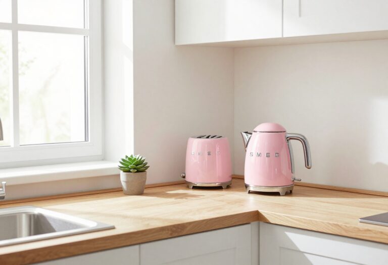
10 Creative Kitchen Color Palette Ideas for a Fresh, Pulled-Together Look
Your kitchen is the heart of the home, but choosing a color palette can feel overwhelming. You want something that looks great, feels cohesive, and doesn't clash with your existing cabinets or countertops. The good news?
A thoughtful color scheme can actually make your kitchen feel more spacious and organized—especially when you pair it with smart storage choices. Think of color as the backbone of your kitchen's personality.
Whether you're drawn to warm earthy tones or crisp modern hues, the right palette sets the stage for everything else. And when you weave in storage-savvy elements like open shelving or pull-out drawers, your kitchen becomes both beautiful and functional.
1. Soft Sage and Warm Wood
There’s a reason sage green has become a kitchen darling—it’s calm without being boring. Pair it with warm butcher-block countertops and open wooden shelving, and you get a space that feels both grounded and airy. The wood tones keep the green from feeling too cool, while glass jars on the shelves turn pantry staples into part of the decor.
It’s a look that says “I have my act together” without trying too hard.
Why It Works
Sage green is naturally soothing, which makes the kitchen feel like a retreat rather than a workspace. The warm wood adds contrast and texture, preventing the room from looking flat or sterile. Together, they create a balanced palette that feels timeless but current.
Best For
This combo shines in kitchens with good natural light, where the green can shift from soft to vibrant depending on the time of day. It also works well in open-concept homes where you want the kitchen to blend smoothly into living or dining areas.
Styling Tip
Keep countertops clutter-free by using those glass jars for flour, sugar, pasta, and coffee beans—they’re practical and pretty. Add a few wooden cutting boards leaning against the backsplash for extra warmth without adding visual noise.
2. Navy Blue and Brass Accents
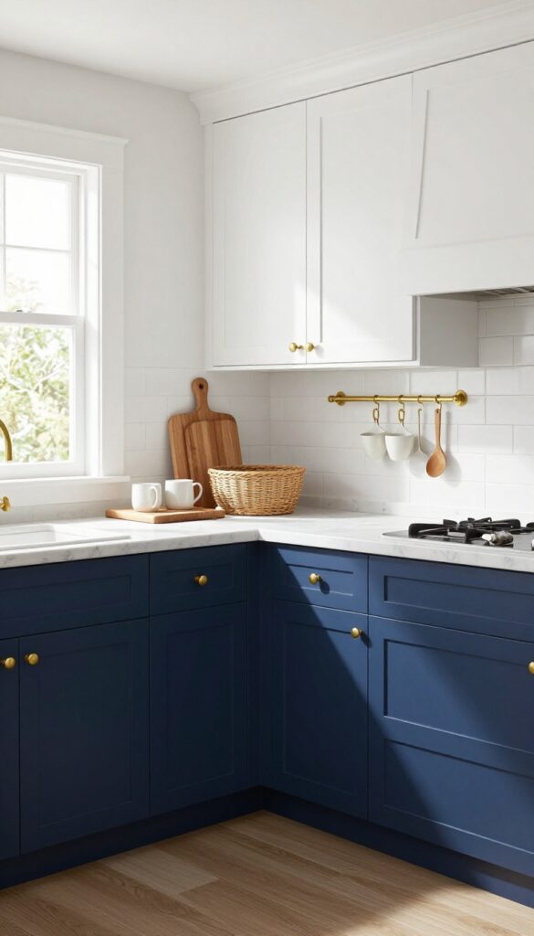
Deep navy lower cabinets paired with warm brass hardware bring instant sophistication to a kitchen. The dark base anchors the room while keeping upper walls light—white or cream works beautifully—so the space never feels heavy or closed in. It’s a look that feels polished but not fussy, and it gives you plenty of room to play with texture through wood cutting boards, woven baskets, or marble countertops.
Why It Works
The contrast between navy and brass creates visual interest without needing extra patterns or busy backsplashes. Navy hides everyday kitchen grime better than lighter shades, making it a practical choice for busy households. Brass adds warmth that prevents the dark blue from reading too cold or formal.
Best For
This palette shines in kitchens with good natural light where the navy can read as a true deep blue rather than black. It’s especially fitting for galley kitchens or smaller spaces where lower cabinets anchor the room and upper cabinets stay light to maintain an airy feel.
Styling Tip
Swap out standard cabinet pulls for unlacquered brass cup pulls on drawers and bin pulls on doors—they develop a subtle patina over time that adds character. Install a brass rail along the backsplash to hang frequently used mugs and utensils; it frees up drawer space and turns everyday tools into decor.
3. Creamy White and Terracotta
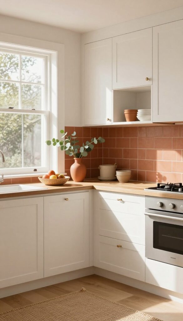
White kitchens are classic, but they can sometimes feel a little cold or clinical. That’s where terracotta comes in—it adds warmth and earthiness without overpowering the space. Pairing creamy white cabinetry with terracotta backsplash tiles or accessories creates a balanced look that feels both fresh and grounded.
The clay tones soften the crispness of white, making the kitchen feel more inviting and lived-in.
Why It Works
Terracotta brings natural warmth that prevents all-white kitchens from looking sterile. It’s a low-commitment way to add color—you can swap out accessories seasonally or keep them permanent with tile. The combination also plays well with natural materials like wood and stone, which you might already have in your kitchen.
Best For
This palette is ideal for kitchens that get plenty of natural light, as the white helps bounce light around while terracotta adds coziness. It works especially well in open-concept layouts where you want the kitchen to feel connected to adjacent living spaces without feeling too stark.
Styling Tip
Use terracotta pots for utensil storage and a fruit bowl on the counter for easy access. If you’re not ready to commit to terracotta tile, try adding a few ceramic canisters or a clay pitcher as a vase. For extra texture, bring in woven baskets or a jute runner.
4. Charcoal and Blush Pink
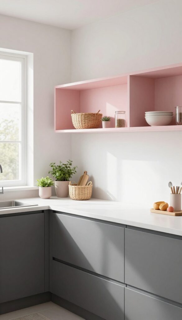
If you want a kitchen that feels both grounded and airy, charcoal gray and blush pink make an unexpected but totally charming pair. The deep charcoal brings weight and sophistication, while the soft pink keeps things light and approachable. It’s a look that reads modern but never cold, thanks to that warm blush counterbalance.
Why It Works
The contrast between dark and light creates visual interest without overwhelming the space. Charcoal hides smudges and wear on lower cabinets—perfect for busy kitchens—while blush adds a soft focal point that makes the room feel inviting. Plus, the two tones naturally define zones: lowers for heavy use, uppers for display.
Best For
This palette shines in kitchens that get good natural light, because the pink can read muddy in dim rooms. It’s ideal for open-concept homes where you want the kitchen to feel connected to living areas without screaming for attention. Also great for renters who can paint an accent wall or swap hardware without a full reno.
Styling Tip
Maximize storage by fitting pull-out drawers in all your charcoal lower cabinets—deep drawers for pots, shallow ones for utensils. On open shelves painted blush or backed with blush wallpaper, store everyday dishes in matching white stoneware and add a few woven baskets for pantry overflow. Keep countertops clutter-free; let the cabinets do the heavy lifting.
5. Mustard Yellow and Slate Gray
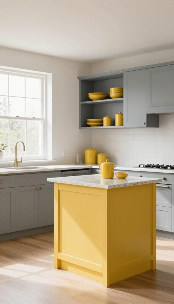
A mustard yellow island or backsplash pops against slate gray cabinets, bringing warmth to an otherwise cool palette. Yellow energizes the space while gray keeps it grounded, making the kitchen feel both lively and balanced. It’s a bold move that still feels totally livable.
Why It Works
The contrast between cheerful yellow and deep gray creates visual interest without overwhelming the room. Gray acts as a neutral anchor, so the yellow doesn’t feel chaotic—just bright and inviting. It’s a pairing that feels modern but also timeless.
Best For
Kitchens with good natural light where the yellow can really shine. It works especially well in open-plan spaces because the gray helps the eye flow into adjoining rooms. If you love color but want to keep things sophisticated, this is your match.
Styling Tip
Use labeled canisters on the counter for coffee and tea—they’re both decorative and practical. Add open shelving in slate gray with a few yellow ceramic pieces to tie the look together. Keep countertops mostly clear to let the color combo do the talking.
6. Olive Green and Natural Linen
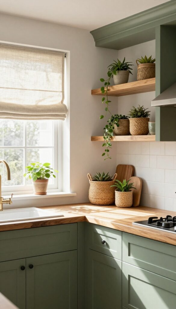
Olive green cabinets bring a grounded, organic feel to the kitchen without going full forest. Pair them with linen-textured curtains or roman shades in natural off-white, and you get a space that feels both earthy and airy. The soft green works beautifully with wood tones, so consider open shelving in warm oak or a butcher block countertop to tie everything together.
Why It Works
Olive green is forgiving—it hides smudges better than white or black, and it doesn’t show every crumb. The linen adds softness and texture, making the room feel more lived-in and less sterile. Plus, the combo naturally encourages a storage-smart mindset: woven baskets on top of cabinets become both decor and hidden storage for rarely used items.
Best For
This palette shines in kitchens that get plenty of natural light, where the olive can read as fresh rather than dark. It’s also great for open-concept spaces because it bridges the gap between indoor and outdoor vibes. If your kitchen has exposed wood beams or a farmhouse sink, even better.
Styling Tip
Use woven baskets on top of upper cabinets to store infrequently used items like holiday platters or extra linens. Stick to natural materials—rattan, seagrass, or jute—to reinforce the organic look. For an extra touch, add a few trailing plants on top of the cabinets to soften the line between storage and decor.
7. White and Black with Wood Accents
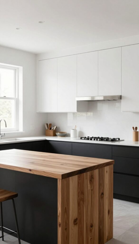
High-contrast kitchens never go out of style, and this one proves it with a fresh twist. White upper cabinets keep things light and open, while black lower cabinets ground the space and add drama. A wood butcher-block island brings in warmth, making the whole look feel approachable rather than stark.
The mix is bold but balanced—perfect for a kitchen that feels both polished and lived-in.
Why It Works
- The strong contrast creates visual interest without needing extra decor. White reflects light, making the room feel bigger, while black anchors the design. Wood softens the edges and adds texture, so the space doesn't feel cold or clinical.
- It's a timeless trio that works in modern, farmhouse, or transitional kitchens.
Best For
This palette shines in medium to large kitchens where you can fully appreciate the contrast. It's especially great for open-concept layouts where the kitchen flows into living spaces—the white keeps it airy, and the black defines the zone without walls.
Styling Tip
Free up drawer space by installing magnetic knife strips on the backsplash between the upper and lower cabinets. It keeps knives handy and adds a sleek, professional touch. Stick to stainless steel or black hardware to keep the look cohesive.
8. Dusty Blue and Copper
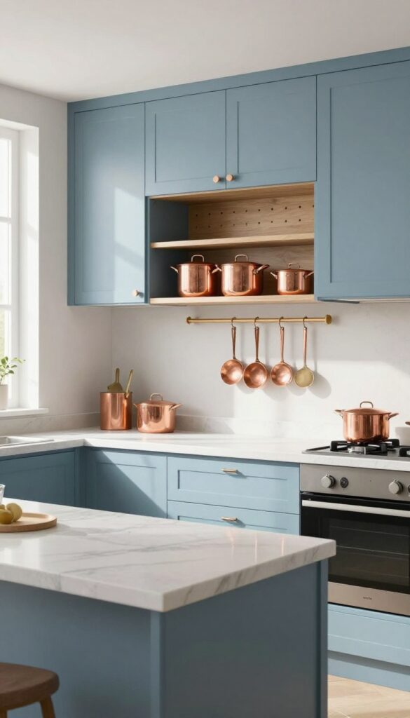
Dusty blue cabinets bring a sense of calm to the kitchen, like a quiet morning sky. Pair them with copper handles and light fixtures, and suddenly the space feels warm and inviting—not cold or sterile. The real trick here is adding a pegboard wall for your pots and pans; it turns everyday storage into a design feature that’s both practical and pretty.
Why It Works
The dusty blue is soft enough to keep the kitchen feeling open, while copper adds just the right amount of warmth without overwhelming the space. The pegboard keeps cookware within arm’s reach and visually breaks up the cabinetry, making the room feel curated rather than cluttered.
Best For
This palette is ideal for kitchens that get good natural light, as the blue can read a bit darker in dim spaces. It works beautifully in open-plan layouts where you want the kitchen to feel connected to adjacent living areas without screaming for attention.
Styling Tip
Stick with matte finishes for both the cabinet paint and the copper hardware—it keeps the look grounded and modern. For the pegboard, use a warm wood tone or paint it the same dusty blue to let the copper really pop.
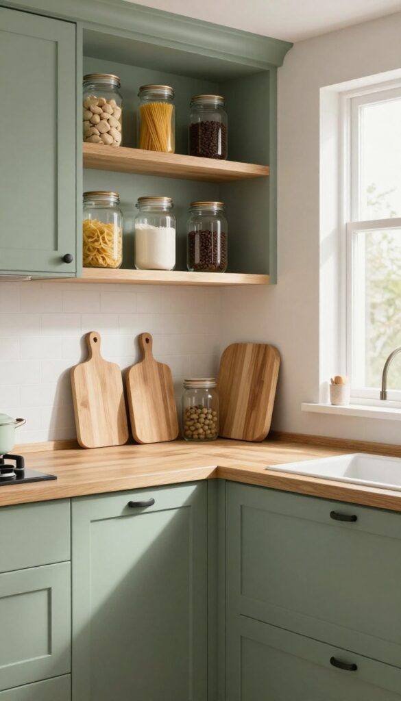
9. Warm Beige and Sage Green
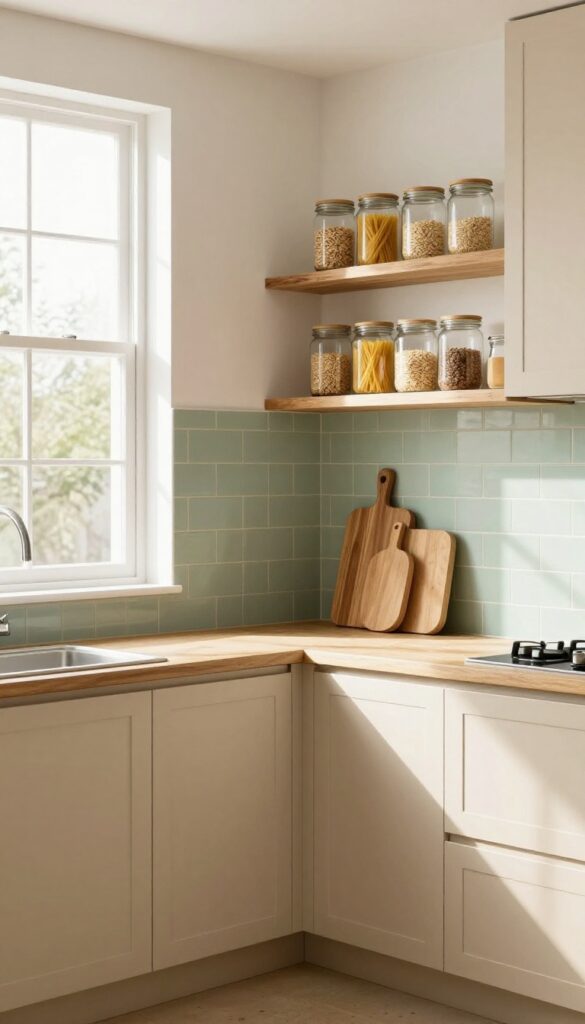
Beige cabinets might sound basic, but pair them with sage green subway tile and the whole kitchen wakes up. The combination feels grounded and cozy, like a breath of fresh air without trying too hard. It’s a palette that works especially well in kitchens that get lots of natural light, where the green can shift from soft to vibrant throughout the day.
Why It Works
Beige is warm and forgiving—it hides crumbs and smudges better than white—while sage green adds a calm, organic energy. Together they create a neutral backdrop that feels finished but not fussy. Plus, both colors are easy to accessorize with wood tones, black metals, or warm brass.
Best For
This palette is ideal for kitchens that double as gathering spaces, where you want a relaxed but put-together feel. It’s also great for rental kitchens or anyone who wants to avoid trend-driven colors that might feel dated in a few years.
Styling Tip
Use clear glass containers on open shelves for dry goods like pasta, oats, and spices. They keep the pantry organized and visible while adding a clean, purposeful look that complements the earthy tones. Add a few wooden cutting boards or a live-edge shelf for extra warmth.
10. Two-Tone Gray and White with Gold
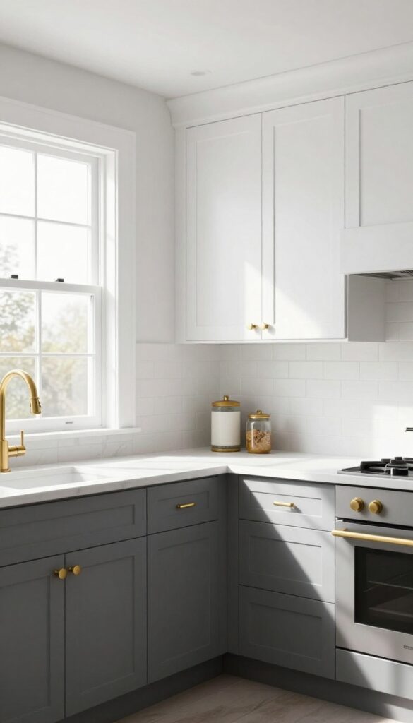
Gray and white is a classic kitchen duo, but when you split them between upper and lower cabinets, the whole space gains a custom, layered feel. The darker gray anchors the room while the white keeps it airy, and gold hardware adds just enough warmth to keep things from feeling cold. It’s a look that feels both polished and inviting, without trying too hard.
Why It Works
The two-tone approach adds visual interest without overwhelming the eye. Gray lower cabinets hide dirt and wear better than white, while white uppers reflect light and make the ceiling feel higher. Gold hardware ties the two together and introduces a subtle luxe touch that elevates the whole palette.
Best For
This palette works well in kitchens with good natural light, where the contrast can really shine. It’s especially great for galley or L-shaped layouts where you want to define zones—darker lowers ground the cooking area, while bright uppers keep the space open.
Styling Tip
Add a rolling cart in either gold or gray for extra counter space and storage—it’s practical and reinforces the color scheme. Use open shelving on one wall with white dishes and a few gold accents to tie everything together.
FAQ
How do I choose a kitchen color palette that won't feel dated in a few years?
Stick with timeless base colors like white, gray, navy, or sage green, and add trendy pops through accessories that are easy to swap out. This way your major investment stays fresh while you can update accents as styles change.
Can I use dark colors in a small kitchen without making it feel cramped?
Absolutely! Dark colors can actually add depth and coziness. To keep the space open, use dark on lower cabinets or an island, and keep upper cabinets or walls light.
Good lighting and reflective surfaces like mirrors or glossy backsplashes also help.
What are some storage-smart color ideas for open shelving?
Stick to a cohesive color scheme for items on display—like matching white dishes or glass jars with uniform labels. This creates a curated look even when shelves are full. Use baskets or bins in your accent color to hide less attractive items.
How can I incorporate color without painting cabinets?
You can add color through backsplash tiles, a painted island, colorful appliances, or even a vibrant rug. Peel-and-stick wallpaper is another renter-friendly option for an accent wall or behind open shelves.
What's the best way to test a kitchen color palette before committing?
Paint large swatches on foam boards and place them around your kitchen at different times of day to see how light changes the color. Also, hold up fabric samples or tile pieces next to the swatches to ensure everything harmonizes.
Conclusion
Choosing a kitchen color palette is one of the most fun parts of decorating—and when you pair it with smart storage ideas, your kitchen becomes both beautiful and efficient. Whether you go bold with navy and brass or keep it soft with sage and wood, the key is to pick colors that make you happy every time you walk in.
Remember, you don't have to do everything at once. Start with one element—like painting the island or adding a colorful backsplash—and build from there.