15 Earthy Boho Living Room Color Ideas for Natural Warmth
Earthy boho style is all about grounding your space with nature-inspired hues while keeping things light and airy. But achieving that warm, lived-in feel doesn't mean piling on layers of clutter or going full-on hippie.
A modern, clean take on boho uses color as the star—think muted terracottas, soft sage greens, and warm beiges that feel curated, not chaotic. These 15 color ideas will help you bring natural warmth into your living room without sacrificing a polished look.
Each palette is designed to be easy to live with, visually interesting, and totally Pinterest-worthy.
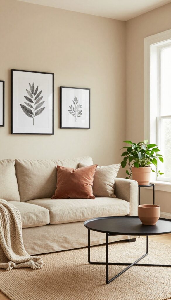
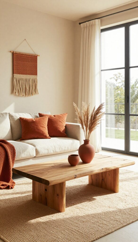
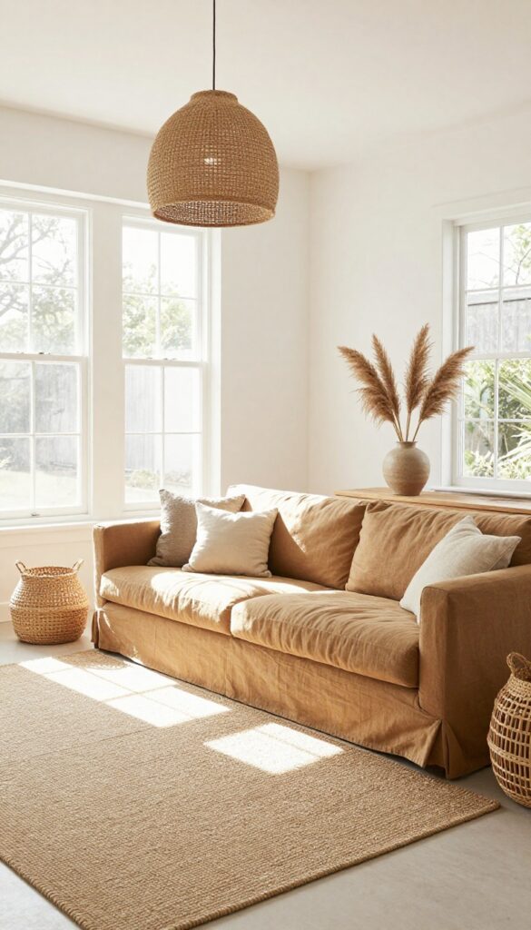
1. Terracotta Accent Wall with Cream Neutrals
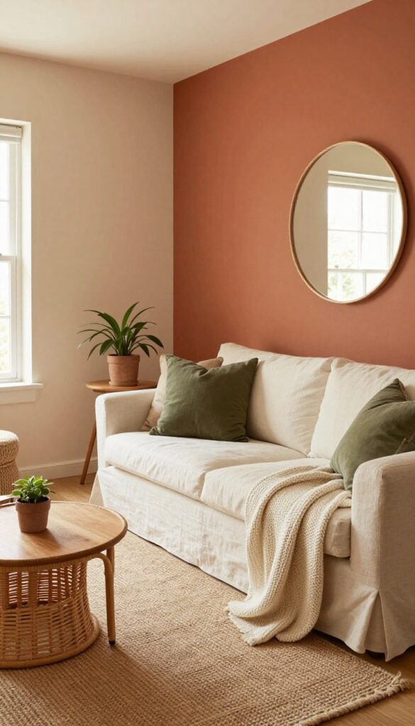
There’s something about terracotta that instantly warms up a room without making it feel small. When you paint just one wall in this rich, earthy clay tone, it becomes the anchor for everything else. The rest of the space stays light and airy with creamy whites and warm beiges, so the overall look feels grounded but not heavy.
A terracotta accent wall pairs beautifully with soft, neutral furnishings. Think a linen sofa in off-white, a jute rug, and rattan side tables. The contrast between the bold wall and the pale surroundings keeps the room from feeling too dark or too stark.
It’s a look that works in living rooms, bedrooms, and even dining nooks.
Best Colors
Stick with warm, muted tones. Pair terracotta with cream, ivory, or warm beige on the other walls. Add touches of olive green or rust in pillows or throws for depth, but keep the base palette simple.
Texture Mix
Balance the smooth painted wall with natural textures. A chunky knit throw, a linen sofa, and a woven rattan chair add visual interest without clutter. The mix keeps the room feeling layered and lived-in.
Finishing Touch
Hang a large round mirror or a piece of abstract art on the terracotta wall. The reflective surface bounces light around the room and prevents the wall from feeling too dominant.
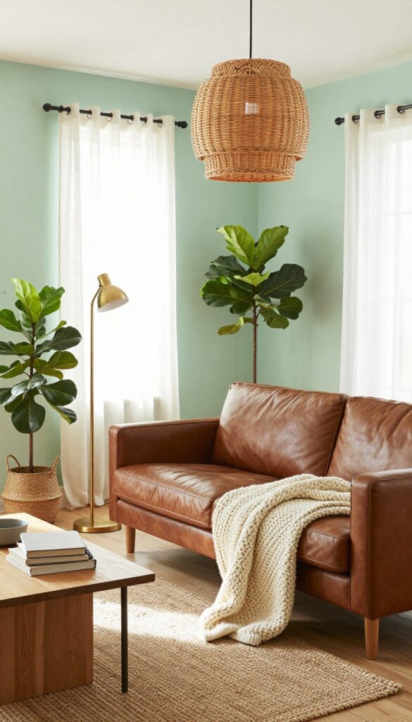
2. Sage Green Walls with Warm Wood Tones
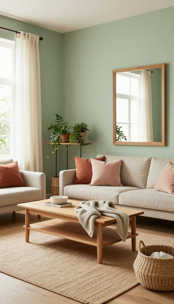
Soft sage green walls instantly bring a room to life without shouting for attention. It’s a color that feels grounded and fresh, like a quiet morning in a sunlit forest. Pairing it with warm wood tones keeps the space from feeling too cool or sterile, adding just the right amount of natural warmth.
This combination works beautifully in living rooms where you want a calm, inviting atmosphere. The green acts as a neutral backdrop, letting wood furniture and creamy textiles take center stage. Light oak or ash pieces keep the look airy, while a jute rug adds texture underfoot.
Finish with linen curtains and a few woven baskets for storage, and you’ve got a room that feels both put-together and relaxed.
Best Colors
Stick with muted sage greens that have a hint of gray to keep the vibe modern. Pair with warm whites like cream or ivory for trim and ceilings. Accent colors can include terracotta, soft blush, or muted mustard for pillows and throws.
Texture Mix
Balance the smoothness of painted walls with plenty of natural textures. A chunky knit throw, a flatweave jute rug, and linen curtains add depth. Wood furniture should have visible grain—avoid high-gloss finishes that feel too sleek.
Finishing Touch
Add a large mirror with a warm wood frame to reflect light and make the room feel bigger. Hang it opposite a window to bounce natural light around the space. A few trailing plants on a shelf complete the earthy look.
3. Warm Beige and Clay with Black Accents
This palette feels grounded without being heavy. Warm beige walls or a beige sofa create a soft, neutral foundation, while clay-toned pillows and throws add earthy warmth. Black accents—like a slim coffee table or framed art—introduce crisp contrast that keeps the look modern and clean.
It's a balancing act between cozy and structured, perfect for living rooms that want to feel both inviting and intentional.
Start with a warm beige base—think sandy or oat-colored walls, a linen sofa, or a textured area rug. Layer in clay through velvet pillows, a chunky knit throw, or ceramic vases. Black elements should be deliberate: a black metal floor lamp, a slim black coffee table, or black-framed botanical prints.
The key is restraint—too much black can make the room feel stark, but used sparingly, it grounds the warm tones and adds a crisp edge.
Best Colors
Choose a warm beige like Sherwin-Williams Accessible Beige or Benjamin Moore Navajo White for walls. For clay, look for shades like baked terracotta, rust, or muted brick. Black should be a true charcoal or matte black—avoid glossy finishes to keep the look soft.
Texture Mix
Combine smooth linen or cotton for the base, then add nubby clay-colored wool throws, matte ceramic accessories, and a sleek black metal or wood coffee table. A jute or sisal rug underfoot adds natural texture without competing with the beige.
Finishing Touch
Add a single black-framed mirror or a set of black candle holders on the coffee table. A trailing pothos plant in a clay pot brings life and reinforces the earthy palette.
4. Dusty Rose and Olive Green Combo
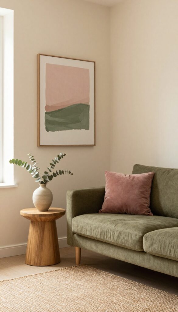
Pairing dusty rose with olive green is like bringing a garden into bloom inside your living room. The softness of rose keeps the space from feeling too heavy, while olive green adds a grounded, organic anchor. This combination works especially well in rooms with good natural light, where the colors can shift and breathe throughout the day.
It's romantic without being precious, earthy without feeling rustic.
Start with a neutral base—think warm beige or soft cream walls—then layer in dusty rose and olive green through textiles and furniture. A dusty rose accent chair or a vintage-inspired rug sets the romantic tone, while olive green throw pillows or a linen sofa add depth. The key is balance: let one color dominate and the other accent.
For a modern edge, choose clean-lined furniture in matte finishes, and keep accessories minimal. A few ceramic vases in muted terra-cotta or dried eucalyptus stems tie the palette together without clutter.
Best Colors
- Stick to muted, dusty versions of both shades. Think blush pink with a hint of brown, and olive green that leans gray rather than bright. Avoid pastel pink or neon green—they'll break the earthy mood.
- A warm white or cream as a third color keeps the look airy.
Texture Mix
Velvet for the dusty rose adds softness and sheen; linen or cotton for olive green keeps it casual. A chunky knit throw in cream bridges the two. Add a jute rug or a woven basket for natural texture that grounds the pairing.
Finishing Touch
Hang a large abstract print that blends dusty rose and olive green washes. Or style a shelf with a few ceramic pieces in both colors, plus a trailing pothos plant. The greenery echoes the olive tone and brings life to the arrangement.
5. Ochre Yellow with Natural Linen
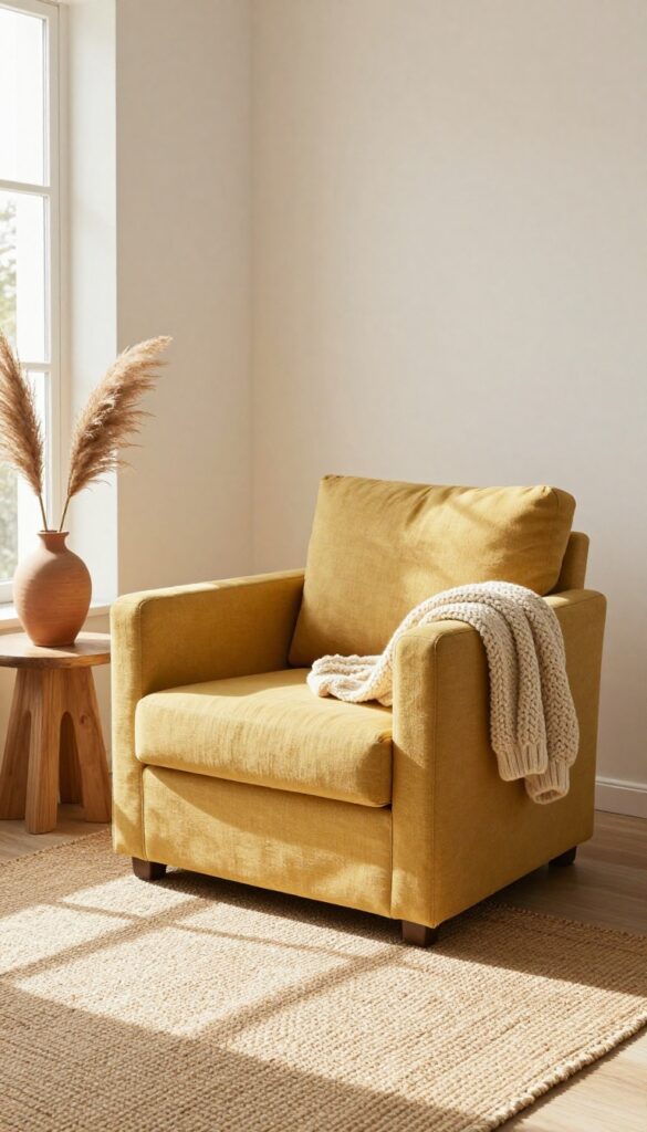
Yellow can feel risky in a boho space, but ochre is the perfect muted, earthy version. It brings warmth without screaming for attention. Paired with natural linen, it feels grounded and modern—not like a preschool playroom.
Start with one statement piece in ochre yellow: a cozy armchair, a large floor cushion, or even a textured throw. Keep your sofa, walls, and larger furniture in soft linen tones—think undyed flax, cream, or light sand. This lets the ochre stand out without competing.
Add a chunky knit blanket in cream and a woven jute rug to reinforce the natural texture. For a finishing touch, bring in a few dried pampas grass stems or a ceramic vase in a warm terracotta. The result is a living room that feels sunny but serene, with just the right pop of color.
Best Colors
Ochre yellow (#CC7722) as the accent, with natural linen (#F5E6D3) as the base. Add in cream (#FFFDD0), warm taupe (#A89F91), and a touch of terracotta (#E2725B) for depth.
Texture Mix
Pair the smooth, matte finish of linen with the nubby texture of wool or chunky cotton. A flat-weave jute rug adds organic roughness, while a velvet ochre cushion brings a hint of luxury. This contrast keeps the space visually interesting without clutter.
Small-space Fix
In a compact room, use ochre in a single floor cushion or a small ottoman instead of a chair. It still delivers the color pop but takes up less visual real estate. Keep the rest of the room in light linen tones to maintain an airy feel.
6. Deep Forest Green and Tan Leather
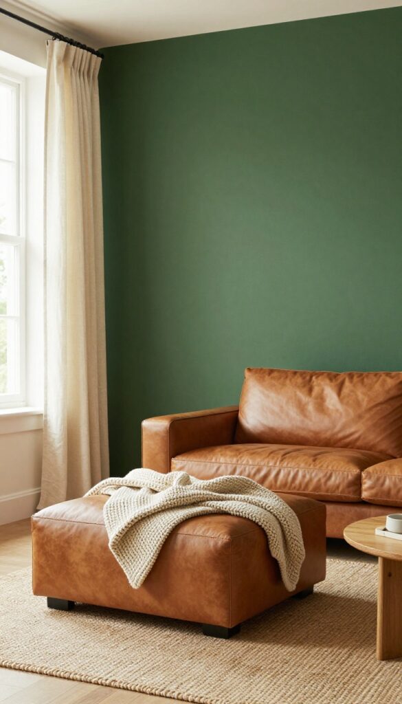
Deep forest green brings a grounded, moody richness that instantly makes a living room feel like a retreat. Pairing it with tan leather keeps the look from going too dark or serious—the warm caramel tones add a soft, lived-in contrast that feels both modern and inviting. Cream curtains and natural light balance the palette, so the room stays airy without losing its cozy edge.
A deep forest green sofa or accent wall sets a bold foundation, while tan leather ottomans or a pouf introduce organic warmth and texture. Cream linen curtains soften the light and keep the space from feeling closed in. This combination works especially well in medium to large living rooms, where the dark green can anchor the room without overwhelming it.
Best Colors
Stick to a deep, slightly muted forest green (think Benjamin Moore Essex Green or Sherwin-Williams Rookwood Dark Green) for the main piece or wall. Pair it with tan leather in a medium caramel shade—not too yellow or orange. Add cream or off-white for curtains and smaller textiles, and use black or dark wood for accents like lamp bases and picture frames.
Texture Mix
Balance the smooth finish of leather with nubby textures: a chunky knit throw on the sofa, a jute or sisal rug underfoot, and matte ceramic or stone accessories. The contrast between the sleek leather and these natural fibers keeps the room from feeling flat or too polished.
Lighting Tip
- Because deep green absorbs light, layer in warm ambient lighting. Use a floor lamp with a linen shade in one corner and a table lamp on a console table. Dimmable overhead lights let you adjust the mood—bright for daytime, dim for evening coziness.
- Avoid cool white bulbs; stick to soft white (2700K–3000K) to keep the tan leather glowing.
7. Sand and Driftwood with Pops of Rust
This palette feels like a coastal walk meets autumn warmth. Sand-colored walls keep the room airy, while driftwood-toned furniture adds that weathered, natural base. Rust accents then step in to create a cozy contrast—think burnt orange cushions, a textured wall hanging, or a simple ceramic vase.
It’s earthy without being heavy, and warm without feeling dark.
Start by painting your walls a soft sandy beige or warm off-white. Then bring in a sofa or coffee table in a light, washed wood—like ash or reclaimed driftwood. Layer in rust through textiles and decor: a few throw pillows, a chunky knit blanket, or a handwoven wall piece.
A rust-colored ceramic vase on the coffee table or a side table ties it all together. The key is keeping the rust as an accent, not overwhelming the room. This combo works beautifully in living rooms that get good natural light, as the sand tones bounce light around while rust adds depth.
Best Materials
Stick with natural textures: linen for curtains and cushions, jute or sisal for rugs, and unfinished wood for furniture. A driftwood coffee table or side table feels right at home here. For the rust accents, look for matte ceramic, wool, or cotton—avoid shiny or synthetic finishes that would clash with the earthy vibe.
Layout Tip
Arrange your seating to face a focal point like a fireplace or a large window. Keep the layout open and uncluttered—driftwood furniture tends to be slim and low-profile, so let it breathe. A low coffee table in front of a neutral sofa, with rust pillows on each end, creates a balanced, inviting setup.
Finishing Touch
Add a dried eucalyptus or pampas grass arrangement in a rust-toned vase. It brings in organic shape and a subtle earthy scent, reinforcing the natural warmth without adding clutter. Place it on a console table or the coffee table for a simple, sculptural detail.
8. Muted Lavender and Warm Gray
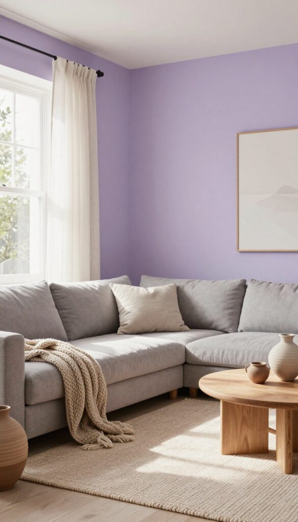
Lavender might feel like a stretch for a boho living room, but when you mute it down and anchor it with warm gray, it becomes unexpectedly sophisticated. This pairing brings a soft, earthy energy without going full flower-child. It works especially well in rooms with good natural light, where the lavender reads as a gentle neutral rather than a loud color.
The warm gray keeps everything grounded, so the space feels calm and collected, not overly sweet or feminine.
Start by introducing muted lavender on a single accent wall or through a large area rug. A wall painted in a dusty lavender sets a serene backdrop without overwhelming the room. If painting feels too permanent, a wool or flat-weave rug in a lavender tone can achieve the same effect with more flexibility.
Pair that with a warm gray sofa—think greige or a gray with beige undertones—to create a cozy, grounded seating area. White trim and light oak or natural wood accents keep the look fresh and modern. Add texture with chunky knit throws, linen curtains, and a few ceramic vases in neutral tones.
The result is a living room that feels both airy and intimate, with a subtle pop of color that never screams for attention.
Best Colors
- Stick with muted, dusty lavender rather than bright or cool-toned purple. Warm grays like Sherwin-Williams Repose Gray or Agreeable Gray work best. White trim should be a soft white with warm undertones to tie everything together.
- For wood finishes, choose light oak, walnut, or bamboo to add natural warmth without competing with the lavender.
Texture Mix
Balance the softness of lavender and gray with plenty of texture. A chunky cable-knit throw in cream, a linen sofa in warm gray, and a jute or sisal rug layered under the lavender rug add depth. Woven baskets for storing blankets and a few ceramic or stone accessories keep the look grounded and earthy.
Finishing Touch
Add a touch of greenery to bring life to the palette. A fiddle-leaf fig or a trailing pothos in a simple terra-cotta pot complements the lavender and gray beautifully. Keep wall art minimal—a single large piece with a neutral palette or a set of small botanical prints in thin wood frames works without cluttering the visual calm.
9. Clay Pink and Mustard Yellow Accents
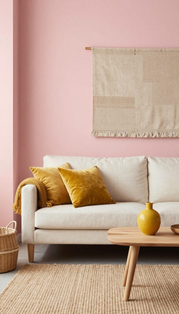
This color duo feels like a warm hug on a sunny afternoon. Soft clay pink on the walls creates a calm, earthy backdrop that doesn't feel too sweet or feminine. Mustard yellow accents—think a chunky knit throw, a ceramic vase, or a small side table—add just enough energy to keep the room lively without overwhelming it.
Start with a matte clay pink paint on the walls. It's a shade that reads neutral but adds way more personality than beige or gray. Then bring in mustard yellow through textiles and accessories.
A velvet mustard pillow on a neutral sofa, a wool throw draped over an armchair, or a framed abstract print with yellow strokes all work beautifully. For a bolder touch, try a small mustard yellow side table or a ceramic lamp base. The key is balance: let the pink be the main character and the yellow play a supporting role.
Best Colors
- Stick to muted, earthy versions of both colors. Think Farrow & Ball's 'Setting Plaster' for the pink and a ochre-like mustard such as 'Babouche' for the yellow. Avoid anything too bright or neon—it'll clash with the boho vibe.
- White trim or natural wood floors help ground the palette.
Texture Mix
Pair the smooth matte walls with nubby textiles: a chunky knit mustard throw, a linen sofa in cream, and a jute rug. Add a clay pot or a rattan basket for organic texture. The contrast between soft pink and rough natural materials keeps the look modern and tactile.
Finishing Touch
Hang a large woven wall hanging in neutral tones above the sofa. It ties the pink and yellow together without adding another color. A trailing pothos plant on a shelf adds a fresh green note that complements both hues.
10. Taupe and Terracotta with Green Plants
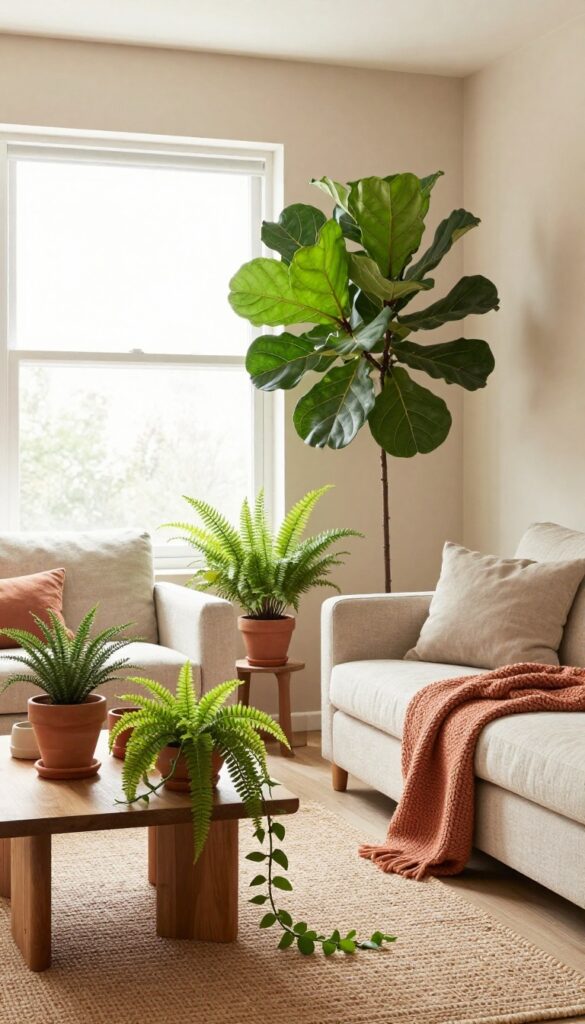
Taupe walls bring a quiet, grounded feel to a living room without washing it out. Pair that neutral backdrop with warm terracotta accents—like a chunky knit throw, ceramic pots, or a flat-weave rug—and the space instantly feels sunbaked and inviting. Green plants are the secret weapon here: they break up the earthy tones and add life, making the whole palette feel fresh rather than heavy.
This color combination works because it balances warmth with neutrality. Taupe keeps the room from feeling too hot, while terracotta adds just enough spice. The plants act as visual punctuation, drawing the eye around the room and softening hard edges.
It's an easy look to pull off in any living room, whether you're starting from scratch or just refreshing a few pieces.
Best Colors
- Stick with a warm taupe for the walls—something with a hint of brown or gray, like Sherwin-Williams 'Agreeable Gray' or Benjamin Moore 'Revere Pewter'. For terracotta, look for shades that lean rusty rather than bright orange. Think of a well-worn clay pot.
- Green plants should be varied in tone: deep emerald for fiddle-leaf figs, lighter lime for pothos or ferns.
Texture Mix
Smooth taupe walls need contrast, so bring in nubby textures like a wool rug, a linen sofa, and matte ceramic planters. A terracotta rug with a low pile works well underfoot, while a chunky knit throw in a slightly darker terracotta adds cozy depth. The leaves of the plants provide their own texture—glossy or matte, broad or feathery—so mix them up for visual interest.
Plant Styling Tip
Group plants in clusters of three at different heights: a tall floor plant in a large terracotta pot, a medium snake plant on a side table, and a trailing pothos on a shelf. Use pots in varying terracotta shades—some glazed, some raw—to keep the look curated but not matchy. Place them near windows where natural light hits the taupe walls, making the greens pop even more.
11. Warm White and Camel with Woven Textures
This palette is proof that neutral doesn't have to mean boring. By sticking with warm white walls and camel-toned furniture, you create a calm, sunlit base that feels modern and grounded. The real magic comes from layering in woven textures—sisal, rattan, jute—that add visual interest without introducing more colors.
It's a clean, collected look that works especially well in open-plan spaces or rooms that get plenty of natural light.
Start with a warm white paint—think creamy, not stark—to keep the room feeling airy. Then bring in a camel-colored sofa or a pair of armchairs as the main seating. A large sisal rug anchors the space and adds that tactile, earthy feel.
Woven baskets tucked beside the sofa or under a console table provide both storage and texture. The overall effect is serene, sophisticated, and effortlessly warm.
Best Materials
Stick with natural fibers: sisal or jute for rugs, rattan or seagrass for baskets, and linen or cotton for upholstery. These materials have subtle variations in color and weave that create depth. Avoid synthetic blends that look too uniform—they can make the room feel flat.
Finishing Touch
Add a single statement piece in a slightly darker camel or tan, like a leather ottoman or a woven pendant light. This adds a focal point without breaking the neutral scheme. Keep accessories minimal: a few ceramic vases in warm earth tones and maybe a dried palm frond or pampas grass arrangement.
Small-space Fix
If your room is on the smaller side, use a light warm white on the walls and choose a camel sofa with slim, exposed legs to keep the visual weight light. A sisal rug with a low pile won't overwhelm the floor area, and woven baskets can double as side tables or extra seating.
12. Slate Blue and Burnt Orange
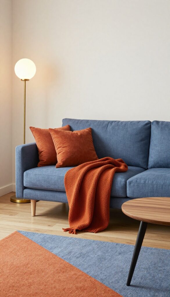
Slate blue brings a grounded, moody calm to a living room, while burnt orange injects just the right amount of warmth. Together, they create a balanced palette that feels both modern and inviting. This combination works especially well in spaces that get evening use, as the deep blue absorbs light and the orange glows under lamps.
Anchor the room with a slate blue sofa or a single accent wall. Then layer in burnt orange through smaller pieces like throw pillows, a chunky knit blanket, or a patterned rug. The contrast is striking but not overwhelming, and the earthy undertones keep it from feeling too stark.
A few matte black or brass accents—like floor lamps or coffee table legs—tie the look together without competing.
Best Colors
Stick to a muted slate blue (think gray-blue, not navy) and a burnt orange that leans more terracotta than pumpkin. These softer versions blend easily with neutral walls and wood tones. Add cream or off-white as a third color to keep the space from feeling too dark.
Texture Mix
- Balance the coolness of slate blue with warm textures. A linen sofa in slate blue feels relaxed, while velvet adds a touch of luxury. Burnt orange looks best in nubby fabrics like wool or cotton chenille.
- A flatweave rug with both colors ties the textures together.
Finishing Touch
Use warm lighting to make the orange pop. A brass floor lamp with a soft white bulb or a pair of table lamps with amber glass shades will enhance the cozy vibe. Avoid cool white bulbs—they can make the blue feel cold and the orange look flat.
13. Pale Peach and Sandy Beige
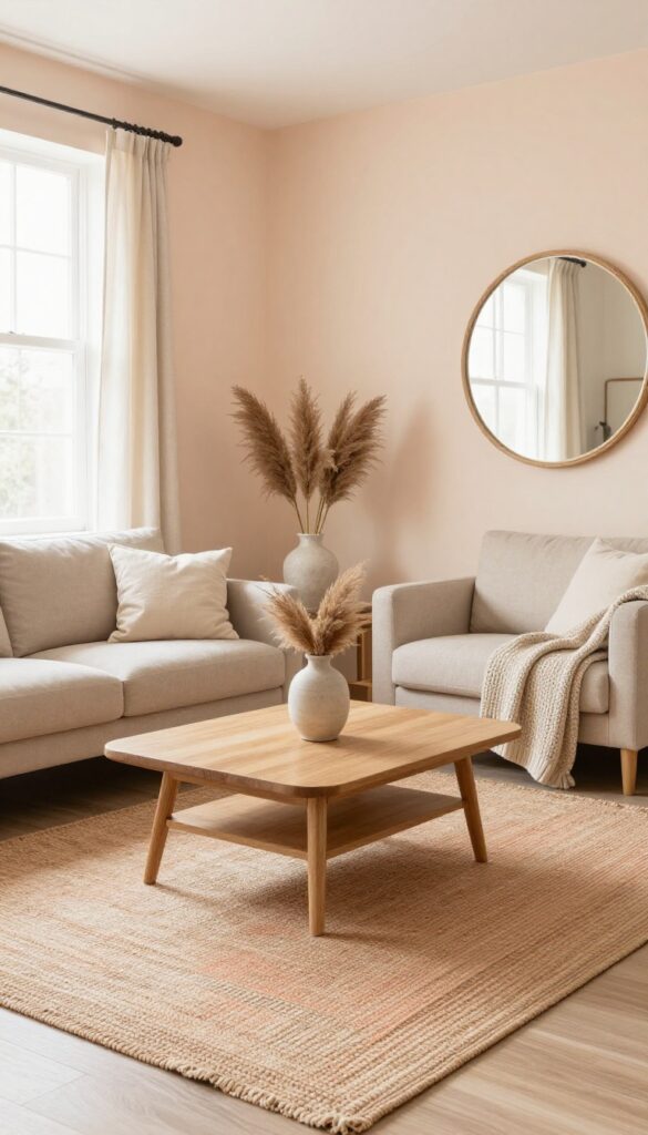
Soft peach walls or a large peach-toned area rug can keep your living room feeling light and airy, even on cloudy days. Sandy beige upholstery and natural wood accents add warmth without weighing the space down. The result is a room that feels modern, clean, and effortlessly inviting — like a breath of fresh air.
This palette works beautifully in living rooms that get plenty of natural light, as the pale peach will glow softly during the day. Pair it with light beige sofas or armchairs, a jute rug, and wooden coffee tables or shelving. Keep accessories minimal: a few cream cushions, a woven throw, and a ceramic vase with dried pampas grass.
The key is to let the wall or rug color be the star while everything else stays neutral and textural.
Best Colors
Stick with muted, dusty peach rather than bright coral. Sandy beige should lean warm — think of sun-bleached sand. Add touches of cream, off-white, and light oak for a cohesive look.
Texture Mix
Balance the smoothness of painted walls with nubby linen curtains, a chunky knit throw, and a flat-weave wool rug. Wooden furniture with visible grain adds organic texture without clutter.
Finishing Touch
Hang a large round mirror with a natural rattan or wood frame to bounce light around the room. It reinforces the airy feel and ties the peach and beige tones together.
14. Charcoal and Warm Ivory with Brass Details
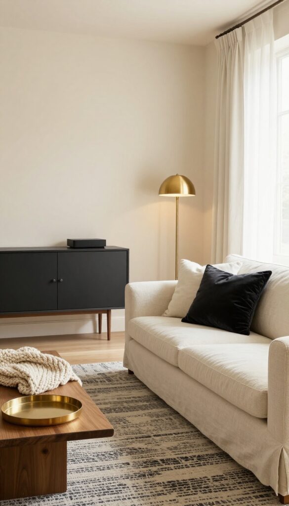
Pairing deep charcoal with warm ivory creates a living room that feels grounded yet airy—modern without being cold. The key is balancing the dark tones with plenty of soft, light textures so the space stays inviting. Brass accents add just enough shine to keep the look polished.
To pull off this look, start with warm ivory walls and a linen sofa in the same creamy tone. Then bring in charcoal through a patterned area rug or a media console. Brass light fixtures, curtain rods, or cabinet hardware tie everything together with a subtle glow.
The contrast between the dark charcoal and the warm ivory keeps the room from feeling flat, while the brass adds a touch of elegance that feels intentional, not overdone.
Best Colors
Stick with a warm ivory like Benjamin Moore's White Dove or Sherwin-Williams Creamy for walls and large upholstery. For charcoal, go with a soft black-gray like Sherwin-Williams Tricorn Black or a deep charcoal such as Benjamin Moore's Wrought Iron. Brass should be unlacquered or satin for a softer, more lived-in feel.
Texture Mix
Balance the dark and light with varied textures. A chunky knit throw in ivory, a charcoal velvet pillow, and a jute rug layered under the patterned one add depth. The linen sofa brings a natural, relaxed feel that keeps the brass from feeling too formal.
Finishing Touch
Add a brass floor lamp with a warm bulb near the sofa, and place a small brass tray on the coffee table to hold remotes or a candle. These small touches reinforce the color scheme without clutter.
15. Soft Mint and Cocoa Brown
Pairing soft mint green with cocoa brown feels fresh and grounded at the same time. The cool, airy mint on the walls opens up the room, while rich brown furniture adds warmth and weight. It’s a color duo that feels modern but still deeply earthy, and it works in both bright and moody lighting.
Start with a soft mint green paint on the walls—think pale sage with a hint of blue. Then anchor the space with a cocoa brown leather sofa or a pair of velvet armchairs. The contrast is subtle yet striking, and it keeps the room from feeling too sweet or too heavy.
Add natural textures like a jute rug, linen curtains, and a wooden coffee table to tie the look together. This palette is surprisingly versatile: it works in a mid-century modern living room, a boho loft, or even a coastal cottage.
Best Colors
- Stick with a soft mint that reads more green than blue—something like Benjamin Moore’s ‘Misted Green’ or Sherwin-Williams’ ‘Quietude’. For brown, go with a warm cocoa or milk chocolate tone. Avoid shades that lean too gray or too orange.
- White trim and cream accents keep the look crisp.
Texture Mix
- Balance the cool walls and smooth leather with plenty of texture. A chunky knit throw in cream, a sisal or jute rug, and a woven rattan pendant light add warmth. Velvet pillows in deep brown or pale blush soften the seating.
- The mix keeps the room from feeling flat.
Finishing Touch
Add a few leafy green plants—like a fiddle-leaf fig or a trailing pothos—to echo the wall color. A brass floor lamp or gold-framed mirror adds a subtle gleam. Keep accessories minimal: a stack of neutral books on the coffee table and a simple ceramic vase are enough.
FAQ
What colors work best for a modern boho living room?
Stick with muted, earthy tones like terracotta, sage green, warm beige, clay, and ochre. These colors feel grounded and pair well with natural textures like linen, wood, and rattan.
How can I make boho decor look clean and not cluttered?
Focus on a limited color palette and use texture instead of patterns. Choose a few statement pieces—like a woven rug or a macrame wall hanging—and keep surfaces clear. Negative space is your friend.
Can I use dark colors in a small boho living room?
Yes, but balance them with lighter elements. For example, a deep forest green accent wall works well with cream furniture and plenty of natural light. Mirrors also help open up the space.
What neutral colors work with earthy boho style?
Warm whites, beige, taupe, and camel are excellent neutrals. They provide a calm base that lets bolder earthy accents like terracotta or rust stand out without feeling jarring.
How do I add warmth without using too many colors?
Layer textures like chunky knit throws, jute rugs, and velvet cushions in a single color family. Warm lighting from floor lamps or string lights also adds coziness without extra hues.
Conclusion
Bringing earthy boho warmth into your living room doesn't require a complete overhaul. Start with one or two color ideas that resonate with you, then layer in natural textures and simple accessories. The goal is a space that feels both inviting and intentional—a place where you can truly unwind.
Remember, the best boho rooms are those that reflect your personality while keeping the look clean and modern. So pick your favorite palette, have fun with it, and let your living room glow with natural warmth.