13 Picture Wall Ideas for Living Room Memories and Art
A picture wall can turn a blank living room wall into a storybook of your favorite moments and pieces. But getting the layout right without it feeling chaotic takes a little thought.
These 13 ideas focus on cozy, layered arrangements that feel collected over time rather than thrown together.
Whether you're working with family photos, art prints, or a mix of both, each idea keeps practicality in mind so your wall looks stylish without demanding constant upkeep.
1. Start with a Symmetrical Grid for a Clean Backdrop
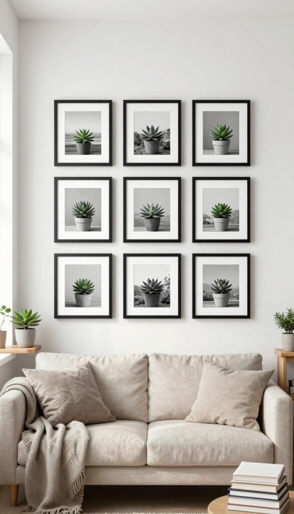
A symmetrical grid of matching frames instantly brings order and calm to any wall. It’s a go-to for living rooms where you want the photos or art to shine without visual clutter. Think of it as a structured foundation—once the grid is up, you can layer in cozy touches like a small plant or a stack of books on a nearby shelf, and the whole setup feels intentional and balanced.
A symmetrical grid is all about repetition and alignment. Use identical frames—same size, color, and style—spaced evenly, typically two to four inches apart. This works beautifully above a sofa, console table, or even in a hallway leading into the living room.
The uniformity creates a clean visual anchor, making the space feel more organized and put-together. Black-and-white photography or simple line art prints keep the look sophisticated, but you can also use muted color palettes for a softer feel. The key is to measure carefully before hanging—use painter’s tape to map out the grid on the wall to avoid crooked rows.
Once it’s up, the grid acts as a backdrop that lets other decor elements, like textured throws or metallic accents, stand out without competing.
Best Frame Choices
Stick with slim, modern frames in black, white, or natural wood for a timeless look. Avoid ornate or bulky frames that break the grid’s clean lines. If you want a subtle pop, choose a single metallic finish like brass or silver, but keep it consistent across all frames.
Layout Tip
For a 3×3 grid (nine frames), center it over your sofa or console table. The grid should be about two-thirds the width of the furniture below it. Use a level and measuring tape to ensure each frame is perfectly aligned—a small error stands out in a symmetrical arrangement.
Cozy Detail
Soften the grid’s formality by placing a small vase with dried eucalyptus or a stack of neutral-toned books on the console table beneath. This adds a lived-in, layered feel without disrupting the symmetry above.
2. Mix Frame Finishes for an Eclectic, Curated Feel
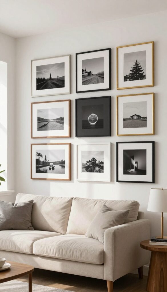
One of the quickest ways to make a gallery wall look like it’s been collected over time is to mix frame finishes. Instead of sticking to all black or all wood, try blending different tones—like warm walnut, matte black, antique gold, and crisp white—in roughly equal amounts. The key is keeping the spacing consistent so the variety feels intentional, not chaotic.
This approach adds instant warmth and texture, making your living room feel layered and personal without looking overly styled.
Mixing frame finishes works because it breaks up visual monotony and adds depth. The contrast between a dark frame and a light one makes each piece stand out, while the variety keeps the eye moving. To pull it off, choose a common element—like similar mat colors or artwork style—to tie everything together.
Then arrange your frames on the floor first to test the balance before hammering any nails. Aim for a mix of about one-third wood, one-third black or dark metal, and one-third gold or white. This ratio keeps the look curated, not random.
Best Frame Combos
- Start with a neutral base: white or cream walls. Then pick two or three finishes that complement your room’s existing hardware and furniture. For a cozy living room, try combining natural oak, matte black, and brushed brass.
- If your space leans modern, mix sleek black, silver, and a pop of walnut. Avoid using more than four different finishes, or the wall can start feeling busy. Stick to a consistent frame width—thin profiles work best for small spaces, while thicker frames add presence in larger rooms.
Layout And Spacing Tip
- Keep gaps between frames between two and three inches for a tight, gallery-like feel. Use a level and painter’s tape to mark the grid before hanging. For a relaxed look, align the outer edges of your arrangement rather than centering every piece.
- If you’re hanging over a sofa, leave about six to eight inches between the top of the backrest and the bottom of the lowest frame. This keeps the wall connected to the furniture without crowding it.
Finishing Touch
- Add a small shelf or ledge below the gallery wall to lean a few extra frames or small decor objects. This lets you swap pieces in and out easily without committing to new nail holes. A slim floating shelf in a matching wood tone ties the whole arrangement together and gives the wall a collected-over-time feel.
- It also provides a spot for trailing plants or a tiny sculpture, adding another layer of texture.
3. Lean Art on a Shelf for Easy Swapping
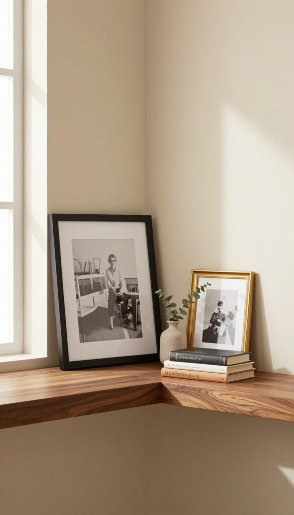
Floating shelves are one of those decor moves that instantly make a room feel more curated and intentional. Instead of committing to a single gallery wall layout, you can lean framed pieces against the wall and swap them out whenever the mood strikes. This approach gives you the flexibility to rotate in new art, family photos, or seasonal prints without ever picking up a hammer.
It also creates a relaxed, layered look that feels collected over time rather than staged all at once.
Start by installing a sturdy floating shelf at eye level or slightly above, depending on your ceiling height. A deep shelf—at least six inches—gives you room to layer smaller frames in front of larger ones for depth. Mix in a few decorative objects like a small vase or a stack of books to break up the frames and add texture.
The key is to keep the arrangement balanced but not too symmetrical; let the pieces overlap slightly for that effortless, lived-in feel.
Shelf Styling Tip
Vary the heights and sizes of your frames to create visual interest. Lean a large piece at the back, then place a medium frame slightly in front and to the side, and finish with a small frame or object in the foreground. This layering trick adds dimension and makes the shelf look intentionally styled.
Cozy Detail
Incorporate a mix of frame finishes—wood, black, gold, or white—to keep the display from feeling too matchy. A warm wood tone against a neutral wall adds coziness, while a metallic accent brings a touch of polish. If your room leans cool, go for silver or chrome; for warmer spaces, brass or copper works beautifully.
Small-space Fix
In a compact living room, a single floating shelf above a sofa or console table can act as a mini gallery without taking up floor space. Keep the shelf clutter-free by limiting yourself to three to five pieces. This prevents the area from feeling busy while still giving you room to refresh the look whenever you want.
4. Create a Salon-Style Wall with Varied Sizes
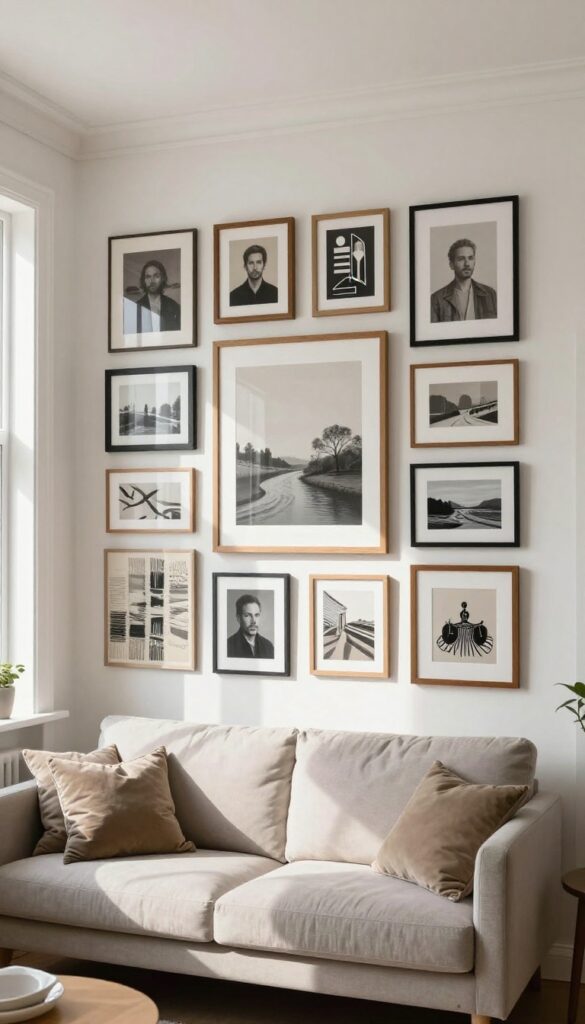
A salon-style wall feels like stepping into a cozy gallery, where every frame tells a story. By clustering frames of different sizes close together, you create a dense, layered look that feels curated over time. This arrangement works especially well in living rooms, where it can anchor a sofa or fill a blank wall with personality.
The secret is starting from a central point and working outward, mixing portraits, landscapes, and abstract pieces for visual variety.
To achieve this look, gather frames in various shapes and finishes—wood, metal, black, white—and lay them out on the floor first. Arrange them around a focal point, like a large central piece, then layer smaller frames around it. Keep gaps tight, about 1 to 2 inches apart, for that signature salon density.
The mix of subjects and frame styles adds depth, making the wall feel collected over time. This approach is forgiving: you can swap pieces in and out as your taste evolves.
Layout Tip
- Start with the largest piece slightly off-center, then build outward. Use paper templates taped to the wall to test spacing before hammering nails. A salon wall looks best when it feels organic, so avoid perfect symmetry.
- Let the frames flow naturally, with smaller ones filling gaps.
Best Frame Mix
Combine ornate vintage frames with sleek modern ones for contrast. Stick to a unified color palette—like all black frames or mixed wood tones—to keep the chaos cohesive. Add a few unframed canvases or textile art pieces for texture variety.
Finishing Touch
Install picture lights above the central cluster to highlight the gallery feel. Warm LED bulbs make the art pop and create a cozy glow. If you have a high ceiling, you can even extend the salon wall upward to draw the eye.
5. Incorporate a Large Central Piece as an Anchor
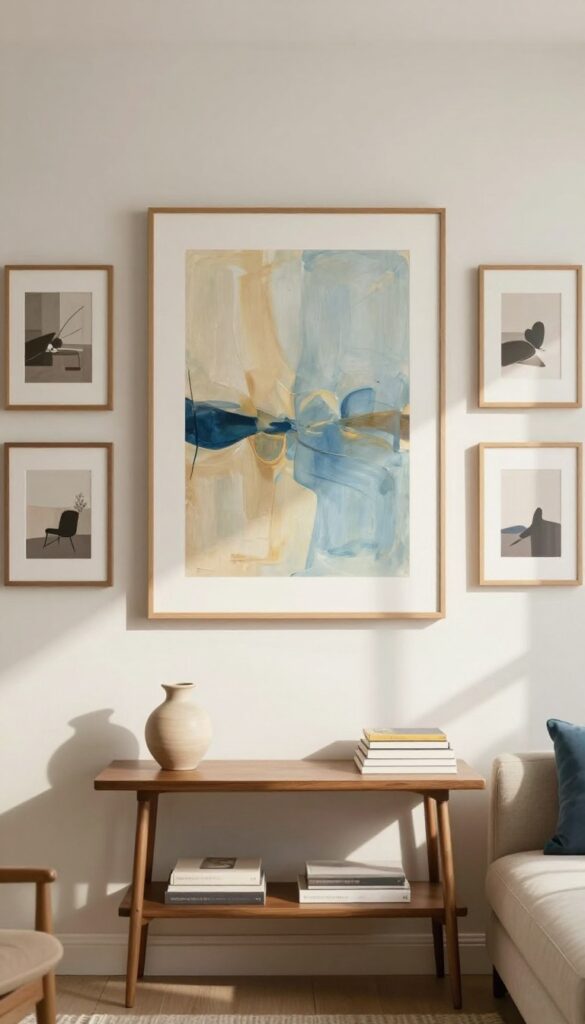
Starting a gallery wall can feel overwhelming, but anchoring it with one oversized piece makes the whole process easier. A large central frame or canvas gives your eye a place to rest and creates a natural focal point. This approach works especially well in living rooms where you want the wall to feel intentional without being chaotic.
Choose a piece that pulls together your room's color scheme—maybe a landscape print with your sofa's blue tones or an abstract that echoes your throw pillows. Then let smaller pieces orbit around it.
The key is to pick a central piece that's bold enough to stand on its own but flexible enough to let smaller artworks complement it. Think of it as the star of your wall—everything else is the supporting cast. This method takes the guesswork out of arranging because you build outward from one confident center.
It also makes the wall feel grounded and balanced, which is especially nice in a cozy, layered living room where you want warmth without visual clutter.
Choosing The Right Anchor
- Go for something that makes a statement but still fits your room's vibe. A large abstract painting works if your decor is modern, while a vintage mirror or a oversized photograph suits a more traditional space. The anchor should be at least twice the size of your smallest surrounding piece.
- And make sure its colors tie into the rest of your room—pick up a hue from your rug, curtains, or sofa for a pulled-together look.
Arranging The Smaller Pieces
- Once your anchor is up, arrange the smaller frames around it in a loose cluster. You don't need perfect symmetry—a balanced asymmetry feels more organic and lived-in. Keep about 2 to 3 inches between frames for a cohesive look.
- Mix in a few different shapes or textures, like a round mirror or a woven wall hanging, to add depth without distracting from the anchor.
Finishing Touch: Lighting
- Highlight your anchor piece with a picture light or a small spotlight. This draws the eye right where you want it and adds a cozy glow to the whole arrangement. In a living room, warm white bulbs (2700K) keep the mood inviting.
- If you can't hardwire, battery-operated picture lights are an easy, no-drill option.
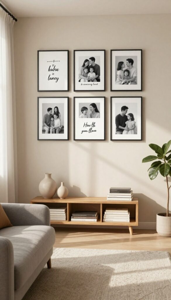
6. Use Matching Frames for a Series of Prints
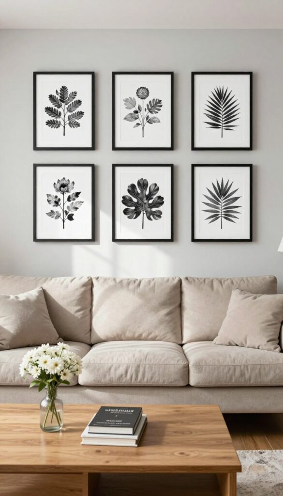
There’s something quietly satisfying about a set of prints that all match. When you pick a series—like botanical studies, vintage maps, or black-and-white photography—and frame each one the same way, the collection feels intentional and curated. It’s a look that works in almost any living room, from modern to traditional, because the repetition creates a calm, orderly rhythm.
The key is choosing frames that complement your room’s existing finishes, so the whole setup feels like it belongs, not like an afterthought.
This approach is especially effective when you have a long wall above a sofa or a console table. A horizontal row of three to five frames instantly anchors the space. For a more dramatic effect, arrange them in a square grid—four prints in a two-by-two layout feel balanced and gallery-like.
The uniformity lets the artwork itself shine, while the cohesive framing ties everything together. It’s a practical way to make a big visual impact without needing a single oversized piece.
Best Frame Styles
- Stick with one frame style and color for the whole series. Thin black or white metal frames keep things sleek and modern, while natural wood (like oak or walnut) adds warmth and a slightly rustic feel. If your living room leans traditional, go for classic gold or silver with a simple profile.
- The goal is to let the prints stand out, so avoid overly ornate frames that compete with the artwork.
Layout Tip
- For a row, space frames about two to three inches apart. For a grid, keep the gaps consistent both horizontally and vertically. Before committing, lay the frames on the floor and adjust spacing until it looks balanced.
- A good rule of thumb: the total width of the arrangement should be about two-thirds the width of the furniture below it.
Cozy Detail
To soften the look, add a small shelf just below the frames and lean a few personal photos or small objects against it. Or hang a simple fabric banner or a piece of macramé between two frames for texture. This breaks up the repetition just enough to feel layered and lived-in, without losing the polished uniformity.
7. Add a Mirrored Element for Light and Depth
A small mirror tucked among your frames does more than just look pretty—it bounces light around the room and tricks the eye into seeing more space. It breaks up the pattern of solid frames and adds a subtle reflective layer that feels intentional, not accidental. Placed off-center, it keeps the gallery wall from feeling too rigid while still letting your photos and art take center stage.
Mixing a mirror into your picture wall is one of those clever tricks that makes the whole arrangement feel bigger and brighter without adding clutter. The key is choosing a mirror that complements your frames without competing with them—think a round or oval shape to soften the straight lines of rectangular frames. Position it slightly off-center so it reflects a window or a light-colored wall, which instantly makes the space feel airier.
This works especially well in living rooms that lack natural light or feel a bit cramped. Keep the mirror small enough that it doesn't dominate the wall; it should feel like part of the collection, not the main event. For a cozy, layered look, pair it with warm-toned frames and matte finishes that absorb rather than reflect too much glare.
Best Mirror Shapes
- Round mirrors are the go-to choice for softening a grid of rectangular frames. They add a gentle curve that feels organic and approachable. Oval mirrors work similarly but can elongate the wall vertically, which is great for lower ceilings.
- Avoid square or rectangular mirrors unless you're deliberately repeating the shape for a modern, minimalist look.
Placement Tip
Hang the mirror off-center, about a third of the way from one end of the gallery wall. This creates visual interest and keeps the eye moving across the arrangement. Make sure it reflects something pleasant—a window, a lamp, or a piece of art—rather than a blank wall or a cluttered corner.
Finishing Touch
Choose a mirror with a thin, simple frame in a finish that matches your other frames—black, brass, or natural wood are safe bets. A frameless mirror with a beveled edge is another option if you want the reflection to take center stage. Clean the mirror regularly to keep the light bouncing crisp and clear.
8. Layer Frames with Other Wall Decor
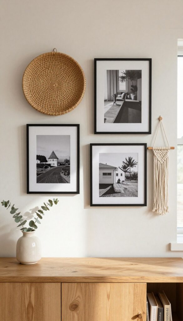
A gallery wall doesn’t have to be all frames. Mixing in woven baskets, small sculptures, or macramé hangings adds texture and breaks up the visual monotony. This layered approach makes your display feel curated and collected over time, not like a store-bought set.
The key is keeping the color palette cohesive so the mix feels intentional, not chaotic. It’s an easy way to add depth and personality to your living room walls.
Start by choosing a unifying color scheme—maybe warm neutrals with touches of green, or black and white with natural wood tones. Arrange your frames first, then weave in other elements like a round woven basket, a ceramic wall pocket, or a small macramé piece. These softer textures contrast nicely with the hard edges of frames and glass.
For a balanced look, group similar colors or materials together, and leave a little breathing room between items. This style works especially well above a sofa or console table, where you want visual interest without overwhelming the space.
Best Materials To Mix
- Natural fibers like rattan, seagrass, and jute add warmth and softness. Small metal or ceramic sculptures bring a sculptural element. Macramé hangings offer a boho touch.
- Stick to two or three materials to keep it cohesive.
Layout Tip
- Lay out your arrangement on the floor first. Place larger frames in the center, then add smaller frames and decor pieces around them. Step back and adjust until the spacing feels balanced.
- Use painter’s tape to mark positions on the wall before hanging.
Cozy Detail
Add a small dried eucalyptus or pampas grass bundle tucked into a basket or ceramic piece. It brings in organic texture and a soft, earthy color that ties the whole display together.
9. Go Monochrome for a Sophisticated Look
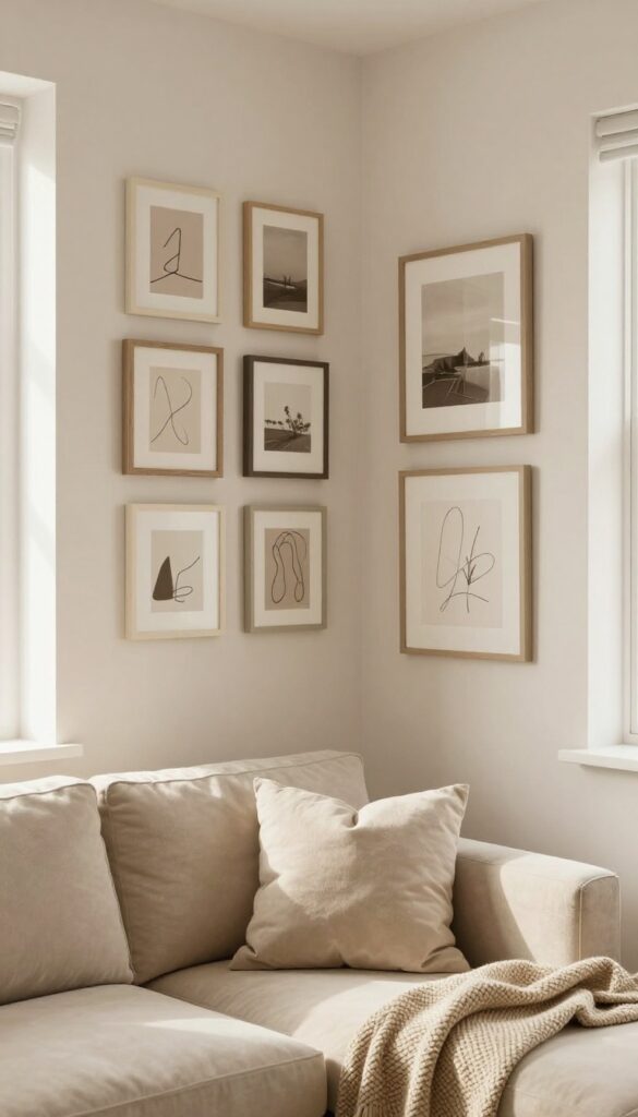
Sticking to a single color family for your picture wall might sound limiting, but it actually opens up a world of sleek, intentional design. By choosing frames and art in shades of one color—like all black, all white, or even all warm neutrals—you create a cohesive display that feels curated rather than chaotic. This approach works especially well in minimalist or modern living rooms, where every element needs to earn its place.
The monochrome look also makes it easier to swap pieces in and out without disrupting the overall harmony, so your wall can evolve with your style.
A monochrome picture wall is all about subtlety and sophistication. Instead of competing colors, the focus shifts to texture, tone, and composition. Black-and-white photography, charcoal sketches, or sepia prints all fit beautifully.
You can mix frame styles—thin black metal with chunky black wood—as long as the color stays consistent. This creates depth without clutter. For a cozy feel, choose warm tones like cream, beige, and taupe.
For a bolder statement, go all black or deep navy. The key is to vary the shades slightly so the wall doesn't look flat. Think matte black next to glossy black, or off-white next to pure white.
Best Colors For A Cozy Monochrome Wall
- While black and white are classic, cozy monochrome walls thrive in warm neutrals. Try a palette of cream, oatmeal, and soft beige for a gentle, inviting look. If you prefer darker tones, charcoal and warm gray create a cocooning effect.
- For a touch of color without breaking the monochrome rule, use sepia-toned prints or faded ochre frames. The goal is to keep the overall hue consistent while playing with lightness and darkness.
Texture Mix To Add Depth
- Without color contrast, texture becomes your best friend. Combine smooth glass frames with matte paper prints, or pair rough linen matting with sleek metal frames. Canvas prints add a soft, fabric-like feel, while wooden frames bring warmth.
- Even the wall itself can contribute—try a slightly textured wallpaper or a matte paint finish. This variety keeps the eye moving and prevents the wall from feeling one-dimensional.
Layout Tip For Maximum Impact
- A grid layout works beautifully for monochrome walls because the uniformity reinforces the cohesive color scheme. Arrange frames in a neat 3×3 or 4×4 grid with equal spacing for a clean, modern look. Alternatively, a salon-style cluster can feel more organic, but stick to a tight grouping to maintain the monochrome effect.
- Leave at least two inches between frames to let each piece breathe. Center the arrangement at eye level for the best visual balance.
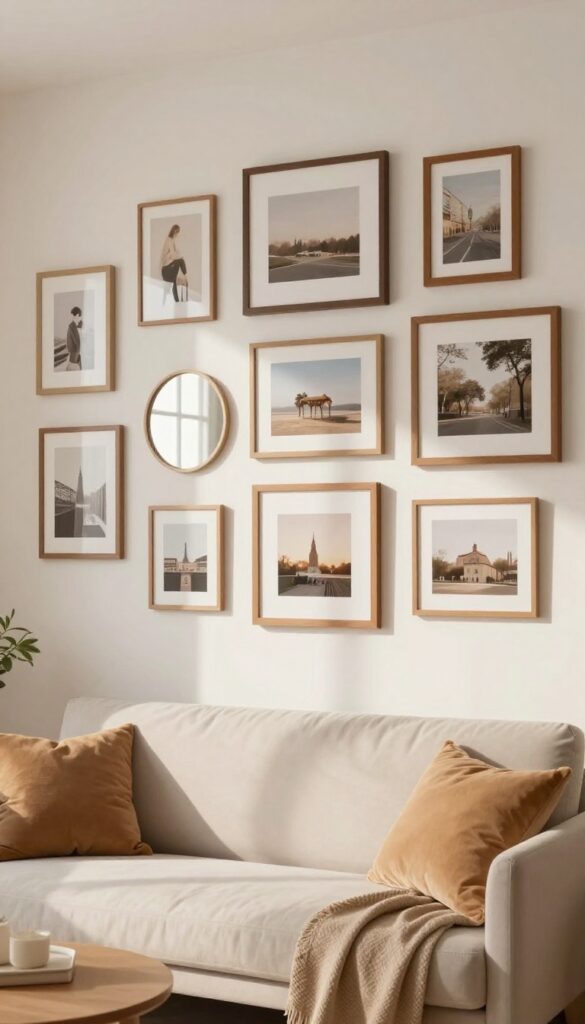
10. Create a Themed Wall Around a Hobby or Travel
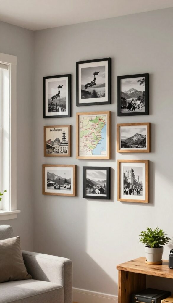
A themed wall turns your favorite pastime or travel memories into a daily dose of inspiration. Instead of scattering photos randomly, group them around a specific interest—like hiking trails, coffee shops, or vintage cameras. The result feels curated and intentional, not cluttered.
This approach works especially well in a living room where you want the walls to tell your story without overwhelming the space.
Start by choosing one theme that genuinely excites you. It could be a collection of national park maps, black-and-white shots from a trip to Japan, or even a series of pressed flowers from local walks. The key is consistency: stick to similar frame styles and colors to keep the display cohesive.
For a cozy, layered look, mix frame sizes but keep the finish uniform—matte black or natural wood both work beautifully. Arrange them in a loose grid or organic cluster on the floor first, then transfer the layout to the wall using paper templates. This avoids unnecessary nail holes and lets you play with spacing until it feels right.
Best Frame Materials
Rustic wood frames add warmth to nature-themed walls, while sleek metal or acrylic suits modern travel shots. For a budget-friendly option, paint thrifted frames in a single color to tie the collection together. Mixing a few deep frames with shallow ones adds depth without extra cost.
Layout Tip
Treat the wall like a gallery: leave 2–3 inches between frames for a clean look. If your theme includes small objects like postcards or ticket stubs, mount them on clipboards or in shadow boxes for easy swapping. This keeps the display fresh and lets you rotate items seasonally.
Cozy Detail
Add a small shelf below the arrangement to display a few 3D items—a vintage camera, a stack of travel guides, or a tiny plant. This bridges the gap between flat art and real objects, making the wall feel more layered and lived-in.
11. Use Clipboards or Wire Hangers for a Casual Vibe
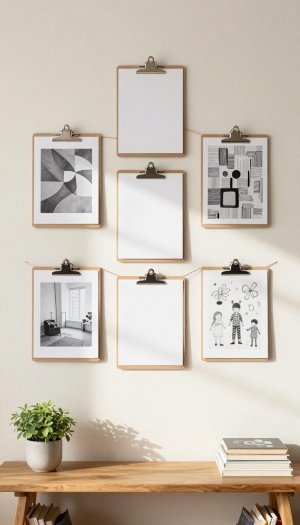
Sometimes the best gallery wall is the one you can change on a whim. Clipboards and wire hanger systems let you swap out prints, photos, or kids' artwork in seconds, no nails or frames required. The look is intentionally undone—think bohemian studios or industrial lofts where imperfection feels intentional.
It's also a renter's dream: no holes, no commitment, just a relaxed wall that evolves with your mood.
Clipboards and wire hangers bring a casual, collected-over-time feel to any living room. They work especially well in spaces that already lean boho or industrial, but they can soften a minimalist room too. The key is to keep the clips or wires themselves simple—black metal or natural wood clipboards, thin copper or black wire—so the art stays the star.
Group them in a loose grid or stagger them for a more organic layout. You can even clip fabric swatches, postcards, or dried flowers for extra texture.
Best Materials
- For clipboards, go with unfinished wood or matte black metal to match most decor styles. For wire systems, a thin galvanized wire or copper tubing works well. Use mini clothespins or binder clips to attach prints to the wire.
- The hardware should feel intentional—avoid plastic clips that look flimsy. A leather loop or twine can add warmth if you want a softer touch.
Layout Tip
- Start with a single wire stretched across a wall or a row of clipboards at eye level. For a layered look, hang two wires at different heights and overlap a few prints. Leave some clips empty for a minimalist vibe, or fill every one for a maximalist collage.
- Keep the spacing uneven to emphasize the casual feel—perfectly symmetrical rows would kill the relaxed energy.
Small-space Fix
- In a tiny living room, use a single wire above a sofa or console table to avoid overwhelming the wall. Choose a few favorite prints and rotate them seasonally. This keeps the wall feeling fresh without adding visual clutter.
- For renters, command hooks can hold the wire without damaging paint.
12. Frame Kids' Art for a Whimsical Touch
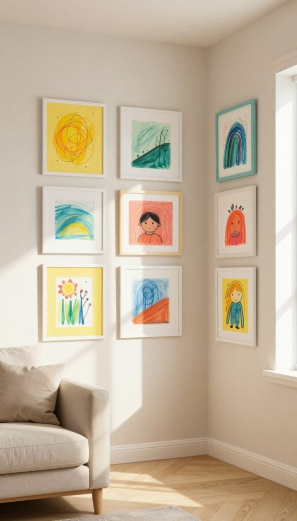
Children's artwork brings a burst of color and personality that no store-bought print can match. Framing a few favorite pieces turns scribbles and watercolors into intentional decor that feels both playful and cherished. The key is to treat their art with the same respect you'd give a gallery piece—simple frames, thoughtful placement, and a rotation system that keeps the display fresh without overwhelming the room.
Select a handful of drawings or paintings that capture your child's unique style—maybe a bold abstract, a cheerful landscape, or a portrait of the family pet. Use lightweight frames in bright hues like yellow, teal, or coral to echo the art's energy, or go with white or natural wood for a more cohesive look. Arrange them at eye level in a cluster or along a narrow wall, spacing frames a few inches apart for a clean gallery feel.
Swap out pieces every few weeks to celebrate new creations and keep the wall dynamic. This approach works beautifully in a living room where you want a touch of whimsy without sacrificing style—just keep the rest of the decor neutral to let the art pop.
Best Frames For Kids' Art
Choose frames with a wide mat to give the artwork breathing room and make even small drawings feel substantial. Lightweight acrylic or wood frames with shatterproof glass are ideal for safety and easy swapping. Stick to a consistent color palette—like all white or all bright primary colors—to unify the display.
Layout Tip
Lay the frames out on the floor first to experiment with arrangement. A grid layout works well for uniform pieces, while a salon-style cluster adds playful energy. Keep the center of the arrangement at eye level (around 57–60 inches from the floor) so both kids and adults can enjoy it.
Rotation Strategy
Set a reminder to swap art every month or season. Involve your child in choosing the next pieces to make it a fun ritual. Store unframed art in a flat portfolio box to protect it, and consider rotating by theme—like all animal drawings one month, then landscapes the next.
13. Combine Photos with Inspirational Quotes
Mixing your favorite snapshots with typography prints that carry meaningful quotes turns a picture wall into something more personal and motivating. The key is keeping the font styles consistent so the whole arrangement feels intentional, not chaotic. This approach works especially well in a cozy living room where you want the walls to reflect both your memories and your outlook on life.
Start by selecting a handful of photos that capture happy moments—family trips, candid shots, or quiet everyday scenes. Pair them with prints that feature quotes you love, whether from books, songs, or personal mantras. Stick to one or two typefaces across all the typography pieces to create a cohesive thread.
Black-and-white photos can help the text stand out without competing, but warm-toned images also work if you keep the quote colors muted. Arrange them in a loose grid or organic cluster, leaving a few inches between frames for breathing room. The result feels layered and thoughtful, like a gallery that tells your story.
Best Frame Pairing
Use the same frame color for all the typography prints—matte black or natural wood are safe bets—and mix in slightly different frames for the photos to add texture. This creates a unified base while letting each image keep its own character.
Layout Tip
Plan the arrangement on the floor first. Lay out your frames and move them around until the balance feels right. Snap a photo of the final layout so you can replicate it on the wall without second-guessing.
Cozy Detail
Add a small shelf beneath the gallery to hold a few objects that tie into the quotes—a small plant, a candle, or a stack of books. This grounds the wall and makes the whole setup feel more lived-in.
FAQ
How do I choose the right frames for my picture wall?
Consider your room's existing decor. For a cohesive look, stick to one or two frame colors that complement your furniture. For an eclectic vibe, mix finishes like wood, black, and gold but keep the spacing uniform.
What's the best way to arrange frames without damaging the wall?
Lay the frames on the floor first to experiment with layout. Use painter's tape to mark positions on the wall. For heavy frames, use wall anchors.
Consider a picture rail or wire system if you change art often.
How many frames should I include in a picture wall?
It depends on your wall size. A small wall might need 3-5 frames, while a large wall can handle 10-15. Start with a few and add more over time for a collected look.
Can I mix personal photos with art prints?
Absolutely. Mixing photos with art adds variety and personality. Keep the color palette consistent so the wall feels unified.
Use similar frame styles to tie them together.
How do I make a picture wall look cohesive?
Choose a common element—like frame color, subject matter, or matting—to tie the pieces together. Maintain consistent spacing between frames. A central anchor piece can also help unify the display.
Conclusion
Building a picture wall is one of the most personal ways to decorate your living room. Whether you lean toward a tidy grid or a free-spirited salon wall, the key is to let your memories and style guide the layout.
Start with a few pieces you love, then layer in more as you find them. Your wall will feel like a living, evolving part of your home.