10 Living Room Painting Ideas That Give Blank Walls Life
Blank walls can feel like a missed opportunity. They’re the perfect canvas for adding warmth, depth, and a little personality to your living room. Whether you’re drawn to soft neutrals or bold accents, the right paint choice can completely shift the mood of the space.
But with so many options, it’s easy to feel stuck. That’s where these ideas come in—each one is designed to feel achievable and stylish, with a focus on cozy, layered results.
Think textured finishes, unexpected color placements, and tricks that make your walls feel like part of the decor. From subtle ombré effects to playful geometric patterns, these painting ideas will help you turn those blank walls into something worth talking about.
1. Warm Ombré Wash for a Sunset Glow
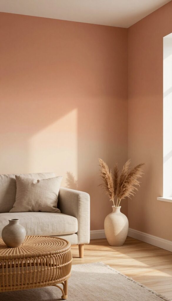
There’s something about a wall that looks like it caught the last light of the day. A warm ombré wash does exactly that—blending terracotta, peach, and cream in a soft gradient that feels both dreamy and grounded. It’s not a perfect, painted stripe; it’s a blurred, layered finish that looks like it happened naturally, like the wall itself decided to warm up.
This technique works especially well in living rooms that get afternoon sun, because the paint seems to glow even more when light hits it. It’s artistic without trying too hard, and it makes any seating area feel instantly cozier.
The key to this look is keeping the transition subtle. Use a large sponge or a soft rag to blend the darker shade into the lighter one while the paint is still wet. Start with a cream base, then work your way up from the bottom with your warmest tone, feathering the edges as you go.
The result is a wall that feels like a canvas—soft, layered, and full of depth. It pairs beautifully with neutral furniture and natural textures like linen, rattan, or light wood. If you’re nervous about going too bold, try this on a single accent wall behind your sofa or console table.
It’s a low-commitment way to test the waters before painting the whole room.
Best Colors
- Stick to warm earth tones that naturally blend into each other. Terracotta, burnt sienna, dusty rose, and peach all work well with a cream or warm white base. Avoid cool tones like blue or gray—they don’t create that sunset warmth.
- If you want a more muted look, try a clay pink fading into a soft beige.
Texture Tip
- The ombré effect relies on soft, uneven blending, so don’t stress about perfection. Use a damp sea sponge or a lint-free rag to dab and swirl the paint. Work in small sections and keep a spray bottle handy to mist the wall if the paint starts to dry too fast.
- The goal is a hazy, watercolor-like finish.
Finishing Touch
Once the ombré wall is dry, add a matte clear coat to protect the finish without adding shine. Then style the wall with a few simple pieces—a low-profile console table, a woven basket, and a single trailing plant like pothos. Keep the rest of the room light and airy so the wall remains the focal point.
2. Two-Tone Horizontal Split for Depth
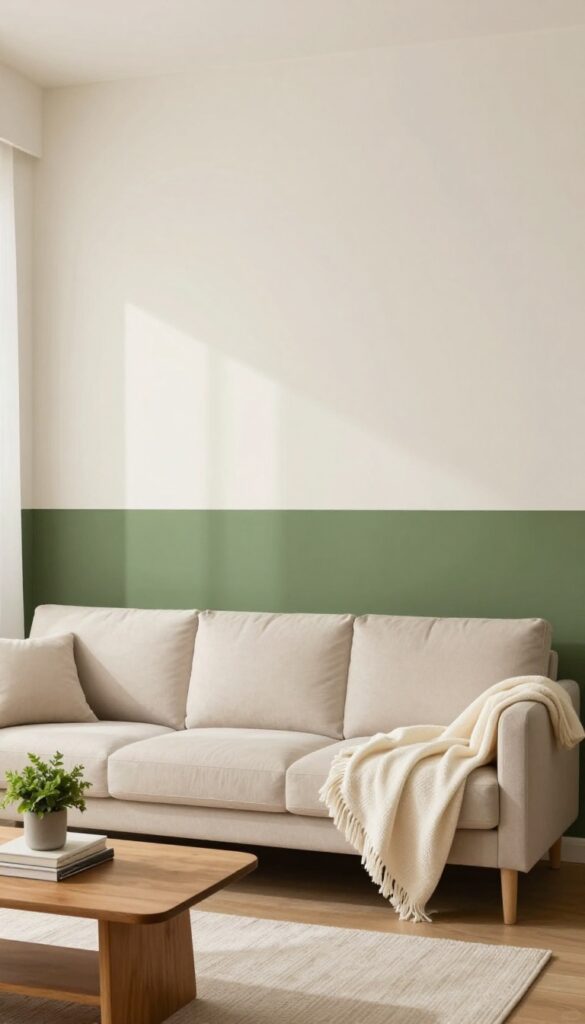
A horizontal color split is one of those tricks that instantly makes a room feel more grounded. By painting the lower third of your wall a deeper shade—think charcoal, olive, or navy—and keeping the upper portion light and airy, you create the illusion of taller ceilings and a cozy, anchored space. It’s like giving your walls a built-in wainscoting effect without the carpentry.
This technique works especially well in living rooms that need a little visual weight without feeling heavy.
The two-tone horizontal split is a low-commitment way to add architectural interest. It defines the room’s perimeter, making furniture feel more intentional and the space more layered. The darker lower band hides scuffs and marks better than a solid light wall, which is a bonus for busy households.
Pair it with soft textiles and warm lighting, and you’ve got a living room that feels both polished and inviting.
Best Color Combos
- For a cozy vibe, try a deep olive green on the bottom with a warm off-white or pale cream on top. Charcoal gray pairs beautifully with a soft blush or light beige. If you want something bolder, navy bottom with a crisp white upper half feels classic and crisp.
- Stick to colors that share an undertone—warm with warm, cool with cool—to keep the look cohesive.
Where To Split
- The standard split is at one-third of the wall height, usually around 36 inches from the floor. But don’t be afraid to adjust based on your furniture. If your sofa back is 30 inches high, consider splitting at 32 inches so the dark band sits just below the backrest.
- This creates a seamless visual line and makes the room feel intentionally designed.
Finishing Touch
Add a thin horizontal trim or a strip of painter’s tape to create a crisp line between the two colors. A slightly raised chair rail or a simple wooden batten at the transition point adds a subtle architectural detail. Then layer in textured throw pillows and a chunky knit blanket on the sofa to echo the cozy, grounded feel of the darker lower wall.
3. Textured Limewash Finish for Old-World Charm
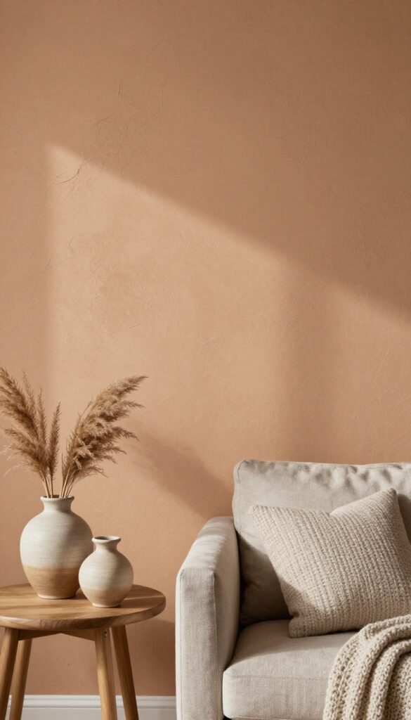
Limewash paint is having a serious moment, and for good reason. It creates a matte, slightly mottled texture that catches light softly, giving walls a natural, earthy feel. This finish pairs beautifully with layered textiles and wood furniture, making any living room feel instantly more grounded and cozy.
Limewash paint is having a serious moment, and for good reason. It creates a matte, slightly mottled texture that catches light softly, giving walls a natural, earthy feel. This finish pairs beautifully with layered textiles and wood furniture, making any living room feel instantly more grounded and cozy.
Unlike flat paint, limewash has subtle variations in tone that mimic the look of aged plaster. It’s not perfectly uniform, which is exactly the point. The result is a wall that feels alive, shifting with the light throughout the day.
It works especially well in rooms with natural light, but even a dimmer space gets a soft, warm glow from the texture.
Best of all, limewash is surprisingly forgiving. Small imperfections in your drywall or plaster just add to the character. It’s a finish that embraces imperfection, making it perfect for anyone who wants a lived-in, relaxed vibe without trying too hard.
Best Colors For A Cozy Vibe
Stick with warm, muted tones like terracotta, ochre, dusty rose, or soft clay. These colors enhance the natural texture and keep the room feeling inviting. Avoid bright or cool shades—they can look flat or clash with the limewash’s organic finish.
Texture Mix
- Balance the rough wall texture with soft, plush furnishings. Think chunky knit throws, velvet cushions, and a wool area rug. Add in natural wood coffee tables or sideboards to reinforce the earthy, old-world feel.
- The contrast between smooth fabrics and textured walls is what makes the space feel layered and intentional.
Lighting Tip
- Use warm, dimmable lighting to make the limewash glow. Table lamps with linen shades or wall sconces with a soft amber bulb work wonders. Avoid harsh overhead lights—they can wash out the subtle variations in the finish.
- Instead, create pools of light that highlight the texture.
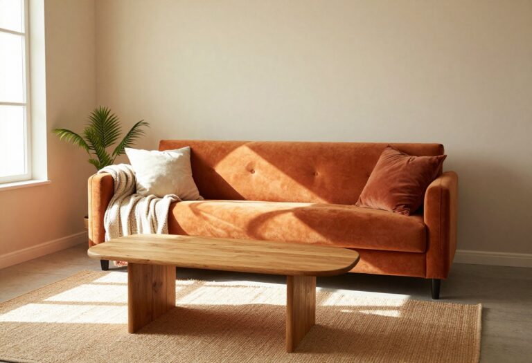
4. Color-Blocked Arch as a Focal Point
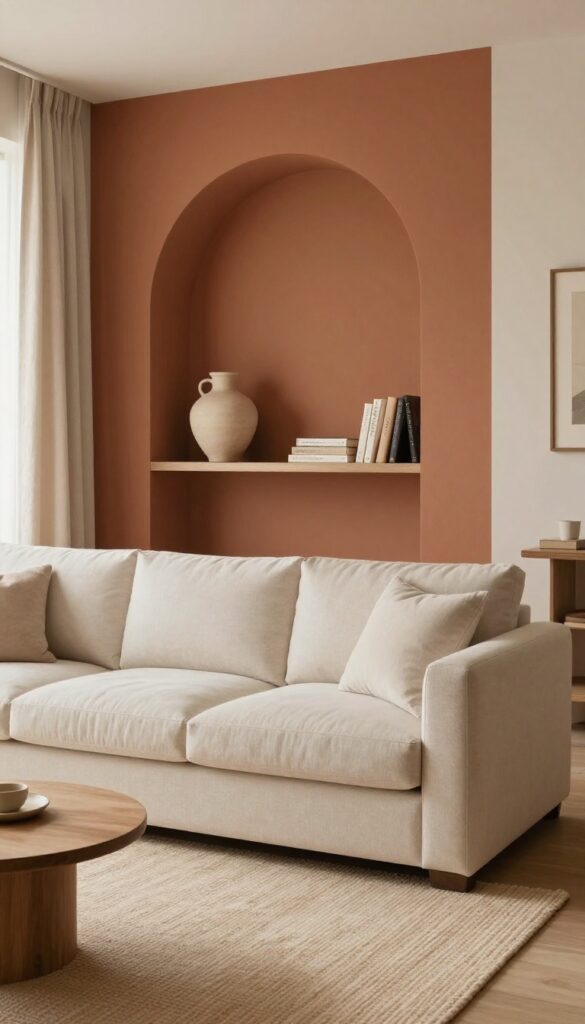
Forget the traditional accent wall—painting a single arch shape in a bold, contrasting hue is a low-lift way to create a major focal point. It tricks the eye into seeing architectural detail where there is none, and it instantly gives a blank wall a sense of purpose. The best part?
You only need painter’s tape, a level, and a steady hand to pull it off in an afternoon.
This idea works especially well behind a sofa or a long console table, where the arch frames the furniture like a piece of art. Choose a color that feels intentional—either a deeper version of your wall color for a tonal look, or a complementary shade that pops. The arch doesn’t have to be perfect; a slightly asymmetrical shape can feel even more organic and modern.
Keep the rest of the room neutral so the arch stays the hero.
Best Colors For The Arch
- Stick with warm, earthy tones if you’re going for cozy—think terracotta, muted rust, or a deep olive green. For a more layered feel, try a dusty blush or a soft clay. Avoid neon or overly bright shades unless you’re aiming for a playful, eclectic vibe.
- The goal is contrast without shouting.
Placement And Scale
Center the arch behind your main seating piece, and make it wide enough to frame the furniture without cutting it off. A good rule: the arch should be about two-thirds the width of the sofa or console. Height-wise, let it rise a few inches above the tallest piece—this draws the eye upward and makes the ceiling feel higher.
Finishing Touch: Texture Play
Once the paint dries, add a small floating shelf inside the arch to display a ceramic vase, a stack of books, or a trailing plant. The shelf breaks up the painted shape and adds a layer of depth. Keep the items minimal—you want the arch to remain the main event, not get cluttered.
5. Striped Accent Wall for Playful Rhythm
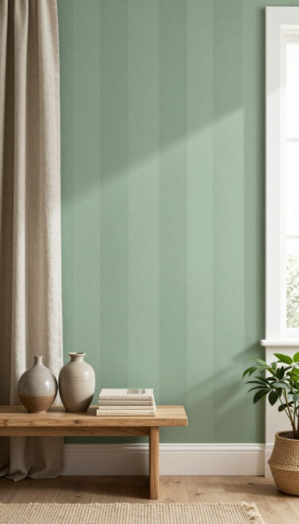
Vertical stripes in two similar tones, like sage and moss, add subtle movement and a cozy, wrapped-in feel. It’s an easy way to bring in pattern without going bold or busy. Keep stripes wide for a relaxed look that doesn’t overwhelm—think calm, not chaotic.
A striped accent wall is a playful but sophisticated choice that adds rhythm to your living room. By using two closely related shades, you create depth without high contrast. This technique works especially well in smaller spaces because vertical stripes draw the eye upward, making the ceiling feel higher.
Pair it with neutral furniture and natural textures like linen and wood to keep the room grounded.
Best Colors
Stick with analogous colors—two shades next to each other on the color wheel. Sage and moss green, dusty blue and slate, or warm beige and taupe all work beautifully. Avoid high-contrast combos like black and white if you want a cozy, relaxed vibe.
Striping Tips
For a laid-back feel, use painter's tape to create stripes that are 8 to 12 inches wide. This proportion feels balanced and not too busy. Alternate the two colors, starting and ending with the lighter shade at the top and bottom for a finished look.
Finishing Touch
Add a long, low console table or a bench against the striped wall. Style it with a few ceramic vases and a stack of books in coordinating tones. This anchors the pattern and gives the room a collected, intentional feel.
6. Monochromatic Layering with Sheen Variation
You know that feeling when a room looks flat, even after you've painted it a color you love? The fix might not be a new color at all—it could be a shift in finish. Monochromatic layering with sheen variation uses the same hue in matte and satin finishes on different wall sections or trim.
The light catches each surface differently, creating subtle depth that makes the room feel layered and intentional without adding a single piece of furniture.
This technique is perfect for cozy, relaxed spaces where you want visual interest without clutter. It works especially well in living rooms with natural light that shifts throughout the day, as the changing light plays up the contrast between finishes. Start by choosing a warm neutral or a muted earth tone—think soft greige, warm taupe, or dusty sage.
Paint the main walls in matte for a soft, velvety backdrop, then use satin on a focal wall, wainscoting, or even just the ceiling. The result is a quiet, sophisticated depth that feels custom and curated.
Best Colors For This Look
- Stick with colors that have a bit of warmth to them—cool tones can feel sterile when paired with sheen contrast. Try a warm beige like Benjamin Moore's Revere Pewter in matte on three walls and satin on an accent wall. Or go deeper with a charcoal like Sherwin-Williams Tricorn Black in matte, then use satin on the trim for a subtle glow.
- Earthy greens and soft blues also work beautifully, especially when the satin finish is used on lower wall sections like a dado rail.
Where To Apply The Satin Finish
- The key is to use satin sparingly so it feels intentional, not accidental. Apply it to a single accent wall, the ceiling, or architectural details like picture rails or paneling. In a living room, painting the fireplace wall in satin while the rest stays matte adds a soft sheen that catches candlelight and evening lamp glow.
- For a more subtle approach, use satin only on the trim—baseboards, crown molding, and window frames—to frame the matte walls without overwhelming them.
Lighting Tip
- Lighting makes or breaks this technique. Position a floor lamp or sconces to graze the satin wall, highlighting the sheen and creating a gentle glow. Avoid overhead lights that are too bright or direct, as they can wash out the contrast.
- Warm-toned bulbs (2700K–3000K) enhance the coziness and make the sheen look soft rather than shiny. In the evening, the satin areas will subtly reflect ambient light, giving the room a layered, lived-in feel.
7. Stenciled Botanical Pattern for Whimsy
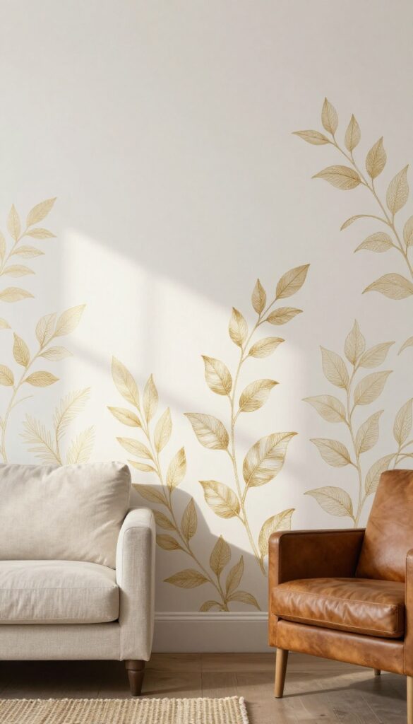
A stenciled wall can feel like a secret garden without the commitment of wallpaper or a mural. By choosing a large-scale botanical pattern in a soft metallic or muted tone over a neutral base, you get that handcrafted look that makes a room feel personal and layered. This is especially charming in a reading nook or behind a sofa, where the pattern adds quiet visual interest without shouting for attention.
Stenciling is one of those DIY projects that delivers big personality for relatively low cost and effort. The key is to pick a stencil that's generous in scale—think oversized leaves or sprawling vines—so the pattern reads clearly from across the room. A soft metallic like brushed gold or pewter over a warm white or pale greige base creates a subtle shimmer that catches the light, while a muted sage or dusty rose over a cream background keeps things earthy and cozy.
The irregular, hand-stamped look of stenciling adds texture that feels intentional and collected, not mass-produced. This idea works beautifully in small spaces because the pattern can be confined to a single accent wall or even just the upper half of a wall, leaving the rest of the room breathable. Pair it with natural textures like linen curtains, a jute rug, and a worn leather chair to lean into that relaxed, layered vibe.
Best Colors
- For a cozy feel, stick with warm neutrals as your base—think creamy ivory, warm beige, or soft taupe. Then choose a stencil color that's one or two shades darker or a muted metallic. Soft gold, antique brass, or a dusty terracotta work beautifully.
- Avoid high-contrast combos like black on white, which can feel too stark for a relaxed room.
Placement Tip
Instead of stenciling an entire wall, try creating a feature band at chair-rail height or framing a reading nook with the pattern on just one wall. This keeps the look intentional and prevents the pattern from overwhelming the space. It also makes the project more manageable if you're new to stenciling.
Finishing Touch
Once your stencil is dry, add a few floating shelves with trailing plants or a stack of vintage books. The organic shapes of the plants echo the botanical pattern, while the shelves break up the wall and add depth. A warm-gold picture light above the stenciled area highlights the texture in the evening.
8. Deep Accent Ceiling for Cocoon Effect
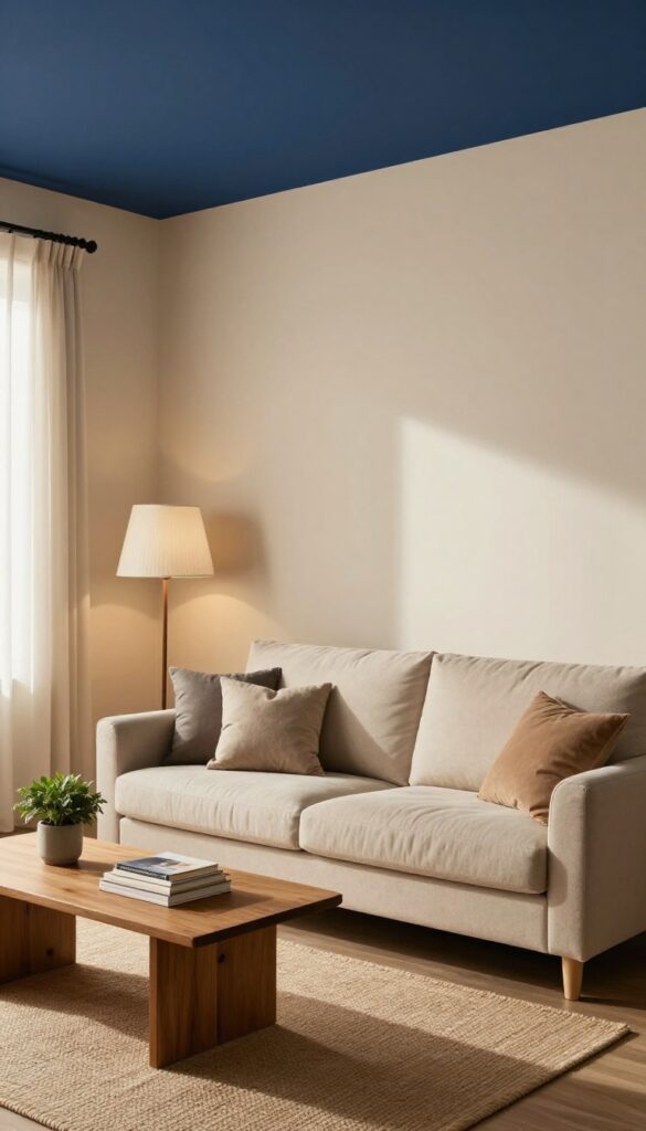
You’ve probably heard about accent walls, but what about an accent ceiling? Painting the ceiling a rich, moody color like navy, charcoal, or deep forest green while keeping the walls light creates a surprising cocoon effect. It tricks the eye into thinking the ceiling is lower, which actually makes the room feel cozier and more intimate—perfect for a living room where you want to unwind.
This is one of those ideas that sounds bold but feels surprisingly natural once it’s done. The contrast between light walls and a dark ceiling draws your eye upward just enough to notice the depth, but the darkness overhead creates a snug, enveloping sensation. It’s like the room is giving you a gentle hug.
Best of all, it works in almost any living room—whether you have high ceilings that feel cavernous or standard eight-foot ceilings that could use a little drama. The key is to choose a dark shade with warm undertones (think navy with a hint of green or charcoal with a touch of brown) so the space doesn’t feel cold or cave-like. Pair it with plenty of soft lighting—floor lamps, table lamps, maybe a dimmer switch—to keep the mood relaxed and inviting.
Best Colors To Try
- Navy blue is a classic choice because it reads as sophisticated without being too heavy. Charcoal gray works well if you want something more neutral but still dramatic. For a warmer vibe, try a deep olive or a rich plum.
- Avoid pure black or very cool tones—they can make the room feel smaller and less cozy. If you’re unsure, start with a deep navy or charcoal and see how it feels with your lighting.
Lighting Tips
- Since the ceiling is dark, you’ll need to compensate with layered lighting. Use warm white bulbs (2700K–3000K) to keep the glow soft. Add a mix of overhead fixtures, floor lamps, and table lamps to avoid shadows.
- A dimmer switch is a game-changer—it lets you adjust the brightness from bright and airy to dim and snug. Consider a statement chandelier or pendant light that contrasts with the dark ceiling, like a brass or gold fixture.
Finishing Touch
Keep the walls a light, warm neutral—think cream, warm white, or soft beige—to maximize the contrast. Add texture with a chunky knit throw, velvet pillows, or a shag rug to enhance the cozy feel. Crown molding painted the same color as the ceiling helps the look feel intentional and polished, not like an unfinished project.
9. Washed Chalkboard Wall for Functional Art
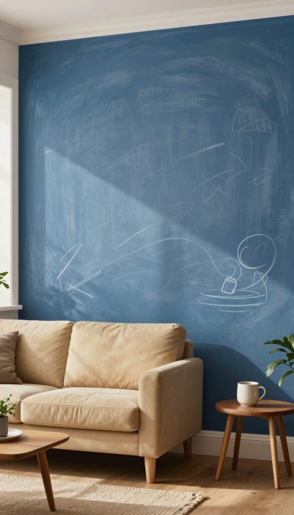
Chalkboard paint isn’t just for kids’ rooms or kitchens anymore. When you wash it down with a dry brush technique, it takes on a soft, aged look that feels more like a textured accent wall than a classroom fixture. The trick is choosing a muted tone—think dusty blue or soft gray—so it blends into your living room instead of screaming for attention.
This wall pulls double duty: it’s a place to jot down reminders or doodle, but it also adds a relaxed, lived-in texture that makes the room feel cozy and layered.
Start by picking a wall that gets some natural light but isn’t the main focal point—a side wall behind a sofa or a narrow stretch near a reading nook works beautifully. Paint the whole surface with two coats of chalkboard paint in your chosen color, letting it dry completely. Then, grab a dry brush with a tiny bit of white or lighter gray paint and lightly drag it across the surface in random strokes.
This distresses the finish, giving it a washed, timeworn look that softens the starkness. Once it’s sealed with a clear wax or matte topcoat, you can write on it with chalk and erase as needed. The result is a wall that feels both practical and artistic—perfect for a living room that values function without sacrificing style.
Best Colors For A Washed Effect
- Stick with muted, dusty shades that feel warm and inviting. Soft gray, dusty blue, sage green, or even a pale mauve work well because they don’t compete with your furniture. Avoid bright or dark colors—they’ll make the distressed look feel muddy.
- Test a small patch first to see how the dry brush technique looks on your chosen hue.
Texture Mix Tip
Pair this wall with soft textures to balance its tactile feel. A chunky knit throw on the sofa, a wool rug, or velvet pillows will contrast nicely with the matte, slightly rough chalkboard surface. Add a wooden frame around the wall’s edges or a floating shelf with a few plants to anchor the look and keep it from feeling too bare.
Finishing Touch For Everyday Use
Keep a small tray of colored chalk and a soft eraser nearby on a console table or in a basket. This makes it easy to update notes or drawings without hunting for supplies. For a cleaner look, use a damp cloth to erase fully, and consider a monthly reapplication of wax to maintain the distressed finish.
10. Geometric Diamond Pattern for Modern Warmth
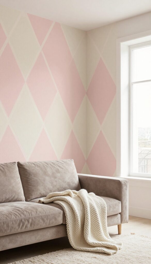
Geometric patterns have a way of making a room feel intentional without screaming for attention. When you tape off diamond shapes in soft, neutral tones like blush and cream, you get a subtle geometric effect that adds visual interest while keeping the space cozy. It's the kind of detail that makes people think you spent a lot more time and money than you actually did.
This idea works especially well in living rooms that lean modern but need a touch of warmth. The diamonds create a gentle rhythm across the wall, almost like a woven textile, which makes the room feel layered and lived-in. You can scale the pattern to fit your wall size—larger diamonds for a bolder statement, smaller ones for a more delicate look.
The key is keeping the palette soft so the geometry feels inviting, not cold.
Best Colors
Stick with warm neutrals: blush pink, cream, soft beige, or a muted terracotta. These colors reflect light nicely and keep the pattern from feeling harsh. If you want a little contrast, use a slightly deeper shade for the diamond outlines, like a warm taupe or dusty rose.
Taping Technique
- Use painter's tape and a level to map out your diamonds before painting. Start by marking the center of the wall and working outward in a grid. Press the tape edges down firmly to prevent bleeding, and remove it while the paint is still slightly wet for crisp lines.
- Patience here pays off big time.
Cozy Detail
Pair the diamond wall with soft textures like a chunky knit throw, a velvet sofa, or a wool rug. The geometric pattern adds structure, so you want the furniture and accessories to bring in the cozy factor. A floor lamp with a warm bulb also helps soften the look.
FAQ
What paint finish works best for a cozy living room?
Matte or eggshell finishes are ideal for a cozy look because they absorb light and reduce glare, creating a soft, warm atmosphere. For high-traffic areas, consider a washable matte.
How do I choose colors that feel layered without being busy?
Stick to a cohesive palette of 2-3 tones within the same color family, and vary the intensity. For example, pair a warm beige with a deeper taupe and a muted rust accent.
Can I paint an accent wall in a small living room?
Absolutely. Choose a darker or richer color on one wall to add depth, but keep the other walls light to maintain openness. A textured finish like limewash can also add dimension without overwhelming the space.
What’s the easiest way to add texture with paint?
Try a sponge or rag technique for a soft, mottled effect, or use a specialty paint like limewash or chalk paint. These methods are forgiving and create a handcrafted feel.
How do I make a painted wall feel cohesive with my furniture?
Pull a color from your existing decor—like a throw pillow or rug—and use it as your wall color. This ties the room together and makes the painted wall feel intentional.
Conclusion
Painting your living room walls doesn’t have to be a big, scary project. With a little planning and a creative approach, you can turn a blank wall into a cozy, layered feature that makes the whole room feel more inviting. Try one of these ideas, or mix and match elements to suit your space.
The best part? Paint is forgiving—you can always change it up when the mood strikes. So grab a brush and start giving those walls the life they deserve.