11 Living Room Paint Ideas That Change the Mood Fast
Paint is one of the quickest ways to transform a room. A fresh coat can make a space feel bigger, cozier, or more energetic—all without a major renovation. If your living room needs a mood lift, the right color can do the trick.
We're focusing on light and airy shades here. Think soft whites, pale blues, and gentle greens that bounce light around and create a serene backdrop.
These aren't boring neutrals—they're nuanced hues that add depth without weighing the room down. Whether you're starting from scratch or just want to refresh, these 11 paint ideas will help you find a color that feels right.
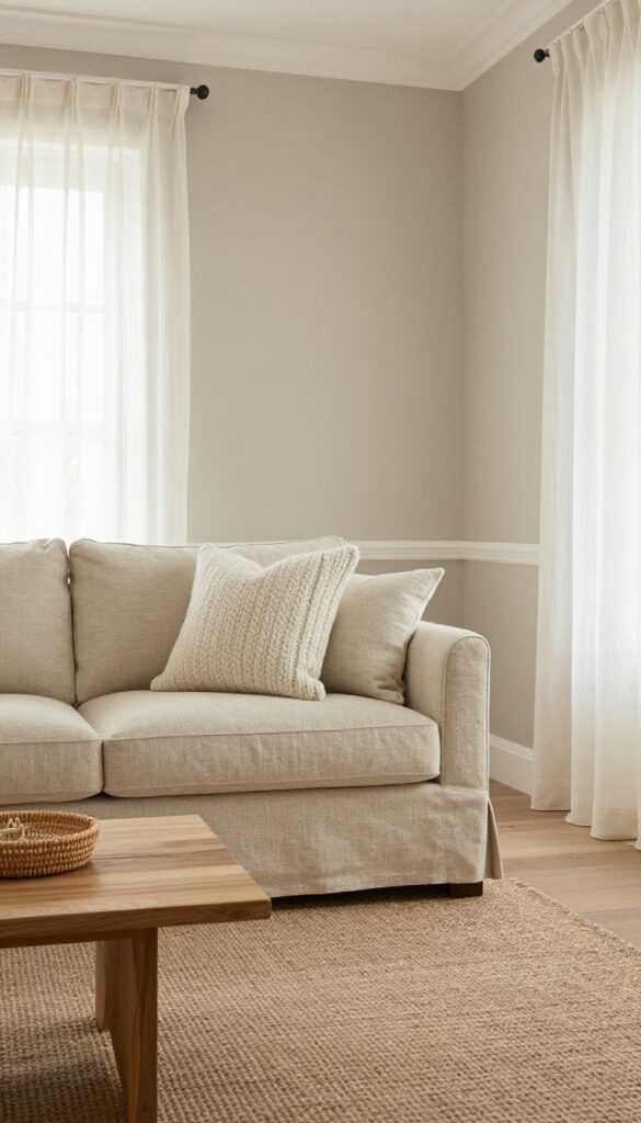
1. Cloud White – The Ultimate Fresh Start
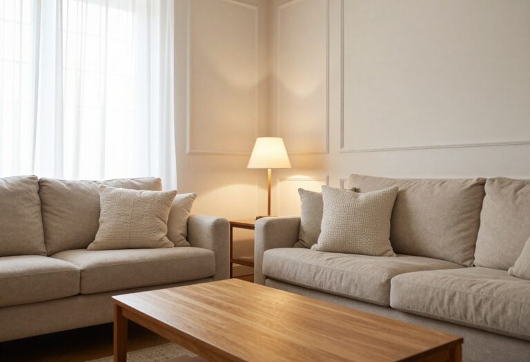
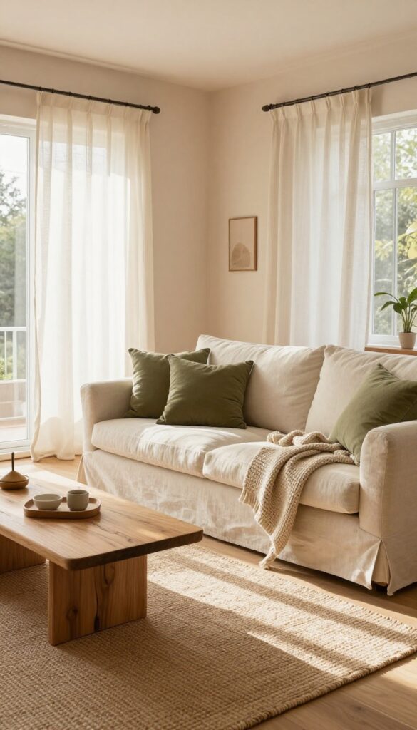
Sometimes a room just needs a deep breath. Cloud White delivers that feeling the second you walk in. It’s not a stark, clinical white—it’s warm with a subtle gray undertone that softens the whole space.
This shade makes walls feel like they’re receding, opening up square footage without knocking anything down. Natural light bounces off it beautifully, and even on gray days, the room holds onto a quiet brightness. It’s the kind of backdrop that lets every other element shine without competing for attention.
Cloud White works wonders in living rooms that get moderate light. It pairs effortlessly with natural wood furniture, linen sofas, and chunky knit throws. The trick is to keep the palette soft and tonal—think cream, beige, and pale oak—so the room feels cohesive.
Add a jute rug or a rattan coffee table to bring in texture without clutter. This isn’t a look that demands perfection; it’s relaxed, lived-in, and endlessly adaptable. Whether your style leans Scandinavian, coastal, or modern farmhouse, Cloud White is the canvas you can build on for years.
Best Colors To Pair With Cloud White
Stick with muted tones to maintain the airy feel. Pale greige, dusty blush, and soft sage green keep things calm. For contrast, use charcoal or navy in small doses—like a throw pillow or a slim floor lamp—to anchor the lightness without weighing it down.
Texture Mix For Depth
- Since the walls are quiet, let your furnishings do the talking. Combine a nubby wool rug with smooth leather or velvet cushions. Add a matte ceramic vase and a woven basket for storage.
- The mix of textures prevents the room from feeling flat or sterile.
Lighting Tip For A Glowing Effect
Cloud White reflects light, so maximize that with layered lighting. Use warm LED bulbs (2700K–3000K) in floor lamps and sconces. Avoid harsh overhead lights—instead, place a lamp in a corner to cast a soft glow across the wall, making the white feel creamy and inviting.
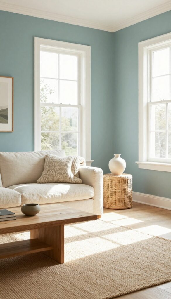
2. Pale Sky Blue – Bring the Outdoors In
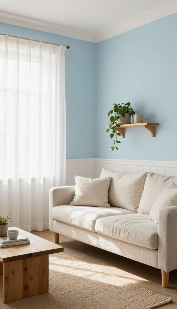
There’s a reason we feel calmer just looking at a clear blue sky. That same sense of openness and ease is exactly what pale sky blue brings to a living room. It’s soft without being wishy-washy, and it pairs beautifully with whites, woods, and natural textures.
Whether you paint all four walls or just one accent wall behind the sofa, this color makes the room feel bigger, brighter, and more relaxed—like a breath of fresh air you can come home to.
Pale sky blue works in almost any living room, from a cozy apartment to a sprawling open plan. It reflects light beautifully, so even north-facing rooms feel less cave-like. The key is keeping the undertones neutral—too much green or gray can pull it toward sad, but a true sky blue stays uplifting.
Pair it with crisp white trim for contrast, or go tonal with creamy off-whites for a softer edge. Add in natural wood furniture, linen curtains, and a few trailing plants, and you’ve got a space that feels both grounded and airy.
Best Color Pairings
- Stick with whites, warm grays, and sandy beiges for the main palette. Then layer in accents of navy or slate for depth, and touches of blush or terracotta for warmth. Avoid pairing pale sky blue with cool grays that lean blue themselves—that can make the whole room feel cold.
- Instead, let the blue stand out against warmer neutrals.
Texture Mix
- Since the wall color is so serene, add visual interest through texture. Think chunky knit throws, a jute or sisal rug, velvet pillows in deeper blues, and a leather ottoman. The contrast between smooth walls and tactile fabrics keeps the room from feeling flat.
- A reclaimed wood coffee table or woven baskets also reinforce that natural, outdoor feel.
Lighting Tip
Pale sky blue looks best in rooms with plenty of natural light, but it works with warm artificial light too. Use soft white bulbs (2700K–3000K) in floor and table lamps to avoid washing out the color. A single statement pendant in brass or black adds a modern edge without competing with the walls.
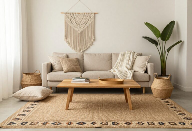
3. Sage Green – Earthy and Grounding
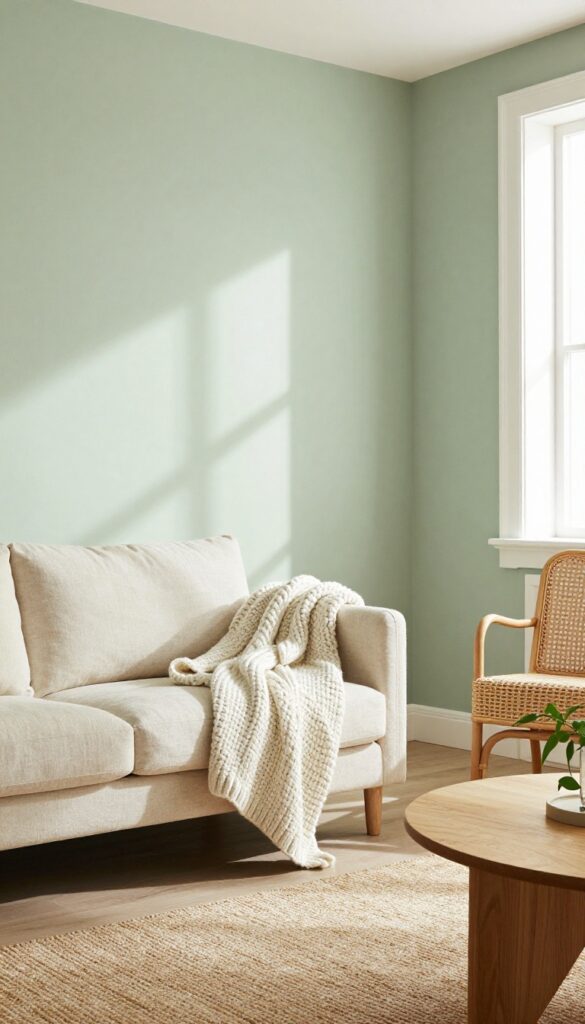
Sage green has a quiet way of making a room feel settled. It’s not a loud color, but it brings enough personality to keep a living room from feeling flat. Paired with crisp white trim and natural textures like rattan or linen, it strikes that balance between cozy and airy.
This shade works especially well in rooms that get good natural light, where it can shift from a soft gray-green in the morning to a warmer tone by afternoon.
Sage green is one of those rare colors that feels both calming and fresh. It grounds the room without making it feel dark or heavy. The trick is to let it breathe—use it on walls or an accent wall, then layer in light woods, cream textiles, and plenty of greenery.
The result is a space that feels connected to nature, even in the middle of the city.
Best Colors To Pair
Stick with whites that have a warm undertone, like ivory or cream, to keep the look soft. For contrast, try deep navy or charcoal in small doses—think a throw pillow or a ceramic vase. If you want a more monochromatic vibe, layer in muted olive or dusty blue for depth without losing that airy feel.
Texture Mix
- Sage green can read flat if everything is too smooth. Bring in a chunky knit throw, a linen sofa, and a jute rug to add visual interest. Rattan or cane furniture fits right in, adding warmth and a handcrafted feel.
- A matte finish on the walls also helps the color feel softer and more organic.
Finishing Touch
A large mirror with a natural wood frame opposite a window will bounce light around the room and make the sage feel even fresher. Add a few trailing plants on a shelf or mantel to echo the earthy vibe. Keep accessories minimal—a couple of ceramic vases or a stack of books in neutral tones is enough.
4. Buttercream Yellow – Warmth Without the Weight
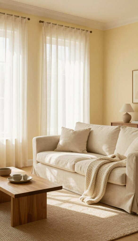
North-facing rooms get a bad rap for feeling cold and shadowy, but the right paint color can flip that script entirely. A pale, buttery yellow brings in gentle warmth without overwhelming the space. It’s cheerful without being loud, and it pairs effortlessly with cream and beige accents.
Think of it as sunlight you can brush onto your walls.
This shade works especially well in living rooms that don’t get direct sun. It reflects light softly, making the room feel brighter and more open. The key is choosing a yellow with enough white in it so it stays airy.
Pair it with off-white trim and natural linen curtains to keep the look light. For a subtle contrast, add wooden furniture in a warm oak tone. The overall effect is cozy but not heavy—like a room that’s always bathed in late afternoon light.
Best Colors
- Stick with buttery yellows that have a hint of cream or vanilla. Avoid anything too golden or mustardy, which can feel heavy. Benjamin Moore’s Hawthorne Yellow or Sherwin-Williams’ Buttercup work well.
- For trim, use a warm white like Swiss Coffee to keep the palette soft.
Texture Mix
Balance the smooth wall finish with textured fabrics. A chunky knit throw in cream, a linen sofa in beige, and a jute rug add depth without cluttering the look. The texture keeps the room from feeling flat or too monochromatic.
Lighting Tip
Use warm white bulbs (2700K–3000K) to enhance the yellow’s cozy vibe. Avoid cool or daylight bulbs, which can make the color look dingy. Table lamps with linen shades diffuse the light nicely and add to the airy feel.
5. Dusty Lavender – Soft and Unexpected
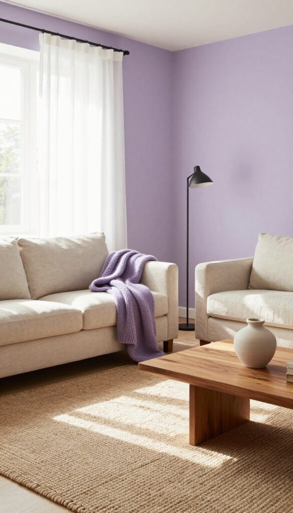
Purple can feel intimidating, but dusty lavender flips that script completely. It’s a muted, almost dusty shade that brings warmth without overwhelming a room. Think of it as a neutral with a whisper of personality—it shifts from lilac to grey depending on the light, which keeps the space feeling fresh and airy.
This color works especially well in living rooms that get good natural light, where it softens corners and adds a gentle, grown-up charm.
Dusty lavender is a muted purple that feels sophisticated and calming. It adds a subtle hint of color that changes with the light, keeping the room airy. Pair it with warm woods and creamy whites to ground the look, or go bolder with deep navy accents for contrast.
This shade works beautifully in north-facing rooms where cooler tones can feel flat—dusty lavender adds just enough warmth without turning yellow.
Best Colors To Pair
- Stick with soft, earthy companions to keep the mood light. Cream, oatmeal, and warm taupe let the lavender breathe. For a bit of edge, add charcoal or black in small doses—like a slim floor lamp or picture frames.
- Avoid bright whites that can make the lavender look washed out; go for off-white or ivory instead.
Texture Mix
Because dusty lavender is so soft, texture becomes your best friend. A chunky knit throw in a lighter lilac, a velvet sofa in a deeper plum, or a linen curtain in the same hue adds depth without clutter. Throw in a woven jute rug or a matte ceramic vase to keep things grounded and natural.
Lighting Tip
This color loves layered lighting. Use warm white bulbs (2700K–3000K) to bring out its cozy side. A floor lamp with a fabric shade near a reading chair makes the lavender glow, while a dimmer switch lets you shift from bright and airy to intimate and moody as the evening goes on.
6. Seafoam Green – Crisp and Refreshing
Seafoam green sits right where blue meets green, and it brings that exact calm, coastal feeling indoors without screaming beach theme. It’s one of those colors that feels both cool and warm at the same time—like a gentle wave on a sunny shore. For small living rooms, this shade is a secret weapon: it bounces light around the room, making the whole space feel bigger and breezier.
You get the freshness of a crisp morning without the chill of stark white or the heaviness of deeper tones.
Seafoam green is a versatile backdrop that pairs beautifully with natural textures and soft neutrals. It works in almost any light because it has enough pigment to hold its own in dim corners, yet it stays light enough to keep a room feeling open. This color is especially forgiving with wear and tear—dust and smudges don’t show as easily as on pure white walls.
Whether you paint all four walls or just an accent wall behind the sofa, seafoam green adds a subtle personality that feels both modern and timeless.
Best Color Pairings
- Seafoam green loves white trim and warm wood tones. Try pairing it with crisp white baseboards and a light oak coffee table for a clean, airy look. For a bit more depth, add touches of sandy beige or soft gray in your rug or throw pillows.
- Avoid pairing it with bright primary colors—they can clash with the muted, soothing vibe. Instead, go for blush pink, pale coral, or cream for accents that keep the room feeling soft and cohesive.
Texture Mix
- Because seafoam green is already a calm color, you want to bring in texture to keep the room from feeling flat. A chunky knit throw in off-white, a linen sofa in a natural hue, and a jute rug add layers that make the space feel lived-in and inviting. Woven baskets for storage or a rattan pendant light reinforce the organic, relaxed mood.
- The key is to balance the coolness of the paint with warm, tactile materials.
Small-space Fix
- In a small living room, use seafoam green on the ceiling too. It sounds bold, but it actually makes the ceiling feel higher by blurring the line between walls and ceiling. Keep the floor and furniture light—a pale gray sofa or a whitewashed console table—so the room doesn’t feel boxed in.
- Add a mirror opposite a window to double the light and the sense of space. You’ll be surprised how much bigger the room feels.
7. Warm Greige – The Perfect Neutral
If you can't decide between gray and beige, greige is your answer. This blend of gray and beige sits right in the middle—warmer than a cool gray, but not as yellow as beige. It creates a soft, airy backdrop that feels grounded without being heavy.
In a light and airy living room, greige walls let the furniture and decor take center stage while keeping the whole space calm and cohesive.
Greige is one of those colors that just works. It adapts to different lighting throughout the day, shifting from a warm stone tone in the morning to a cozy taupe by evening. Because it's a neutral, it pairs beautifully with white trim, natural wood, and both warm and cool accents.
Think of it as the ultimate supporting actor—it never steals the show, but it makes everything around it look better. For a light and airy feel, stick with a lighter greige like Sherwin-Williams Agreeable Gray or Benjamin Moore Revere Pewter. These shades have enough warmth to keep the room inviting but enough gray to feel crisp and modern.
Best Color Pairings
- Greige loves white. Crisp white trim and ceilings make the walls look fresh and bright. For a soft contrast, add creamy off-white furniture or linen curtains.
- If you want a pop of color, muted blues and sage greens work beautifully with greige. Try a navy velvet sofa or sage throw pillows to bring in depth without overwhelming the space.
Texture Mix
- Since greige is so neutral, texture becomes your best friend. Layer a chunky knit throw over a linen sofa, add a jute rug, and bring in wooden coffee tables or rattan accents. The mix of soft, rough, and smooth surfaces keeps the room from feeling flat or boring.
- A few matte black or brass accessories add just enough contrast.
Lighting Tip
- Greige can look flat in dim light, so make sure your room has good lighting. Natural light is ideal, but if that's limited, use warm white bulbs (2700K–3000K) in floor lamps and sconces. Avoid cool white bulbs—they'll make greige look drab.
- A mix of overhead, task, and accent lighting will bring out the subtle undertones in the paint.
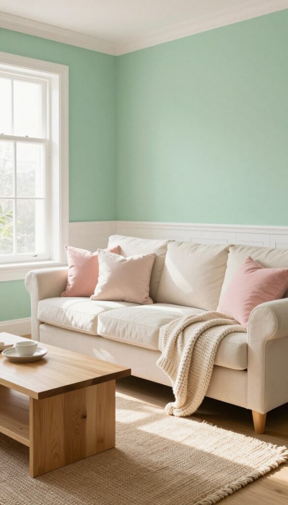
8. Blush Pink – Subtle Romance
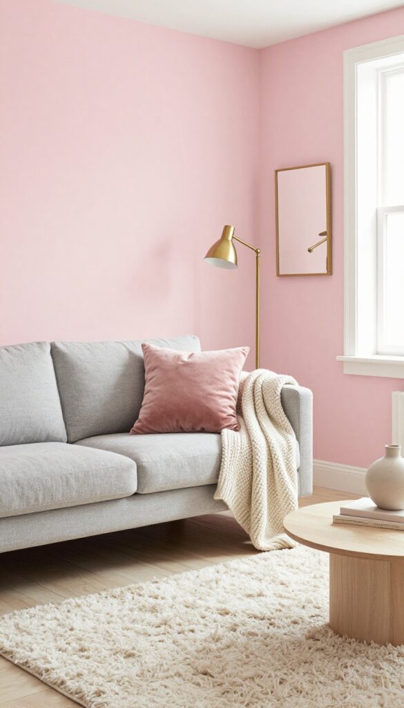
Blush pink has this effortless way of making a room feel softer without going full princess. It's a grown-up take on pink that reads more like a neutral than a statement color. When you pair it with light grays, whites, or even warm woods, the whole space feels airy and gently romantic, like a room that's always ready for a quiet afternoon.
A pale blush pink adds a soft, romantic touch without being too sweet. Pair it with gray or white furniture for a modern, light look.
Best Colors To Pair
- Blush pink loves company. Stick with soft grays, warm whites, and pale beiges to keep the look light and airy. For a bit of contrast, add touches of dusty rose or mauve in pillows or throws.
- Avoid anything too bright or cool-toned, as that can make the pink feel jarring.
Texture Mix
- Since blush is such a soft color, texture becomes your best friend. Think velvet pillows, a chunky knit throw, or a linen sofa. A shaggy rug in cream or light gray adds depth without visual weight.
- The goal is to keep the room feeling layered but not busy.
Finishing Touch
Bring in a few metallic accents—brass or gold works beautifully with blush. A simple brass floor lamp or gold-framed mirror adds just enough shine. Keep accessories minimal: a couple of ceramic vases or a stack of coffee table books in neutral tones complete the look.
9. Misty Aqua – Coastal Calm
There’s a reason coastal-inspired rooms feel so instantly relaxing. Misty aqua captures that soft, watery blue-green that reminds you of sea glass and morning tides. It’s not loud or tropical—it’s muted, like the sky just before the sun breaks over the horizon.
This shade works beautifully when you want a living room that feels open, airy, and quietly refreshed.
Pair misty aqua with crisp white trim and natural textures to keep the look light. The color itself does most of the work, so you don’t need a lot of pattern or clutter. Think of it as a neutral with a soft personality—it goes with warm woods, rattan, and creamy linens without competing.
It’s especially nice in rooms that get good natural light, where the paint shifts slightly throughout the day.
Best Color Pairings
- Stick with whites that have a hint of warmth—pure white can feel too stark next to misty aqua. Cream, ivory, and soft beige keep the palette gentle. For accents, sandy beige, driftwood gray, and touches of coral or terracotta add depth without breaking the calm.
- Avoid dark or cool grays that might make the room feel flat.
Texture Mix
- Since the wall color is already serene, use texture to add interest. A chunky knit throw, a sisal rug, and linen curtains bring in that beachy tactile feel. Wicker or rattan furniture pieces—like a side table or a basket for blankets—reinforce the coastal vibe without going full nautical.
- A few smooth ceramic vases or a seagrass ottoman round out the look.
Finishing Touch
Add one or two pieces of natural wood furniture, like a live-edge coffee table or a mango wood console. The warm wood tone prevents the room from feeling too cool or sterile. Then finish with a simple arrangement of dried pampas grass or eucalyptus in a neutral vase—it keeps the airy feel and ties everything together.
10. Creamy Off-White – Cozy and Inviting
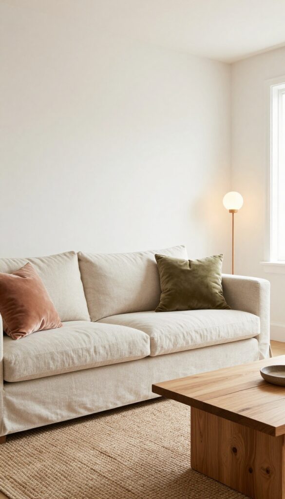
Pure white can feel sterile, but a creamy off-white is like a warm hug for your living room. This shade sits right between bright and cozy, reflecting light while adding a soft, buttery undertone that makes the space feel lived-in and welcoming. It's the perfect canvas for layering textures—think chunky knits, linen, and wood—without ever feeling busy or cold.
Creamy off-white works in almost any living room, from a sun-drenched space to a north-facing one that needs warmth. The key is choosing a shade with a hint of yellow or beige, like Benjamin Moore's White Dove or Sherwin-Williams' Creamy. It pairs beautifully with natural materials and soft pastels, and it makes a room feel airy without that stark, gallery-like vibe.
Start with the walls, then bring in texture through furniture and accessories to keep the look interesting.
Best Colors To Pair
Stick with warm neutrals like taupe, sand, and soft greige for a seamless flow. Add depth with earthy greens or muted terracotta in pillows or a throw. Avoid cool grays or stark whites—they'll clash with the warmth and make the room feel disjointed.
Texture Mix
Since the walls are neutral, texture does the heavy lifting. Layer a chunky wool blanket over a linen sofa, add a jute rug, and bring in a wooden coffee table with visible grain. Velvet cushions in a warm blush or olive can add a touch of luxury without overwhelming the space.
Lighting Tip
Creamy off-white loves warm light. Use bulbs with a color temperature around 2700K to enhance the cozy undertones. Place floor lamps in corners to bounce light off the walls, creating a soft, diffused glow that makes the room feel even more inviting.
11. Light Terracotta – Earthy Warmth
A pale, dusty terracotta does something unexpected to a room. It warms up the space without making it feel heavy or closed in, which is exactly what you want when you're aiming for light and airy. This shade sits somewhere between pink and clay, soft enough to keep the walls from shouting but rich enough to add real character.
It feels grounded, like the room has been there forever, but fresh at the same time.
Light terracotta works especially well in living rooms that get good natural light. The sun hitting those warm tones makes the whole space glow gently, almost like the walls are breathing warmth into the room. It's not a loud color, so it doesn't fight with your furniture or decor.
Instead, it wraps everything in a soft, earthy hug. Pair it with olive green accents, natural wood furniture, and creamy whites, and you get a look that feels both put-together and completely relaxed. The key is keeping the rest of the room light—think linen curtains, a jute rug, and pale upholstery—so the terracotta stays the star without overwhelming the space.
Best Colors To Pair
- Olive green is a natural partner for light terracotta. It echoes the earthy vibe and adds a touch of contrast without clashing. Creamy off-whites and warm beiges keep the palette soft, while touches of rust or deep clay in accessories add depth.
- Avoid cool grays or stark whites, which can make the terracotta look muddy rather than warm.
Texture Mix
- Since the wall color is already soft, you want textures that feel natural and touchable. Linen sofa upholstery, a chunky knit throw, and a sisal or jute rug all play well with terracotta. Wood furniture with visible grain—like oak or walnut—adds warmth, while matte ceramic vases or terracotta pots reinforce the earthy feel.
- Stay away from glossy finishes; they can make the room feel less grounded.
Finishing Touch
Add a few olive green cushions or a throw blanket to tie the color story together. A large framed botanical print with green leaves on a cream background can also pull the look together without adding clutter. Keep the window treatments simple—light linen curtains in a natural tone let the sunlight do the work.
FAQ
What is the best light and airy paint color for a small living room?
Soft whites like Cloud White or pale blues like Pale Sky Blue work best. They reflect light and make the room feel more spacious.
How do I choose a paint color that changes the mood?
Think about the feeling you want—calm, cheerful, or cozy. Cool tones like blue and green promote relaxation, while warm tones like yellow and blush add energy.
Can I use dark colors in a light and airy living room?
Yes, but use them sparingly. An accent wall in a deeper shade can add depth without overwhelming the airy feel.
What sheen is best for living room walls?
Eggshell or satin finishes are ideal. They offer a soft glow that enhances light without being too shiny, and they're easy to clean.
How do I test paint colors before committing?
Paint large swatches on different walls and observe them at various times of day. Natural light changes the look, so live with the samples for a few days.
Conclusion
Choosing the right paint color can completely shift the energy of your living room. These 11 light and airy ideas are designed to help you create a space that feels fresh, calm, and inviting—without a major overhaul.
Remember, the best color is one that makes you feel good every time you walk in. So grab some samples, test them out, and enjoy the process of making your living room a place you love to be.