11 Living Room Photo Wall Ideas That Tell Your Story
Your living room walls are prime real estate for telling your story. A photo wall does more than fill empty space—it turns a house into a home by showcasing the people, places, and moments that matter most. But creating one that feels cohesive and intentional takes a little planning.
The key is balancing personal photos with design principles. You want a wall that feels curated, not cluttered. Whether you prefer a clean grid or a relaxed salon style, the right approach makes all the difference.
These 11 ideas will help you build a photo wall that feels modern, meaningful, and totally you. No generic frames or random arrangements here—just thoughtful ways to display your memories with style.
1. The Monochrome Grid for a Clean Look
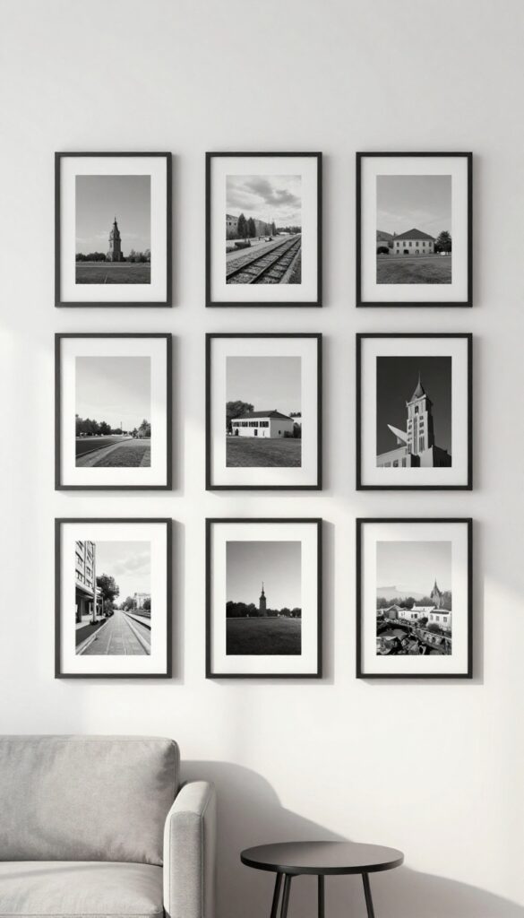
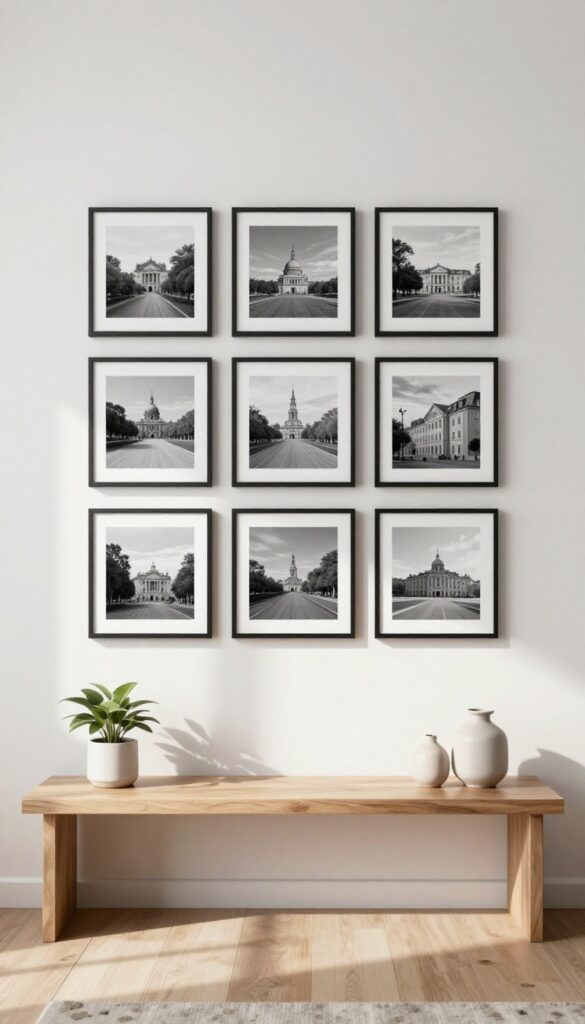
There’s something quietly powerful about a wall of black-and-white photos arranged in a perfect grid. It’s not trying to be loud or eclectic—it’s confident in its simplicity. The monochrome palette keeps the eye moving smoothly across the display, while the uniform spacing gives the whole setup a polished, gallery-like feel.
This approach works especially well in living rooms that lean modern or minimalist, where every element earns its place.
Stick to black-and-white photos in matching frames for a sleek, gallery-like display. Use a level and tape measure to keep spacing even—about 2 to 3 inches between frames works well. This approach keeps the focus on the images themselves, letting the stories they tell take center stage without visual clutter.
Best Frames For The Look
Thin black or white frames with a matte finish keep the grid feeling clean and contemporary. Avoid ornate or metallic frames—they can distract from the uniformity. A simple frame lets the photos breathe and keeps the overall look cohesive.
Layout Tip
Plan your grid on the floor first. Lay out the frames in the exact arrangement you want, measure the total width and height, and mark the wall with painter's tape before hanging. This saves you from uneven rows and unnecessary nail holes.
Photo Selection Advice
Choose images with consistent contrast and brightness so no single photo stands out too much. Portraits, landscapes, or abstract close-ups all work, but keep the subject matter varied enough to feel like a collection, not a repeat.
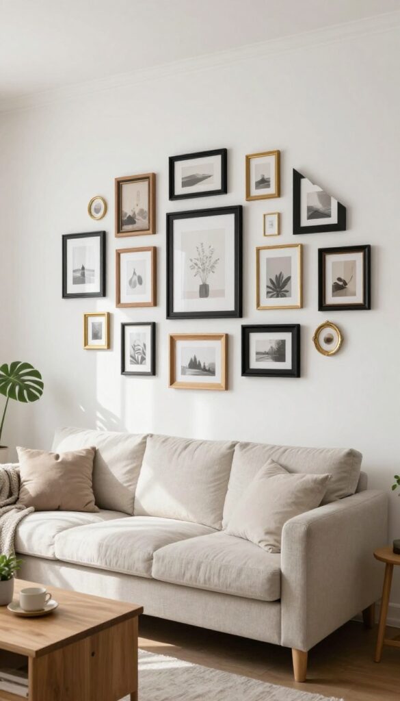
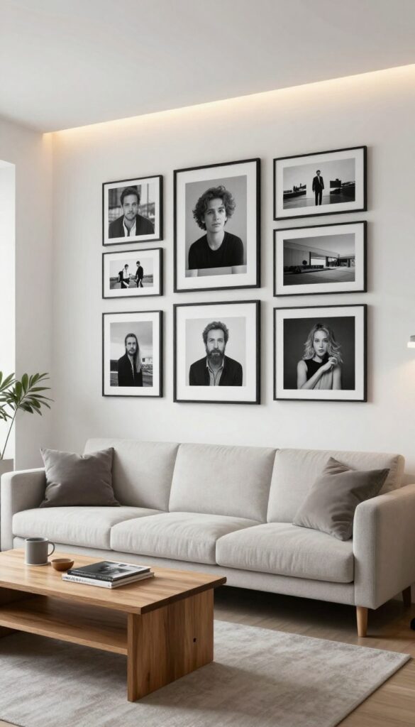
2. Mixed Media Wall with Art and Photos
A gallery wall doesn't have to be all matching frames and uniform photos. Mixing art prints, postcards, and even a small mirror with your favorite snapshots creates a curated, collected-over-time look that feels personal and modern. The key is choosing a unifying color palette—warm neutrals or cool blues work beautifully—so the wall feels intentional rather than chaotic.
Varying frame sizes keeps the eye moving, while balancing the overall shape (think rectangle or oval) maintains visual harmony.
This approach lets you tell a richer story than photos alone. Maybe a minimalist line art print sits next to a vintage postcard from your travels, with a black-and-white family photo anchoring the corner. The mix of textures—matte paper, glossy print, reflective glass—adds depth.
Start by laying out pieces on the floor to find a composition that feels balanced before hammering any nails. Use paper templates on the wall to test spacing.
Best Color Palette
- Stick to two or three colors that repeat across frames and artwork. For a clean, modern look, use warm whites, soft beige, and black. For a cooler vibe, go with slate blue, gray, and cream.
- This consistency ties together disparate items.
Layout Tip
Create a loose grid or organic cluster. Lay all pieces on the floor first, then transfer the arrangement to the wall using paper cutouts. Keep 2–3 inches between frames for a cohesive feel.
Finishing Touch
Add one unexpected element like a small round mirror or a dried botanical in a simple frame. This breaks up the rectangular shapes and adds a tactile, personal layer.
3. Floating Shelf Gallery
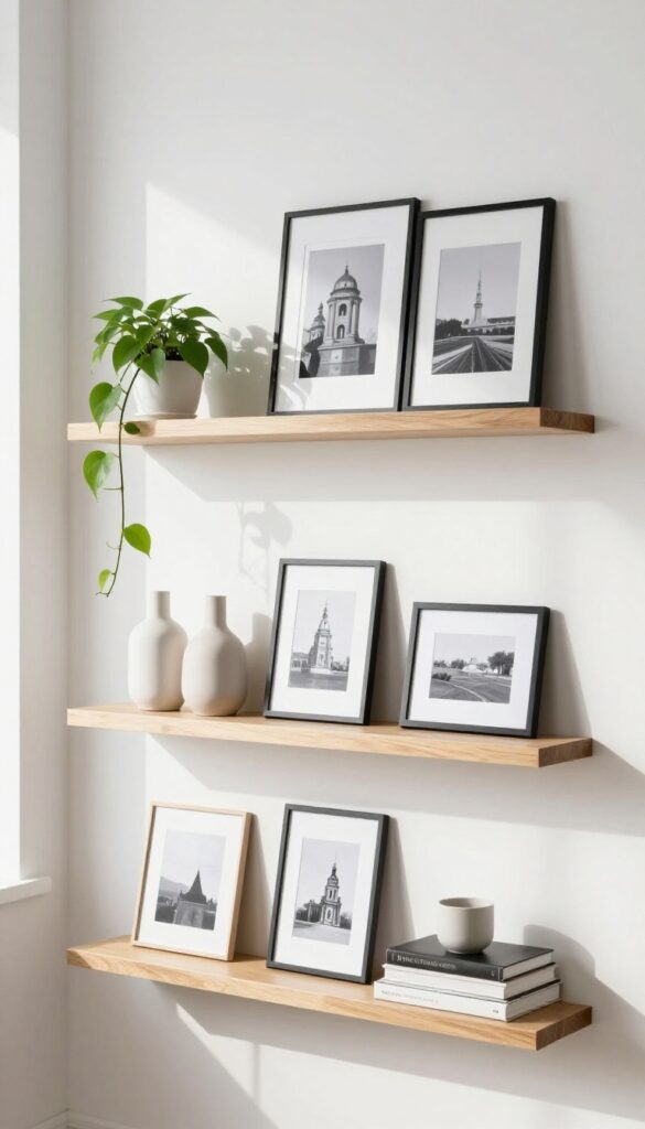
A gallery wall is a classic way to display photos, but the commitment can feel intimidating. Floating shelves offer the same visual impact without the permanence—or the nail holes. Lean framed photos of varying sizes against the wall, then weave in small plants, a ceramic vase, or a stack of books for depth.
The best part? You can swap out images seasonally or whenever the mood strikes, keeping your wall fresh without any damage.
A floating shelf gallery is the perfect solution for anyone who loves the look of a curated wall but hates the hassle of measuring, leveling, and patching holes. By using one or more floating shelves, you create a flexible display that can evolve with your style. Start with a clean, modern shelf in a finish that complements your room—black metal for an industrial edge, or natural wood for warmth.
Arrange your photos in a mix of orientations: some leaning, some standing, and maybe one or two overlapping slightly. Then add small objects like a trailing pothos, a minimalist vase, or a few stacked books to break up the frames and add texture. The result is a layered, lived-in look that feels intentional but effortless.
This approach works especially well in living rooms where you want to showcase family memories without overwhelming the space. Plus, it's a great conversation starter when guests spot a favorite photo tucked among the greenery.
Shelf Styling Tip
Aim for odd numbers when grouping items on each shelf—three or five pieces usually feel most balanced. Vary the heights by using book stacks as risers for smaller frames, and let a trailing plant drape over the edge to soften the lines. Keep the color palette cohesive by sticking to frames in similar tones (black, white, or natural wood) and letting the photos themselves provide the color.
Best Materials
- Floating shelves come in many materials, but for a modern, clean look, opt for solid wood with a matte finish or powder-coated metal. If your living room has warm undertones, go with walnut or oak. For cooler, minimalist spaces, white or black shelves create a crisp backdrop.
- Avoid glossy finishes—they can look dated and show fingerprints easily.
Small-space Fix
- In a compact living room, a single long shelf above a sofa or console table can replace an entire gallery wall. Use it to display just a few carefully chosen photos and a single plant or sculptural object. This keeps the wall from feeling cluttered while still adding personality.
- For extra storage, choose a shelf with a lip or a shallow drawer underneath.
4. Single Large Statement Print
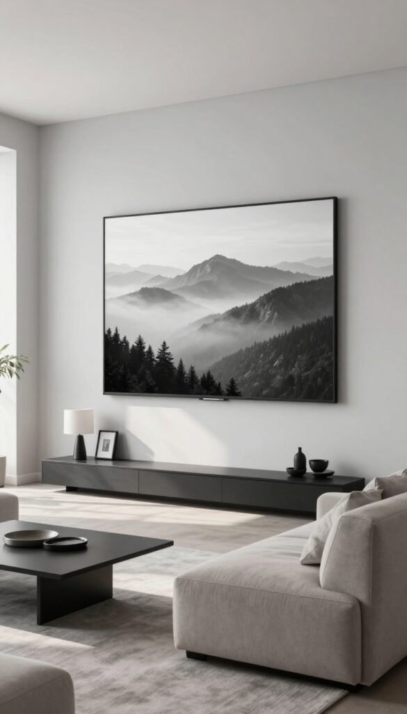
Go big or go home—literally. One oversized photo blown up to 24×36 inches or larger becomes the star of your living room wall. It’s bold, unfussy, and instantly personal.
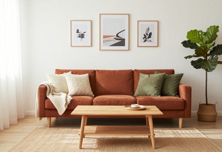
Whether it’s a black-and-white landscape or a candid family moment, a single large print anchors the space without cluttering the wall. Surround it with a few smaller frames for contrast, or let it stand alone for a minimalist look. This approach works especially well above a sofa or console table, where it draws the eye and sets the room’s mood.
The beauty of a single large statement print is its simplicity. You choose one photo that means something—a favorite vacation shot, a portrait, or even a close-up of a flower—and let it take center stage. The print becomes a conversation starter and a visual anchor.
For a clean, modern feel, go with a frameless canvas or a sleek black frame. Keep the surrounding wall uncluttered so the image breathes. If you want to add a few smaller frames, place them asymmetrically around the big one for a curated gallery vibe.
This idea is perfect for living rooms where you want a personal touch without overwhelming the space.
Best Colors
- Stick with a cohesive color palette that complements your room. Black-and-white photos work with any decor and feel timeless. If your print has color, pull one or two hues from it and echo them in throw pillows or a rug.
- For a modern look, choose a photo with muted tones—soft grays, warm beiges, or deep blues—to keep the wall serene.
Layout Tip
Hang the large print at eye level, about 57 to 60 inches from the floor to the center of the image. If it's above a sofa, leave 6 to 8 inches between the top of the backrest and the bottom of the frame. For a console table, center the print above the table, leaving 4 to 6 inches of breathing room.
Finishing Touch
Add a picture light above the print to create a gallery feel. A warm LED spotlight highlights the texture of the canvas or paper and makes the image pop, especially in the evening. It’s a small detail that elevates the whole look.
5. Asymmetrical Cluster for a Relaxed Vibe
Symmetry is great for formal spaces, but a living room wall that feels too balanced can come off as stiff. An asymmetrical cluster of frames brings a collected-over-time look that's effortlessly cool. You start with one anchor piece—usually the largest frame—placed slightly off-center, then let the rest fall into place around it like a puzzle.
The uneven outer edges are key; they keep the arrangement from feeling too deliberate, so it looks like you've been adding to it for years. This approach works especially well above a sofa, console table, or in a reading nook where you want a bit of visual texture without overwhelming the room.
To pull off this look, gather frames in mixed sizes, orientations, and finishes. The mix is what makes it feel relaxed—think a 16×20 landscape print next to a 5×7 portrait, with a small square or two tucked in. Start by laying the frames out on the floor to find a composition that feels balanced but not mirrored.
Then transfer that pattern to the wall using paper templates. The goal is to keep the outer edges jagged, so resist the urge to line up the bottoms or tops. This cluster works best on a large wall with plenty of breathing room around it, and it pairs nicely with a neutral backdrop so the frames stand out without competing.
Best Frame Mix
- Stick to two or three frame colors maximum—black, natural wood, and maybe a metallic accent like brass. Too many finishes can look chaotic. Vary the matting too: some frames with wide white mats, others with no mat at all.
- This creates depth and keeps the eye moving across the cluster.
Layout Tip
- Use painter's tape to mark the outline of the largest frame on the wall first. Then arrange the smaller pieces around it, stepping back often to check the balance. Leave about 2 to 3 inches between frames for a tight but airy feel.
- If you're nervous about committing, try a temporary layout with removable adhesive strips.
Finishing Touch
Incorporate one or two non-frame elements like a small woven wall hanging, a ceramic plate, or a dried floral arrangement. This breaks up the rectangle shapes and reinforces the relaxed, collected aesthetic. Just keep the extra pieces within the same color palette as the frames.
6. Matching Frames in a Linear Row
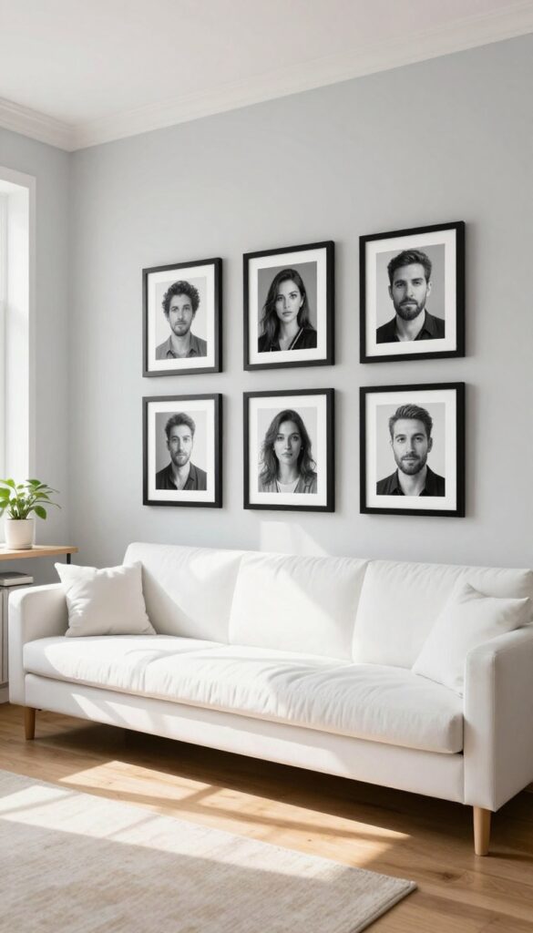
There’s something quietly satisfying about a row of identical frames marching across a wall. It’s clean, intentional, and instantly pulls a room together without shouting for attention. This look works especially well in modern spaces where clutter is kept at bay and every detail has a purpose.
The repetition creates a rhythm that feels both calming and curated—like a gallery wall that decided to keep things simple.
To pull off this look, start by choosing frames that are exactly the same size, color, and style. Black or white thin frames are classic, but a warm wood tone can soften the effect. Lay out your photos on the floor first to plan the spacing—about 3 to 4 inches apart is the sweet spot.
Mount them using a level and tape measure to keep the line perfectly straight. The result is a display that feels almost architectural, drawing the eye along the wall and making the space feel longer.
Best Photo Choices
Stick with images that share a similar mood or color palette—think black-and-white portraits, muted landscapes, or photos with consistent editing. This keeps the row from feeling chaotic and reinforces the minimalist vibe. If you want a hint of color, choose one accent hue that appears in every photo.
Where To Hang It
A linear row is perfect above a long sofa, console table, or in a narrow hallway. Center the row over the furniture piece, and hang it so the bottom of the frames sits about 6 to 8 inches above the back of the sofa or table. This creates a balanced look that doesn’t feel disconnected from the rest of the room.
Finishing Touch
Add a slim picture light above the row to highlight the frames and create a soft glow in the evening. It turns the arrangement into a subtle focal point and adds a layer of warmth to the clean lines.
7. Thematic Photo Wall (Travel, Family, or Nature
A photo wall with a clear theme instantly feels more curated than a random assortment of frames. Whether you choose your favorite travel snapshots, black-and-white family portraits, or nature close-ups, the repetition of subject matter creates a visual story that draws the eye. Sticking to consistent frame finishes—all black, all wood, or all brass—keeps the arrangement cohesive and modern.
The result is a wall that feels intentional and personal without looking cluttered.
Pick a theme that resonates with you—maybe it's the cities you've visited, your kids through the years, or macro shots of leaves and flowers. Then commit to that theme for the entire wall. Use the same frame color and style throughout to unify the images.
Arrange them in a grid for a clean, contemporary look or a salon-style cluster for a more relaxed feel. The key is to let the theme be the star; the frames should fade into the background. This works especially well in living rooms, hallways, or above a console table where the narrative can be appreciated up close.
Best Frame Finishes
- Stick with one finish to keep the wall from feeling busy. Matte black frames work well for travel or black-and-white photos, adding a gallery-like edge. Natural wood frames warm up family portraits and nature shots.
- For a modern touch, try thin brass or gold frames—they catch the light without overpowering the images.
Layout Tip
A grid layout (like 3×3 or 4×4) gives a clean, structured look that fits a modern aesthetic perfectly. Use the same spacing between frames—about 2 to 3 inches—for a professional finish. If you prefer a more organic arrangement, lay the frames on the floor first to map out the composition before hammering any nails.
Finishing Touch
Add a small LED picture light above the arrangement to highlight the photos, especially in the evening. This creates a mini gallery feel and draws attention to the theme. Choose a warm light temperature (2700K–3000K) to keep the mood cozy and inviting.
8. Gallery Wall with Built-In Lighting
A gallery wall tells your story through carefully chosen photos and art, but adding built-in lighting takes it from simple to stunning. Small picture lights above key frames or a sleek track light washing the entire arrangement create a museum-like glow that makes each image pop. Warm LED bulbs in the 2700K to 3000K range ensure skin tones look natural and prints avoid a harsh, washed-out appearance.
This setup works beautifully in a modern living room where clean lines and intentional design rule the day.
The real magic happens when you layer light and shadow across your wall. Instead of relying on a single overhead fixture that flattens everything, directional lighting adds depth and drama. It draws the eye to specific moments—a favorite travel shot, a family portrait, or a piece of art—and creates a focal point that feels curated, not cluttered.
For a modern look, keep frames consistent in color (black, white, or natural wood) and spacing tight but even. The lighting becomes the unifying element that ties the whole composition together.
Best Colors
- Stick with a neutral palette for the wall itself—soft white, warm gray, or a muted charcoal—so the lighting and photos take center stage. Frame colors should coordinate: matte black or brushed brass for a sleek feel, or natural oak for warmth. Avoid mixing too many finishes; two at most keeps it clean.
- The photos themselves can be black-and-white for a cohesive look, or a mix of color and monochrome if you repeat a color accent (like a blue tone) across several images.
Layout Tip
- Plan your arrangement on the floor first, then transfer it to the wall using paper templates. Keep a consistent gap of 2 to 3 inches between frames for a tidy grid or a relaxed salon style. For a modern angle, try a symmetrical grid with a larger central piece flanked by smaller ones.
- Place the center of the arrangement at eye level (around 57 to 60 inches from the floor) so the lighting hits the images at the right angle.
Lighting Tip
- Choose adjustable picture lights that let you direct the beam exactly where you want it. Hardwired options look the cleanest, but plug-in versions with cord covers work well too. For track lighting, position the heads at a 30-degree angle to minimize glare.
- Always use dimmable bulbs so you can shift from bright gallery mode to a softer evening glow. Test the light placement before committing—shadows can change the mood dramatically.
9. Corner Photo Wall for Awkward Spaces
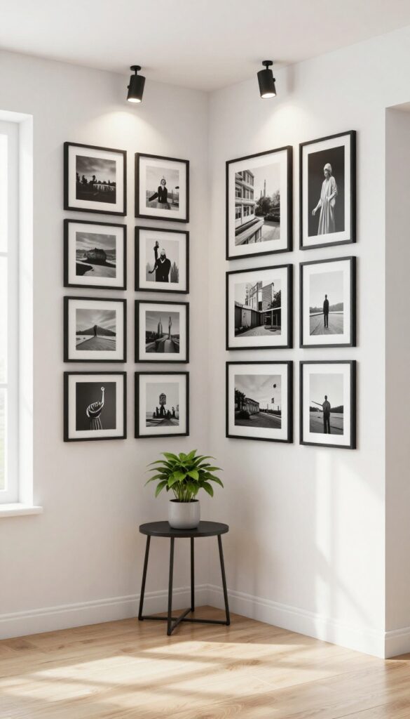
That empty corner where furniture just doesn’t fit? It’s the perfect spot for a photo wall. By wrapping pictures around both walls, you turn a dead zone into a curated focal point.
The key is consistency—matching frames and even spacing make the corner feel intentional, not cluttered. It’s a clever way to add personality without sacrificing floor space.
A corner photo wall works best in small living rooms, narrow entryways, or any room with an awkward layout. Start by choosing a cohesive frame style—black, white, or natural wood—and stick to it. Arrange the photos in a grid or staggered pattern, keeping the gaps between frames uniform (about 2–3 inches).
This creates a seamless visual flow around the corner. For a modern look, use black-and-white prints or a single color palette. The result is a gallery that feels built-in, not tacked on.
Frame Selection
Stick to one frame color and material—thin black metal or simple white wood work well. Mixing frame styles can break the clean line you’re going for. If you want variety, keep the frame finish the same but vary the mat size or photo orientation.
Layout Tip
- Plan your layout on the floor first. Use painter’s tape to mark the corner and map out where each frame will go. Keep the spacing consistent—2 inches between frames is a good rule.
- For a cleaner look, align the outer edges of the frames to create a rectangle shape around the corner.
Lighting Trick
Add a small picture light above the corner or a slim floor lamp nearby to highlight the photos. This draws the eye to the gallery and makes the corner feel like a deliberate design feature, not an afterthought.
10. Minimalist Clip-and-String Display
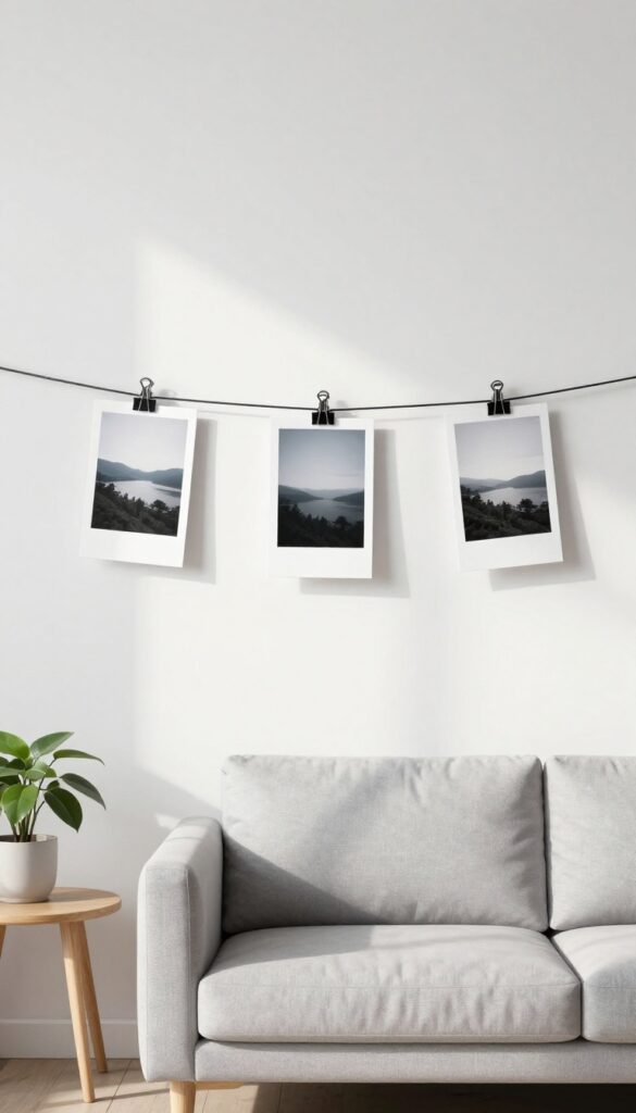
Sometimes the simplest setups leave the biggest impression. A thin wire or twine stretched across a wall, paired with a few small clips or clothespins, creates an airy, modern photo display that doesn't compete with your decor. This idea works especially well in living rooms where you want a personal touch without visual clutter—just three to five photos, spaced out, tell a story without overwhelming the space.
This renter-friendly option requires almost no tools and can be adjusted whenever you want a change. The key is restraint: resist the urge to fill every inch of the wire. Leave plenty of negative space around each photo so the display feels curated, not chaotic.
Choose a spot where the wire can be the star—above a sofa, along a narrow wall, or even across a window frame for a playful twist. The clips themselves become part of the look, so pick ones that match your style: sleek black metal for a modern edge, natural wood for warmth, or brass for a touch of elegance.
Best Materials
- For the wire, go with something thin and sturdy—picture wire, fishing line, or even a leather cord for a softer feel. Twine works too, but keep it taut so photos don't sag. Clips should be small and simple: mini clothespins, bulldog clips, or even tiny binder clips.
- If you want a cohesive look, spray-paint the clips to match your wire or wall color. For photos, stick with lightweight prints on matte paper to avoid pulling the wire down.
Layout Tip
- Place the wire about 12 to 18 inches below the ceiling to keep the display at eye level. For a balanced look, space the photos evenly, but don't be afraid to cluster a couple closer together for visual interest. Vary the heights slightly by clipping some photos higher and others lower along the same wire—this adds movement without looking messy.
- If you have multiple wires, stagger their lengths for a layered effect.
Finishing Touch
To keep the display feeling intentional, choose a consistent color palette for your photos—black-and-white prints, sepia tones, or a single accent color like soft blue. You can also mix in a small dried flower or a minimalist postcard for texture. At night, consider a small picture light or a nearby lamp to gently illuminate the display and make the photos pop against the wall.
11. Layered Frames on a Console Table
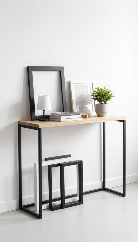
A console table or shelf doesn't have to be just a landing spot for keys and mail. By leaning frames of different sizes against the wall and layering them in front of each other, you create a casual gallery that feels curated, not cluttered. This approach works especially well in entryways, behind sofas, or along a hallway where wall space is limited.
The beauty is in the flexibility—swap out photos, adjust the arrangement, or add seasonal accents whenever the mood strikes.
This decor idea turns a flat surface into a dynamic storytelling zone. Start with a few larger frames as the base layer, then add smaller ones in front, overlapping slightly for depth. Mix in a table lamp, a stack of books, or a small plant to break up the frames and add warmth.
The result is a vignette that feels intentional but not overly styled. Because nothing is hung, you can easily update the look for holidays, new memories, or just a change of pace. Keep the frames cohesive with a consistent color palette—black, white, and natural wood tones work well for a modern, clean look.
Best Frame Pairings
- Stick to two or three frame finishes to keep the arrangement from feeling chaotic. For a modern and clean angle, mix matte black with natural wood or white with light oak. Vary the sizes—a large 16×20 frame as the anchor, then an 8×10 and a 5×7 layered in front.
- This creates a natural focal point without needing perfect symmetry.
Styling Shortcut
Use the rule of thirds when placing objects. Divide the console table into three sections: one for the tallest frame, one for a medium frame with a lamp, and one for a small frame with a stack of books. This keeps the eye moving and prevents the display from feeling lopsided.
Small-space Fix
If your console table is narrow, choose slim frames and skip bulky accessories. A single leaning frame plus a small vase or candle can be enough to make an impact. For very tight spots, use a floating shelf above the table to add another layer of frames without eating into surface space.
FAQ
How do I choose the right frame size for my photo wall?
Start with the wall space you have. For a grid, use matching frames around 8×10 or 11×14 inches. For a cluster, mix sizes from 4×6 to 16×20, keeping the largest piece as your anchor.
Always measure your wall area first and lay the arrangement on the floor to test proportions.
How many photos should I include in a gallery wall?
It depends on your wall size and the look you want. A small wall (2×3 feet) might hold 3 to 5 frames, while a larger wall (4×6 feet) can handle 9 to 15. The key is to leave enough breathing room—aim for 2 to 4 inches between frames for a clean look.
Can I mix frame colors and materials?
Yes, but keep a unifying element. For example, mix black and wood frames if they all have the same mat color, or use all metallic finishes (gold, silver, bronze) for a cohesive feel. Too many different colors can look chaotic, so limit yourself to two or three finishes.
How do I make a photo wall look modern and not dated?
Stick to a consistent color palette in your photos—black and white or muted tones work best. Use simple, thin frames rather than ornate ones. Keep the arrangement balanced but not too symmetrical, and leave some negative space around the edges.
Conclusion
A photo wall is one of the most personal touches you can add to your living room. Whether you go for a clean grid or a relaxed cluster, the key is choosing a layout that feels intentional and true to your style. Don't be afraid to start small and build over time.
Remember, the best photo walls evolve with you. Swap out images as you take new ones, and let your wall tell an ever-changing story.