13 Cozy Painting Kitchen Cabinets Ideas for a Home That Feels Easy to Use
Painting kitchen cabinets is one of the fastest ways to change how your kitchen feels. A fresh coat of color can turn a tired, cluttered space into a warm, welcoming hub.
But the right shade and finish do more than look pretty—they can make your kitchen easier to use by hiding smudges, brightening dark corners, and creating a calm backdrop for daily life. If you're ready to refresh your cabinets but aren't sure where to start, these 13 cozy ideas will guide you.
Each one focuses on both beauty and practicality, so you can enjoy a kitchen that feels as good as it looks. Let's dive in.
1. Warm Off-White with a Matte Finish
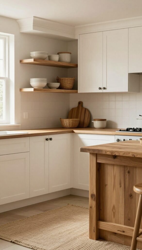
A soft, creamy off-white with a matte finish is the ultimate cozy cabinet color. It brightens the room without feeling stark, and the matte texture hides fingerprints and smudges far better than glossy paint. This shade pairs beautifully with natural wood countertops or open shelving, creating a warm, inviting kitchen that feels easy to live in.
Warm off-white is more than just a neutral—it's a backdrop that makes everything else in your kitchen look intentional. The matte finish softens light, reducing glare and making the space feel calm. Plus, it's forgiving: everyday cooking splatters and handprints are less noticeable, so you can spend less time scrubbing and more time enjoying your kitchen.
Why Matte Beats Gloss For Cozy Kitchens
Glossy cabinets reflect light and show every smudge, which can make a kitchen feel busy and high-maintenance. Matte finishes absorb light, creating a soft, muted look that feels instantly cozy. They also hide minor imperfections, so your cabinets look fresh longer between cleanings.
Pairing Warm Off-white With Natural Textures
To keep the cozy vibe, pair warm off-white cabinets with natural wood accents—think butcher block counters, wooden open shelves, or a rustic island. Add woven baskets, linen curtains, or a jute rug for extra warmth. The contrast between the creamy cabinets and organic textures makes the kitchen feel layered and lived-in.
Best Paint Finishes For Durability
While matte is the star, you'll want a paint specifically formulated for cabinets. Look for a matte or satin finish with a durable, scrubbable formula. Many brands offer low-VOC, water-based options that dry to a tough, wipeable surface.
Test a sample on a cabinet door to ensure it can handle daily wear.
2. Sage Green for a Calming Vibe
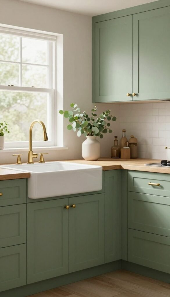
Sage green is having a moment, and for good reason. It’s a color that whispers rather than shouts, bringing a slice of the outdoors inside. This muted, gray-green tone feels grounded and soothing, which makes it a perfect pick for a kitchen you want to relax in.
What’s great about sage is how flexible it is. It pairs well with natural wood, brass, and even black accents, so you can dress it up or keep it simple. Plus, it hides everyday messes better than you’d think, which is a win for a busy home.
Sage green cabinets create a kitchen that feels calm and collected. The color has a softness that makes the space inviting, but it’s not so pale that it washes out. It works in both modern and farmhouse kitchens, and it’s forgiving when it comes to smudges and fingerprints—a practical bonus.
To make the most of sage green, think about the undertones. A sage with more gray feels more muted and sophisticated, while one with a hint of yellow leans warmer and cozier. Test a few samples on your cabinets to see how they look in your lighting throughout the day.
The finish matters too. A matte or satin finish keeps the color soft and low-maintenance, while a semi-gloss adds a subtle sheen that’s easier to wipe clean. Either way, sage green is a choice that feels both current and timeless.
Pair With Brass Hardware
Brass hardware is a natural match for sage green. The warm, golden tones of brass bring out the earthy side of the green, creating a look that feels polished but not fussy. Think cup pulls, knobs, or even a brass faucet to tie it all together.
This combo works because it adds a touch of elegance without making the kitchen feel formal. It’s cozy yet refined, and it’s easy to mix and match finishes if you want a more collected look.
Open Shelving For An Airy Feel
Open shelving alongside sage green cabinets keeps the space light and open. Use a few floating shelves to display everyday dishes, glass jars, or plants. This breaks up the cabinetry and adds visual interest without overwhelming the room.
Stick to a simple palette on the shelves—white ceramics, wood tones, and a few green plants—to keep the calm vibe going. It also makes grabbing a plate or a mug a little easier, which adds to the kitchen’s usability.
Add Natural Textures
Sage green loves natural partners like wood, rattan, and stone. A wooden butcher block countertop or a rattan pendant light can soften the look and make the kitchen feel more grounded. These textures add warmth and depth, preventing the green from feeling flat.
You don’t have to go all out—just a few touches here and there can make a big difference. A woven rug, a wooden cutting board, or even a stone backsplash can tie the whole space together.
3. Two-Tone Cabinets: Dark Bottom, Light Top
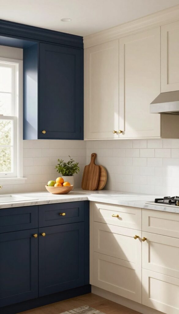
Mixing two colors on your cabinets is a clever way to add visual interest without going overboard. A dark lower half and a light upper half create a grounded, balanced look that feels both modern and cozy. This combo also works hard for you: darker lowers hide scuffs and fingerprints better, while lighter uppers reflect more light and make the room feel airier.
Plus, it naturally defines your workspace, making the kitchen easier to navigate.
Two-tone cabinets are a favorite among designers because they offer the best of both worlds. The dark bottom anchors the room, while the light top keeps it from feeling heavy. Here’s how to pull it off smoothly.
Why Dark Bottom, Light Top Works
Dark colors on lower cabinets are practical—they hide dirt, water spots, and everyday wear. Light colors on top bounce natural light around, making the kitchen feel larger and brighter. This combo also draws the eye upward, adding height to the room.
Picking The Perfect Shades
For the lower cabinets, think deep charcoal, navy, or even a dark green. Pair with a soft white or cream on top. Keep undertones in mind: warm whites pair well with navy, while cool whites match charcoal.
Test samples on your actual cabinets to see how they look in your lighting.
Finishing Touches That Tie It Together
Use the same hardware on both sections for a cohesive look. A matte finish on lowers and a satin or semi-gloss on uppers adds subtle contrast. Add open shelving or a light backsplash to keep the space from feeling too heavy.
4. Buttery Yellow for a Sunny Morning
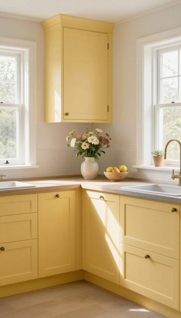
Yellow is often overlooked in kitchen design, but a soft buttery tone can work wonders. It’s warm without being loud, and it brings a sense of sunshine into the room. If you want a kitchen that feels bright and inviting from the moment you wake up, this might be your color.
Buttery yellow sits somewhere between cream and gold, with just enough pigment to add warmth without overwhelming the space. It pairs beautifully with natural wood, white trim, and even gray countertops. The key is choosing a shade that feels soft and buttery, not bright or acidic.
A matte or satin finish helps keep it cozy and easy to live with.
Why Yellow Works In Kitchens
Yellow is associated with happiness and energy, but a muted buttery tone is more calming than energizing. It can make a small kitchen feel larger and more open, especially when paired with light-colored countertops and backsplashes. It also works well in kitchens that lack natural light, as it adds a subtle glow that makes the space feel sunnier.
Pairing Buttery Yellow With Other Colors
Buttery yellow is surprisingly versatile. It looks great with white, cream, and light gray, and it adds warmth to darker woods like walnut or oak. For a fresh, modern look, try pairing it with matte black hardware or a deep navy island.
If you prefer a more classic style, use white or brass fixtures to keep the focus on the cabinets.
Finishes And Maintenance Tips
For a buttery yellow that stays beautiful, choose a satin or eggshell finish—they’re easier to clean than flat finishes and hide fingerprints better than high-gloss. Use a high-quality primer before painting to prevent stains from bleeding through. When cleaning, use a soft cloth and mild soap, and avoid abrasive scrubbers that could dull the finish.
5. Chalky Blue for a Vintage Touch
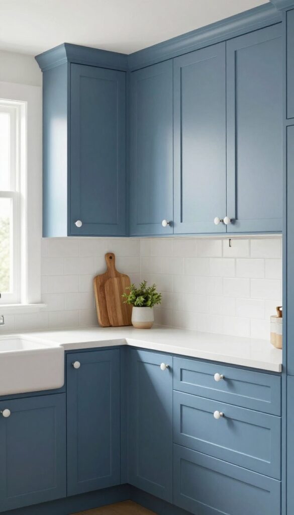
Chalky blue is a shade that feels like a well-worn denim jacket—comfortable, familiar, and full of quiet character. It brings a cozy, vintage vibe to kitchens, especially when paired with ceramic knobs and a farmhouse sink. The soft, matte texture of chalky paint hides everyday smudges and fingerprints, so your cabinets look great even on busy mornings.
This color works beautifully in both modern and traditional kitchens. It pairs well with white countertops, butcher block, and brass fixtures. The muted tone doesn't compete with other elements, making it a versatile backdrop for your cooking and gathering space.
Why Chalky Blue Works So Well
Chalky blue sits between sky blue and gray, giving it a calming presence that’s not too bold. The matte finish absorbs light, which softens the overall look and makes the room feel more intimate. It also does a great job of hiding minor scuffs and water spots, which is a huge plus in a busy kitchen.
Pairing With Vintage Hardware
To really lean into the vintage feel, choose ceramic knobs in white or cream, or go with aged brass handles. A farmhouse sink with a gooseneck faucet completes the look. These details add texture and charm without making the space feel cluttered.
Coordinating With Countertops And Backsplash
Chalky blue cabinets look stunning with white marble or quartz countertops. For a warmer touch, consider butcher block or soapstone. A simple white subway tile backsplash keeps the focus on the cabinets, while a patterned tile can add a playful vintage twist.
Maintenance And Longevity
The matte finish is forgiving, but it’s still a good idea to wipe down cabinets with a soft cloth and mild soap. Avoid harsh cleaners that can dull the finish. With proper care, chalky blue cabinets will stay beautiful for years, and the color won’t feel dated anytime soon.
6. Greige (Gray + Beige) for Neutral Warmth
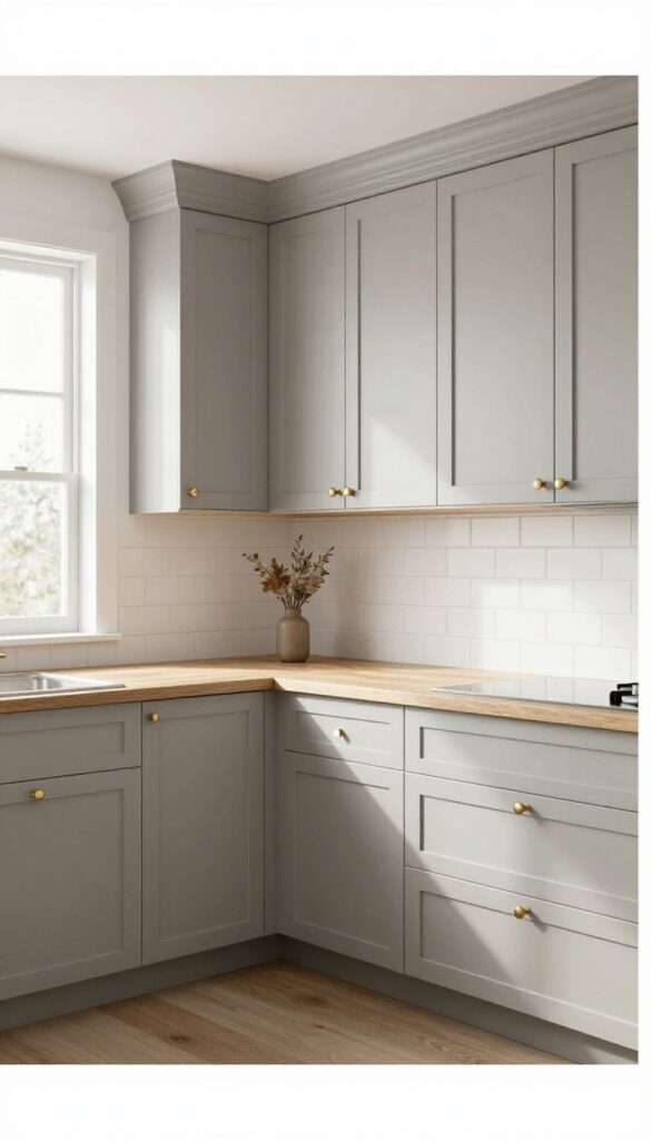
Greige is that hard-to-pin-down color that sits right between gray and beige, and it's a genius choice for kitchen cabinets. It brings the calm of gray without feeling cold, and the warmth of beige without looking dated. The result is a neutral that feels both modern and inviting, like a soft blanket on a cool evening.
What makes greige so practical is its chameleon-like ability to work with almost any style. Whether your kitchen leans farmhouse, contemporary, or somewhere in between, greige blends in effortlessly. It also does a great job of hiding everyday smudges and fingerprints, so your cabinets stay looking fresh longer.
Greige is a versatile neutral that adapts to your kitchen's personality. It's not too warm, not too cool—just right. This balance makes it easy to pair with different countertops, backsplashes, and hardware.
Plus, its muted tone creates a cozy backdrop that makes the space feel lived-in and welcoming. One of the biggest perks of greige is its forgiving nature. Unlike stark white, greige doesn't show every speck of dust or grease.
That means less time scrubbing and more time enjoying your kitchen. It's a practical choice for busy households where the kitchen is the heart of the home. When you pick greige, you're choosing a color that will stand the test of time.
Trends come and go, but greige remains a classic. It's the kind of color that feels fresh years later, so you won't feel the urge to repaint anytime soon.
Why Greige Feels Cozy
Greige has a way of making a kitchen feel grounded and warm. The beige undertones add a subtle softness that gray alone lacks, while the gray keeps things from feeling too sweet or old-fashioned. This combination creates a gentle, inviting atmosphere that's perfect for morning coffee or evening meals.
Unlike bold colors that can feel overwhelming, greige recedes into the background, letting your other design choices shine. It's a color that whispers, not shouts, which is exactly what you want in a cozy kitchen.
Choosing The Right Greige Shade
Not all greiges are created equal. Some lean more gray, others more beige. The key is to test a few samples in your kitchen's lighting before committing.
Natural light can change how the color reads, so what looks perfect in the store might look different on your walls. If your kitchen gets lots of sunlight, a greige with more gray will keep it from feeling washed out. In darker kitchens, a warmer greige with more beige will add brightness.
Don't be afraid to ask for samples and live with them for a few days.
Pairing Greige With Hardware And Countertops
Greige is a chameleon when it comes to pairing. For a modern look, go with matte black handles and white quartz countertops. For a warmer, traditional feel, brass or bronze hardware and butcher block counters are lovely choices.
You can also play with textures. A greige cabinet with a matte finish feels soft and understated, while a satin or semi-gloss adds a subtle sheen that catches the light. Either way, greige gives you the freedom to experiment without worrying about clashing.
7. Deep Forest Green for Drama
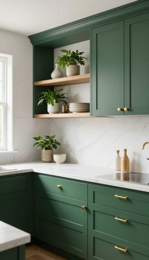
Deep forest green brings a bold, moody elegance that instantly elevates a kitchen. It’s a shade that feels both grounded and luxurious, especially when paired with warm metallic accents. This color works best in larger kitchens where it can breathe, but even a compact space can handle it if you balance it with plenty of light.
Why Forest Green Works
Forest green is a deep, saturated hue that adds depth without feeling cold. It has a natural, calming quality that makes a kitchen feel more intimate and inviting. Unlike stark black or navy, it doesn’t swallow light—it absorbs it softly, creating a cozy glow.
This makes it a great choice for kitchens that get a lot of natural light, as it tones down brightness while adding character.
Pairing With Hardware And Accents
Brass or gold hardware is the classic companion to forest green. The warm metallic finish pops against the dark green, creating a high-end, tailored look. You can also mix in black matte fixtures for a more modern edge, or add natural wood open shelving to introduce warmth and texture.
Keep countertops light—white marble or quartz balances the drama and keeps the space from feeling too heavy.
Balancing The Drama
To keep forest green from overwhelming the room, use it strategically. You can paint all cabinets for a full statement, or just the lower cabinets and leave the uppers white or light cream. Add under-cabinet lighting to brighten work areas, and choose a satin or semi-gloss finish to reflect light and make cleaning easier.
A few green accessories, like a vase or small plants, tie the look together without overdoing it.
8. Soft Pink for a Subtle Pop
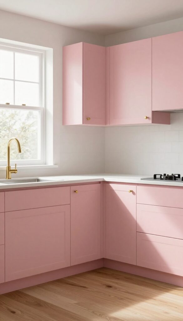
A muted blush pink on cabinets adds a subtle pop of color without being overwhelming. It's a cozy, feminine touch that pairs well with white countertops and wooden floors. This shade brings warmth and a hint of playfulness, making the kitchen feel inviting and easy to use.
Soft pink is a versatile choice that works in both modern and farmhouse kitchens. It brightens the space without shouting, and it's forgiving when it comes to fingerprints and smudges. The key is to choose a muted, dusty pink rather than a bright or neon shade, keeping the look sophisticated and calm.
Choosing The Right Blush
Not all pinks are created equal. Look for a blush with a hint of beige or gray to keep it grounded. Test samples on your cabinets in different lighting—what looks soft in the store can turn neon in a sunny room.
A matte or satin finish helps the color feel more subdued and easier to wipe clean.
Pairing With Neutrals
Soft pink pairs beautifully with white, cream, or light gray countertops. Wooden floors in natural oak or walnut add warmth and balance the coolness of the pink. Brass or gold hardware adds a touch of elegance, while matte black knobs give a modern edge.
Keep the rest of the kitchen simple so the pink remains the star.
Maintenance And Practicality
Pink cabinets are surprisingly practical. The light color hides dust and water spots better than dark shades, and a good quality paint will resist chipping. Use a gentle cleaner and a soft cloth to keep the finish looking fresh.
If you have kids or pets, a satin or semi-gloss finish will hold up better than flat paint.
9. Charcoal Gray for a Modern Edge
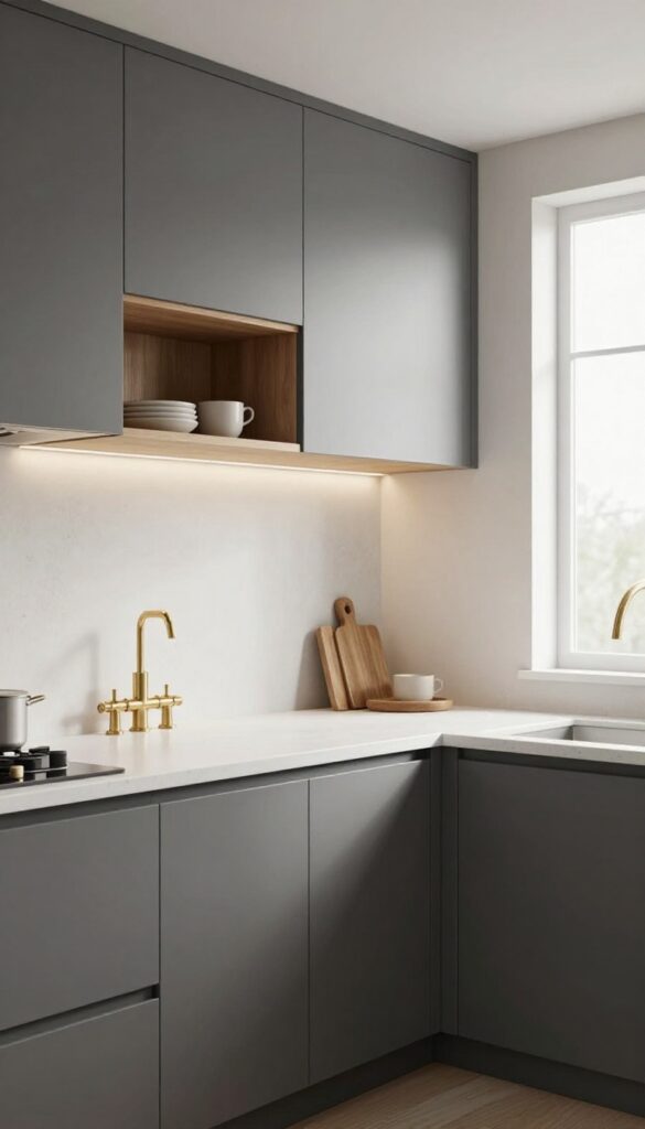
If you want a kitchen that feels grounded and sophisticated, charcoal gray is a powerhouse choice. It brings a sleek, contemporary vibe without the starkness of black, and it pairs beautifully with warm woods, brass fixtures, and soft textiles. Plus, this deep shade is surprisingly forgiving when it comes to everyday messes.
Charcoal gray cabinets offer a perfect balance between drama and warmth. Unlike pure black, which can feel harsh, charcoal has a softness that makes a kitchen feel inviting. It also hides fingerprints, water spots, and grease splatters better than lighter colors, which is a huge win for busy cooks.
Whether you go with a matte or satin finish, this color instantly elevates the look of your space while staying practical.
Why Charcoal Works So Well
Charcoal gray is a chameleon color. In bright, natural light, it takes on a soft, almost blue-gray tone. In dimmer kitchens, it adds a cozy, moody feel.
It also acts as a neutral, so you can easily change your decor without repainting. Plus, it doesn't show smudges as much as lighter shades, making it a low-maintenance option for families.
Pairing Charcoal With The Right Finishes
To keep charcoal from feeling too heavy, pair it with light countertops like white quartz or butcher block. Brass or gold hardware adds warmth and a touch of luxury, while matte black fixtures keep things edgy. For a softer look, consider open shelving in light wood or a white backsplash to break up the darkness.
Finishing Touches For A Cozy Feel
Add under-cabinet lighting to brighten work areas and make the charcoal pop. Use textured accessories like woven baskets, ceramic canisters, or a wooden cutting board to bring in natural warmth. A simple runner rug or a few green plants can also soften the overall look, making the kitchen feel both modern and welcoming.
10. Creamy White with Glazed Details
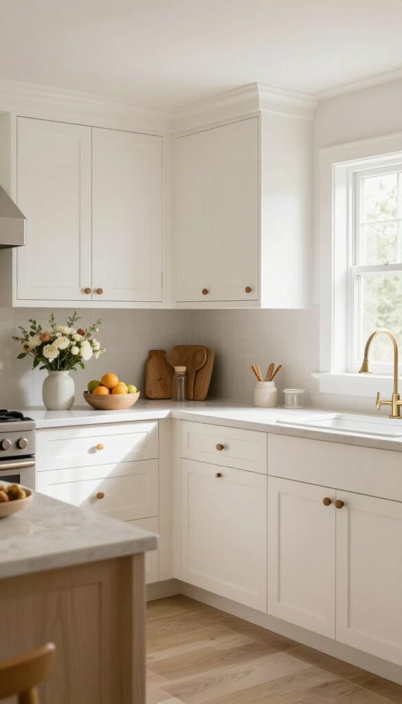
Creamy white cabinets are a classic choice, but they can sometimes feel a little flat. Adding subtle glazed details changes that completely. The glaze settles into the recesses and edges, picking out the wood grain and adding a soft, dimensional glow that makes the cabinets feel custom and expensive.
This finish is perfect if you love the brightness of white but want something with more warmth and character. The creamy undertone keeps the kitchen from feeling stark or clinical, while the glaze adds a gentle contrast that makes the cabinetry the focal point of the room. It's a cozy, inviting look that works with a variety of design styles, from farmhouse to traditional to transitional.
Why Glaze Works So Well
Glaze is essentially a translucent layer that sits on top of the paint. It catches in the corners and carvings, creating shadows that add depth. On flat cabinet doors, it can highlight the natural grain, giving a textured, hand-rubbed appearance.
This subtle detailing makes the cabinets look like they were professionally finished, even if you did it yourself.
Choosing The Right Glaze Color
The glaze color matters more than you might think. For a warm, cozy feel, go with a brown or taupe glaze. It adds an antique, time-worn quality that pairs beautifully with creamy white.
If you want a softer look, a gray glaze can add depth without the yellowing effect some brown glazes have. Test a few options on a sample board to see how they look in your lighting.
Application Tips For A Flawless Finish
Applying glaze is a straightforward process, but it takes a little patience. Start with a base coat of creamy white paint and let it dry completely. Then, brush on the glaze in small sections and wipe it off with a soft cloth.
The more you wipe, the lighter the effect. Work quickly and keep a damp cloth handy to fix any mistakes. Finish with a clear topcoat to protect the glaze and make it last.
11. Terracotta for Earthy Warmth
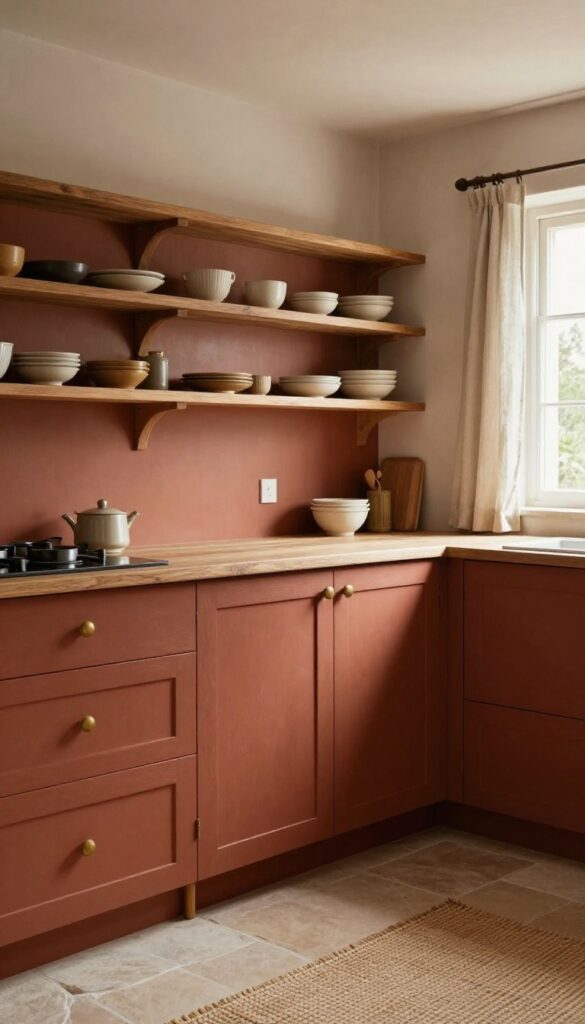
Terracotta brings an earthy, rustic warmth to your kitchen. This rich, reddish-brown tone pairs well with natural materials like wood and stone, creating a grounded, cozy atmosphere. It's a bold yet inviting choice that makes the space feel lived-in and welcoming.
Terracotta is more than just a color; it's a mood. It evokes sun-baked clay, Mediterranean villas, and the comfort of a well-worn pot. When you paint your cabinets this hue, you're not just adding color—you're adding texture and history.
The shade works beautifully with a variety of styles, from farmhouse to modern, and it's surprisingly versatile.
Why Terracotta Works So Well
Terracotta has a natural depth that flat colors lack. It absorbs light rather than reflecting it, which gives the kitchen a soft, intimate feel. This makes it ideal for larger spaces that might otherwise feel cavernous, or for smaller kitchens where you want to create a cozy nook.
Plus, it's a warm neutral that doesn't clash with other colors—it grounds them.
Pairing With Natural Materials
To let terracotta shine, pair it with natural materials. Wooden countertops or open shelving in oak or walnut bring out the reddish undertones. Stone or concrete floors add an organic contrast.
Even simple touches like linen curtains or a woven rug can enhance the earthy vibe. Avoid too many cool-toned metals; instead, opt for brass or copper fixtures to complement the warmth.
Finishes And Maintenance
For a matte, chalky finish that feels authentic, use a matte or satin sheen. This hides fingerprints and smudges better than glossy finishes, making it practical for busy kitchens. Keep in mind that terracotta can vary in intensity, so test a sample on your cabinets first.
A clear topcoat can protect the paint and make cleaning easier without losing the matte look.
12. Navy Blue with Brass Accents
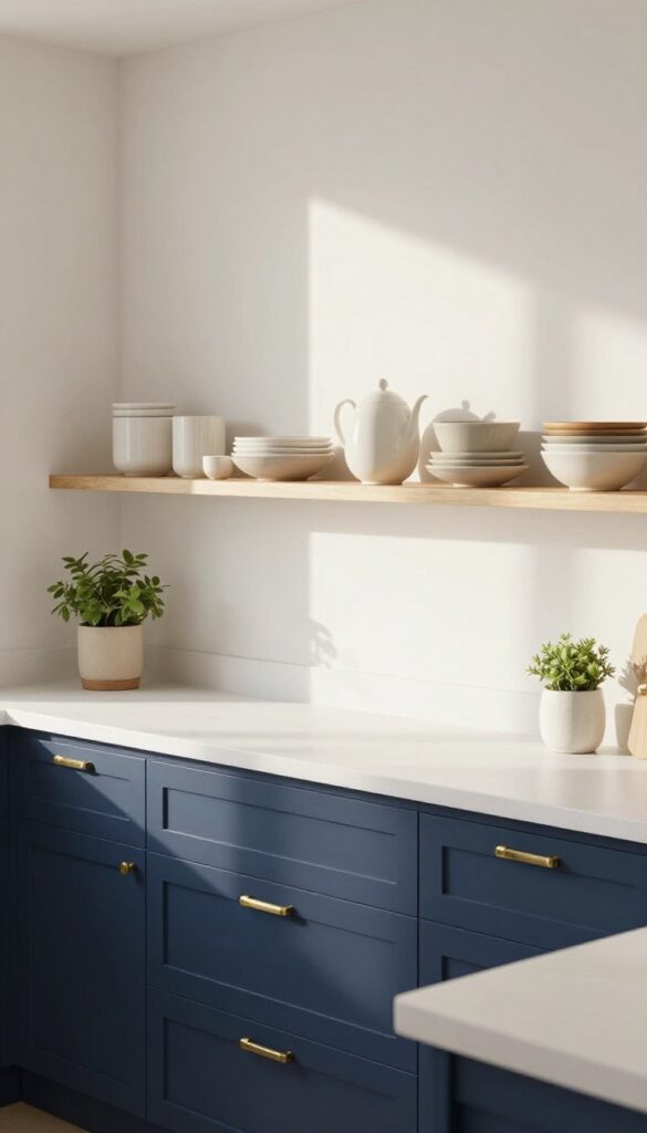
Navy blue cabinets are a classic choice that adds depth and elegance without feeling cold. When you pair them with warm brass hardware and a bright white countertop, the contrast creates a cozy, inviting atmosphere that feels both timeless and fresh. This combination works beautifully in kitchens of all sizes, and it’s surprisingly practical too.
Navy blue is a versatile color that can read as both traditional and modern, depending on how you style it. The key to making it feel cozy rather than stark is to introduce warm metallic accents and soft textures. Brass handles, knobs, and fixtures add a subtle glow that catches the light and makes the space feel more intimate.
A white countertop or backsplash keeps the look airy and prevents the navy from overwhelming the room.
Why Navy Works
Navy is a deep, saturated shade that hides everyday smudges and fingerprints better than lighter colors. It also provides a strong visual anchor for the kitchen, making other elements like open shelving or a farmhouse sink stand out. Unlike black, navy has a hint of blue that adds warmth and pairs well with natural wood tones and greenery.
Choosing The Right Brass
Not all brass is the same. Polished brass gives a shiny, traditional look, while brushed brass or antique brass offers a softer, more muted finish. For a cozy feel, go with brushed or satin brass—it’s less reflective and blends more seamlessly with everyday use.
Mixing brass with other metals like chrome or stainless steel is fine, but keep the brass as the dominant accent to maintain a cohesive look.
Balancing With White And Wood
To keep the kitchen from feeling too dark, balance the navy with plenty of white or light neutrals. White countertops, backsplashes, and open shelving create a crisp contrast. Adding wooden elements—like a butcher block island or floating wood shelves—introduces warmth and softens the overall feel.
This mix of cool navy, warm brass, and natural wood creates a layered, inviting space.
13. Distressed White for a Farmhouse Feel
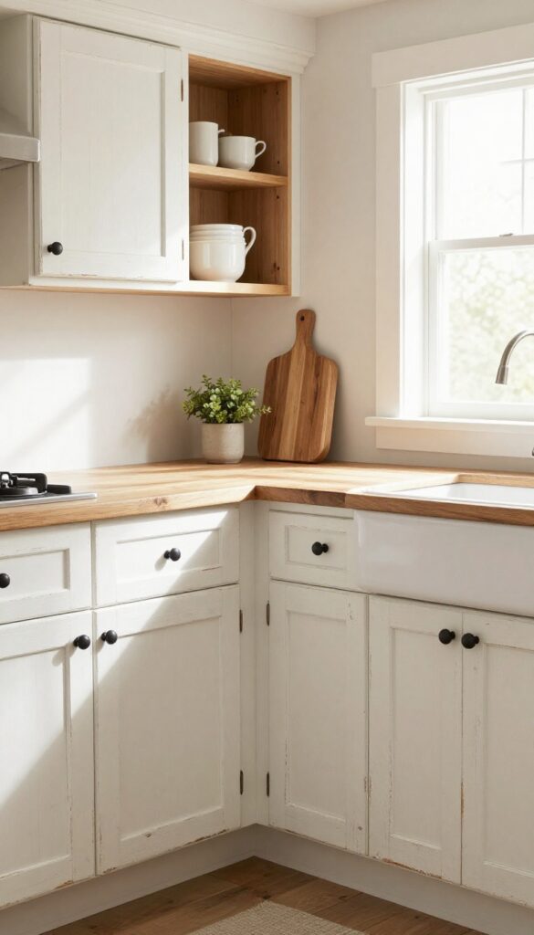
A distressed white finish brings instant farmhouse charm to your kitchen. The slightly worn look adds character and makes the space feel lived-in, not perfect. It's a style that embraces everyday use, hiding small scuffs and fingerprints while keeping things bright and airy.
Distressed white cabinets pair beautifully with natural wood accents, black hardware, and open shelving. The finish works well in both modern farmhouse and rustic cottages, giving your kitchen a welcoming, time-worn appeal. Plus, the patina means you won't stress over every little mark—it all adds to the story.
How To Achieve The Distressed Look
Start with a base coat of white paint, then lightly sand edges and corners to reveal the wood or a darker undercoat. Use a damp cloth to wipe away dust, then apply a matte topcoat for protection. The key is subtlety—you want gentle wear, not a heavy, aged effect.
Choosing The Right White
Not all whites are equal. For a warm farmhouse feel, pick a white with creamy undertones like ivory or antique white. Avoid stark, cool whites that can look too modern.
Test a few samples on your cabinets to see how they change with your lighting throughout the day.
Pairing Hardware And Accents
Black iron handles or cup pulls enhance the rustic vibe. Consider open wooden shelves, a farmhouse sink, and butcher block countertops to complete the look. Keep the rest of the kitchen simple so the distressed cabinets remain the focal point.
FAQ
What is the best paint finish for kitchen cabinets?
Satin or semi-gloss finishes are best for kitchen cabinets because they are durable, easy to clean, and resist moisture. Matte finishes are also popular for a cozy look but may require more careful cleaning.
Do I need to sand cabinets before painting?
Yes, sanding is essential to help the paint adhere properly. Lightly sand the surfaces with fine-grit sandpaper, then wipe away dust before priming and painting.
How long does it take to paint kitchen cabinets?
Depending on the size of your kitchen and the method used, it can take anywhere from 2 to 5 days. This includes prep, priming, painting, and drying time between coats.
Can I paint laminate cabinets?
Yes, you can paint laminate cabinets, but you need to use a high-adhesion primer and a paint designed for laminate. Proper prep is key to prevent peeling.
What colors make a small kitchen look bigger?
Light colors like white, cream, and pale gray can make a small kitchen feel more spacious. Using the same color on upper and lower cabinets can also create a seamless, open look.
Conclusion
Painting your kitchen cabinets is a rewarding project that can completely change the feel of your home. Whether you choose a soft sage or a bold navy, the right color and finish can make your kitchen more inviting and easier to use.
Take your time to pick a shade that resonates with you and matches your lifestyle. With a little effort, you'll have a cozy kitchen that feels both beautiful and practical for years to come.