13 Penny Tile Bathroom Floor Ideas with Retro Flair
Penny tile has a way of making a bathroom feel instantly warmer, like the room remembers a decade it never lived through. Those tiny rounds add texture, pattern, and a soft vintage charm that larger tiles simply can't match.
The best part is how many directions you can take it. You can keep things classic with white hex and black accents, or push into bold color blocking and ombre gradients that feel completely modern.
Dark grout, mosaic medallions, and metallic finishes each change the mood without changing the footprint. Even a tiny powder room can handle penny tile beautifully.
1. Classic White Hex with Black Accents
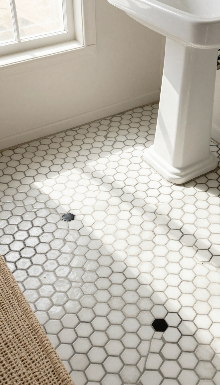
White hex penny tile with black accents is the little black dress of bathroom floors. It works in farmhouses, bungalows, and modern apartments without missing a beat. The look comes down to contrast.
Crisp white tiles get a sharp outline from black grout, a black border, or a small black flower at the center of each hex. That tiny bit of black keeps the floor from feeling flat and adds just enough vintage snap.
You can keep it simple with a plain white field and a black border, or go full retro with flower mosaics. Either way, the floor reads clean and intentional. One thing to know: black accents show every crumb and hair, so this isn't the most forgiving option if you hate sweeping.
But it hides stains better than pure white grout, which is a fair trade. For a softer look, swap pure black for charcoal or oil-rubbed bronze. You still get the definition, just less stark.
Grout Choices That Make Or Break The Look
Black grout is the classic move. It outlines every hex and gives that old-school mosaic feel. But it can look busy in a small room.
If you want something quieter, try a mid-gray grout. You still see the pattern, but the contrast is gentler. White grout makes the floor look like a solid sheet, which is clean but loses the penny tile charm.
Epoxy grout costs more but resists staining, which matters in a bathroom. Standard cement grout needs sealing every year or two.
Border And Flower Patterns Worth Copying
A black border around the perimeter frames the floor and makes the room feel finished. You can do a single row of black hexes or a thicker band two or three tiles wide. Flower patterns use one black hex surrounded by six white ones.
It's a classic mosaic motif that adds a subtle polka-dot effect. You can scatter them evenly or cluster them in the center like a medallion. For a modern twist, skip the flowers and use a random mix of black and white hexes.
It reads as terrazzo-lite and hides dirt better than a perfect pattern.
Where This Look Works Best
Small bathrooms and powder rooms are a natural fit. The pattern adds detail without overwhelming the space. It also plays well with subway tile walls, beadboard, or simple white wainscoting.
Keep the rest of the room calm and let the floor do the talking. Avoid pairing it with busy wallpaper or heavily patterned shower curtains. The floor already has enough going on.
2. Bold Color Blocking with Two Tones
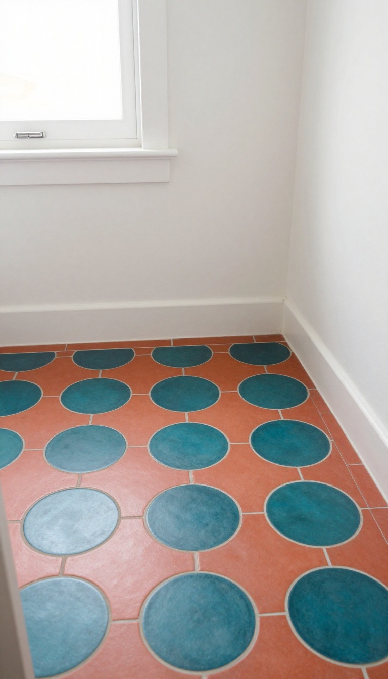
Penny tile doesn't have to play it safe. When you split the floor into two bold colors, you turn a simple round shape into a graphic statement that feels both retro and fresh. Think of it like painting with tile.
You pick two contrasting shades, then map out zones, stripes, or geometric blocks that guide the eye and define the room. The result is a floor that looks custom without a custom price tag. It's a playful way to add energy to a small space.
Color blocking works because penny tile's repeating circles create a natural grid. That grid makes it easy to section off areas with straight lines or curves. You can go subtle with two shades of the same hue, or go bold with opposites like teal and coral.
The key is contrast. The two colors should be different enough that the pattern reads clearly from a distance. If they're too close, the effect gets muddy.
Once you have your pair, decide where each color lives. You might create a border, a stripe down the center, or a checkerboard of large squares. Each layout gives a different vibe, from nautical to mod.
Grout color matters here. A neutral grout lets the tile colors do the talking, while a matching grout can make one color recede. Test a sample board before committing.
Finally, keep the rest of the bathroom calm. Let the floor be the star, and choose wall colors and fixtures that support the scheme without competing.
Choosing Your Two Colors
Start with one color you love, then pick its opposite on the color wheel for maximum pop. Teal and coral, navy and mustard, or pink and green all work beautifully. If you want something softer, try a pastel and a deep tone of the same family, like mint and forest green.
Layouts That Work
A wide border in one color with a solid center in the other is classic and easy to install. For a more dynamic look, try diagonal stripes or a large-scale checkerboard. You can also create a 'rug' effect in the middle of the floor with a contrasting border.
Grout And Finish Tips
Use unsanded grout for penny tile to avoid scratching. A light gray or white grout keeps the pattern crisp. If you want a seamless look, match the grout to one of the tile colors.
Seal the grout well in a bathroom to prevent staining.
3. Mosaic Medallion Centerpiece
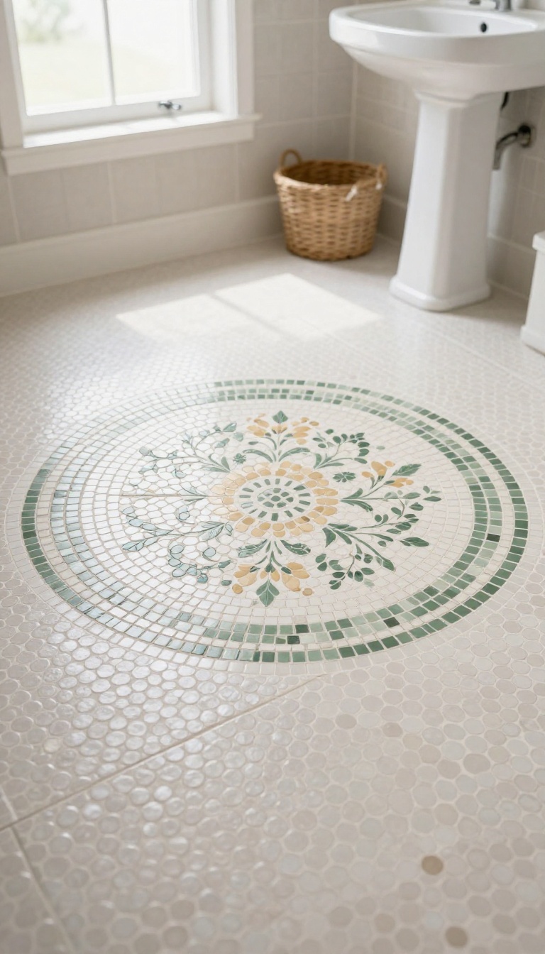
A mosaic medallion turns your bathroom floor into a piece of art. It’s a circular or oval design, usually made from tiny tiles, that sits right in the middle of the room. The medallion becomes an instant focal point, adding old-world elegance without overwhelming the space.
You can go as simple or as ornate as you like. A classic compass rose or a floral pattern in soft neutrals feels timeless. Or choose a bold geometric star in contrasting colors for a more dramatic look.
The medallion works with penny tile because both share that small-scale, intricate vibe. It’s like jewelry for your floor—unexpected but completely charming.
Medallions have been used in grand entryways and historic homes for centuries. They bring a sense of ceremony to an otherwise ordinary floor. In a bathroom, that touch of grandeur feels surprisingly cozy.
You don’t need a huge space to pull it off. Even a small powder room can handle a modest medallion. The key is proportion: the medallion should fit comfortably within the open floor area, leaving enough border around it.
When paired with penny tile, the medallion often uses the same tile in different colors or finishes. That keeps the look cohesive. You can also mix in a slightly larger tile for the medallion to create subtle contrast.
Installation takes planning, but the result is worth it. A medallion adds a custom, high-end feel that guests will notice. It’s a conversation piece that also happens to be practical—it hides imperfections and adds grip underfoot.
Choosing A Pattern
Classic motifs like sunbursts, stars, and floral rosettes never go out of style. They suit vintage and traditional bathrooms perfectly. For a more modern twist, try a geometric hexagon or a simple ring pattern.
Consider the overall style of your bathroom. A ornate medallion might clash with sleek, minimalist fixtures. But in a room with clawfoot tub or pedestal sink, it feels right at home.
You can find pre-made medallions at tile stores, or design your own with a tile setter. Custom gives you full control over size, color, and pattern.
Color And Contrast
The medallion should stand out, but not scream. Use a contrasting color that ties into your vanity, walls, or accessories. Black and white is a classic combo that works with almost any penny tile color.
If your floor is light, a dark medallion adds depth. If your floor is dark, a light medallion brightens the center. You can also use a metallic accent tile for a hint of shine.
Keep the grout color consistent with the rest of the floor to keep the medallion from looking like a patch. Or use a slightly darker grout to make the pattern pop.
Placement And Size
Center the medallion in the main open area of the floor. Avoid placing it where it will be partially hidden by a vanity or toilet. In a long narrow bathroom, you might place it at the entrance or in front of the tub.
Size matters: a medallion that’s too large can make the room feel cramped. Too small and it gets lost. A good rule of thumb is to keep it about one-third to one-half the width of the open floor space.
If you have a pedestal sink or a freestanding tub, the medallion can be centered under it for a truly custom look. Just make sure it’s visible from the doorway.
4. Pastel Penny Tile for Soft Retro Vibes
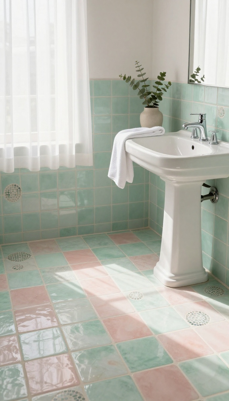
Pastel penny tile brings a gentle, almost dreamy quality to a bathroom floor. Mint, blush, and butter yellow feel like they were pulled straight from a 1950s kitchen, but they work just as well in a modern space. The soft colors keep the retro look from feeling heavy or dated.
These shades also hide dust and water spots better than pure white, which is a nice bonus in a busy bathroom. And because penny tile comes in so many pastel options now, you can mix and match without much risk. The result is a floor that feels warm, welcoming, and quietly stylish.
Pastels have a way of softening a room without making it feel childish. When you use them on penny tile, the small round shape adds texture that keeps the color from looking flat. It's a subtle retro nod that doesn't scream for attention.
The key is to pick a pastel that matches the light in your bathroom. North-facing rooms tend to make cool colors like mint feel chilly, while warm shades like blush and butter yellow can glow too much in direct sun. Test a few samples on the floor before you commit.
You can also pair pastels with white or light gray grout to keep the look airy. Or go with a slightly darker grout in the same color family for a more defined pattern. Either way, the floor becomes a quiet backdrop that still has plenty of personality.
Choosing Your Pastel Palette
Mint green feels fresh and slightly vintage, especially when paired with white fixtures and chrome hardware. Blush pink adds warmth and works well with brass or copper accents. Butter yellow is the cheeriest of the bunch and looks great with white subway tile on the walls.
If you can't decide, consider a two-tone pattern. Alternating mint and white pennies, for example, creates a subtle checkerboard that's playful but not overwhelming. You can also use a single pastel for the field and a slightly deeper shade for a border or a simple design.
Grout And Finish Matter
Grout color changes everything with pastel penny tile. White grout makes the colors blend together for a soft, almost watercolor effect. A light gray grout adds a bit of definition without being harsh.
For a more retro feel, try a grout that matches the tile color. This makes the floor look almost seamless, like a solid sheet of pastel. Just keep in mind that matching grout can show dirt more easily, so it's best for low-traffic bathrooms.
Finish also plays a role. Matte penny tiles have a chalky, vintage look, while glossy ones reflect light and feel a bit more polished. Both work with pastels, so pick based on the mood you want.
Pairing Pastels With Other Elements
Pastel floors pair beautifully with white or light wood vanities. Keep the walls simple—white, cream, or a very light gray—so the floor stays the star. If you want more color, add a pastel towel or a framed print instead of another tile.
Metallic finishes can either warm up or cool down the palette. Chrome and nickel feel crisp and modern, while brass and gold add a touch of vintage glam. Black accents, like a black mirror frame or black faucet, create a striking contrast that keeps pastels from feeling too sweet.
5. Penny Tile with Dark Grout for Definition
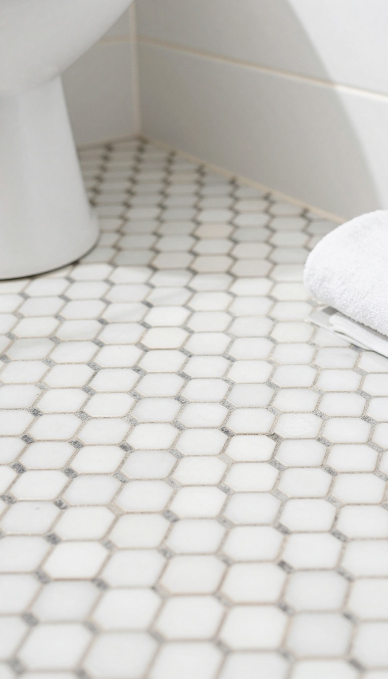
Dark grout turns a field of penny tile into something crisp and deliberate. Instead of letting the tiles blend into a soft, uniform surface, the grout lines step forward and trace every little hexagon or circle. That contrast gives a retro floor a sharper, more modern read without changing the tile itself.
It's a small swap with a big payoff. The pattern pops, the floor looks more custom, and you get a graphic quality that holds up in both tiny powder rooms and full baths.
Penny tile already has a busy, dotted texture. Add dark grout and that texture becomes a visible grid, almost like a hand-drawn pattern across the floor. The effect is bold but not loud, because the grout is thin and the tiles stay the star.
This look works especially well when you want the floor to feel intentional rather than washed out. It also hides dirt better than white grout in high-traffic bathrooms, which is a practical bonus most people don't think about until six months in. You can go subtle with charcoal against warm white tile, or push the contrast with black grout and a colored penny tile.
Either way, the grout becomes a design element, not just a filler.
Choosing The Right Grout Color
Charcoal and graphite are the safest dark choices because they read as dark without turning into a harsh black outline. If you want maximum definition, true black grout against white or cream penny tile gives you that classic retro diner look. For a softer edge, try a deep gray or slate.
It still defines the shape but feels less graphic. Just avoid brown-based darks unless your tile has warm undertones, or the floor can look muddy.
Tile Colors That Pair Best
White and off-white penny tile are the obvious match because dark grout creates that crisp, high-contrast pattern. But don't stop there. Soft mint, pale blue, and blush pink all look great with charcoal grout, giving you a retro pastel floor with modern bite.
If you're using a darker tile, like navy or forest green, choose grout that's one or two shades darker than the tile. That keeps the definition without making the floor look like a checkerboard.
Installation And Upkeep Notes
Dark grout shows less everyday dirt, but it can also show hazy residue if it's not sealed properly. Ask your installer to use a quality unsanded grout and seal it after curing. That keeps the color rich and makes cleaning easier.
When you mop, skip bleach-based cleaners that can fade dark grout over time. A gentle pH-neutral cleaner and a soft brush keep the lines sharp without stripping the sealer.
6. Ombre Gradient Floor for a Playful Twist
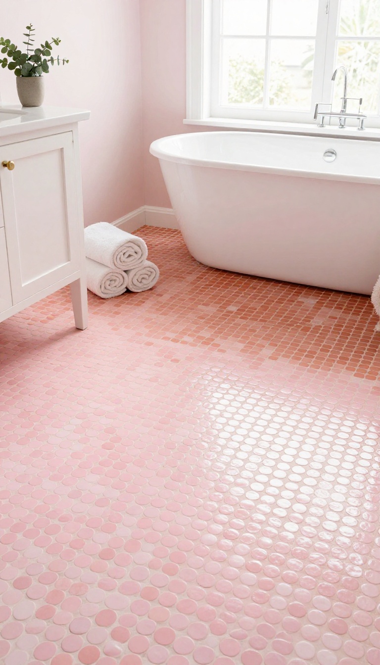
Why settle for one color when you can blend a whole spectrum? An ombre penny tile floor lets you fade from pale to deep across the room, creating a custom look that feels both retro and fresh. It's a playful way to add movement and personality without overwhelming the space.
The trick is to treat color like a slow sunrise. Start with a light shade near the entrance or vanity, then gradually shift to a darker tone as you move toward the tub or back wall. You can go subtle with shades of the same hue, or bold with a rainbow effect.
Either way, the gradient draws the eye and makes even a small bathroom feel larger.
Choosing Your Color Path
Pick a base color you love, then select three to five shades that step up or down in intensity. For a soft look, try blush to coral to terracotta. For something bolder, go from mint to teal to navy.
Order sample tiles and lay them out in your actual space to see how the light hits them. Natural light can make or break a gradient, so test at different times of day.
Laying Out The Gradient
You don't need a perfect diagonal—organic transitions often look better. Divide the floor into zones: lightest near the door, mid-tones in the center, darkest at the far end. Use a chalk line to mark where each shade begins, but don't stress over sharp lines.
The penny tiles themselves create a soft edge because of their round shape. Work in small sections so the thinset doesn't dry before you place the next color.
Grout That Blends Or Pops
Grout color changes everything. A light grout keeps the gradient seamless and airy, while a dark grout adds definition and makes each penny pop. For a truly custom feel, consider using a grout that matches the mid-tone of your gradient.
That way, the transition feels intentional and cohesive. Just remember that dark grout can make light tiles look brighter, so adjust your color choices accordingly.
7. Checkerboard Pattern with Penny Tiles
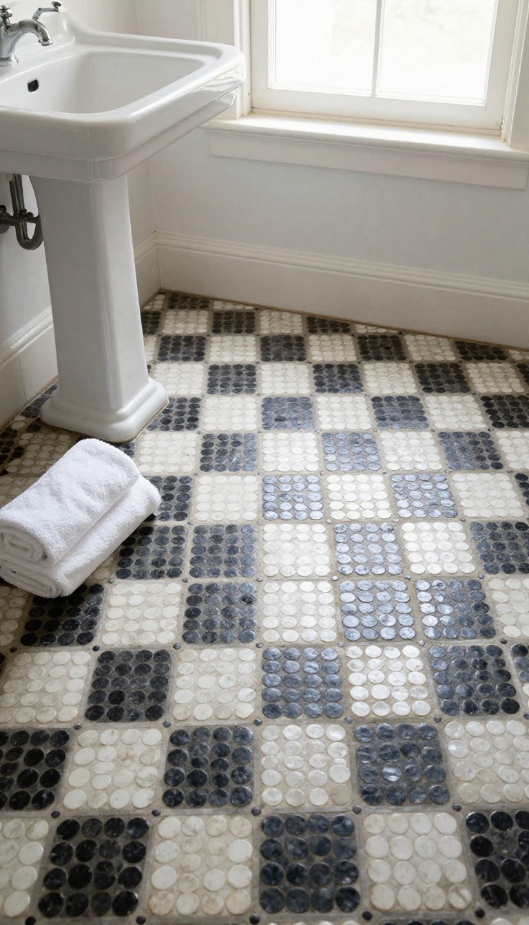
Checkerboard floors have a way of pulling a room together without trying too hard. They show up in old diners, classic kitchens, and plenty of vintage bathrooms where the contrast between two colors does all the heavy lifting. Penny tiles take that familiar idea and shrink it down, so instead of big squares you get a field of tiny circles locked into a graphic grid.
The result feels playful but still grounded, like a retro pattern that never really went out of style.
The trick with a penny tile checkerboard is that the pattern lives in the color placement, not the tile shape. Each penny is round, but when you alternate colors square by square, your eye reads the whole floor as a checkerboard. That optical flip is what makes it feel bold and intentional rather than busy.
You get the softness of penny tile and the punch of a classic two-tone layout at the same time.
Pick Two Colors That Actually Contrast
A checkerboard only works if the two colors read as clearly different from across the room. Black and white is the obvious choice, and it always delivers that crisp retro look. But you can also try navy and cream, forest green and soft pink, or charcoal and warm gray if you want something less expected.
Just make sure one color is noticeably lighter or darker than the other. If they sit too close in tone, the pattern turns muddy and the whole effect disappears.
Scale The Squares To Your Space
With penny tiles, each checkerboard square is usually made up of a small cluster of tiles rather than a single one. A common approach is a four-by-four block of pennies per square, which keeps the pattern readable without turning your floor into a dizzying grid. In a small powder room, slightly smaller squares can make the space feel bigger and more detailed.
In a larger bathroom, bigger squares keep things calm and balanced. Sketch it out or ask your installer to lay a dry section first so you can see how the scale feels underfoot.
Grout Can Make Or Break The Look
Grout is the quiet third color in any penny tile floor, and in a checkerboard it matters even more. White grout softens the pattern and makes the whole floor feel lighter and more delicate. Dark grout sharpens every edge, so the checkerboard looks almost drawn on.
If you want the pattern to feel vintage and a little worn-in, go with a mid-tone grout that blends with both colors. Just avoid a grout color that competes with your tiles, or the clean geometry gets lost in the noise.
Where It Works Best
Checkerboard penny tile shines in smaller bathrooms where a bold floor can carry the whole room. Powder rooms, guest baths, and vintage-inspired main bathrooms all wear it well. It also pairs nicely with simple white subway tile on the walls, since the floor gets to be the star.
If your bathroom already has a lot of pattern on the walls or a busy vanity, this floor might feel like too much. In that case, save the checkerboard for a space that can handle the drama.
8. Penny Tile Border with Larger Field Tiles
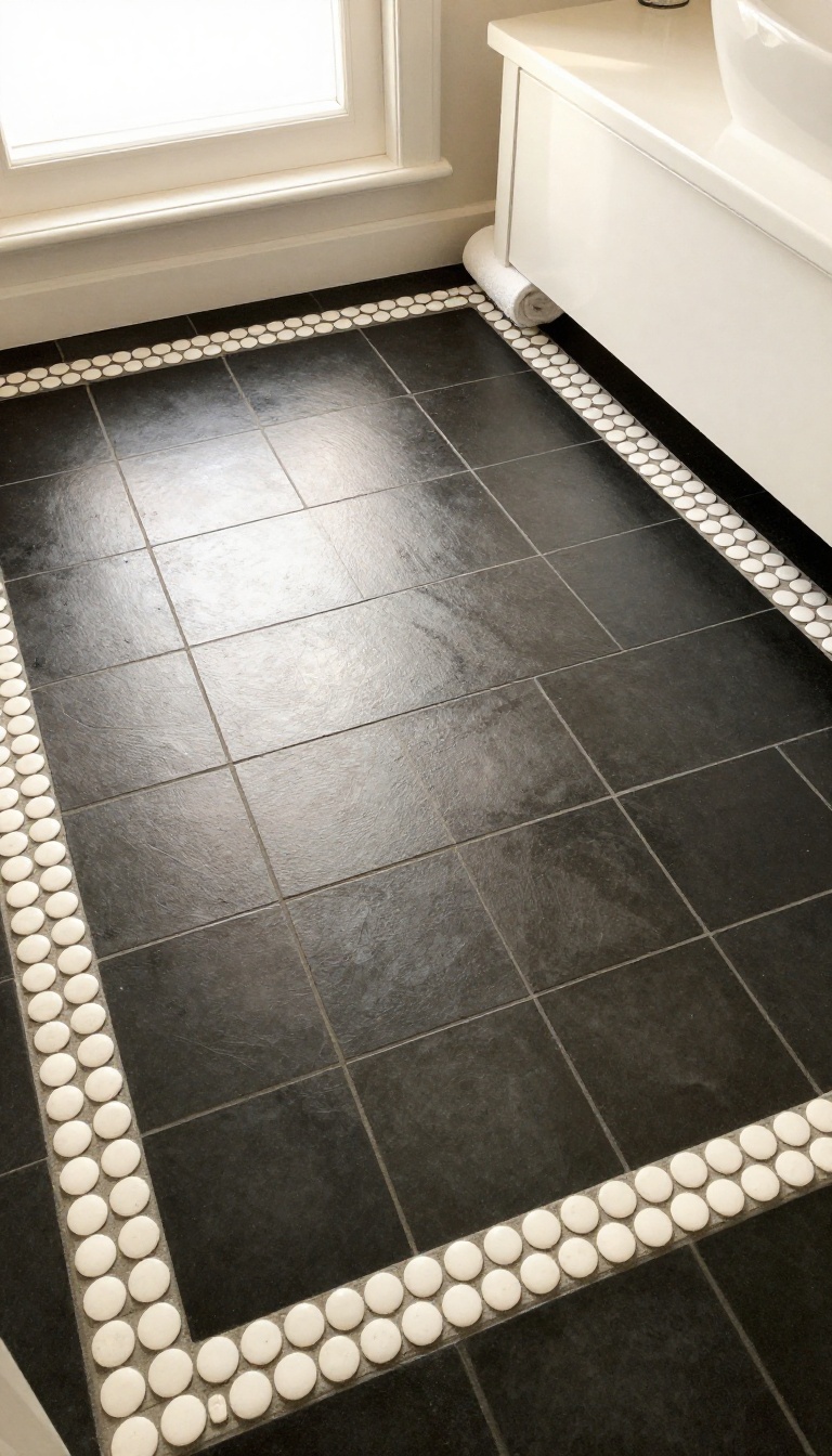
A penny tile border with larger field tiles gives you the best of both worlds: the intricate charm of small rounds and the clean simplicity of bigger squares or rectangles. The penny tile frames the room like a picture frame, while the larger tiles fill the center for a balanced, eye-catching look. This approach works in any size bathroom because you control the border width and tile scale.
It's a smart way to add retro flair without overwhelming the space with tiny tiles everywhere. Plus, it's practical. Larger field tiles mean fewer grout lines to clean in the main area, while the penny tile border adds just enough vintage detail to keep things interesting.
The key is contrast. You want the border and the field to play off each other, not compete. A classic combo is white penny tile border with large black or dark gray field tiles, but you can flip that or go bold with color.
Border width matters. A single row of penny tiles can look delicate, while three or four rows make a stronger statement. For most bathrooms, a border that's 4 to 6 inches wide feels proportional.
Layout is everything. You can run the border around the entire perimeter, or just along the vanity and tub for a more subtle effect. Either way, the penny tile should follow the same grout lines as the field tiles for a seamless look.
Choosing The Right Field Tile
Larger field tiles can be square, rectangular, or even hexagon-shaped, but keep the color palette simple. A solid color or subtle stone-look tile lets the penny border shine. Porcelain and ceramic are durable and easy to clean, while natural stone adds a luxe feel but requires more maintenance.
Size-wise, 12×12 or 12×24 inches are common choices. Just make sure the field tile isn't so large that it makes the penny border look like an afterthought.
Border Placement And Patterns
You can place the border flush with the walls or inset a few inches for a floating effect. A single border around the room is classic, but you can also add a second border around a shower or vanity area. For a twist, try a double border with a thin line of contrasting penny tiles between two rows.
Just remember: the more borders you add, the busier the floor gets, so keep the rest of the bathroom simple.
Grout And Color Combinations
Grout color can make or break this design. Matching grout between the penny border and field tiles creates a cohesive look, while contrasting grout highlights the border. For a retro vibe, use white penny tiles with black grout and pair them with black field tiles.
Or go soft with warm gray grout and cream field tiles. If you're feeling daring, pick a field tile color that matches one of the accent colors in your penny tile.
9. Metallic Penny Tile for Subtle Shine
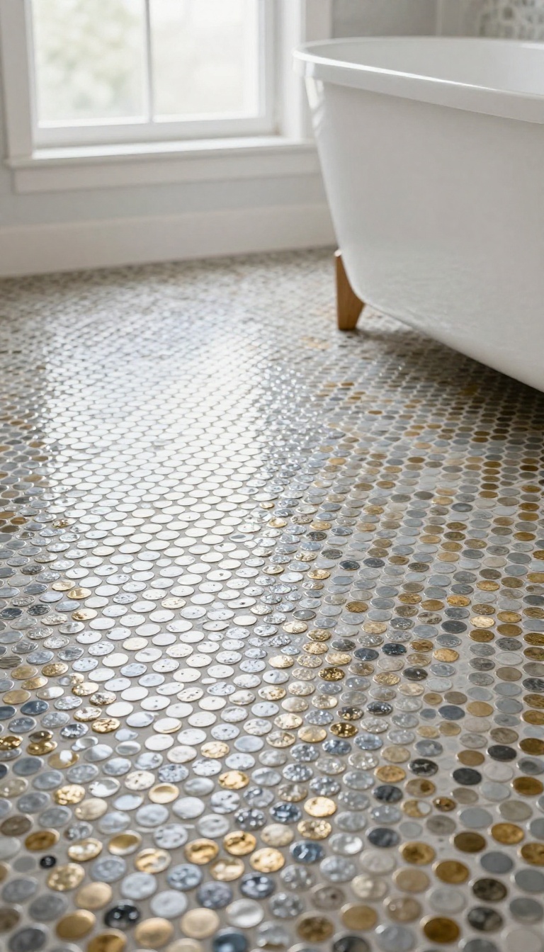
Metallic penny tile brings a quiet shimmer to a bathroom floor without turning it into a disco ball. The finish catches light as you move through the room, so the floor shifts between matte and gleam depending on the angle. It reads retro because of the shape, but the metallic surface pushes it into modern territory.
Silver, gold, bronze, and pewter all work, and each one sets a different mood. This is a great pick if you want personality that still feels grown-up. The shine is subtle enough for everyday use, but it keeps the floor from ever looking flat.
Metallic penny tiles are typically made from porcelain or glass with a metallic glaze, or from real metal like stainless steel and brass. The glaze versions are easier to clean and less prone to scratching, while real metal develops a patina over time. Both options give you that reflective quality that makes the floor feel alive.
One thing to know: metallic finishes show smudges and water spots more than matte tiles. A quick squeegee after showers keeps them looking sharp. In a powder room or guest bath, maintenance is barely a thought.
Choosing Your Metal Tone
Silver and chrome feel cool and sleek, almost like a vintage diner. They pair well with white subway tile, black accents, and industrial fixtures. Gold and brass bring warmth and a touch of luxury.
They look incredible with deep green, navy, or charcoal walls, and they play nicely with warm wood vanities. Bronze and pewter sit somewhere in between. They're earthy and aged-looking, which suits rustic or old-world bathrooms.
Pick the tone that matches your faucet and light fixtures for a cohesive look.
Grout That Makes It Pop
Grout choice changes everything with metallic tile. A matching metallic or light gray grout keeps the surface looking like one continuous sheet of shimmer. Dark grout creates a grid that breaks up the shine and adds graphic contrast.
It's a bolder look, but it keeps the retro penny shape front and center. If you want the metal to be the star, go with a grout that blends in. If you want pattern, go dark.
Either way, seal the grout to protect it from staining.
Where It Works Best
Metallic penny tile shines in small spaces where light is limited. A powder room or half bath becomes instantly more interesting with a reflective floor. It also works in a full bathroom as an accent, like inside a shower niche or as a border around the main floor.
That way you get the glamour without overwhelming the room. Avoid using it on every surface. One metallic element is enough.
Let the floor be the jewelry of the room, not the whole outfit.
10. Penny Tile with Heated Floor System
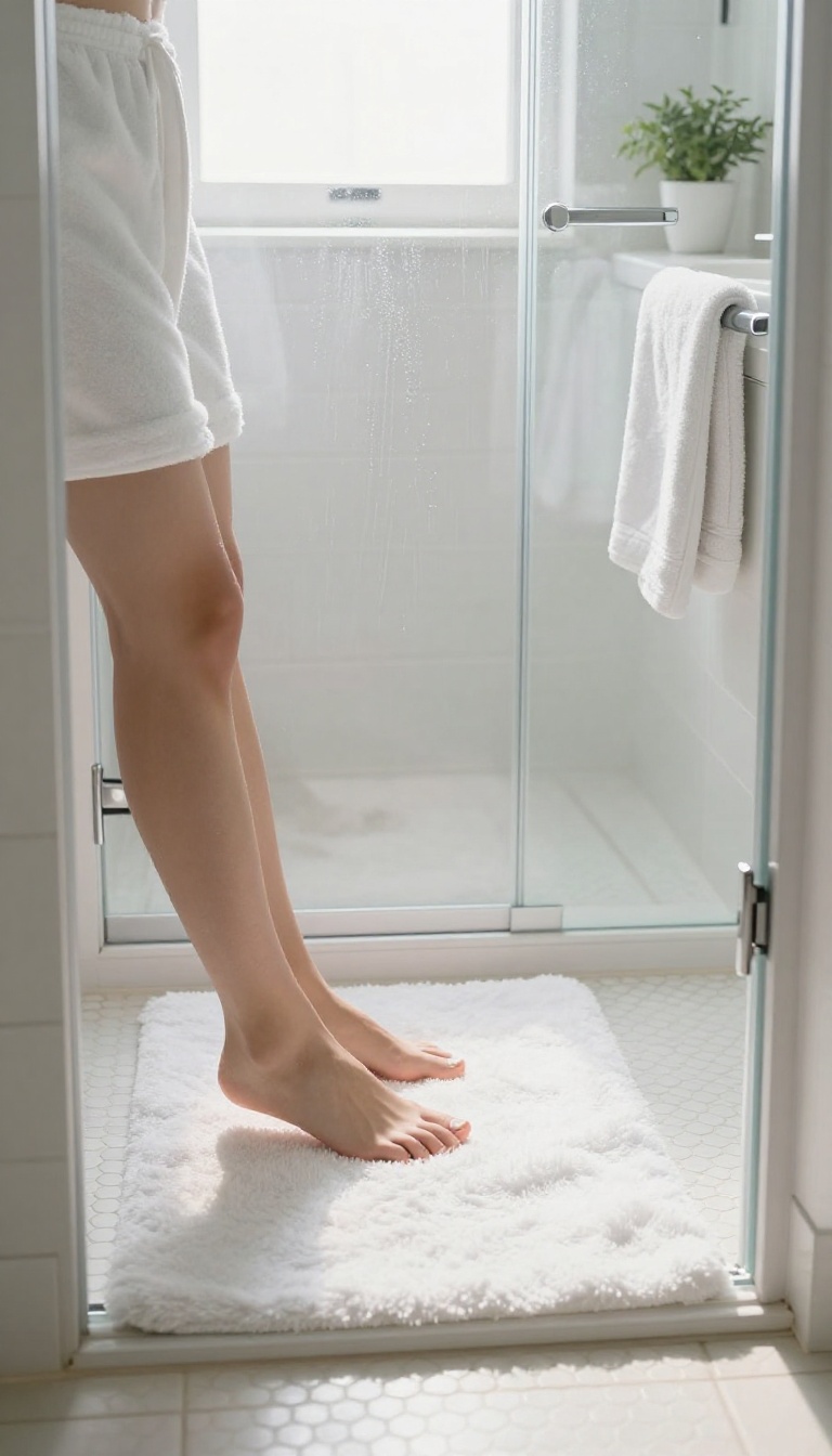
Cold tile underfoot is the one downside of a bathroom floor that looks this good. Radiant heating solves that problem without changing a single thing about the penny tile you love. You get the retro look upstairs and modern comfort downstairs, all in the same footprint.
Electric floor heating mats and cables sit directly beneath the tile, warming the surface from the inside out. The system runs on a thermostat, so the floor is already toasty when you step out of the shower. It works with porcelain, ceramic, and most stone penny tiles, which covers nearly every option on this list.
Installation adds a step to the tiling process, but it is not complicated. The mat rolls out over a leveled subfloor, thin-set goes on top, and the penny tile presses down as usual. A qualified electrician handles the final connection to power, and most bathrooms are done in a day or two of extra work.
What It Costs And What You Save
Materials for a typical 40-square-foot bathroom run somewhere between $300 and $700, depending on the system and whether you add a programmable thermostat. Professional installation pushes the total higher, but many homeowners pair it with a tile job they were already planning. Running costs stay modest because you only heat one small room.
A timer or smart thermostat that warms the floor during morning and evening hours keeps the bill predictable.
Choosing Tile That Plays Nice With Heat
Porcelain and ceramic penny tiles handle radiant heat without any issues. Natural stone, like marble or travertine, also works, though it warms more slowly and needs a little more time to reach temperature. Skip anything with a thick cork or foam backing, since those layers block heat transfer.
A standard mesh-backed penny tile sheet is ideal because it sits flat and lets the warmth rise evenly.
Getting The Thermostat Right
A floor sensor tucked between the heating element and the tile tells the thermostat exactly how warm the surface is. Set it between 75 and 85 degrees for barefoot comfort, and drop it a few degrees if the room already holds heat well. Programmable models let you schedule warmth around your routine instead of running all day.
That small habit keeps the system efficient and the floor ready when you actually need it.
11. DIY Penny Tile on a Budget
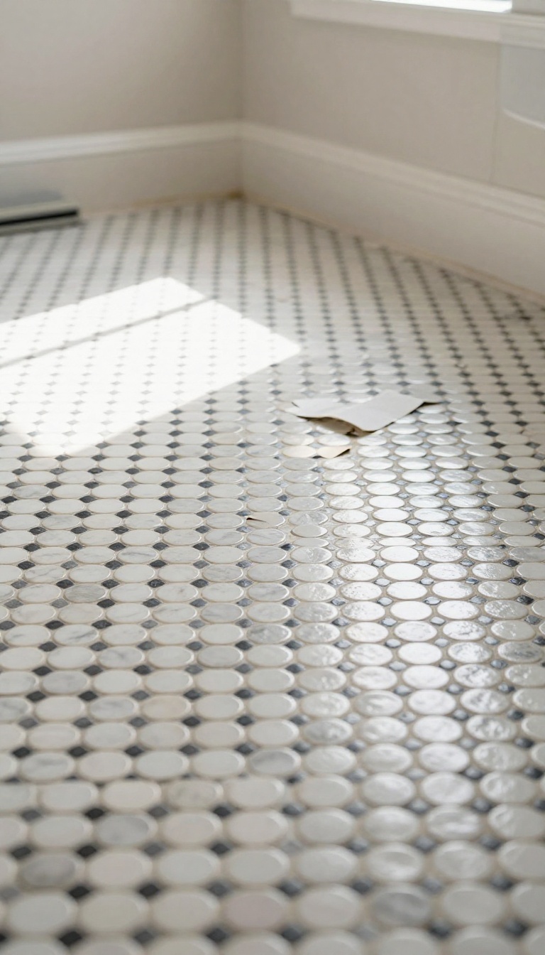
You don't need a big renovation fund to get that vintage penny tile look. With a little planning and some smart shopping, you can install penny tile yourself for a fraction of the cost. This section shows you how to save money without sacrificing style.
Peel-and-stick penny tile sheets are a game-changer for budget bathrooms. They cost a fraction of traditional tile and install in a weekend. Remnant lots from tile stores or online marketplaces can also score you real penny tile at a discount.
Just make sure you have enough to cover your space plus a little extra for cuts and mistakes.
Peel-and-stick Penny Tile
Peel-and-stick sheets are flexible, easy to cut, and require no mortar or grout. They're perfect for renters or anyone short on time. Look for brands with strong adhesive and a realistic finish.
Clean the floor thoroughly before applying, and press each sheet firmly for a lasting hold.
Shopping Remnant Lots
Remnant lots are leftover tiles from larger projects, often sold at 50-70% off. Check local tile shops, online marketplaces, and salvage yards. Measure your space first, then calculate how many square feet you need.
If you find a close match, buy it all—you can always use extras for a backsplash or accent.
Installation Tips For Savings
Skip professional installation and do it yourself. Watch a few tutorials, gather basic tools, and take your time. Use a simple grout color to avoid extra costs.
And don't forget to seal the tile if needed—it's a small step that protects your investment.
12. Penny Tile in a Small Bathroom
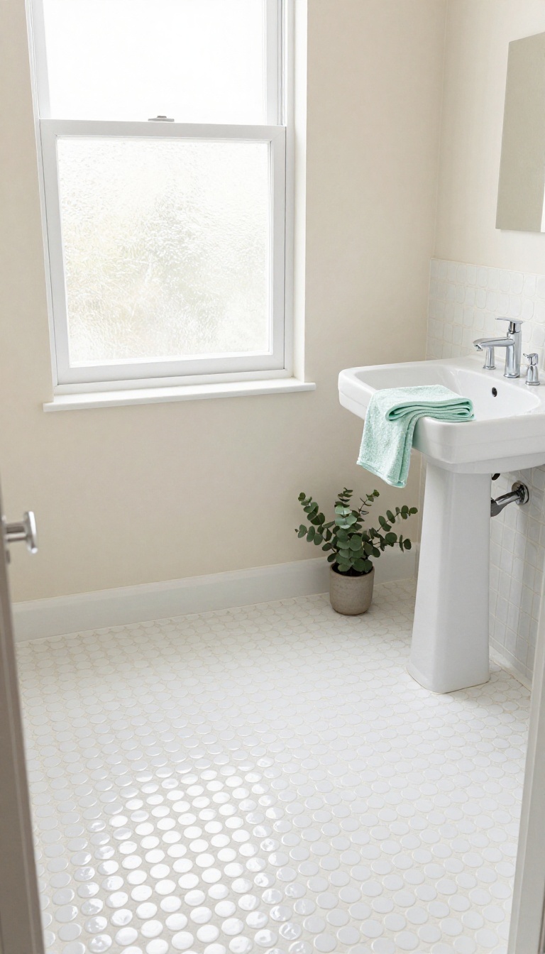
Small bathrooms don't have to feel cramped, especially when you choose the right floor. Penny tile, with its tiny repeating circles, can actually make a tight space feel bigger if you play your cards right. The trick is all about light colors and patterns that keep the eye moving without stopping.
When you're working with a postage-stamp-sized bathroom, every design choice matters. Penny tile is a smart pick because its small scale adds detail without overwhelming the room. But to really open things up, you need to think about color and layout.
Light, airy tones reflect light and blur the edges of the room, while a continuous pattern eliminates visual breaks that can make a space feel chopped up. Get these two elements right, and your tiny bathroom will feel surprisingly spacious.
Stick With Light, Bright Colors
White, cream, pale gray, and soft pastels are your best friends in a small bathroom. These shades bounce light around and make the walls feel like they're further apart. A white penny tile floor with matching white grout creates a seamless, almost floating effect that visually expands the floor area.
If you want a hint of color, try a light mint or baby blue—it adds personality without darkening the space.
Keep The Pattern Continuous
Avoid borders, medallions, or any design that interrupts the flow of the tile. A continuous field of penny tile from wall to wall makes the floor look like one uninterrupted surface. This tricks the eye into seeing more square footage.
If you must have an accent, consider a subtle tone-on-tone pattern, like alternating glossy and matte white tiles, which adds texture without breaking the visual plane.
Match Grout To Tile
Grout lines can either disappear or become a grid that emphasizes every tiny circle. In a small bathroom, matching the grout color to the tile color minimizes visual noise and creates a smooth, cohesive look. White grout with white tile is a classic choice, but you can also use a slightly lighter or darker shade of the same hue for subtle depth without choppiness.
13. Maintenance Tips for Penny Tile Floors
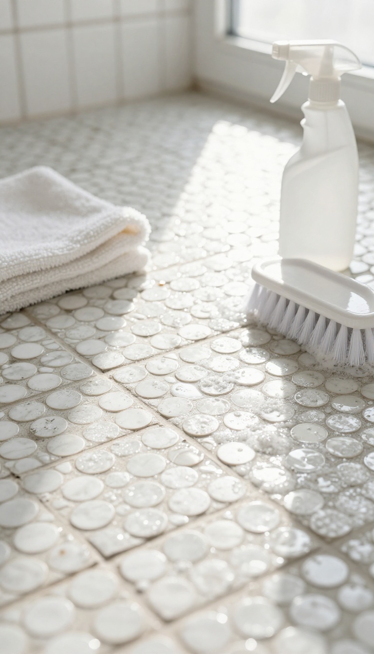
Penny tile floors are tough, but they're not indestructible. Between the grout lines and the tiny rounds, there are plenty of places for dirt and grime to hide. A simple routine keeps your retro floor looking fresh without turning cleaning into a weekend project.
Here's how to stay on top of it.
The key is consistency. A quick sweep or vacuum a few times a week stops grit from scratching the surface. Then a weekly damp mop with a mild cleaner handles the rest.
Every few months, you'll want to deep clean the grout and reseal it to keep stains at bay. It's not glamorous, but it's what keeps that vintage charm intact for years.
Daily And Weekly Care
Sweep or vacuum with a soft brush attachment to pick up loose debris. For a deeper clean, mix a few drops of mild dish soap with warm water and mop with a microfiber pad. Avoid harsh chemicals like bleach or ammonia, which can dull the tile and break down grout over time.
A quick once-over keeps the floor looking sharp without much effort.
Deep Cleaning The Grout
Grout is where penny tile floors show their age first. Once a month or so, use a soft-bristle brush and a paste of baking soda and water to scrub the lines. For stubborn stains, a steamer works wonders without harsh chemicals.
Rinse well and dry with a clean towel to prevent streaks.
Sealing And Protecting
If your grout isn't sealed, it's a sponge for spills. Apply a penetrating sealer every six to twelve months, depending on traffic. Test by dropping a little water on the grout—if it soaks in rather than beading up, it's time to reseal.
This step adds years to the life of your floor and makes cleaning easier.
FAQ
Is penny tile slippery when wet?
Penny tile has many grout lines, which provide natural traction. However, glossy finishes can be slippery, so choose a matte or textured version for bathroom floors.
How much does penny tile installation cost?
Costs vary by location and tile choice, but expect to pay $10 to $30 per square foot installed. DIY can reduce costs significantly.
Can penny tile be installed over existing tile?
Yes, if the existing tile is in good condition and level. Otherwise, removal is recommended for a proper bond.
What grout color works best with penny tile?
White grout creates a seamless look, while dark grout highlights the pattern. Consider maintenance and desired style.
Does penny tile need to be sealed?
Ceramic and porcelain penny tiles don't need sealing, but the grout should be sealed regularly to prevent stains and moisture damage.
Conclusion
Penny tile rewards you the moment it hits the floor. The room instantly reads as retro, but the pattern you choose keeps it from feeling like a costume. Start with one idea that fits your space and budget, then let the grout color and border details do the rest of the talking.
Live with it for a week before you add anything else. Watch how the light moves across the tiles in the morning and how the pattern feels underfoot at night. The best retro floors are the ones that still make you smile long after the novelty wears off.