13 Blue Living Room Ideas for Cool Restful Home Style
Blue has a way of making a room feel instantly calmer. It’s not just a color choice—it’s a mood setter. Whether you lean toward deep navy or pale sky tones, blue living rooms can feel both cool and cozy when you layer them right.
The trick is balancing that coolness with warmth. Think soft textures, natural materials, and plenty of contrast. You don’t need a full renovation to make it work either.
Small swaps like pillows, throws, or a painted accent wall can shift the whole energy of the room. Here are 13 blue living room ideas that keep things practical, stylish, and easy to pull off.
1. Navy Accent Wall with Warm Wood Tones
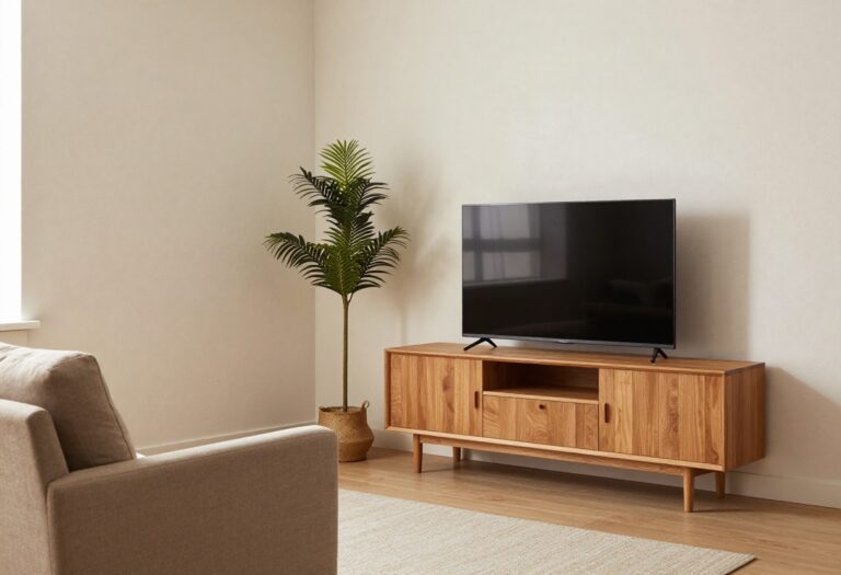
Deep navy can feel bold, but when you anchor it with natural wood, it instantly becomes grounded and inviting. The trick is letting the wood do the warming—think walnut shelves, a oak coffee table, or even a reclaimed wood media console. This combo gives you that cozy, layered look without making the room feel dark or closed in.
A navy accent wall creates a strong focal point, but it needs balancing to keep the room from feeling cold or heavy. Warm wood tones are the perfect counterpoint—they add organic texture and a sense of comfort. Whether you go with a single statement wall behind the sofa or paint the wall opposite the windows, the wood elements will soften the intensity of the blue.
This idea works especially well in living rooms that get plenty of natural light, as the navy will read as rich rather than flat. If your room is on the darker side, keep the other walls a soft white or cream to maintain brightness.
Best Wood Pairings
Medium to dark woods like walnut, teak, or mahogany work beautifully with navy. Avoid very light woods like bleached oak, which can look washed out next to the deep blue. If you already have light wood floors, bring in darker wood furniture to create contrast and avoid a flat look.
Texture Mix
Layer in a chunky knit throw or a velvet pillow in a lighter blue or cream to break up the solid wall. A jute or sisal rug underfoot adds natural fiber texture that complements the wood without competing. This keeps the space feeling tactile and lived-in, not like a showroom.
Lighting Tip
Warm light bulbs (2700-3000K) are essential here. Cool light will make the navy look flat and the wood feel dull. Use a floor lamp with a brass or wood base to cast a warm glow across the accent wall, highlighting the depth of the paint and the grain of the wood.
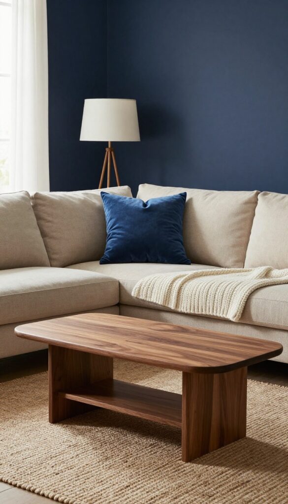
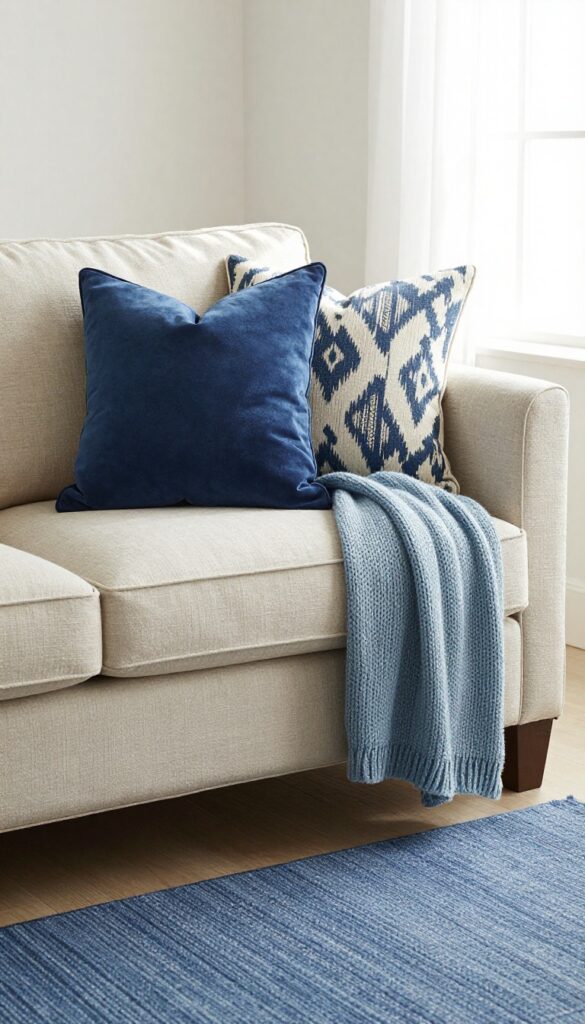
2. Layered Blue Textiles on a Neutral Sofa
A neutral sofa is the perfect canvas for a blue moment. Instead of committing to blue walls or a blue couch, you can pile on blue textiles to get that cool, restful vibe without the permanence. This approach is especially great if you love changing things up seasonally or just want to test the waters with blue.
The key is layering different shades and textures so the look feels intentional and cozy, not like you just threw on a few pillows.
Start with a beige, gray, or cream sofa as your base. Then add a mix of blue throw pillows in varying sizes and patterns—think a navy velvet square, a chambray lumbar, and a patterned ikon or geometric print. Drape a chunky knit throw in a soft powder blue over one arm or across the back.
Finish with a flatweave or low-pile rug in a blue that ties the pillows together, like a washed indigo or a blue-gray tone. The result is a layered, inviting look that feels cool and serene but still warm enough for everyday living. You can easily swap out pillows or the throw to adjust the intensity of blue, from pale sky to deep navy, without any major commitment.
Best Blue Shades To Layer
- Stick with two or three blue tones that feel harmonious. A classic combo is navy, powder blue, and a mid-tone denim blue. If you prefer a more monochromatic look, choose a single hue in different textures—like a velvet navy pillow, a linen navy throw, and a wool navy rug.
- For a bit of contrast, add a pillow with a subtle white or cream pattern to break up the blue.
Texture Mix For Coziness
- The key to making layered blue textiles feel inviting is texture. Mix smooth velvet with chunky knits, soft linen, and nubby wool. A velvet pillow feels luxurious next to a cable-knit throw, while a flatweave rug adds a casual foundation.
- This variety keeps the eye moving and prevents the look from feeling flat or one-dimensional.
Finishing Touch: Add Warmth
- Blue can read cool, so balance it with warm accents. A wooden coffee table, a brass floor lamp, or a few terracotta-toned accessories will keep the space from feeling chilly. Even a warm beige throw or a cream-colored sheepskin rug can do the trick.
- The goal is a restful, cozy room, not an icy one.
3. Soft Blue Walls with White Trim for Airiness
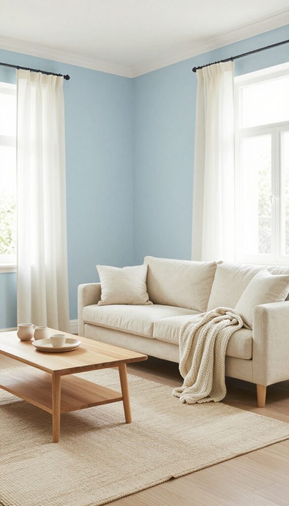
Pale blue walls instantly make a room feel more open and calm, especially when paired with bright white trim. This classic combination leans into the restful vibe of blue without making the space feel cold or sterile. The key is choosing a blue with a hint of gray or green so it stays soft and welcoming, not icy or stark.
Start with a pale blue like Benjamin Moore's "Palladian Blue" or Sherwin-Williams "Rainwashed." Paint the walls and ceiling the same soft blue to blur the edges and make the room feel larger. Then paint all trim—baseboards, window frames, door casings—in a crisp white like "Chantilly Lace." This sharp contrast frames the blue beautifully and adds architectural interest. For the rest of the room, bring in off-white linen curtains, a light wood coffee table, and a cream or beige sofa.
The soft neutrals keep the look airy and layered, while the blue walls become a soothing backdrop. Add texture with a chunky knit throw or a sisal rug to warm up the space without adding clutter.
Best Blue Shades
Stick with muted, dusty blues—think sky blue, powder blue, or blue-gray. Avoid bright or electric blues, which can feel jarring in a restful space. Test samples on your wall and observe them at different times of day; north-facing rooms may need a warmer blue to avoid feeling chilly.
Trim And Ceiling Tips
- White trim is non-negotiable for this look. Go for a semi-gloss or satin finish on trim to reflect light and create a crisp edge. If your ceiling is low, paint it the same blue as the walls to visually push it upward.
- For higher ceilings, keep the ceiling white to maintain an open feel.
Furniture Pairing
Light wood tones like oak or ash work beautifully with soft blue walls. A white or cream sofa keeps the palette fresh. Add a few darker accents—a navy throw pillow or a charcoal floor lamp—to ground the room and prevent it from feeling washed out.
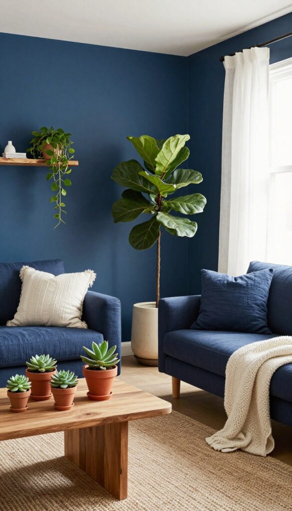
4. Blue Velvet Sofa as a Statement Piece
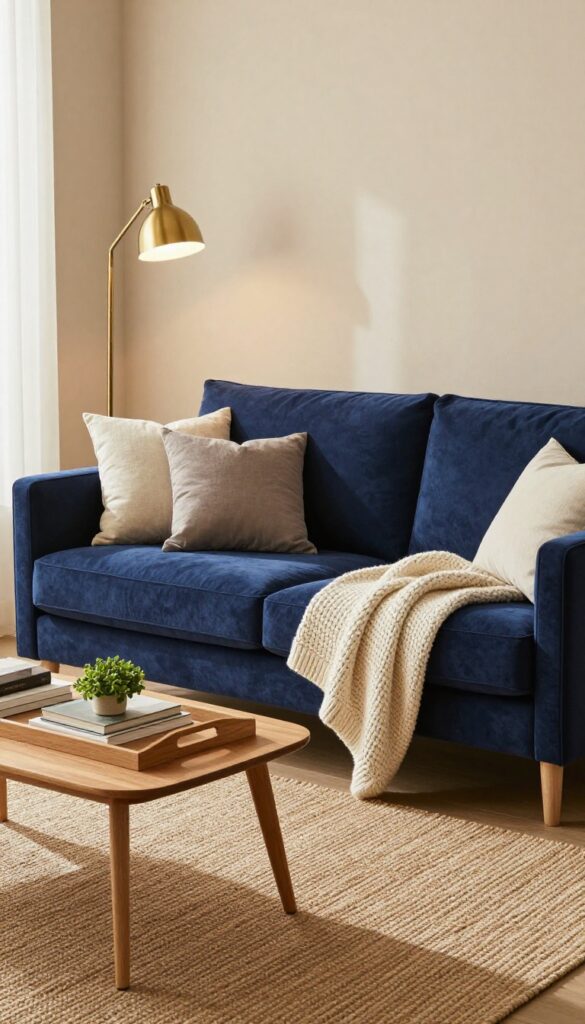
A blue velvet sofa is one of those pieces that instantly upgrades a room without trying too hard. The rich fabric adds depth and a soft, tactile quality that flat weaves just can't match. By keeping the surrounding palette neutral—think beige walls, a natural jute rug, and warm brass accents—the sofa gets to shine without competing.
It's a bold move that still feels grounded and livable.
This idea works especially well in living rooms that need a focal point but don't have built-in architectural details. The velvet catches light differently throughout the day, giving the space a subtle, ever-changing texture. Pair it with a chunky knit throw or a few linen pillows to keep the look cozy rather than formal.
The brass touches—like a floor lamp, coffee table legs, or picture frames—add just enough gleam to keep the room from feeling too heavy.
Best Colors
- Stick with a deep navy or a mid-tone sapphire blue for the sofa. These shades feel rich without being overwhelming. For the rest of the room, lean into warm neutrals: beige, cream, taupe, and soft gray.
- Avoid cool whites or stark grays, which can make the velvet look flat. A touch of olive green in a plant or accent pillow can also complement the blue beautifully.
Texture Mix
- Velvet is smooth and plush, so balance it with rougher textures. A jute or sisal rug adds organic, nubby contrast. Linen curtains or cotton drapes keep the windows light.
- A chunky knit throw or a woven basket for blankets introduces more tactile variety. The goal is to create a layered, inviting feel that doesn't rely on pattern alone.
Finishing Touch
Add a brass or gold floor lamp with an arc or tripod base to echo the metallic accents and draw the eye upward. A round coffee table in light wood or glass keeps the layout airy. Finally, a large abstract print or a framed mirror above the sofa anchors the piece and completes the vignette without clutter.
5. Mixed Blue Tones in an Open-Concept Layout
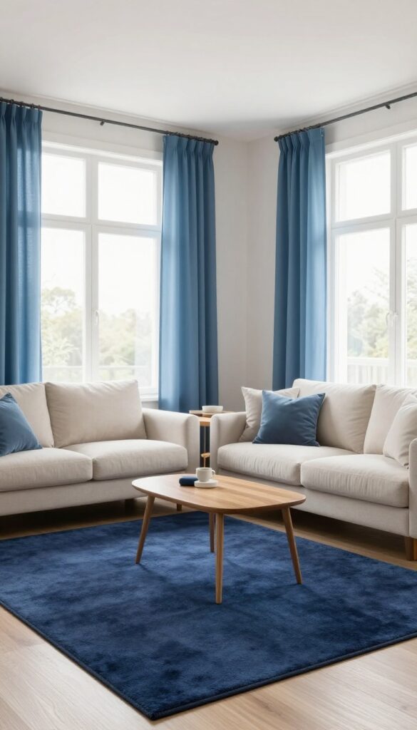
An open-concept space can feel a little chaotic if every zone blends into the next. Using different shades of blue is a clever way to create separation without building walls. A deep navy rug under the sofa defines the living area, while airy sky-blue curtains and throw pillows soften the dining side.
The result is a cohesive but distinct layout that feels intentional and calm.
Start by choosing a dominant blue for the main seating zone—navy or indigo works well because it anchors the space. Then, use lighter blues like powder blue or periwinkle on the dining side through window treatments, seat cushions, or a subtle wall color. This gradient effect guides the eye naturally from one area to the next, making the room feel larger and more organized.
Add a few accents in complementary neutral tones like warm wood or cream to keep the look grounded.
Best Colors
Stick with two to three blue shades that share the same undertone—cool blues for a crisp feel, or greenish blues for a more organic vibe. Navy, slate, and soft denim are a reliable trio. Avoid mixing warm and cool blues unless you use a neutral buffer like beige or gray.
Layout Tip
Use rugs to visually separate zones. A large navy rug under the sofa and coffee table signals the lounge area, while a smaller light blue rug or a subtle change in flooring (like a transition from carpet to tile) marks the dining zone. Keep furniture low to maintain sightlines.
Finishing Touch
Repeat the lighter blue in small decor pieces on the navy side—like a ceramic vase or a throw blanket—and vice versa. This back-and-forth creates a visual conversation between the zones, making the open layout feel connected rather than disjointed.
6. Blue and Natural Fiber Pairing
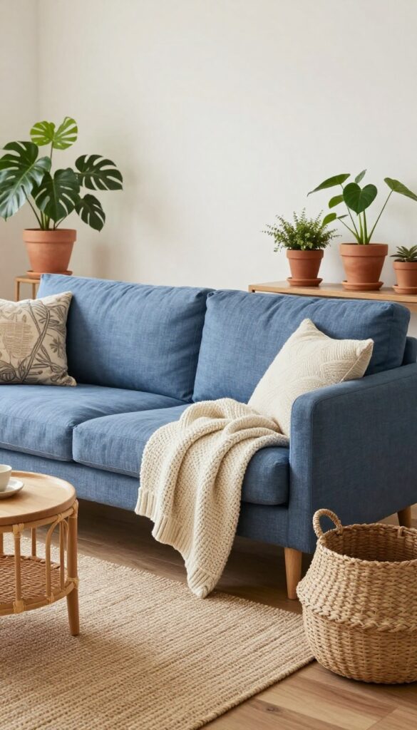
Bringing blue and natural fibers together is one of those decorating moves that feels both intentional and effortless. The coolness of blue tones down the warmth of rattan, sisal, and linen, while the organic textures keep the room from feeling too polished or precious. It's a grounded, layered look that works in everything from coastal cottages to modern apartments.
A blue linen sofa is the natural starting point. Its soft, slightly rumpled fabric invites you to sink in, and the color reads as calm without being boring. Pair it with a sisal rug—the rough weave adds just enough contrast to make the blue pop.
Then bring in rattan side tables or a woven pendant light to echo the natural theme. The mix of smooth blue and scratchy, earthy textures keeps the eye moving and the space feeling collected over time.
Best Colors
- Stick with muted blues like denim, slate, or dusty navy. They play nicely with the warm beige and brown tones of natural fibers. Avoid bright or electric blues, which can clash with the earthy vibe.
- If you want a pop, try a deep teal—it reads as blue but has enough green to bridge the gap.
Texture Mix
- Layer different natural textures to keep the look from falling flat. A chunky knit throw in cream or oatmeal on the blue sofa adds softness. Woven baskets for storage bring in more rattan or seagrass.
- Even a simple jute ottoman can serve as a footrest and extra seating while reinforcing the organic feel.
Finishing Touch
Add a few leafy plants in terra-cotta pots to tie the whole scheme together. The green leaves echo the natural fibers and soften the blue. A fiddle-leaf fig or a cluster of snake plants on a rattan plant stand feels like the final layer that makes the room look lived-in and relaxed.
7. Blue Accent Chair with Patterned Upholstery
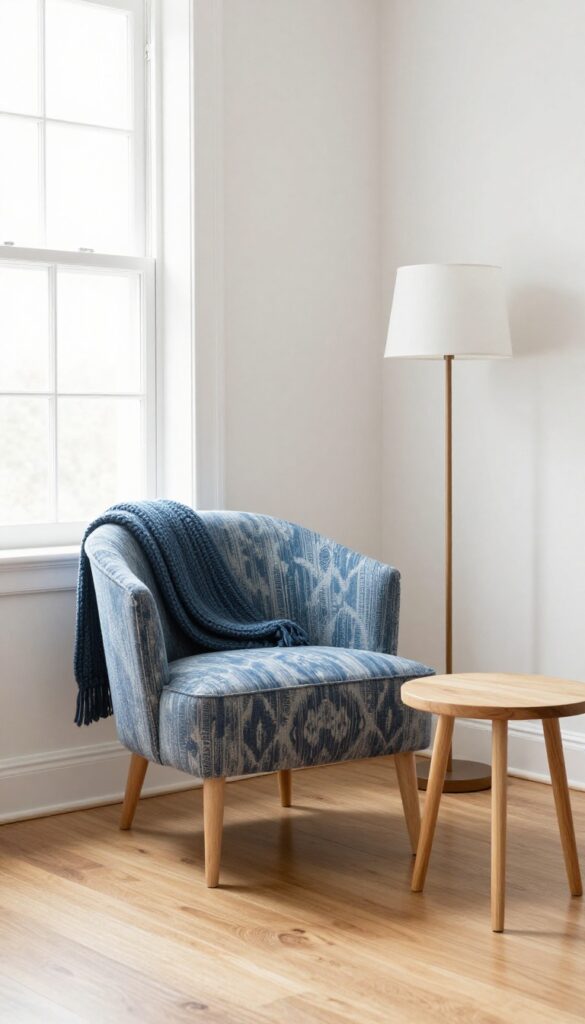
One of the easiest ways to introduce blue into a neutral living room is with a single accent chair. Instead of going solid, choose a pattern like stripes, ikat, or a subtle geometric. It adds visual interest without demanding too much attention.
Place it near a window or next to a bookshelf for a pop of color that feels intentional and balanced.
A patterned blue chair becomes a focal point without overwhelming the space. The key is to let it stand out by keeping surrounding furniture neutral. This approach works especially well in living rooms that already have a lot of texture or warm wood tones.
The chair adds a cool, calming element that contrasts nicely with warmer materials like rattan or brass.
Best Colors To Pair
Blue patterned chairs pair beautifully with whites, creams, and warm grays. For a bolder look, try mustard yellow or blush pink pillows on the chair. If your room leans cool, stick with crisp white walls and light wood floors to keep the space airy.
Layout Tip
Position the chair at an angle to the sofa or fireplace to create a conversational grouping. This breaks up the straight lines of the room and makes the chair feel like a deliberate design choice rather than an afterthought. Add a small side table and a floor lamp to complete the vignette.
Cozy Detail
Layer a soft throw blanket over the back of the chair in a complementary neutral or a lighter blue. This not only adds texture but also makes the chair look more inviting. Choose a chunky knit or a linen throw for a relaxed, lived-in feel.
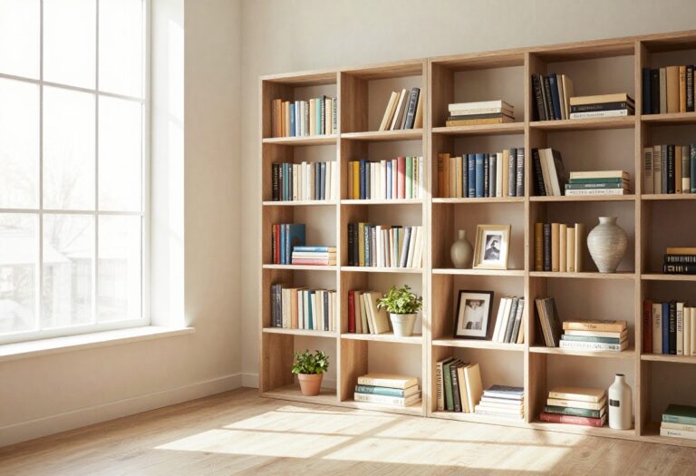
8. Blue Gallery Wall with Art and Objects
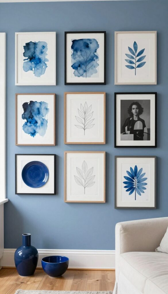
A gallery wall is one of those projects that instantly makes a room feel collected and personal. When you lean into blue as the unifying thread—through paintings, prints, ceramics, or even small objects—the whole display feels intentional without being matchy. The trick is to mix in neutral and black-and-white pieces so the eye has places to rest, keeping the wall from feeling too busy or one-note.
This approach works especially well in a living room where you want a cozy, layered look that still feels curated and calm.
Start by gathering a mix of blue-toned artwork, such as abstract watercolors, botanical prints, or simple line drawings. Add in a few ceramic plates or small sculptural objects in shades of navy, cobalt, or soft periwinkle. Then introduce black-and-white photography or minimalist sketches to break up the color and add contrast.
Arrange everything on the floor first to test the layout—aim for a balanced composition with varied frame sizes and shapes. Once you're happy, transfer the arrangement to the wall using paper templates or careful measurements. The result is a gallery wall that feels both collected and cohesive, with blue as the quiet anchor.
Best Colors To Include
Stick with a palette of two to three blue shades—like navy, dusty blue, and a pale sky blue—plus plenty of white and black. The neutrals keep the wall from feeling overwhelming, while the blues create a soothing rhythm. Avoid adding too many other bright colors, as they can distract from the calm, restful vibe you're after.
Shelf Styling Tip
If you're nervous about committing to a full grid, start with a single floating shelf. Lean a few blue-framed prints against the wall and layer in small ceramic objects or a small vase with dried eucalyptus. This approach is more forgiving and easier to swap out when you want a refresh.
Finishing Touch
Add a small picture light above the gallery wall or a warm LED strip along the shelf. The extra glow highlights the textures and colors, making the blue tones feel even more inviting—especially in the evening when you want the room to feel cozy and layered.
9. Blue Throw Blankets and Poufs for Easy Swaps
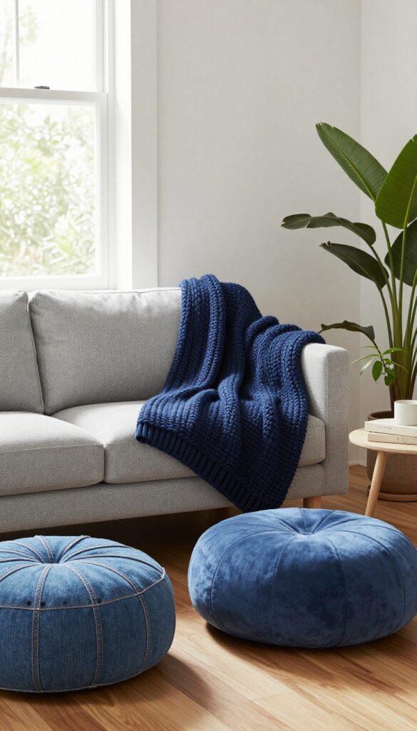
Sometimes you want blue without the commitment of painting a wall or buying a new sofa. That is where soft accessories come in. Throw blankets, poufs, and floor cushions let you test the waters or change your mind whenever the mood strikes.
They add a pop of color and a layer of texture that makes a living room feel instantly more inviting. And because they are easy to swap out seasonally, you can keep your space feeling fresh without a major overhaul.
The beauty of using blue throw blankets and poufs is that they work with almost any existing color scheme. Whether your room is neutral, warm-toned, or already has a few cool accents, blue will blend in or stand out depending on the shade you choose. For a cozy, layered look, drape a chunky knit throw over the back of your sofa or fold it neatly on an armchair.
Poufs can double as extra seating or a footrest, and they are lightweight enough to move around as needed. Floor cushions placed in a corner create a casual reading nook that feels relaxed and lived-in. The key is to pick fabrics that invite touch—think soft wool, cotton blends, or velvet.
These pieces do not just add color; they add warmth and comfort, which is exactly what a cozy living room needs.
Best Colors And Patterns
- Navy and denim blue are safe bets that ground a space, while lighter shades like sky blue or powder blue keep things airy. If you want a bolder look, try a deep teal or sapphire. Patterns like stripes, ikat, or subtle geometrics add visual interest without overwhelming the room.
- Stick to one or two patterns per space to keep it cohesive.
Texture Mixing Tips
- Pair a smooth velvet pouf with a chunky knit throw for contrast. Or place a woven cotton blanket over a leather sofa to soften the look. Mixing textures prevents the room from feeling flat and makes the blue elements stand out more.
- A faux fur throw on a sleek modern chair adds both coziness and a touch of luxury.
Seasonal Swap Strategy
- Rotate your blue accessories with the seasons. In warmer months, use lightweight cotton throws and poufs in pale blues. Come fall and winter, switch to thicker knits and deeper navy or indigo tones.
- Store off-season pieces in a basket or under the sofa for easy access. This keeps your decor feeling current and intentional without buying all new furniture.
10. Blue and Greenery Combo for Freshness
Pairing blue with houseplants is one of the easiest ways to bring life into a living room. The green leaves pop against blue walls or soft blue textiles, creating a natural contrast that feels both energetic and soothing. It’s a look that works in any style, from modern to boho, and it instantly makes the space feel fresher without a full redesign.
Start by choosing a blue base—whether it’s a painted accent wall, a navy sofa, or a set of blue throw pillows. Then layer in plants at different heights: a tall fiddle-leaf fig in a corner, a trailing pothos on a shelf, and a few small succulents on the coffee table. The key is to let the greenery be the star against the blue backdrop.
For a cozy, layered feel, mix in natural textures like woven baskets, linen curtains, and a chunky knit throw. This combo keeps the room from feeling too cold or too tropical—it strikes a perfect balance between calm and lively.
Best Color Pairings
- Stick with deep navy or dusty blue for the walls or large furniture pieces. These shades let the green stand out without competing. For a softer look, try pale blue with bright lime or chartreuse plants.
- Avoid pairing bright royal blue with dark green—it can feel heavy. Instead, keep one color muted and the other vibrant.
Plant Styling Tip
Group plants in odd numbers (3 or 5) for a natural, curated feel. Use pots in neutral tones like terracotta, cream, or matte black to keep the focus on the blue and green. Place a few plants on a blue console table or hang them in macrame holders against a blue wall to create depth.
Finishing Touch
Add a single blue-and-green patterned pillow or a small rug that ties both colors together. This subtle repetition makes the combo feel intentional rather than accidental. A ceramic vase in a similar blue tone filled with eucalyptus branches is an easy final touch.
11. Blue Striped Rug to Anchor the Room
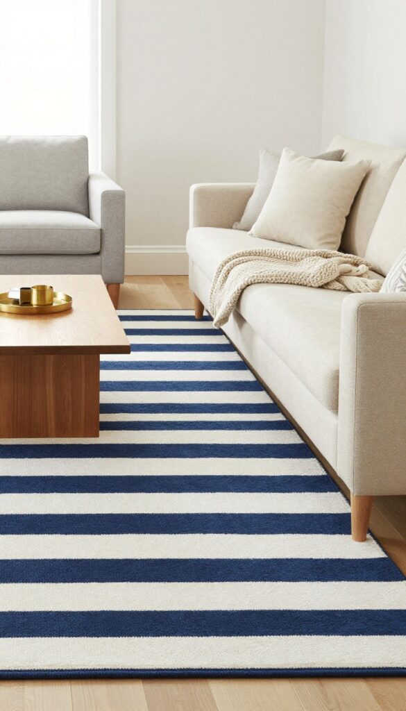
A blue and white striped rug is one of those hardworking pieces that instantly pulls a room together. It carves out a clear seating zone, especially in open floor plans where the living area can feel lost. The stripes add a subtle sense of movement and direction, making the space feel intentional without being loud.
Solid-colored furniture lets the rug take center stage, keeping the look clean and grounded.
Striped rugs are a classic choice that work in both modern and traditional settings. The blue and white combination feels fresh and coastal but can also lean preppy or even rustic depending on the shade and pattern width. To keep the room from feeling busy, choose a rug with a simple two-tone stripe rather than multiple colors.
Then let your sofa and chairs stay neutral—think cream, beige, or light gray. This way the rug becomes the visual anchor, and the rest of the room supports it. The result is a space that feels layered but not cluttered, cozy but still open.
Best Colors
Navy and white is the most versatile combination, working well with warm wood tones and brass accents. For a softer look, try a light blue with off-white stripes. If you want a bit more drama, a deep indigo with cream stripes adds richness without overwhelming the room.
Layout Tip
Place the rug so the front legs of your sofa and chairs sit on it, creating a unified seating area. In a rectangular room, run the stripes parallel to the longest wall to visually widen the space. For a square room, diagonal stripes can add unexpected energy.
Cozy Detail
Layer a smaller textured rug—like a chunky knit or a sheepskin—on top of the striped rug near the coffee table. This adds warmth underfoot and breaks up the pattern just enough to keep the eye moving. It also makes the space feel more lived-in and inviting.
12. Blue Painted Ceiling for Unexpected Depth
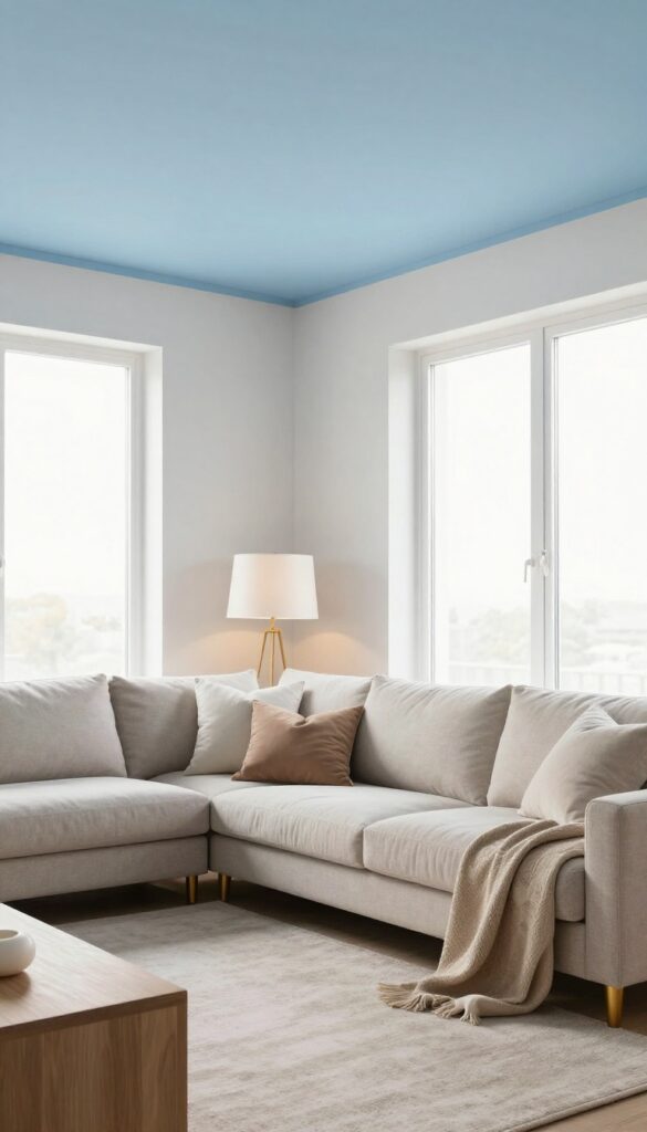
Ceilings are often an afterthought, but painting yours a soft blue can completely transform the room. It draws the eye upward, making the space feel larger and more airy, while adding a subtle layer of color that feels calming and intentional. This trick works especially well in living rooms with white or light gray walls, as the contrast creates a sense of depth without overwhelming the senses.
Warm lighting is key here—it balances the cool tone and keeps the room feeling cozy, not cold.
A blue ceiling is a surprisingly simple way to add character to a living room. It’s not as bold as painting all four walls, but it still makes a statement. The effect is especially nice in rooms with good natural light, where the blue can shift from a soft morning hue to a deeper evening tone.
To keep the look grounded, stick with neutral walls and add warm wood or brass accents. The ceiling becomes a quiet focal point that adds visual interest without competing with your furniture or decor.
Best Blue Shades
- Stick with muted, dusty blues like slate, powder blue, or a soft periwinkle. Avoid anything too bright or saturated, as it can feel heavy overhead. A matte finish works best to diffuse light and avoid glare.
- Test a few samples on the ceiling first—colors look different up there than on walls.
Lighting Tip
- Warm light fixtures are essential to balance the cool ceiling. Use table lamps with soft white bulbs, or install a dimmer switch for overhead lights. Avoid cool-toned LEDs, which can make the blue feel flat or chilly.
- A warm glow keeps the room inviting.
Cozy Detail
Add a few layered textures like a chunky knit throw or a velvet sofa to offset the airy ceiling. The contrast between the soft blue above and cozy fabrics below creates a balanced, lived-in feel. A light-colored rug also helps tie the look together.
13. Blue and Brass Accents for a Touch of Glam
Blue and brass is a pairing that feels both classic and fresh. The cool depth of navy or teal gets a warm, luminous lift from brass or gold accents—think lamp bases, picture frames, or drawer pulls. This mix adds a subtle luxury without tipping into formal or stiff territory.
It works especially well in living rooms that want a polished yet relaxed vibe, where the metallic glow feels like a natural complement to the blue rather than an afterthought.
Start with a blue sofa or a statement blue wall as your anchor. Then introduce brass through smaller pieces: a floor lamp with a brass stem, a coffee table with brass legs, or a set of brass-framed mirrors. The key is balance—too much brass can feel flashy, while too little gets lost.
Aim for three to five brass accents in the room, varying in size and finish. Brushed brass has a softer sheen that blends well with everyday living, while polished brass adds more sparkle. This combination brings a cozy glamour that feels intentional and inviting, not overdone.
Best Colors
- Deep navy, rich teal, and muted slate blue pair beautifully with brass. These shades have enough depth to anchor the metallic shine without competing. For a lighter look, try powder blue or soft denim—brass still pops but feels airier.
- Avoid pairing brass with icy or neon blues, which can clash and feel disjointed.
Texture Mix
- Brass shines best against textured surfaces. Velvet cushions, a chunky knit throw, or a linen sofa add softness that contrasts with the metal's sleekness. A brass coffee table on a jute rug or next to a leather armchair creates a layered, lived-in feel.
- The mix keeps the room from looking too polished or cold.
Finishing Touch
Add a brass tray on a blue ottoman or side table to corral remotes and coasters. This small detail ties the look together and adds function. For a quick update, swap out standard cabinet knobs for brass pulls—it's an easy, low-commitment way to test the trend.
FAQ
What blue shades work best for a small living room?
Light blues like powder blue or soft periwinkle make small rooms feel airy and open. Avoid very dark blues on all walls—use them as accents instead.
How do I keep a blue living room from feeling cold?
Add warm textures like wood, wool, velvet, and rattan. Warm lighting with soft yellow bulbs also helps balance the coolness of blue.
Can I mix different blues in one room?
Absolutely. Stick to a consistent undertone (all warm or all cool) and vary the saturation. A navy sofa with sky blue pillows and a teal rug can look cohesive.
What colors go well with blue in a living room?
White, beige, gray, and warm wood tones are safe bets. For contrast, try mustard yellow, blush pink, or emerald green in small doses.
Is blue a good choice for a rental living room?
Yes. Use removable wallpaper, blue area rugs, slipcovers, and accessories. That way you can take the color with you when you move.
Conclusion
Blue living rooms don't have to feel stark or impersonal. With the right mix of textures, warm accents, and thoughtful layering, they become spaces you actually want to unwind in. Start small with a few pillows or go bold with a painted wall—either way, blue brings a calm that's hard to beat.
The best part is how flexible blue is. It works with almost any style, from modern to rustic, and it ages well. So pick a shade that speaks to you and start layering.