11 Living Room Color Ideas That Refresh the Whole Room
Sometimes a room just needs a color reset. Not a full renovation, just a thoughtful shift in palette that makes everything feel lighter and more open. The right color can change how a space feels without moving a single piece of furniture.
These 11 living room color ideas are all about that fresh, airy vibe. They're designed to feel achievable, not overwhelming. Whether you're painting walls or swapping accessories, each idea brings a sense of calm and brightness.
Think soft, breathable hues that let your room breathe. No heavy darks or loud neons here. Just gentle colors that make your living room a place you actually want to relax in.
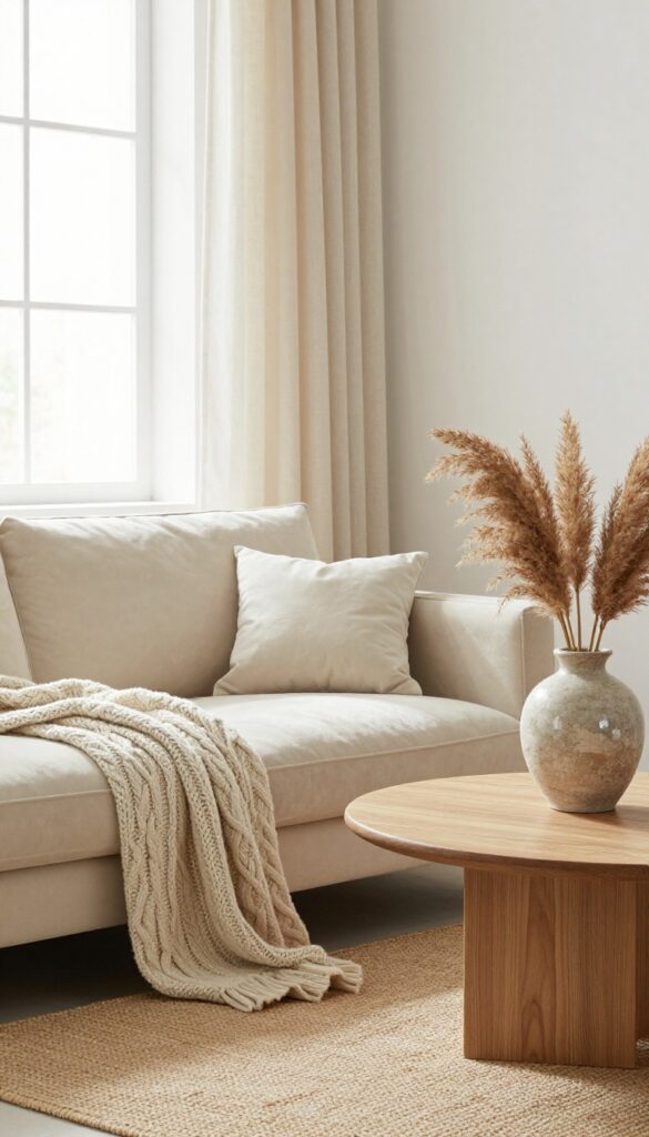
1. Warm White Walls with Natural Wood Accents
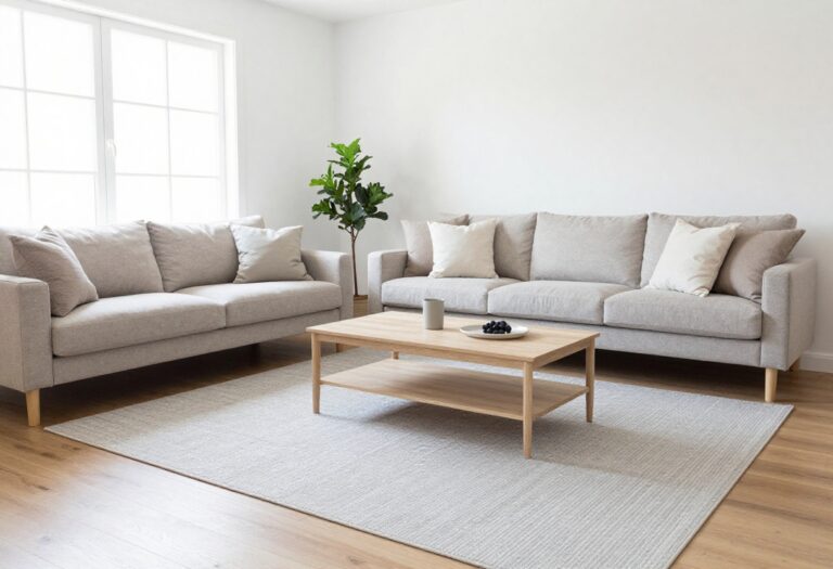
There’s a reason warm white walls never go out of style—they make any living room feel instantly bigger, brighter, and more welcoming. Pair that soft backdrop with natural wood accents, and you get a space that’s light and airy without feeling cold or sterile. Think of it as the perfect blank canvas that still has plenty of personality.
Start by painting your walls a warm white like Swiss Coffee or Alabaster. These shades have just a hint of creaminess, so they don’t read as stark or clinical. Then bring in wood furniture—a solid coffee table, floating shelves, or even a media console.
The wood adds warmth and texture without weighing the room down. Keep your textiles light: linen curtains, a jute rug, and cotton throws keep the look soft and relaxed. This combo works especially well in smaller living rooms or spaces with limited natural light, because the white walls bounce light around while the wood prevents it from feeling too sterile.
Best Wood Tones To Try
Stick with medium or light woods like oak, ash, or birch. These have a warm, honeyed tone that complements white walls without creating too much contrast. Avoid dark woods like walnut or mahogany—they can make the room feel heavier and less airy.
Texture Mix For Depth
Layer in different textures to keep the room from feeling flat. A chunky knit throw on a linen sofa, a flatweave jute rug, and matte wood surfaces add visual interest. Even a few rattan or woven baskets can bring in that organic, natural feel.
Finishing Touch
Add a couple of low-maintenance plants like a snake plant or pothos. Their green leaves are the perfect pop of color against warm white walls and wood tones. Place one on a shelf and another in a woven basket on the floor for balance.
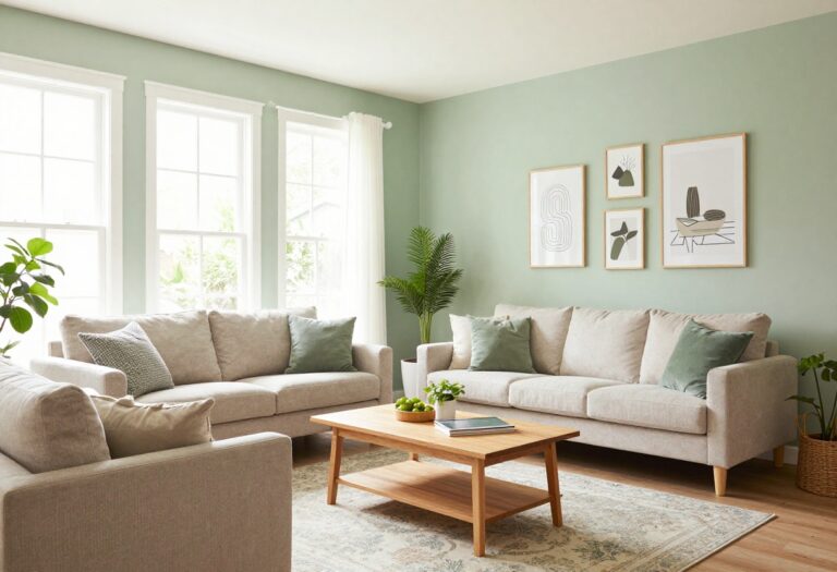
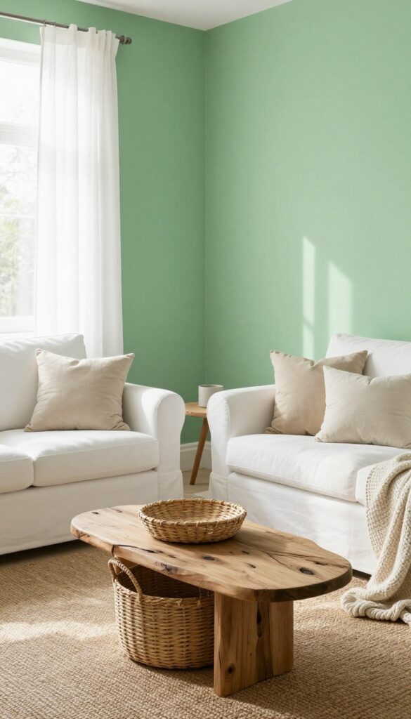
2. Pale Sage Green on an Accent Wall
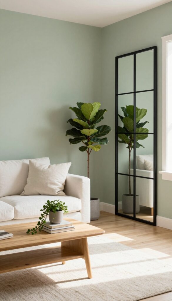
There’s a reason sage green has become a go-to neutral in modern decor. It’s soft, natural, and works with almost any style. Painting just one wall in a muted sage green brings the outdoors in without making the room feel heavy or dark.
Pair it with white or cream furniture and plenty of green plants, and you get a space that feels grounded yet airy—like a breath of fresh air in your living room.
This accent wall idea is perfect for living rooms that need a subtle color shift without a full commitment. Sage green sits beautifully between warm and cool tones, so it complements both wooden floors and cool gray sofas. The key is choosing a shade with gray undertones—avoid anything too bright or yellow.
Finish the look with light textiles, natural wood accents, and a few trailing plants to echo the green on the wall.
Best Colors To Pair
Stick with a crisp white, warm cream, or soft beige for the other walls and large furniture pieces. These light neutrals keep the room bright and let the sage wall stand out without clashing. Add touches of terracotta, dusty pink, or warm wood for a cozy contrast.
Finishing Touch
Hang a large mirror on the sage wall to reflect light and make the room feel bigger. Choose a simple frame in natural wood or black metal to keep the look clean. The mirror also doubles as a focal point, drawing the eye to your accent wall even more.
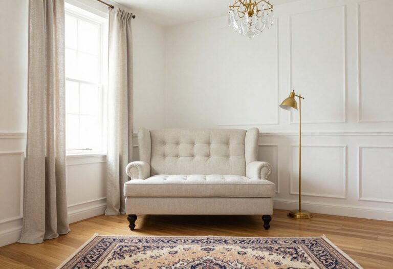
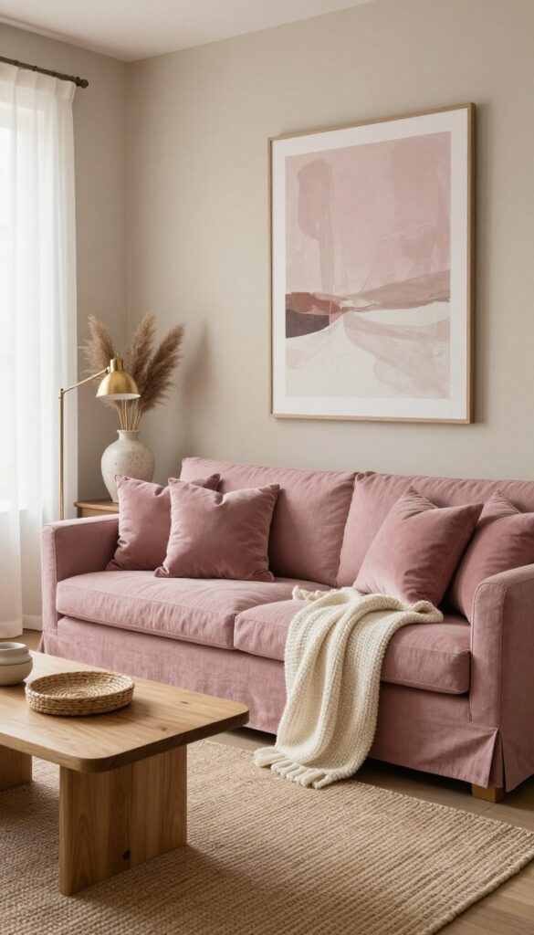
3. Soft Blush Pink Accessories Against Gray
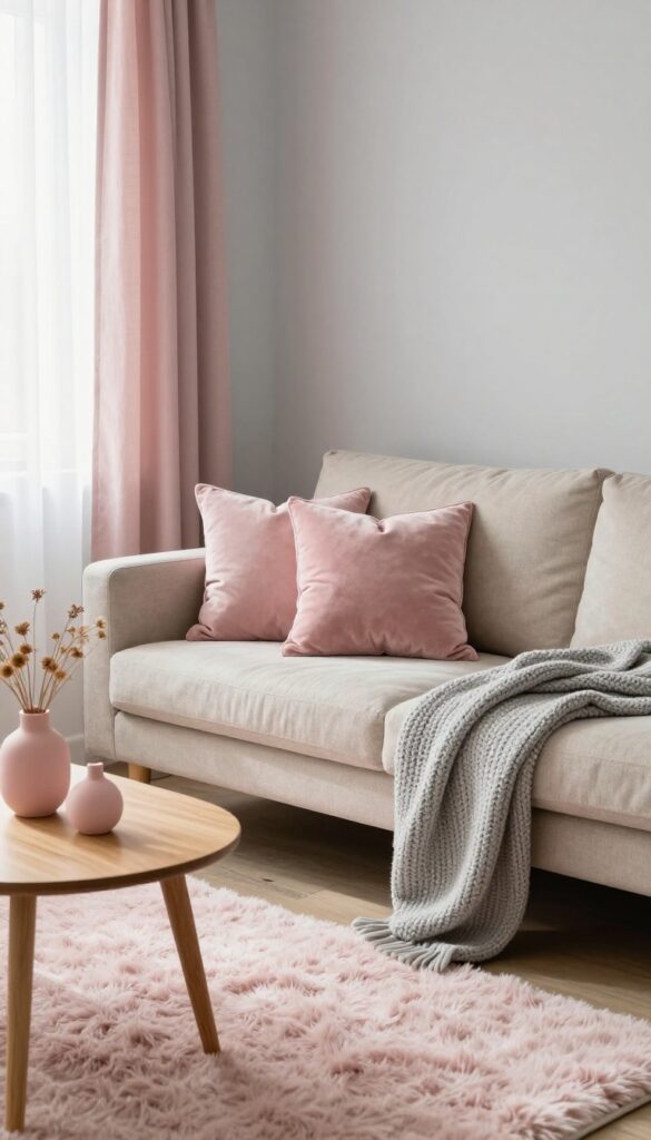
Gray walls are a popular choice for living rooms, but they can sometimes feel a bit cold or flat. The trick is to bring in a soft, warm accent color that wakes up the space without overwhelming it. Blush pink does exactly that—it adds a gentle warmth and a subtle pop of color that feels fresh and inviting.
Think of it as a whisper of color that makes the room feel more alive and personal.
The beauty of this pairing is how effortlessly it works. Gray acts as a neutral backdrop, while blush pink accessories inject a soft, feminine energy that keeps the room from feeling too serious or stark. You don't need to repaint or buy new furniture—just a few well-chosen pieces in muted pink can transform the entire mood.
The key is to keep the pink subdued, like dusty rose or millennial pink, rather than bright or bubblegum. This ensures the look stays sophisticated and airy, not childish or overwhelming.
Best Colors
Stick with muted blush tones that have a hint of beige or gray in them. Pair with warm grays (like greige) rather than cool, blue-based grays for a cohesive look. White and cream also complement this palette beautifully, adding to the light and airy feel.
Texture Mix
- Blush pink looks even better when you vary textures. A velvet throw pillow in blush feels luxurious against a chunky knit gray blanket. A faux fur rug in pale pink adds softness underfoot, while linen curtains in a similar shade keep things casual.
- Mixing textures prevents the color from feeling flat.
Finishing Touch
Add a small pink ceramic vase or a candle holder on a coffee table or shelf. Even a single pink bloom in a clear glass vase can tie the whole look together. Keep the rest of the accessories neutral—white, cream, or light wood—so the blush pink remains the star accent.
4. Sky Blue Ceiling for an Open Feel
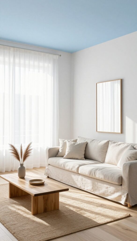
Painting your ceiling a pale sky blue is one of those tricks that sounds a little out there but works like magic. It gently draws the eye upward, making the room feel taller and more open. This is especially effective in living rooms with good natural light, where the blue can catch the sunlight and create a soft, airy atmosphere.
Keep your walls white or a very light beige to let the ceiling do the talking without feeling overwhelming.
The concept is simple: swap your standard white ceiling for a soft, pale blue. This subtle shift mimics the sky, giving the room an unexpected lift. It's a small change that makes a big difference, especially in spaces that feel a bit boxy or low.
The key is to choose a blue that's barely there—think of a clear, hazy morning sky rather than a bold cerulean. This works beautifully with neutral furnishings and natural textures like linen and wood, reinforcing that light, breezy feel.
Best Blue Shades To Try
- Stick with pale, muted blues that have a hint of gray or white. Farrow & Ball's 'Pale Powder' or Benjamin Moore's 'Breath of Fresh Air' are popular choices. Avoid anything too dark or saturated, as that can make the ceiling feel heavy instead of airy.
- If you're unsure, grab a few sample pots and paint large swatches on foam boards to see how the light hits them at different times of day.
Finishing Touch
Once the ceiling is painted, keep the rest of the room light and uncluttered. White or off-white walls, sheer curtains, and a few well-placed mirrors will amplify the open feel. Add a touch of contrast with natural wood furniture or a jute rug to ground the space without weighing it down.
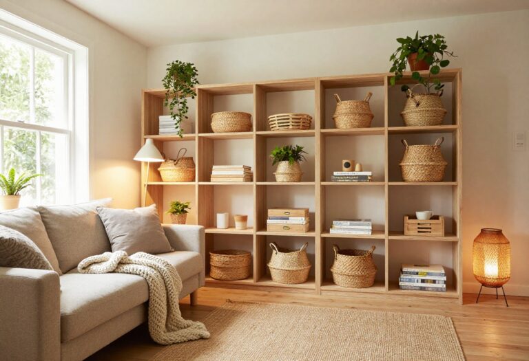
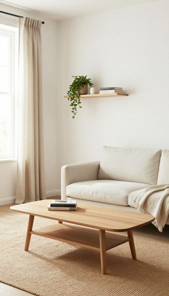
5. Cream and Beige Layered Textures
Sometimes the most calming rooms are the ones that barely use any color at all. A cream and beige palette might sound boring on paper, but when you layer in different textures, it becomes anything but flat. Think of it as a neutral canvas that comes alive through touch and visual weight—a chunky knit here, a velvet curve there, and a natural fiber rug grounding everything.
The result is a living room that feels serene, sophisticated, and surprisingly rich.
Stick to a monochromatic cream and beige palette but vary textures. A chunky knit throw, a velvet sofa, a sisal rug. The lack of color contrast keeps things calm, while texture adds depth.
Texture Mix
- The secret to making this look work is variety. Pair a smooth velvet sofa with a chunky cable-knit throw and a linen curtain. Add a sisal or jute rug for natural roughness, and maybe a ceramic lamp base for a glossy pop.
- The eye moves around the room because each surface feels different, even though the colors are nearly the same.
Best Materials
Stick with natural and tactile materials: linen, wool, cotton, velvet, wood, rattan, and stone. Avoid shiny synthetics or overly sleek finishes—they kill the soft, cozy mood. A matte wood coffee table, a wool bouclé armchair, and a stone vase all contribute to the layered, organic feel.
Finishing Touch
Add a subtle metallic accent like brushed brass or antique gold to catch the light without breaking the calm. A brass floor lamp or a small gold-framed mirror adds just enough interest. Keep accessories sparse—two or three textured cushions and a single ceramic bowl on the coffee table are plenty.
6. Lavender and Lilac in Small Doses
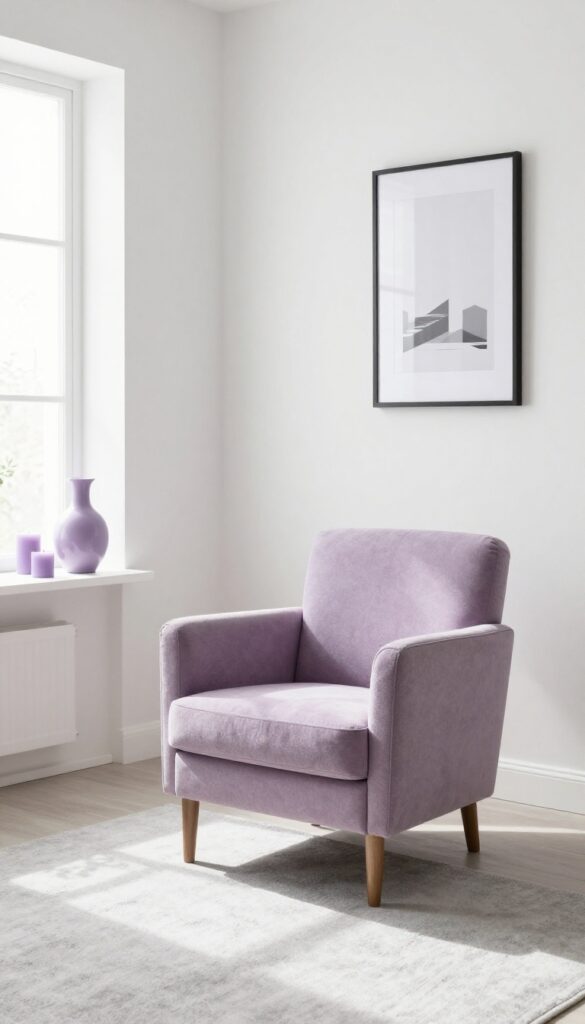
Pastel purples have a way of making a room feel soft and unexpected without going full floral. Lavender and lilac bring a gentle pop of color that feels fresh, not childish, especially when you keep the rest of the palette neutral. The trick is using them sparingly—think a single accent chair, a ceramic vase, or a few candles scattered on a shelf.
Balanced with plenty of white and light gray, these hues add a whisper of personality that’s easy to live with and even easier to swap out when you want a change.
You don’t need a full lavender sofa to make this work. A small dose of lilac in a throw pillow or a textured ottoman can shift the whole mood of the room. The key is letting the color breathe—surround it with crisp whites, warm off-whites, and soft grays so it doesn’t feel heavy.
This approach works especially well in rooms that get good natural light, where the pastel tones can catch the sun and look almost luminous. If you’re worried about it feeling too sweet, add a few darker accents like charcoal or black in picture frames or lamp bases to ground the look.
Best Colors To Pair
- Stick with a base of white and light gray to keep things airy. Warm whites like Swiss Coffee or Alabaster let lavender feel cozy rather than cold. For a slightly bolder contrast, try pairing lilac with dusty rose or pale peach—it’s unexpected but still soft.
- Avoid pairing pastel purples with bright primary colors or dark jewel tones, as that can make the room feel busy. A single lilac chair against a white wall with a gray rug is all you need.
Texture Mix
- Since the color is subtle, texture becomes your best friend. A lavender velvet cushion on a linen sofa adds depth without overwhelming the eye. A lilac ceramic vase next to a matte white lamp creates a nice contrast in finishes.
- Woven baskets, chunky knit throws, and wood accents all help ground the pastel tones and keep the space from feeling too precious. The goal is a room that feels layered and lived-in, not staged.
Finishing Touch
- Add one small lavender or lilac item that’s easy to swap seasonally—like a candle, a stack of books, or a small rug. This keeps the look flexible and lets you test the color without commitment. A lilac-hued print in a simple white frame is another low-risk way to bring in the shade.
- If you fall in love with it, you can always add more later.
7. Butter Yellow on Built-Ins or Trim
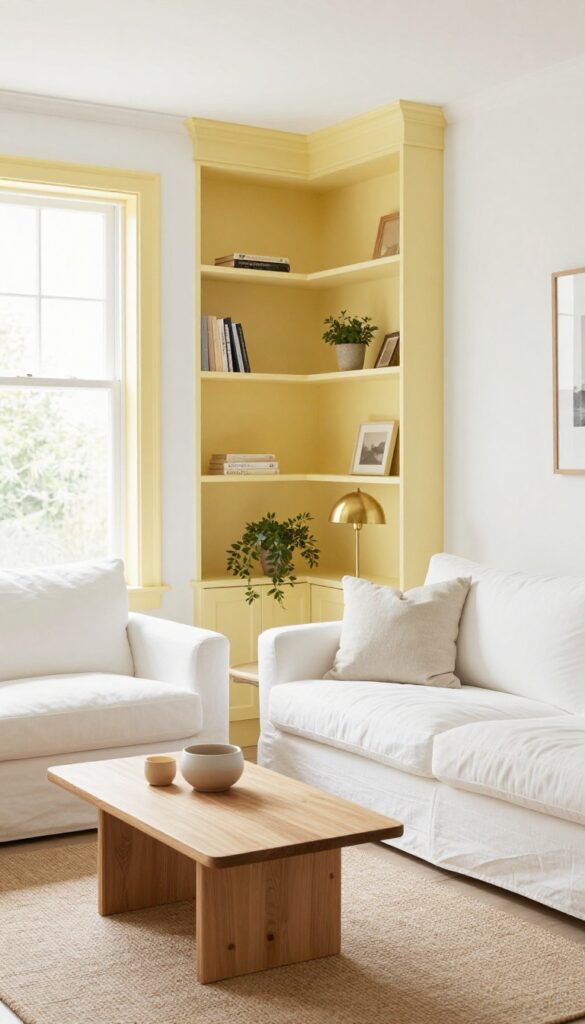
If you want a color that feels like a permanent dose of sunshine, butter yellow is your answer. It's warm without being overwhelming, cheerful without screaming for attention. Painting your built-in shelves or window trim in this soft hue creates a subtle but happy focal point, especially when the rest of the room stays neutral.
Against white walls, it reads like a gentle highlight—almost like the room is glowing from within.
Butter yellow works best as an accent on architectural details rather than on full walls. Think of it as a way to add personality without committing to a bold color everywhere. The key is keeping everything else light and simple: white or off-white walls, natural wood or white furniture, and soft textures like linen or cotton.
This way, the yellow feels intentional and fresh, not overwhelming. It's a great option for living rooms that get good natural light, as the yellow will bounce around and make the space feel even airier.
Best Colors To Pair
Stick with a palette of whites, creams, warm grays, and natural wood tones. For a slightly bolder look, add touches of navy or deep green in throw pillows or a rug. The contrast keeps the yellow from feeling too sweet.
Where To Apply
Built-in bookshelves, window frames, door casings, or even the inside of a cabinet. If you have a fireplace mantel, painting just the surround in butter yellow can create a lovely focal point without overwhelming the room.
Finishing Touch
Add a few brass or gold accents—like a lamp, picture frames, or drawer pulls—to complement the yellow's warmth. A small potted plant with green leaves also looks beautiful against the yellow, adding a natural pop of contrast.
8. Seafoam Green for a Coastal Vibe
Seafoam green brings that calm, breezy feeling of the coast right into your living room without going full nautical. It’s soft, soothing, and works beautifully as an accent wall or on a large area rug. The key is keeping the rest of the room light and natural—think white slipcovers, woven baskets, and a few seashell or driftwood touches.
This isn’t a theme; it’s a mood that feels fresh and airy all year round.
Go with seafoam green on an accent wall or large area rug. It evokes a breezy coastal feel. Pair with white slipcovers and natural fiber baskets.
Add a few seashell or driftwood accents.
Best Colors To Pair
Stick with whites, soft beiges, and warm woods to let the seafoam green shine. Avoid bright or cool whites—opt for creamy shades that keep the look cozy. A touch of sandy tan or pale coral in throw pillows adds subtle warmth without competing.
Texture Mix
Balance the smoothness of seafoam paint or rug fibers with natural textures like jute, rattan, and linen. A chunky knit throw or a sisal rug grounds the airy color. Woven baskets for storage add organic shape and keep the room feeling relaxed.
Finishing Touch
Scatter a few real or faux seashells on a coffee table tray or stack of books. A piece of driftwood leaning against the wall or on a mantel brings in that coastal element without looking kitschy. Keep it minimal—just enough to hint at the beach.
9. Dusty Rose and Warm Taupe Combo
This pairing feels like a warm hug for your living room. Dusty rose brings a soft, romantic blush, while warm taupe grounds it with earthy neutrality. Together, they create a space that's elegant but never stiff—perfect for relaxing evenings or casual get-togethers.
The trick is letting taupe do the heavy lifting on larger surfaces, then bringing in dusty rose in doses that feel intentional, not overwhelming.
Start with taupe on your walls or a large area rug to establish a calm, neutral base. Then layer in dusty rose through curtains, a sofa, or accent pillows. The contrast is subtle but noticeable, adding depth without drama.
This combo works beautifully with natural textures like linen, wool, and light wood. Keep metallics brushed brass or matte black to maintain the soft, airy feel. A few dried pampas grass stems or a ceramic vase in dusty rose tie the look together effortlessly.
Best Colors
- Stick with muted, dusty versions of rose—think dried flower petals rather than bubblegum pink. Pair with taupe that leans warm, not gray. Add touches of cream or off-white to keep the room light.
- Avoid cool grays or stark whites, which can make the palette feel flat.
Texture Mix
Velvet pillows in dusty rose on a taupe linen sofa create a rich tactile contrast. A chunky knit throw in cream adds softness. Woven baskets or a jute rug introduce natural texture that keeps the look grounded and approachable.
Finishing Touch
Hang a large abstract print with washes of dusty rose and taupe above the sofa. Or lean a vintage mirror with a warm gold frame against the wall—it reflects light and echoes the soft, romantic mood without trying too hard.
10. Light Terracotta on a Single Wall
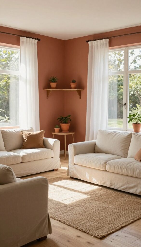
Terracotta doesn’t have to be bold or rustic. A light, muted version on just one wall adds earthy warmth without weighing down the room. It’s a subtle nod to nature that feels fresh and grounded, especially when paired with cream furniture and plenty of white space.
A few terracotta pots scattered around tie the look together effortlessly.
A single wall in light terracotta acts like a warm backdrop that makes the room feel cozy yet open. The trick is choosing a shade that’s soft and dusty rather than bright or orangey. This keeps the vibe light and airy, not heavy.
Balance the warmth with light neutrals—cream sofas, white curtains, and pale wood floors. The contrast keeps the space from feeling too earthy or dark. Add a few terracotta pots in different sizes on shelves or the coffee table to echo the wall color and create cohesion.
This idea works best in living rooms that get good natural light, as the sun will make the terracotta glow without overpowering the space.
Best Colors
Stick with muted, dusty terracotta—think dried clay rather than fired brick. Pair it with cream, off-white, and warm beige for a soft, cohesive palette. A touch of sage green or soft blue in accessories adds a nice complementary contrast without clashing.
Texture Mix
Keep the wall finish matte to avoid glare. Then layer in texture with linen curtains, a chunky knit throw, and a jute rug. The matte wall plus natural textures enhances the earthy feel while keeping the room light.
Finishing Touch
Place a couple of terracotta planters on a floating shelf or side table. Use them for low-maintenance plants like snake plants or pothos. The pots mirror the wall color and bring a bit of life into the space.
11. White-on-White with Pops of Greenery
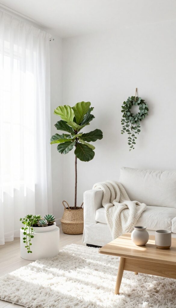
An all-white living room might sound like a recipe for a cold, sterile space, but it’s actually one of the most calming and versatile backdrops you can choose. The trick is to layer in plenty of greenery—real or faux—to bring life, texture, and warmth. Think of it as a neutral canvas where every leaf becomes a design element.
Start with white walls, a white sofa, white curtains, and a white rug. Then introduce plants in varying heights and shapes: a tall fiddle leaf fig in a corner, a cluster of succulents on the coffee table, a trailing pothos on a shelf, and maybe a simple eucalyptus wreath on the wall. The green pops keep the room from feeling like a doctor’s office and instead make it feel fresh, airy, and inviting.
This look works especially well in rooms with good natural light, but even darker spaces can pull it off with the right plant choices and a few mirrors to bounce light around.
Best Plants For The Look
Stick with plants that have strong silhouettes and varied leaf shapes. Fiddle leaf figs, monstera, snake plants, and ferns all add different textures. If you’re not great with plants, high-quality faux versions work just as well—just dust them occasionally and keep them out of direct sun to avoid fading.
Texture Mix Tip
Since the palette is so minimal, texture becomes crucial. Use a chunky knit throw, a linen sofa, a shaggy rug, and matte ceramic pots. The contrast between soft fabrics and glossy leaves creates visual interest without adding color.
Finishing Touch
Add one or two natural wood accents—like a coffee table or a picture frame—to ground the space. The warm wood tone prevents the white from feeling too cool and ties the greenery into the room naturally.
FAQ
What is the best light and airy color for a small living room?
Warm white or pale cream works best. They reflect light and make the space feel larger. Add natural wood or soft pastel accents for interest.
How can I add color without painting walls?
Use colorful accessories like throw pillows, blankets, rugs, and artwork. You can also paint the inside of bookshelves or the ceiling for a subtle pop.
What colors make a living room feel calm?
Soft blues, sage greens, warm whites, and muted pinks are naturally calming. Stick to low-contrast combinations and avoid bright or dark hues.
Can I use dark colors in a light and airy room?
Yes, but sparingly. A dark accent piece like a coffee table or a single dark throw pillow can add depth without weighing down the room. Keep most surfaces light.
How do I choose between warm and cool tones?
Consider your room's natural light. North-facing rooms benefit from warm tones like cream and blush. South-facing rooms can handle cool tones like pale blue or seafoam.
Conclusion
Refreshing your living room with color doesn't have to mean a full makeover. Even small shifts—a new accent wall, a few pastel accessories, or a lighter ceiling—can make the whole space feel renewed. The key is to keep things light and intentional.
Pick one or two ideas that speak to you and start there. You might be surprised how much a little color can change the way a room feels. And remember, the best living rooms are the ones that feel like you.