15 Black and White Shower Tile Ideas with Graphic Contrast
Black and white tile brings instant drama to a shower without trying too hard. The contrast does the heavy lifting, turning a plain wet wall into a focal point that feels intentional and polished.
Whether you're after a classic checkerboard floor or a bold geometric accent, these 15 ideas show how monochrome can add depth, texture, and personality. Each option plays with scale, pattern, or layout to keep things fresh.
You'll find practical tips on grout colors, tile shapes, and placement to help you decide what works best for your space. Let's get into the designs that make black and white anything but boring.
1. Classic Checkerboard Floor That Steals the Show
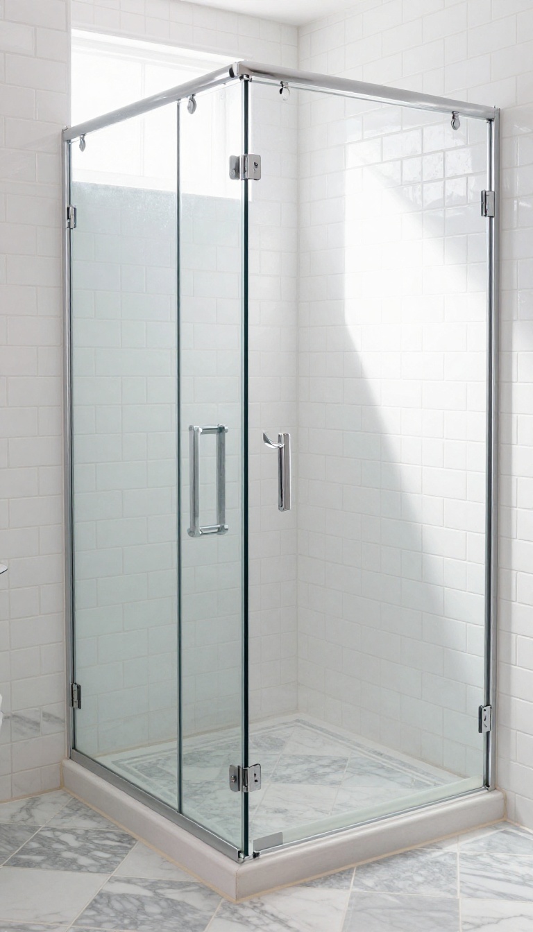
A checkerboard floor is the quickest way to bring vintage charm into a modern shower. The high-contrast pattern adds depth and makes the space feel larger than it actually is. When paired with simple white subway tiles on the walls, the floor becomes the star without overwhelming the room.
Choose large-format checkerboard tiles to minimize grout lines and keep the pattern clean. For a classic look, use polished marble in black and white; for a more budget-friendly option, ceramic or porcelain tiles work just as well. Keep the walls neutral to let the floor shine, and consider a contrasting grout color to define each square clearly.
Why It Works
The alternating squares create a strong visual rhythm that draws the eye downward, making the shower feel grounded and expansive. The pattern is timeless, so it won't look dated in a few years. Plus, it hides water spots and soap scum better than solid tiles.
Tile Size And Layout
Go with 12×12 or 16×16 tiles for a bold statement, or use smaller tiles like 4×4 for a more intricate look. A diagonal layout adds extra movement, while a straight set keeps it classic. Just make sure the pattern is centered properly to avoid awkward cuts at the edges.
Grout Color Tips
For a crisp, graphic effect, use white grout with black tiles and black grout with white tiles, but that can be high maintenance. A medium gray grout works with both colors and hides dirt well. If you want a softer look, match the grout to the lighter tile to let the dark squares pop.
2. Vertical Subway Tile for a Modern Twist
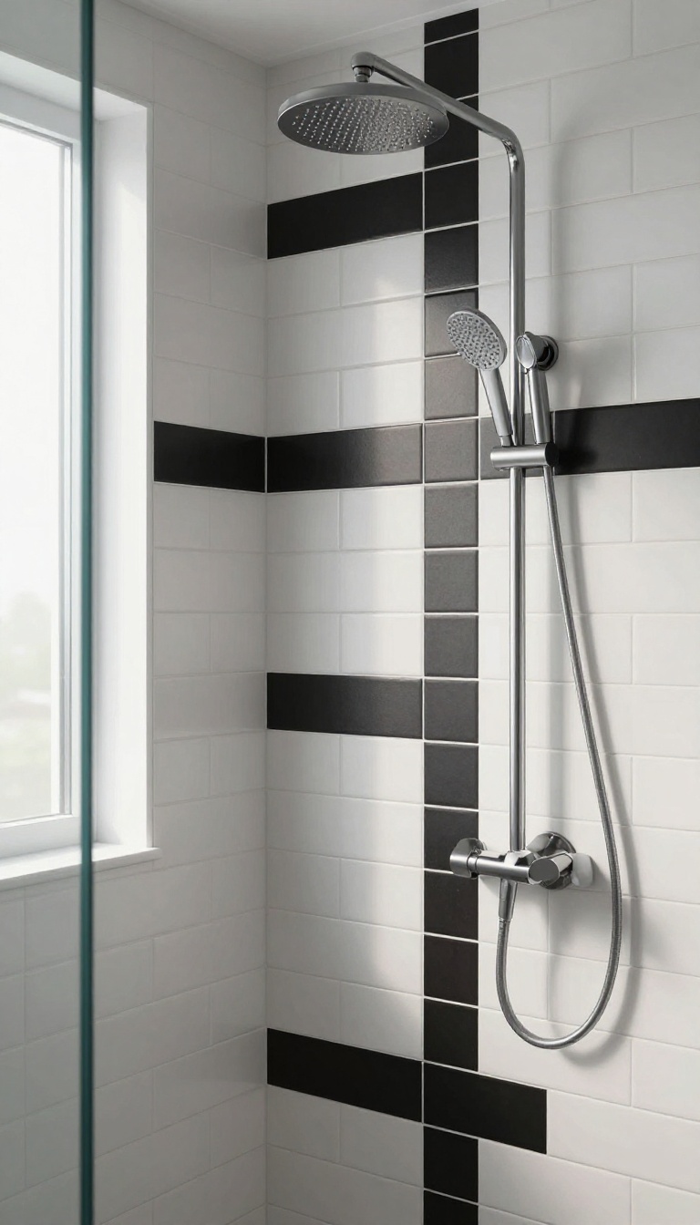
Stacking subway tile vertically is a simple switch that changes the whole feel of a shower. Instead of the classic horizontal brick pattern, vertical lines pull the eye upward, making the ceiling seem higher and the space more open. It's a fresh take on a timeless favorite.
Vertical subway tile works especially well in showers with lower ceilings or tighter footprints. The upward lines create a sense of height, which can make a small bathroom feel more spacious. Plus, alternating black and white tiles adds a graphic stripe effect that's both bold and clean.
Why Vertical Works
Vertical installation naturally draws the eye up, so it's a great trick for smaller or darker bathrooms. The continuous lines also add a sense of movement, which keeps the design from feeling static. This layout pairs well with minimal fixtures and simple hardware to let the pattern shine.
Playing With Color Placement
You can go with a simple alternating stripe—one black, one white—for a classic barber pole look. Or, try a more random pattern for a playful, modern vibe. Another option is to keep the bottom half white and the top half black, which grounds the space while keeping the ceiling feeling light.
Grout And Finish Tips
For a seamless look, match your grout to the tile color—white grout with white tile, black grout with black tile. If you want the stripes to pop, use a contrasting grout, like dark grout with white tile. A matte finish on the tile softens the contrast, while glossy tiles amp up the drama.
3. Hexagon Hive Pattern with Mixed Tones
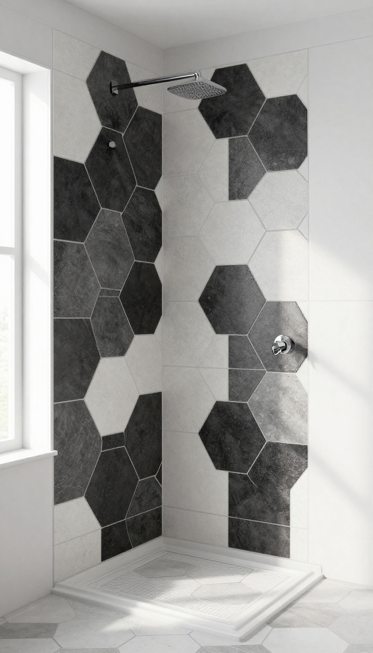
Hexagon tiles already bring a soft, organic feel to a shower, but mixing black and white in a honeycomb layout takes it to a whole new level. The six-sided shapes interlock like a beehive, and the contrasting tones create a striking visual rhythm that feels both playful and refined. Whether you scatter the colors randomly or map out a deliberate pattern, this approach adds depth and movement without overwhelming the space.
A matte finish keeps the look grounded and touch-friendly, making it a smart pick for a daily-use shower.
Random Vs. Planned Placement
You can go fully random, letting the black and white hexagons fall where they may for an organic, almost mosaic-like effect. Or you can plan a specific design, like a diagonal stripe, a border, or a focal wall. Random placement feels more casual and artistic, while planned patterns give a more structured, intentional vibe.
Think about the overall mood you want—random feels relaxed, planned feels polished.
Grout Color Makes The Difference
Grout is the unsung hero here. With hexagon tiles, the grout lines become part of the pattern. White grout keeps the look airy and bright, letting the black tiles pop.
Dark gray or black grout adds a bolder, more graphic edge and helps hide dirt. For a subtle, seamless look, match the grout to the tile color, but if you want extra contrast, go with a contrasting shade.
Scale And Layout Tips
Small hexagons (like 2-inch) create a busier, more intricate pattern, while larger hexagons (4-inch or more) feel more modern and calm. If your shower is small, consider using larger hexagons to avoid visual clutter. You can also use the hexagon pattern on just one wall or the floor, and pair it with solid tiles elsewhere to balance the design.
4. Bold Geometric Diamond Accent Wall
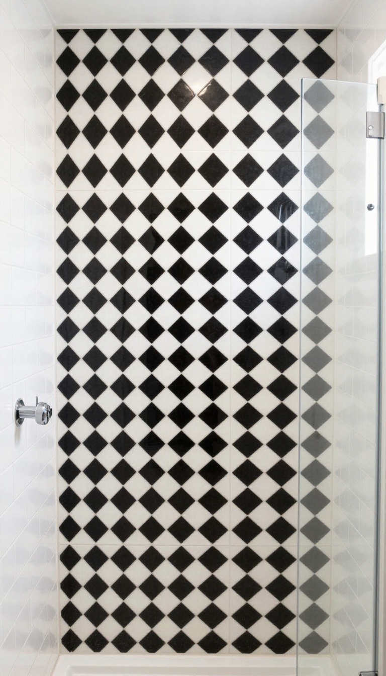
A diamond pattern is a fresh take on geometric tile that adds movement without overwhelming the space. By concentrating the pattern on one wall, you get a striking focal point that feels curated, not chaotic. The key is letting the rest of the shower stay calm so the design can really breathe.
Diamond tiles arranged in a bold black-and-white pattern create a graphic accent that draws the eye and adds depth. The contrast between the two colors makes the geometry pop, while the neutral surroundings keep the overall look balanced. This works especially well in showers with simple fixtures and minimal accessories, letting the tile do all the talking.
Choosing The Right Tile Shape
For a true diamond effect, opt for square tiles set on point rather than actual diamond-shaped tiles. This creates a clean, continuous pattern that feels more intentional. Large-format squares (12×12 inches) give a modern, bold look, while smaller tiles (4×4 inches) add more detail and visual texture.
Consider the scale of your shower—bigger tiles suit larger walls, while smaller ones work better in compact spaces.
Grout Color Matters
Grout plays a huge role in how the pattern reads. White grout with black tiles will make the diamonds feel crisp and graphic, while black grout with white tiles can create a more subtle, blended effect. For a softer look, try a light gray grout that bridges the two colors.
Just remember that lighter grout shows dirt more easily, so weigh maintenance against aesthetics.
Placement And Layout Tips
The accent wall doesn't have to be behind the showerhead—it can be the wall you face when you step in, or the one beside the bathtub. Centering the pattern creates a symmetrical focal point, while an off-center layout adds a playful, dynamic energy. If your shower has a niche or bench, extend the diamond pattern into those areas to tie the design together seamlessly.
5. Herringbone Elegance in Monochrome
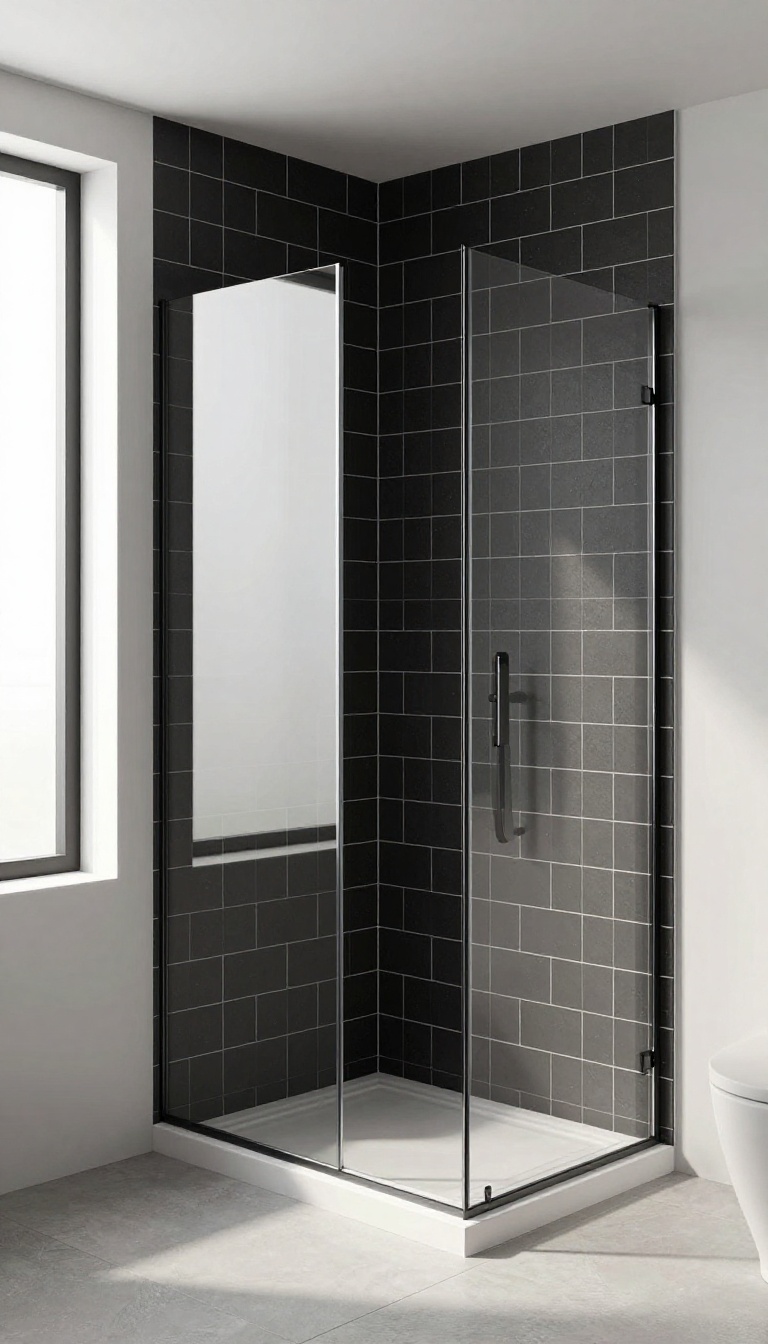
Herringbone is a timeless pattern that instantly adds texture and movement to a shower. When rendered in black and white, it becomes a striking focal point that feels both classic and contemporary. The key is choosing the right tile size and finish to match your style.
The herringbone layout is versatile—it can look sleek and modern with large-format tiles, or more intricate and traditional with small mosaics. The contrast between black and white enhances the zigzag pattern, making the wall feel dynamic. Plus, the vertical lines can make your shower appear taller, which is a nice bonus in compact spaces.
Large-format Herringbone For A Modern Look
Oversized herringbone tiles, like 4×12 inches or larger, create clean, continuous lines that feel very contemporary. Use a matte finish to keep the look understated, or go glossy for a bit of shine. This works well in a walk-in shower with minimal grout lines, letting the pattern shine without being too busy.
Small Mosaic Herringbone For Classic Detail
If you prefer a more traditional or intricate appearance, small mosaic herringbone tiles (like 1×3 inches) are a great choice. They add a lot of texture and visual interest, especially when paired with a contrasting grout color. A dark grout with white tiles makes the pattern pop, while light grout softens the contrast.
Choosing The Right Grout Color
Grout plays a huge role in herringbone designs. For a seamless, modern look, match your grout to the tile color—white grout with white tiles, black grout with black tiles. For a more graphic effect, use a contrasting grout to highlight the zigzag pattern.
Just keep in mind that dark grout can be harder to keep clean in a shower.
6. Checkerboard Accent Stripe in a White Shower
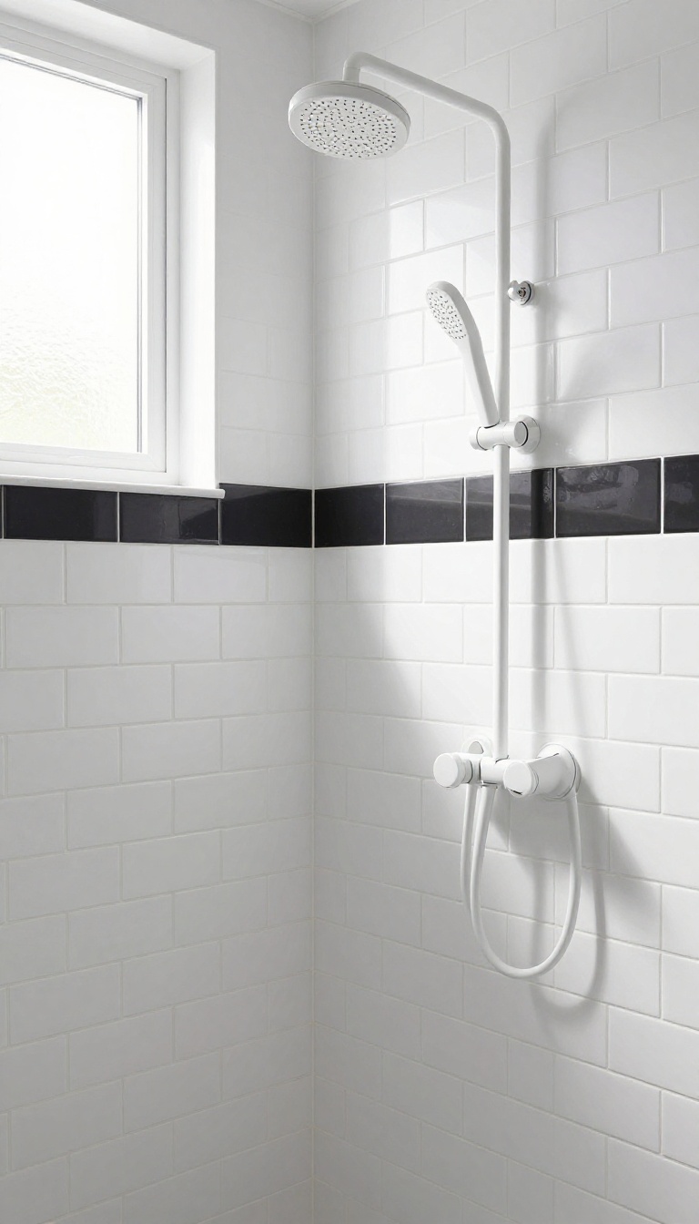
A checkerboard stripe running horizontally across an all-white shower adds a playful pop of contrast without committing to a full pattern. It's a smart way to introduce graphic interest at eye level, breaking up the monotony of white tile while keeping the overall look clean and airy. The stripe can be as subtle or bold as you like—thin and delicate or thick and chunky.
Placement matters too: right at eye level draws attention, while lower down can subtly anchor the space.
The beauty of this idea is its flexibility. You can use classic black and white square tiles for a traditional checkerboard feel, or mix in larger format tiles for a more modern twist. The stripe acts as a visual pause, adding rhythm and structure to the shower walls without overwhelming the senses.
Consider the grout color carefully—white grout keeps the stripe crisp, while dark grout can soften the contrast. The stripe can be a single row or multiple rows stacked together for a bolder statement. It also works well with different tile shapes, like hexagons or subway tiles, as long as the checkerboard pattern is recognizable.
Placement And Proportion
For most showers, placing the stripe at around 54 to 60 inches from the floor puts it right at eye level for the average person. This creates a natural focal point. If you want a more subtle effect, position it lower, near the bench or shelf.
The thickness of the stripe should relate to the size of the tiles—larger tiles can handle a thicker stripe, while smaller tiles call for a narrower band.
Tile And Grout Choices
Square tiles in 2×2 or 4×4 inches are classic choices for a checkerboard stripe. You can also use rectangular tiles in a running bond pattern to create a checkerboard effect. For grout, white or light gray keeps the stripe looking crisp and clean, while dark grout can make the black squares blend together for a more graphic look.
Consider a matte finish for the black tiles to reduce glare and add a tactile feel.
Styling Around The Stripe
Keep the rest of the shower walls white to let the stripe shine. You can echo the black in fixtures, like a black showerhead or faucet, to tie the look together. Add a simple black shelf or a black-framed glass door to reinforce the monochrome palette.
The stripe also pairs well with a black and white floor, as long as the patterns don't compete—choose a simpler floor if the stripe is busy.
7. Black Penny Tile with White Grout
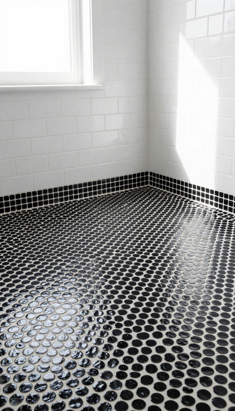
Penny tiles are making a strong comeback, and for good reason. The small, rounded shapes add a playful texture that feels both nostalgic and fresh. When you pair glossy black penny tiles with bright white grout, the contrast creates a dotted pattern that instantly catches the eye.
This look works beautifully on a shower floor, where the texture provides gentle traction underfoot. It also shines as an accent wall behind a freestanding tub or in a niche. The combination of glossy tile and matte grout adds depth, making the surface feel alive without being busy.
The key to this idea is the grout. White grout against black tile creates a high-contrast grid that defines each penny shape. The result is a pattern that reads as both retro and modern, depending on the surrounding fixtures and finishes.
For a softer look, you can opt for a warm white grout or even a light gray. But the classic bright white is what gives this design its graphic punch. When it comes to placement, think about scale.
Penny tiles are small, so they work well in compact showers where larger tiles might feel overwhelming. They also add visual interest to curved surfaces, like a shower bench or a rounded niche, because the tiles flex to follow the shape. On the floor, the texture helps prevent slips, making it a practical choice for a wet area.
To keep the look cohesive, pair the penny tile with simple, large-format white tiles on the walls. This lets the penny tile stand out without competing for attention. You can also carry the penny tile up one wall as a feature, creating a striking focal point that draws the eye upward.
Why White Grout Works
White grout does more than just hold the tiles together—it becomes part of the design. The bright lines break up the black surface into a pattern of dots, which adds rhythm and movement. This contrast also makes the tile look more dimensional, as the glossy black reflects light while the matte grout absorbs it.
The effect is subtle but powerful, giving the shower a custom, high-end feel without extra cost.
Best Spots To Use It
The floor is the most common choice for penny tile, and it's easy to see why. The small tiles create a non-slip surface that's comfortable underfoot. But don't stop there.
An accent wall behind the shower bench or a vertical strip along the back wall can add interest without overwhelming the space. You can even use it in a niche to make your shampoo bottles pop against the dotted backdrop.
Pairing With Fixtures And Finishes
Because the penny tile is so graphic, it pairs well with simple, clean fixtures. Matte black or brushed nickel hardware complements the black tile without competing. For a warmer feel, consider brass or gold accents—they add a touch of luxury that contrasts nicely with the monochrome pattern.
Keep the rest of the shower minimal, with white or light gray walls, to let the penny tile shine.
8. White Marble with Black Veining
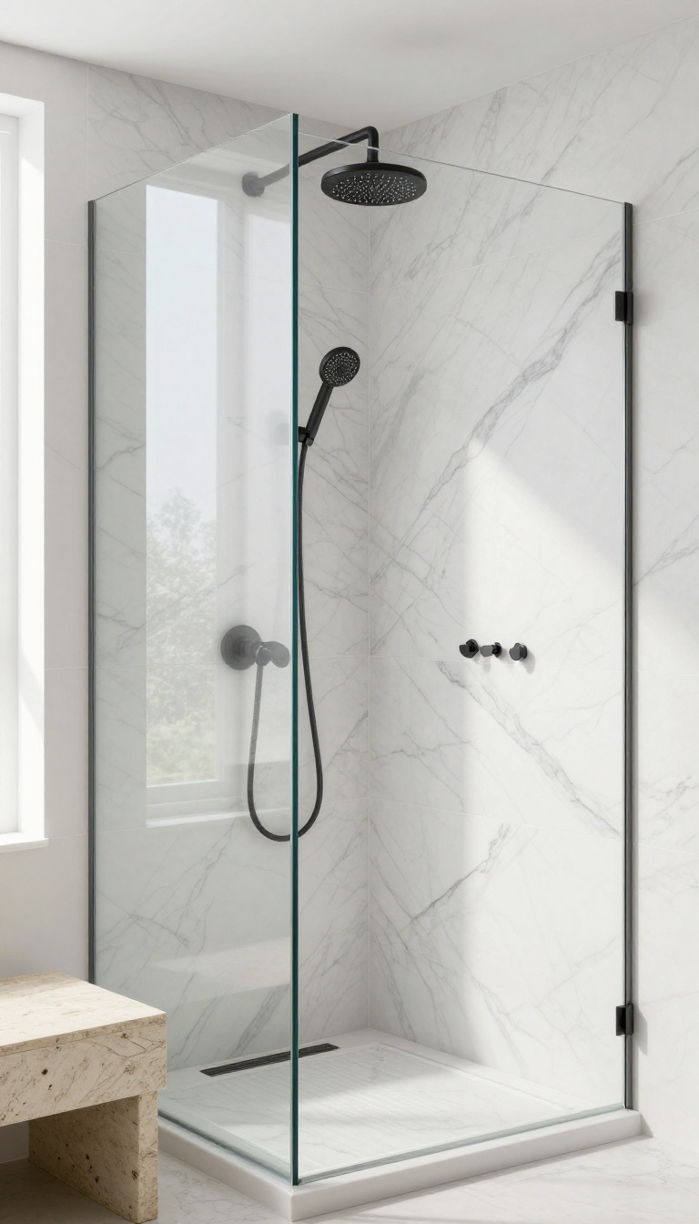
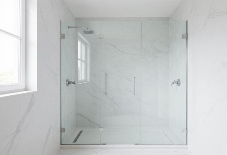
White marble with bold black veining is a classic choice that never goes out of style. The dramatic lines add natural movement and a sense of luxury, making your shower feel like a high-end spa. This look works especially well when you pair it with matte black fixtures for a cohesive, modern finish.
Large-format tiles reduce grout lines, letting the veining shine. Choose a honed finish for a softer, more tactile surface that’s less slippery than polished marble. Keep the rest of the shower simple—let the marble be the star.
Why Large Format Works
Bigger tiles mean fewer grout lines, which helps the veining flow seamlessly across the wall. This creates a more dramatic, uninterrupted pattern. Plus, less grout means less maintenance—a win for any busy bathroom.
Pairing With Black Fixtures
Matte black fixtures, like a rain showerhead or a handheld sprayer, anchor the design and echo the dark veins. This creates a balanced, intentional look. Avoid chrome or brass, which can clash with the cool tones of the marble.
Grout Color Choices
Go with a light gray or white grout to keep the marble feeling airy. Dark grout would compete with the veining and make the pattern look busy. A subtle contrast keeps the focus on the natural stone.
Sealing And Care
Marble is porous, so sealing is essential to prevent stains and moisture damage. Use a high-quality sealer and reapply every year or so. Clean with a pH-neutral cleaner to avoid etching the surface.
9. Checkerboard Walls for a Retro Vibe
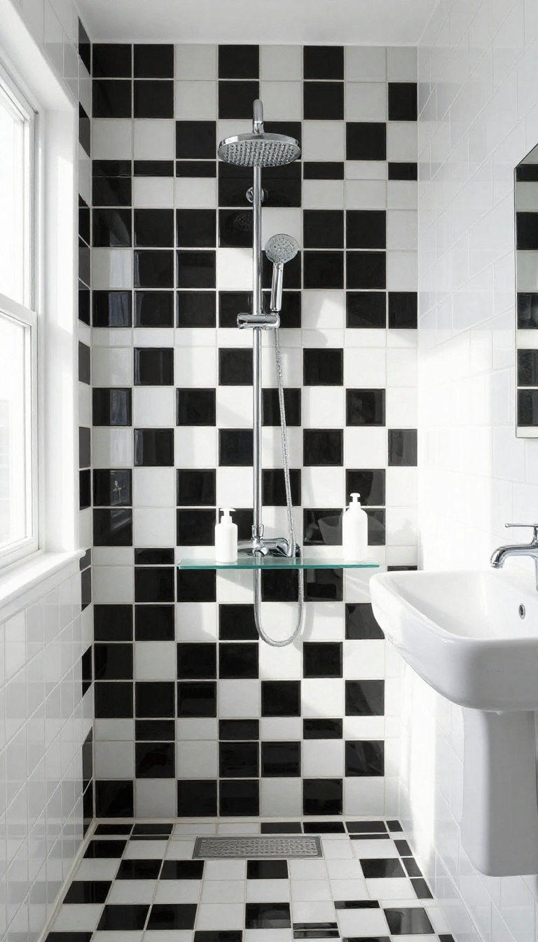
Taking the checkerboard pattern from the floor to the walls is a bold move that instantly channels a retro diner or 1950s soda fountain. The high-contrast grid adds a playful, graphic energy that makes the shower feel like a fun destination. To keep it from feeling too busy, pair it with simple fixtures and minimal accessories.
A full checkerboard wall can be visually intense, but that's exactly what makes it so striking. The key is to balance the pattern with clean, simple elements elsewhere in the bathroom. Choose matte black and white tiles for a softer, more vintage feel, or go glossy for a punchier look.
Keep the grout color consistent—white grout on white tiles and black grout on black tiles helps the checkerboard read clearly.
Choosing The Right Tile Size
Large checkerboard tiles, like 8×8 or 12×12 inches, create a bolder, more modern statement. Smaller tiles, such as 2×2 or 4×4, give a finer, more detailed pattern that feels closer to a classic diner floor. In a small shower, smaller tiles can make the space feel more intricate without overwhelming it.
Consider the scale of your shower and how much pattern you want to live with daily.
Balancing With Fixtures And Accessories
Since the checkerboard wall is the star, keep your shower fixtures simple. Choose chrome or brushed nickel for a clean, timeless look. Avoid ornate or oversized fixtures that compete with the pattern.
Keep shelving minimal—maybe a single glass shelf or a corner caddy in a matching finish. Let the tile do the talking.
Grout Color Matters
Grout color can make or break a checkerboard wall. For a crisp, seamless look, match the grout to each tile color: white grout on white tiles, black grout on black tiles. This emphasizes the checkerboard effect.
Alternatively, a contrasting grout, like black on white tiles, creates a more graphic, line-heavy appearance. Test grout samples in your lighting to see what feels right.
10. Black Hexagon with White Grout
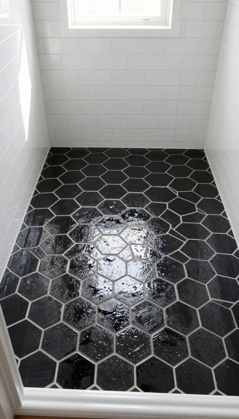
Hexagons are everywhere right now, and for good reason. They bring a modern, almost futuristic vibe while still feeling warm and organic. When you go with glossy black hexagons and white grout, the shape really pops, and the contrast makes the pattern look almost three-dimensional.
This combo works brilliantly on a shower floor, where the small tiles give you extra grip underfoot. But it’s also a stunning choice for a feature wall behind the shower bench or niche. The white grout lines create a web-like effect that draws the eye and makes the space feel dynamic.
The honeycomb pattern is naturally eye-catching, and the black-and-white treatment kicks it up a notch. Glossy black tiles reflect light, so the shower won’t feel like a cave. The white grout acts like a highlighter, tracing every edge and making the geometry the star of the show.
You can go all-in with hexagons on every wall, but that might be overwhelming. Many homeowners choose to limit this pattern to the floor or one accent wall. That way, you get the wow factor without the visual noise.
Another plus: hexagon tiles are available in a range of sizes, from small mosaic sheets to larger individual tiles. Smaller hexagons give a busier, more detailed look, while larger ones feel cleaner and more modern. Pick the scale that matches your style and the size of your shower.
Why White Grout Works
White grout is the secret ingredient here. It creates a crisp, clean line between each tile, which makes the hexagon shape stand out clearly. Dark grout would blend the tiles together and soften the pattern, but white grout keeps the contrast sharp and graphic.
White grout also helps the black tiles feel less heavy. In a small shower, that contrast can make the space feel larger and more open. Just be ready to keep it clean—white grout shows dirt and soap scum more easily, so a good sealer is a must.
Placement Ideas
If you want a bold statement, use black hexagons on the shower floor and keep the walls white. That grounds the space and gives you a strong visual anchor. For a more daring look, create a feature wall behind the shower controls or the bench, and keep the rest of the shower light.
You can also mix hexagons with other tile shapes. For example, pair a black hexagon floor with white subway tiles on the walls. That combination feels classic yet modern, and the hexagons add just the right amount of edge.
Grout And Maintenance Tips
Because white grout is prone to staining, use a high-quality, epoxy-based grout that resists moisture and mold. Epoxy grout is more durable and easier to clean than traditional cement-based grout. Apply a penetrating sealer after installation and reapply every year or so.
For daily cleaning, a soft brush and mild cleaner will keep the grout looking fresh. Avoid abrasive scrubbers that can scratch the glossy tile surface. With a little care, this shower will stay stunning for years.
11. Geometric Moroccan Fish Scale Pattern
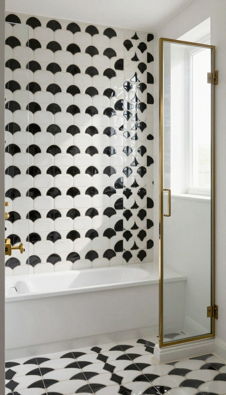
Fish scale tiles, also known as scallop or mermaid tiles, bring a playful yet refined touch to a shower. When arranged in alternating black and white, they create a rhythmic, almost hypnotic pattern that feels both whimsical and upscale. This design works beautifully as an accent wall behind a bench or niche, adding visual interest without overwhelming the space.
The fish scale pattern is a versatile choice that can adapt to different styles, from modern to traditional. The alternating colors break up the monotony and add depth, making the wall feel dynamic. It's a great way to introduce a bold geometric element while keeping the overall look cohesive with the rest of the bathroom.
Why It Works
The scalloped shape softens the stark contrast of black and white, making it feel more organic and less harsh. The pattern draws the eye and adds texture, especially when paired with a matte finish. It's also a practical choice for an accent wall because it doesn't require a full-room commitment.
Placement Tips
Install the fish scale tiles on a single wall, like the one behind a shower bench or in a recessed niche. This creates a focal point without making the space feel busy. If you want a subtle effect, use a lighter grout to blend the tiles; for more contrast, choose a darker grout.
Styling Ideas
Pair the pattern with simple white fixtures and a frameless glass shower door to let the tiles stand out. Add warm brass or matte black hardware for a touch of elegance. Keep the rest of the bathroom minimal so the pattern remains the star.
12. Vertical Black and White Stripes for Height
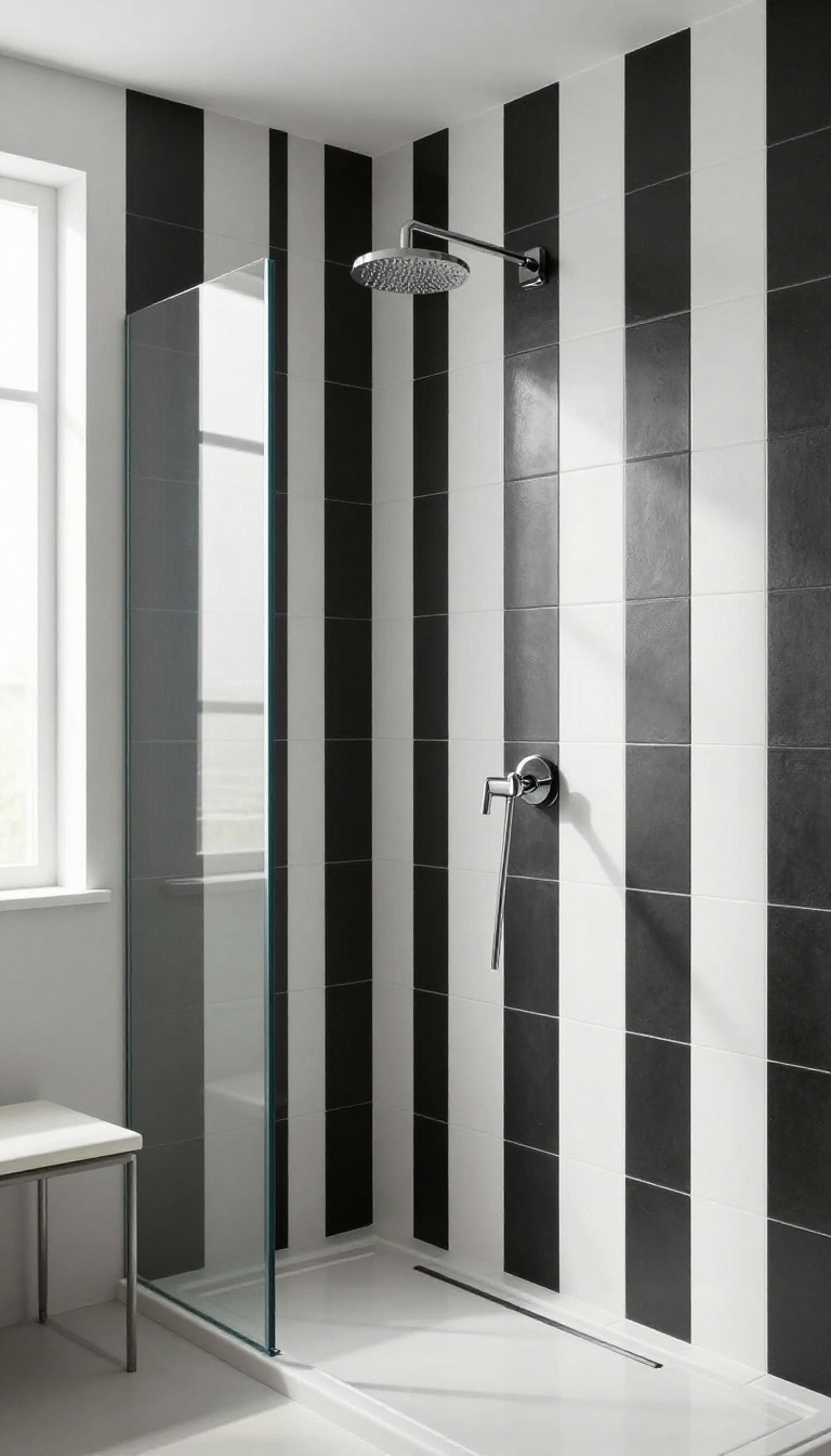
If your shower feels a bit boxy or low, vertical stripes can work wonders. Running black and white striped tiles from floor to ceiling draws the eye upward, making the space feel taller and more open. It's a simple trick that adds a touch of Art Deco glamour without overwhelming the room.
Mixing matte and glossy finishes within the stripes adds another layer of depth, catching light in unexpected ways.
Vertical stripes are a classic way to add height and elegance. In a shower, they create a sense of movement and rhythm that feels both bold and sophisticated. The key is to choose a stripe width that suits your space—narrow stripes for a subtle effect, wider ones for a more dramatic statement.
You can also play with the tile format: subway tiles laid vertically, or long rectangular tiles that naturally form stripes. The contrast between black and white is crisp, but the finish matters too. A glossy stripe next to a matte one will reflect light differently, giving the wall a subtle texture that changes throughout the day.
Choosing The Right Stripe Width
The width of your stripes can completely change the feel of the shower. Thin, pencil-like stripes create a refined, almost pinstripe look that feels tailored and elegant. Wider stripes, on the other hand, make a bolder statement and can make a small shower feel more dynamic.
Consider the scale of your tiles and the size of the wall. A good rule of thumb is to keep stripes proportional to the space—narrower stripes for smaller showers, wider ones for larger areas.
Mixing Finishes For Depth
Don't be afraid to combine matte and glossy tiles in the same stripe pattern. The contrast in sheen adds a layer of visual interest that goes beyond color. Glossy tiles reflect light and can make a stripe pop, while matte tiles absorb light and create a softer, more muted effect.
This interplay can make the wall feel almost three-dimensional. It's a subtle detail that makes the design feel custom and thoughtful.
Placement And Grout Considerations
For vertical stripes to have the maximum elongating effect, start them at the floor and run them all the way to the ceiling, without a break. This continuous line is what creates the height illusion. When it comes to grout, choose a color that blends with the tiles to keep the stripes clean and uninterrupted.
A white grout with white tiles and black grout with black tiles will make the stripes read as solid blocks. Alternatively, a contrasting grout can add a grid-like texture, but it may break up the vertical flow.
13. Checkerboard Niche and Curb Accents
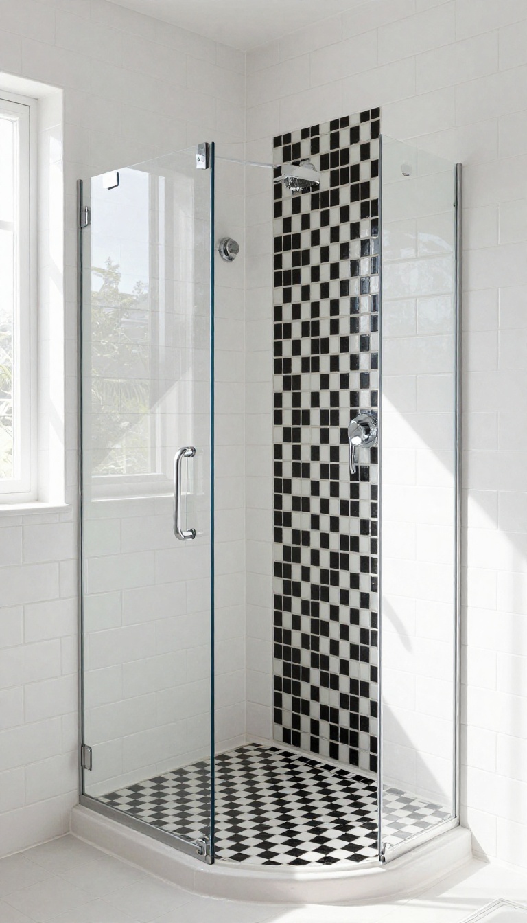
A checkerboard pattern doesn't have to take over the whole shower to make a statement. By using it selectively on the niche and curb, you get that playful contrast without overwhelming the space. It's a clever way to tie the design together and add a custom touch that feels intentional.
When you're working with a black and white palette, the details matter. Adding checkerboard tile to the niche and curb is a subtle nod to the classic pattern that can unify the entire shower. It's like a secret handshake for your tile design—only those who look closely will notice the thoughtful repetition.
Why Focus On The Niche And Curb?
The niche and curb are natural focal points in any shower. The niche draws the eye because it's recessed and often used for storage, while the curb defines the entry and adds a visual break. By tiling these areas in a checkerboard, you're adding interest where it's most likely to be seen, without committing to a full wall or floor pattern.
It's a balanced approach that feels curated rather than chaotic.
Choosing The Right Tile Size
The size of your checkerboard tiles should relate to the scale of the niche and curb. For a standard niche, 2-inch squares work well because they fit the proportions without looking too busy. On a curb, 4-inch squares can make a bolder statement while still feeling classic.
If you're unsure, mock up a few options with cardboard templates to see what feels right in your space.
Grout Color And Contrast
Grout plays a huge role in how a checkerboard reads. Black and white tiles with black grout create a more seamless, modern look, while white grout makes the pattern pop with crisp lines. For a softer, more traditional feel, consider a gray grout that bridges the two.
Just remember that lighter grout shows dirt more easily, so choose a shade that fits your maintenance routine.
Balancing With Surrounding Tile
To keep the checkerboard from feeling out of place, coordinate it with the surrounding tile. If your main shower tile is white subway, the black and white checkerboard will stand out as a playful accent. If you're using a larger format tile, the checkerboard can add texture and visual interest.
The key is to let the accent areas shine without competing with the rest of the design.
14. Black Subway Tile with White Grout
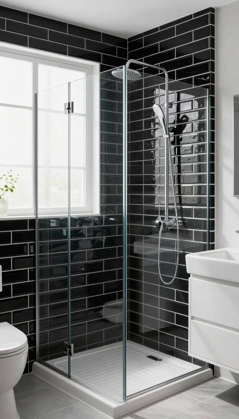
Subway tile is a classic for a reason, but flipping the usual white-on-white script changes everything. Black subway tiles with bright white grout create a crisp, grid-like pattern that feels both bold and clean. The contrast makes each tile pop, giving the wall a graphic, almost architectural quality.
This look works in nearly any bathroom style, from modern farmhouse to sleek urban loft. Pair it with white fixtures and simple hardware to let the tile stay the star. The result is a shower that feels sharp, timeless, and surprisingly easy to live with.
The key to pulling off black subway tile is the grout. White grout is non-negotiable here—it defines the pattern and adds that high-contrast punch. Use a sanded grout for wider joints (around 1/8 inch) to avoid cracking, and seal it well to resist moisture and staining.
Keep the rest of the shower simple. White fixtures, a clear glass door, and a light-colored ceiling keep the space from feeling too dark. If you're worried about the black being overwhelming, limit it to one feature wall and use white tile or paint elsewhere.
Maintenance is straightforward: black tile hides soap scum better than you'd think, but hard water spots can show. Wipe down after use and use a squeegee to keep it looking pristine.
Layout Ideas That Change The Feel
A standard brick pattern is the safe bet, but you can switch it up. A vertical stack (also called straight set) creates a more modern, linear look. Herringbone adds movement and makes the shower feel wider.
Even a simple offset pattern with a 50% overlap gives a subtle twist that keeps things interesting.
Grout Width Matters
Narrow grout lines (1/16 inch) give a sleek, seamless appearance, while wider lines (1/8 inch) emphasize the grid and make the contrast more pronounced. For a truly bold look, go with 1/8 inch. Just remember that wider grout needs more upkeep, so choose a quality grout and seal it properly.
Lighting And Finishes To Complement
Black tile absorbs light, so make sure your shower has adequate lighting. Warm LED sconces or a recessed light with a warm bulb can soften the contrast. Pair with brushed nickel or matte black fixtures for a cohesive look.
Avoid brass or gold unless you're going for a specific vintage vibe.
15. Mosaic Basket Weave Pattern
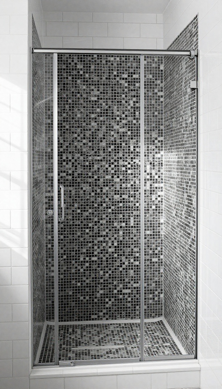
Basket weave mosaic tiles bring a handcrafted feel to a shower that plain squares just can't match. The interlocking rectangles create a woven texture that reads as both classic and contemporary, especially in stark black and white. It's a pattern that adds visual interest without shouting for attention.
The basket weave pattern works beautifully on a shower floor, where the small tiles provide extra grip and the woven design adds a subtle sense of movement. On walls, it can be used as an accent strip or an entire feature wall, depending on how bold you want to go. The black and white contrast makes the weave pop, giving the shower a sophisticated, spa-like vibe.
Why Basket Weave Works In Showers
The small tiles in a basket weave pattern create more grout lines, which means better traction underfoot. That makes it a smart choice for a shower floor. Plus, the woven look adds a layer of texture that plain tiles don't offer, making the space feel more designed and less flat.
Grout Color And Contrast
For a seamless woven effect, choose a grout that blends with the tiles. White grout with white tiles and black grout with black tiles keeps the pattern crisp. If you want the weave to stand out even more, use a contrasting grout, like dark gray with white tiles, to emphasize the individual pieces.
Where To Place The Pattern
Basket weave is versatile. On the floor, it anchors the shower and adds grip. On a wall, it can frame a niche or run as a border.
You could also use it on a single accent wall behind the fixtures to create a focal point without overwhelming the space.
FAQ
Are black and white shower tiles hard to keep clean?
Not necessarily. Dark tiles can show water spots and soap scum, but regular cleaning with a squeegee and mild cleaner keeps them looking sharp. White grout may need sealing to prevent staining.
What grout color should I use with black and white tiles?
It depends on the look you want. White grout creates a crisp, high-contrast look, while black grout adds drama and hides dirt. Gray grout is a good compromise for a softer contrast.
Can I use black and white tile in a small shower?
Yes, but choose patterns wisely. Large-format tiles and vertical layouts can make a small shower feel bigger. Avoid overly busy patterns that might overwhelm the space.
What is the best tile finish for a shower floor?
For safety, choose a tile with a textured or matte finish that provides slip resistance. Small mosaic tiles with more grout lines also offer better traction.
How do I incorporate black and white tile without making the shower look too stark?
Balance the high contrast with warm accents like wood, brass, or soft lighting. You can also use one color as the dominant base and the other as an accent to soften the effect.
Conclusion
Black and white shower tiles offer endless possibilities for creating a bathroom that feels both timeless and fresh. Whether you prefer classic checkerboard or modern geometric patterns, the key is to choose a design that reflects your personal style and fits your space.
Don't be afraid to mix textures and finishes to add depth. With these 15 ideas, you're well on your way to a shower that's anything but boring.