10 Living Room Wall Color Ideas for a Warm, Stylish Update
Staring at the same beige walls for years can make even the comfiest living room feel a little blah. You want warmth, but you don't want to repaint every other year. The right color can solve that—it sets the mood, hides imperfections, and makes your furniture look intentional.
This list breaks down ten wall colors that actually work in real homes. Some are soft and subtle, others bring a little drama.
All of them add warmth without turning your living room into a cave. Pick one, grab a sample, and see how quickly the space changes.
1. Soft Terracotta: The Instant Cozy Fix
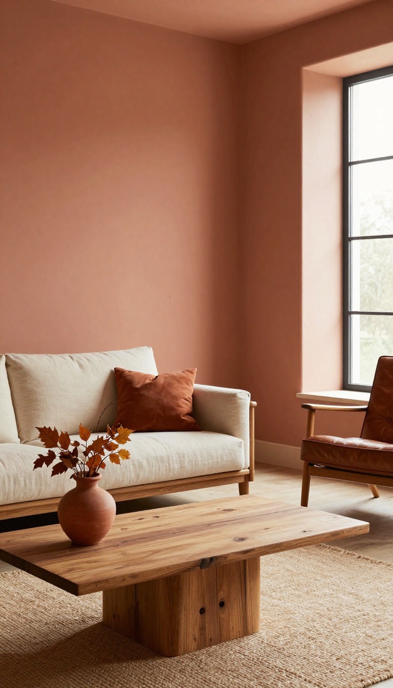
Terracotta might remind you of old flower pots, but on a living room wall it feels fresh and grounded. The color sits somewhere between clay and baked earth, so it brings warmth without shouting. It's also surprisingly forgiving, which matters in a room where life actually happens.
This isn't a loud orange. A soft terracotta has enough brown in it to stay calm, and it plays well with almost any wood tone. That makes it an easy first step if you want cozy without committing to something dark or bold.
Terracotta works because it mimics the colors you already see in natural materials. Think unglazed pottery, worn leather, and dried autumn leaves. Those references make the wall feel familiar instead of trendy.
It also handles real life well. Scuffs and fingerprints blend into the depth of the color, so you're not constantly touching up. In a busy living room, that's a quiet win. ### Why It Feels Cozy Without Feeling Heavy Warm colors can sometimes make a room feel closed in.
Terracotta avoids that because it has a sun-baked quality. It reflects light in a soft, diffused way rather than absorbing it completely. That means even a north-facing room gets a little lift.
And if you have big windows, the color shifts throughout the day—more golden in the morning, deeper and richer at night. ### Pairing It With Wood and Natural Fabrics This is where terracotta really shines. Oak, walnut, and reclaimed pine all look intentional against it. You don't have to match undertones perfectly, which takes the stress out of furniture shopping.
For fabrics, stick with linen, cotton, and wool in cream, oatmeal, or muted olive. A leather sofa in cognac or tan is almost a no-brainer here. Add a jute rug and you've got a room that feels collected, not decorated. ### Where to Use It (and Where to Hold Back) An accent wall behind the sofa or a fireplace is the safest bet.
It gives you the warmth without repainting the whole room. If you're ready to go all in, terracotta works on all four walls as long as you keep the ceiling and trim light. Skip it in tiny rooms with no natural light unless you're willing to add layered lighting.
A floor lamp and a couple of table lamps will do more for the color than any paint finish. ### A Quick Note on Finish and Lighting Flat or matte finishes look best with terracotta. They soften the color and hide wall imperfections better than eggshell or satin. If you need washability, choose a matte washable formula rather than bumping up the sheen.
Test the color on two walls before you commit. Terracotta can lean pink in cool light and almost rust in warm light. Seeing it in your own space for a full day is the only way to know.
Why It Feels Cozy Without Feeling Heavy
Warm colors can sometimes make a room feel closed in. Terracotta avoids that because it has a sun-baked quality. It reflects light in a soft, diffused way rather than absorbing it completely.
That means even a north-facing room gets a little lift. And if you have big windows, the color shifts throughout the day—more golden in the morning, deeper and richer at night.
Pairing It With Wood And Natural Fabrics
This is where terracotta really shines. Oak, walnut, and reclaimed pine all look intentional against it. You don't have to match undertones perfectly, which takes the stress out of furniture shopping.
For fabrics, stick with linen, cotton, and wool in cream, oatmeal, or muted olive. A leather sofa in cognac or tan is almost a no-brainer here. Add a jute rug and you've got a room that feels collected, not decorated.
Where To Use It (and Where To Hold Back)
An accent wall behind the sofa or a fireplace is the safest bet. It gives you the warmth without repainting the whole room. If you're ready to go all in, terracotta works on all four walls as long as you keep the ceiling and trim light.
Skip it in tiny rooms with no natural light unless you're willing to add layered lighting. A floor lamp and a couple of table lamps will do more for the color than any paint finish.
A Quick Note On Finish And Lighting
Flat or matte finishes look best with terracotta. They soften the color and hide wall imperfections better than eggshell or satin. If you need washability, choose a matte washable formula rather than bumping up the sheen.
Test the color on two walls before you commit. Terracotta can lean pink in cool light and almost rust in warm light. Seeing it in your own space for a full day is the only way to know.
2. Warm Greige: The Safe but Stylish Neutral
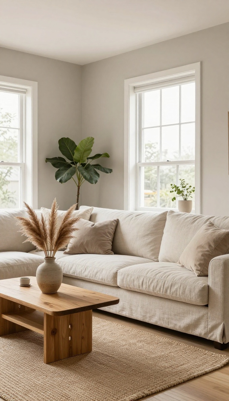
Greige lives somewhere between gray and beige, and that's exactly why it works. It keeps the clean, modern feel of gray but swaps the chill for a soft warmth that beige alone can't quite pull off. Think of it as the neutral that plays nice with almost everything you already own.
The magic of greige is in its balance. Too much gray and a room feels cold and flat. Too much beige and it can turn yellow or dated.
A good greige sits right in the middle, so it reads as calm and grounded without feeling boring. It also handles lighting better than most neutrals. North-facing rooms stay cozy instead of gloomy, and sun-soaked spaces don't turn into a glaring tan box.
That flexibility is why designers reach for it again and again.
Why It Works In Almost Any Room
Greige doesn't compete with your furniture, art, or rugs. It steps back and lets the things you love do the talking. That makes it a smart pick if you change decor often or you're not ready to commit to a bold color.
It also bridges warm and cool tones in a space. Wood floors, metal accents, and fabric in either temperature family all look intentional against it. Few colors are that easygoing.
How To Pick The Right Greige
Greige shifts a lot depending on the light, so always test a sample on your actual wall. Look at it in the morning, afternoon, and at night with lamps on. A shade that looks perfect in the store can turn pink, green, or muddy once it's home.
Lean warmer if your room feels cold or has lots of gray light. Lean cooler if your space gets strong sun or you want a crisper, more modern look. Popular picks like Benjamin Moore Revere Pewter or Sherwin-Williams Agreeable Gray are good starting points, but trust your own eyes.
What Pairs Well With Greige Walls
White trim and ceilings keep greige looking fresh instead of heavy. Add texture through a woven rug, linen curtains, or a chunky throw to stop the color from feeling one-note. For contrast, bring in black metal, warm wood, or deep green plants.
Brass and gold accents also wake up greige without fighting it. The goal is layers, not a room that matches too perfectly.
3. Muted Olive: A Grounded, Organic Choice
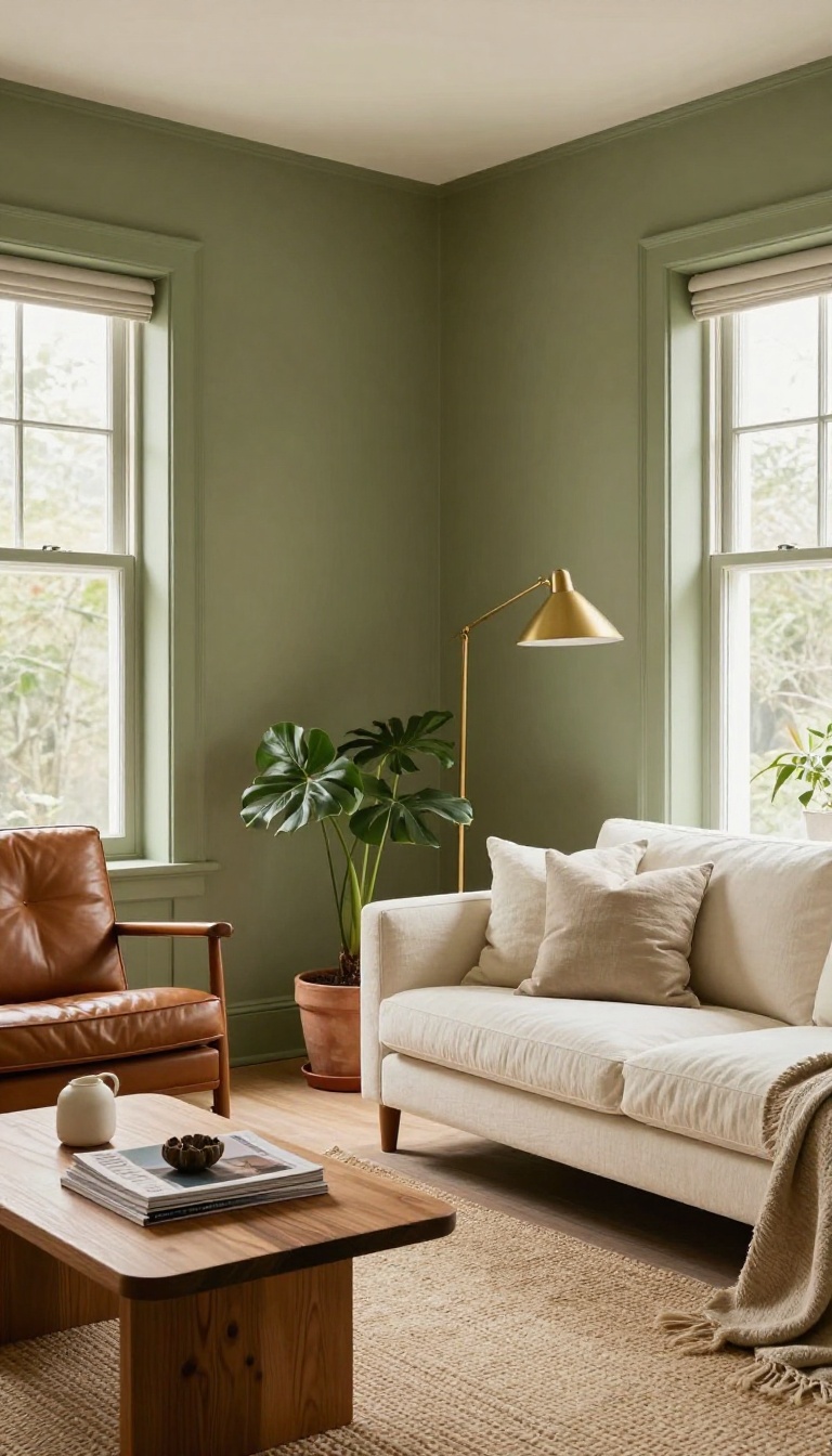
Olive green brings the outside in without turning your living room into a jungle. It's earthy, calm, and surprisingly sophisticated—like a well-worn leather chair that only gets better with age. This muted shade works because it's dark enough to add depth but not so heavy that it swallows the space.
Olive sits in that sweet spot between green and gray, which makes it feel neutral but never boring. It pairs beautifully with brass, warm wood, and rich leather, so your existing furniture gets an instant upgrade. And because it's a nature-inspired tone, it plays well with plants, woven textures, and natural light.
Why It Works In Real Rooms
Olive absorbs light in a gentle way, so it softens harsh afternoon sun and makes evenings feel cozier. It also hides scuffs and smudges better than lighter greens, which is a win in busy households. If your living room gets a lot of natural light, olive can look almost sage; in darker rooms, it reads deeper and moodier.
Pairings That Shine
Brass and olive are a match made in heaven—think a brass floor lamp or drawer pulls. Leather furniture, especially in cognac or tan, adds warmth and contrast. For a lighter look, mix in cream or off-white textiles; for a bolder vibe, add burnt orange or mustard accents.
Getting The Shade Right
Olive can skew yellow or gray depending on the light, so always test a sample on your wall. Look for names like 'olive grove' or 'muted moss' to find that balanced tone. A satin or eggshell finish keeps it easy to clean and adds a subtle sheen.
4. Dusty Rose: Soft Color Without the Sweetness
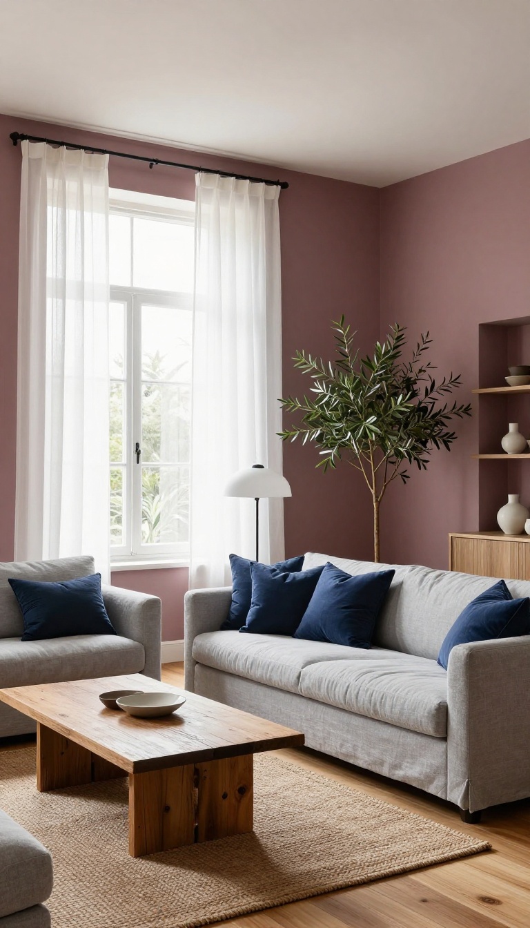
Pink gets a bad rap for being too sugary, but dusty rose is a different story. It's a muted, grayed-down pink that feels warm and sophisticated, not bubblegum. In a living room, it adds a gentle blush to the walls without making the space feel like a nursery.
This color works because it's subtle. It doesn't shout for attention, but it still brings a softness that plain beige can't match. And it plays surprisingly well with other colors, especially cool tones like gray and navy.
Dusty rose is essentially pink that's been through a few filters. It has a dusty, almost vintage quality that keeps it from feeling too sweet. The gray undertones make it read as neutral, so it's easy to live with long-term.
One of the best things about dusty rose is how it flatters different lighting. In a north-facing room, it can look slightly cooler and more mauve. In a sunny space, it warms up and shows more of its pink side.
Either way, it's flattering. If you're worried about committing to pink, start with a single accent wall. It's a low-risk way to test the waters.
Or go all in—dusty rose on all four walls can feel like a cozy hug without being overwhelming.
Why It Works
Dusty rose strikes a balance between warmth and calm. It's not as intense as coral or as cool as lavender. That middle ground makes it versatile.
It also has a softening effect on sharp architectural details. If your living room has hard lines or lots of right angles, this color can take the edge off. And because it's muted, it doesn't compete with your furniture—it complements it.
Pairs Well With
Gray is a natural partner. A medium gray sofa on dusty rose walls looks tailored and modern. Navy adds depth and a touch of drama, especially in a velvet or wool fabric.
Cream and off-white keep things light and airy. For a bit of contrast, try charcoal or black accents in small doses—picture frames, lamp bases, or a metal coffee table. Wood tones, especially warm ones like walnut or oak, also look great against dusty rose.
Getting It Right
The key is to choose a dusty rose with enough gray in it. If it looks too pink in the store, it'll look even pinker on your walls. Test a sample in different lighting throughout the day.
Finish matters too. A matte or eggshell finish feels softer and more velvety. Flat paint can look chalky, while satin might make the color look shinier and more saturated.
Eggshell is usually the sweet spot for living rooms.
5. Deep Navy: Bold Warmth After Dark
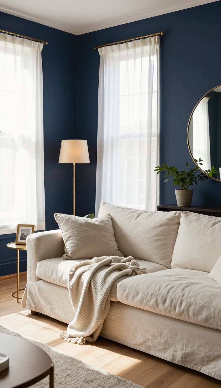
Navy is the color that surprises people. It looks serious on a paint chip, but once it's up, it wraps the room in this rich, cozy hug. At night, with a lamp on, it feels almost like a dimly lit lounge—warm, not cold.
And in the daytime, it still reads as a sophisticated neutral that plays well with almost any furniture.
The trick with navy is that it's dark but not flat. It has depth, so walls feel like they're holding light instead of just reflecting it. That's what makes a living room feel snug without feeling small.
You can go all-in on every wall, or use it as an accent to anchor a seating area. Either way, it brings a calm, grown-up warmth that beige just can't match.
All-over Navy For Maximum Coziness
Painting all four walls navy turns your living room into a proper retreat. The color absorbs light during the day, so the room feels quieter and more intimate. At night, turn on a few warm bulbs and it glows.
Pair it with light wood floors, cream sofas, and brass accents to keep it from feeling like a cave. A large mirror or a window with sheer curtains helps bounce whatever light you have.
Accent Wall Without The Commitment
If full navy feels like too much, pick one wall—usually the one behind the sofa or the fireplace. That single dark plane adds instant depth and draws the eye. Keep the other walls a soft white or warm gray so the room stays bright.
This approach works great in open-plan spaces where you want to define the living area without painting the whole house.
Pairing Navy With Warm Finishes
Navy loves warm materials. Think leather, rattan, aged brass, and chunky wool throws. Those textures soften the darkness and add that lived-in feel.
Avoid cool grays and chrome—they can make navy look chilly. Instead, lean into camel, rust, mustard, and blush. A few gold picture frames or a copper lamp will make the whole room feel intentional and inviting.
6. Creamy White: Bright but Never Cold
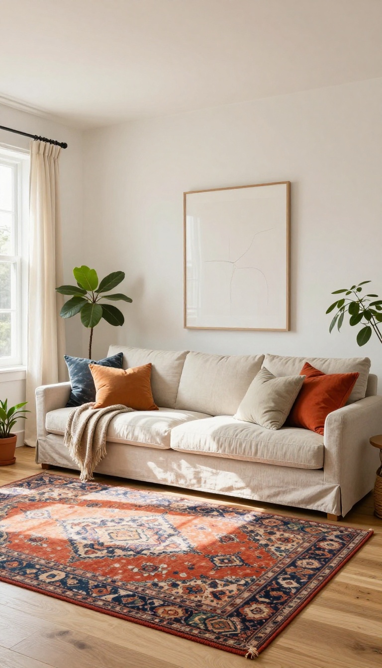
Creamy white is the wall color that finally gets white right. It skips the sterile, hospital-corridor vibe of stark white and adds a soft, buttery undertone that feels instantly welcoming. In a living room, that warmth makes all the difference—especially if you love light walls but hate the chill that sometimes comes with them.
The magic of creamy white is in its undertones. Instead of a cool blue or gray base, it leans toward yellow, beige, or even a hint of peach. That subtle shift means the color reflects light without turning the room into a freezer.
It's bright, yes, but it's also cozy. This shade works overtime in small spaces. Because it bounces light around, a cramped living room suddenly feels more open.
And unlike pure white, it doesn't highlight every smudge or shadow. It's forgiving in the best way. But the real win is how it plays with others.
Creamy white is the ultimate backdrop for colorful accessories. Think bold throw pillows, a vibrant rug, or a statement piece of art. The walls stay quiet and warm while your personality gets to shine.
Why It Works In Real Rooms
Creamy white doesn't fight with your furniture. It complements wood tones, from light oak to dark walnut, and makes natural textures like linen and wool look richer. It also adapts to different lighting.
In a north-facing room, it warms up the cool light. In a sunny space, it glows without glaring.
How To Pick The Right Shade
Not all creamy whites are equal. Some lean more yellow, others more beige. Grab a few samples and paint large swatches on different walls.
Live with them for a couple of days. The right one will feel like a soft hug, not a blank stare.
Styling Tips For A Warm Look
Layer in warm textures: a chunky knit blanket, a jute rug, or linen curtains. Add a mix of metals—brass and bronze feel warmer than chrome. And don't be afraid of color.
A single bright accent, like a mustard throw or a teal vase, pops beautifully against creamy white.
7. Warm Taupe: The Underrated Neutral
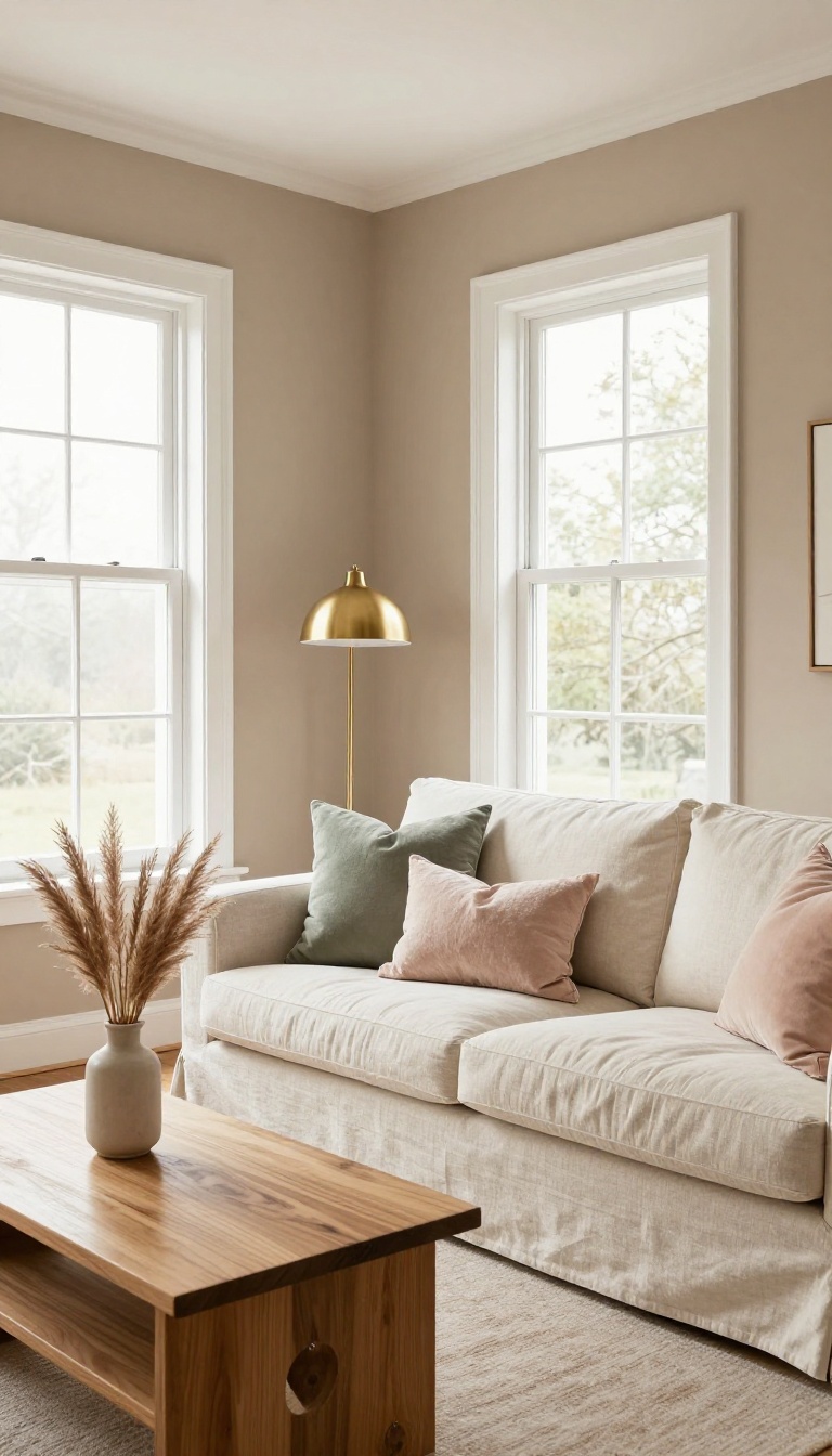
Taupe doesn't get the attention it deserves. It's a brown-gray that sits quietly in the background, adding warmth without shouting for attention. If you've grown tired of beige but aren't ready for a bold color, taupe is your answer.
It's sophisticated, versatile, and works in almost any living room.
Taupe is one of those colors that people either love or overlook. It's not as flat as gray, not as yellow as beige, and not as dark as brown. Instead, it blends all three into a soft, earthy neutral that feels instantly calming.
The magic of taupe is its subtlety. It doesn't compete with your furniture or art; it enhances them. And because it has both warm and cool undertones, it plays well with almost any palette.
Whether your style is modern minimalist or traditional cozy, taupe adapts. It's like the little black dress of wall colors—always appropriate, never boring.
Why Taupe Works So Well
Taupe's balanced mix of brown and gray means it never feels too warm or too cold. That makes it incredibly forgiving in rooms with changing light. In the morning, it might look slightly cooler; by evening, it takes on a cozy warmth.
It also hides imperfections better than lighter colors, so walls look smoother. And unlike pure gray, taupe adds a subtle glow that keeps a room from feeling sterile.
Pairing Taupe With Other Colors
Taupe is a team player. It loves crisp white trim for a clean, tailored look. Add navy or charcoal for contrast, or soft blush and sage for a gentler vibe.
Metallic accents like brass or bronze bring out its warmth, while black frames and hardware give it a modern edge. For a monochromatic scheme, layer different shades of taupe—lighter on walls, darker on upholstery.
Making Taupe Feel Fresh, Not Dated
The key is to avoid matching taupe with too many other browns, which can feel heavy. Instead, mix in textures like linen, wool, and leather to add depth. Keep the ceiling and trim bright white to lift the space.
And don't forget lighting—warm bulbs will enhance taupe's cozy side, while cool bulbs can make it look gray. A few well-placed plants or a colorful rug also keep taupe from feeling one-note.
8. Burnt Orange: A Punch of Energy
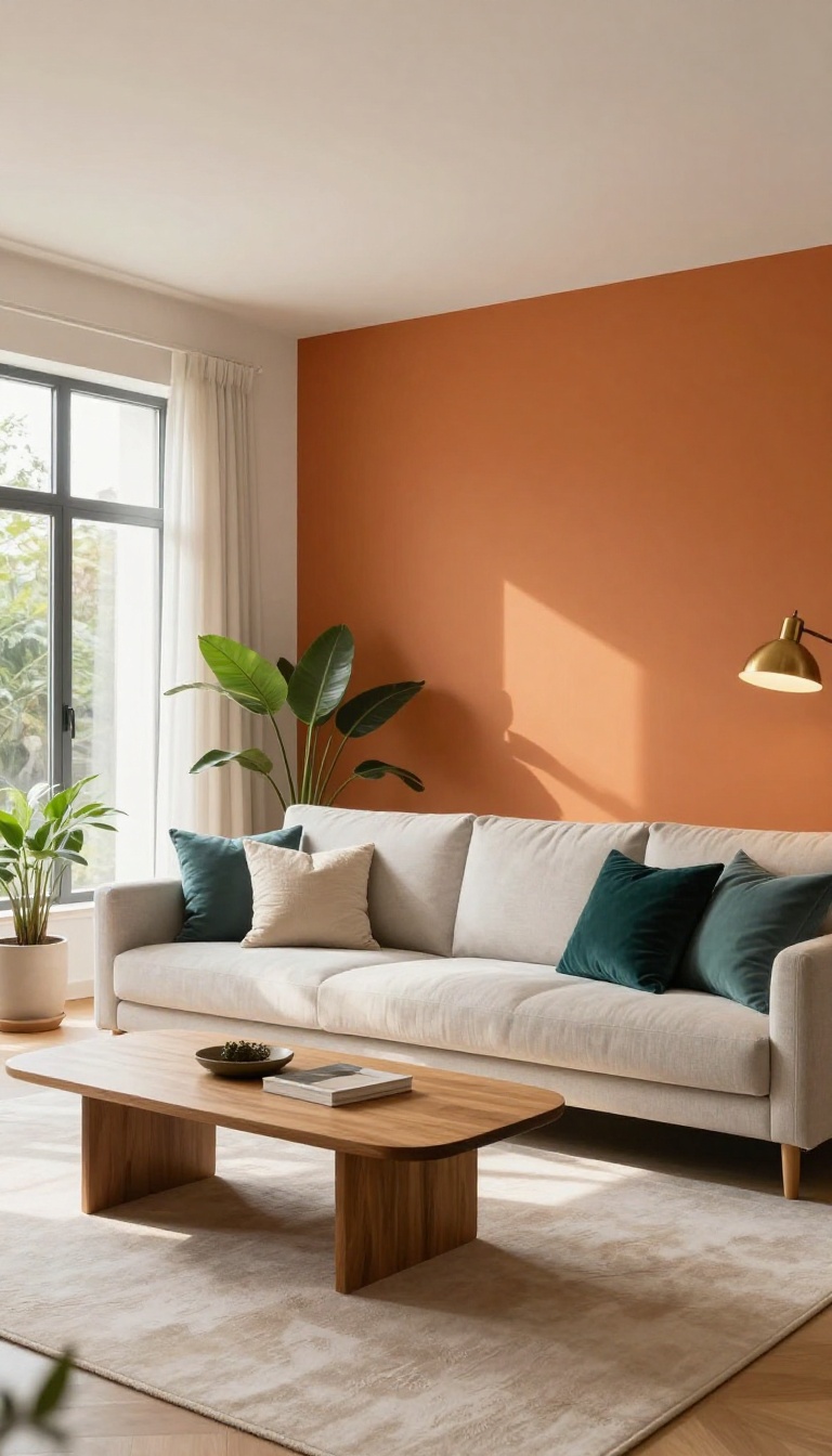
Burnt orange is the color that wakes a room up without making it feel like a loud party. It sits somewhere between red and brown, so it has warmth and depth instead of that bright, in-your-face orange you might remember from old gym lockers. One wall is usually all you need—it draws the eye, adds instant energy, and makes the rest of the room feel more put-together.
The trick with burnt orange is keeping it from taking over. It's intense enough that a full four-wall paint job can feel like a lot, especially in a smaller living room. But used strategically, it's one of the most rewarding colors you can put on a wall.
Where It Works Best
An accent wall behind the sofa or a fireplace is the sweet spot. It anchors the room and gives your furniture a clear focal point. If your living room is on the smaller side, try it on just one wall or even a nook—burnt orange in small doses reads as cozy, not claustrophobic.
Rooms with lots of natural light handle it best, but even dim spaces can pull it off if you pair it with warm lighting.
Colors That Play Nice
Balance is everything here. Cream, warm white, and soft greige keep the orange from feeling overwhelming. For a richer look, pair it with deep teal or navy—those cool tones make the orange pop without fighting it.
Wood tones, especially medium and dark woods, look fantastic against burnt orange, so don't feel like you need to replace your furniture.
Styling Tips That Keep It Calm
Keep the rest of the room simple. A neutral rug, a few textured throw pillows, and maybe a brass or black metal accent will do more than a dozen colorful accessories. If you want to soften the intensity, choose a burnt orange with more brown in it rather than red.
And don't forget the ceiling—painting it a soft white or cream keeps the whole space feeling open.
9. Soft Charcoal: Moody but Manageable
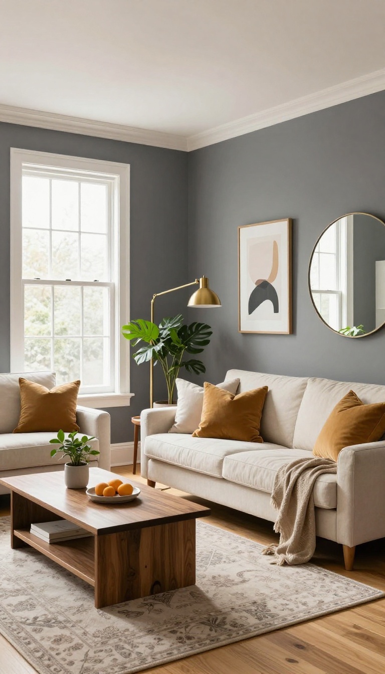
Charcoal gray has a reputation for being heavy, but the right shade is more cozy than cave-like. It's dark without going full black, which means it adds depth and intimacy without swallowing the room. The trick is balancing that moodiness with light floors and bright accents so the space still feels open.
Soft charcoal works because it's a grounded neutral. It plays well with almost any wood tone, metal finish, or fabric color you already own. And unlike pure black, it has a little softness to it—so it feels warm, not severe.
Why It Works
Charcoal absorbs light, which makes a room feel snug and intentional. That's great for large living rooms that feel a bit echoey or cold. It also creates a beautiful backdrop for art and plants, since the dark wall makes colors pop.
How To Keep It From Feeling Closed In
Stick with light floors, white trim, and a light-colored ceiling. Add bright textiles like cream sofas, patterned rugs, or mustard and blush pillows. Mirrors and metallic accents also bounce light around and keep the mood lifted.
Best Pairings
Warm woods like oak and walnut look rich against charcoal. Brass and copper add a little glow. And if you want contrast, pair it with soft whites, pale pinks, or muted greens for a balanced, stylish look.
10. Buttery Yellow: Sunlight on Your Walls
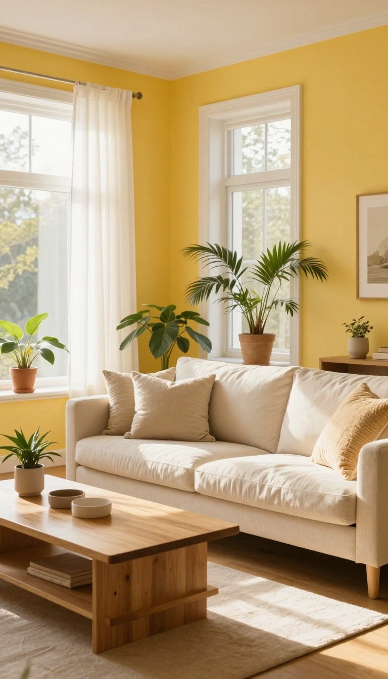
Buttery yellow is like bottled sunshine for your walls. It brings a soft, cheerful glow that makes even a dim, north-facing room feel brighter and more inviting. This shade works with almost any furniture style, from modern to traditional, and it never feels overwhelming.
Buttery yellow sits in that sweet spot between pale pastel and bold mustard. It has enough warmth to cozy up a space, but it's light enough to keep things airy. The color mimics the golden hour, so your living room feels bathed in natural light all day.
It's especially helpful in rooms that don't get much sun, because it tricks the eye into seeing warmth where there might be shadows. You can go slightly deeper with a honey tone for more drama, or keep it pale for a subtle wash of color. Either way, it pairs beautifully with white trim, wood tones, and even cool grays.
One of the best things about buttery yellow is how forgiving it is. It doesn't show dust or smudges as easily as pure white, and it plays well with both warm and cool accent colors. If you have a lot of natural wood furniture, this color enhances the grain without competing.
If your style is more modern, it adds a soft backdrop that makes sleek lines feel less sterile. And if you're worried about it looking too sweet, balance it with black accents or deep green plants.
Why It Works In North-facing Rooms
North-facing rooms often feel cool and shadowy because they don't get direct sun. Buttery yellow counteracts that by adding a warm, golden undertone that mimics sunlight. It's like giving your walls a permanent glow.
Even on gray days, the room feels lighter and more cheerful. Pair it with warm white bulbs to enhance the effect.
Furniture And Decor Pairings
This color is a chameleon. With mid-century modern pieces, it feels retro and fun. With farmhouse decor, it's cozy and welcoming.
Try it with navy blue or charcoal gray for a sophisticated contrast, or with soft pinks and creams for a romantic vibe. Metallic accents like brass or gold look especially rich against buttery yellow.
Choosing The Right Shade
Buttery yellow comes in many variations. Look for paint chips with names like 'warm butter, ' 'soft corn, ' or 'golden cream. ' Test a few samples on different walls to see how the light hits them. A shade that looks pale in the store might turn deeper once it's up.
Always paint a large swatch and live with it for a day or two before committing.
FAQ
What is the best warm wall color for a living room with little natural light?
Buttery yellow or creamy white are great choices because they reflect what light you have and add warmth. Avoid cool grays or blues, which can make dim rooms feel colder.
Can I use dark colors in a small living room?
Yes, dark colors like navy or charcoal can make a small room feel cozy and intentional. Just balance them with light floors, mirrors, and bright accents to keep the space from feeling cramped.
How do I test a wall color before committing?
Paint a large sample swatch on a few walls and live with it for a few days. Check how it looks in morning, afternoon, and evening light before you buy gallons.
What colors go with terracotta walls?
Terracotta pairs well with cream, olive green, navy, and warm wood tones. For a modern look, add black or brass accents.
Should I paint the ceiling the same color as the walls?
Painting the ceiling the same color can make a room feel more intimate and cohesive, especially with warm tones. If you want to keep it bright, use a lighter tint of the wall color on the ceiling.
Conclusion
You don't need a full renovation to make your living room feel warmer and more stylish. A fresh coat of paint in one of these shades can shift the entire mood of the space.
Start with a sample, see how it feels at different times of day, and trust your gut. The right color will make your living room feel like a place you actually want to hang out in.