11 Paint Ideas for Living Room Walls With Warm New Color
Choosing a new paint color for your living room can feel like a big decision, especially when you want the space to feel warm and welcoming. If you're working with a smaller room, the right shade can make all the difference—adding depth, personality, and a cozy vibe without overwhelming the square footage.
These 11 paint ideas are designed to bring warmth into your home while keeping things airy and livable.
Whether you lean toward earthy neutrals or richer tones, there's a color here that will make your walls feel like a hug.
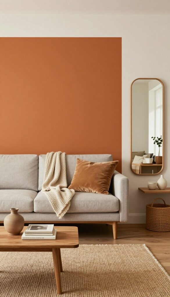
1. Terracotta for Earthy Depth
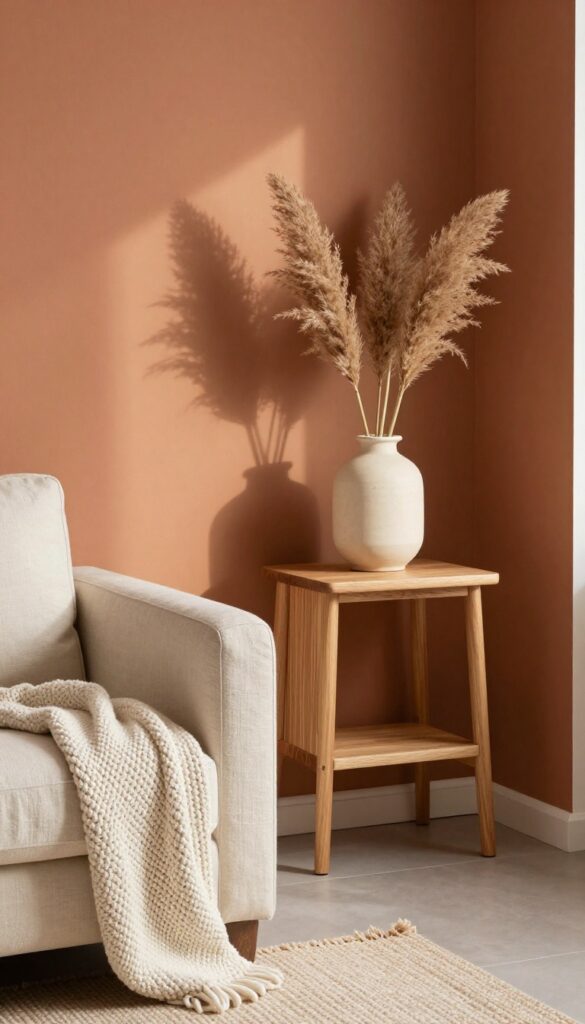
Terracotta brings a grounded, sun-baked warmth that feels natural and inviting. In a small living room, it adds richness without darkening the space too much. Pair with cream textiles and light wood furniture to keep the look balanced.
Terracotta walls instantly make a room feel cozy and lived-in, like a sun-drenched Mediterranean retreat. The earthy pigment works beautifully in compact spaces because it doesn't overwhelm—instead, it wraps the room in a gentle warmth. To keep things airy, balance the terracotta with plenty of off-white or cream on furniture and soft furnishings.
Light wood floors or a pale jute rug will also help maintain an open, breathable feel.
Best Colors To Pair
Terracotta loves creamy neutrals like ivory, beige, and warm white. For a bolder look, add touches of deep olive green or dusty blue in throw pillows or artwork. Avoid cool grays or stark whites—they'll clash with the warmth.
Small-space Fix
If your living room is on the smaller side, paint just one accent wall in terracotta and keep the other walls a soft neutral. This gives you the cozy depth without closing in the room. A terracotta wall behind the sofa works especially well.
Texture Mix
Terracotta walls pair beautifully with natural textures. Think linen curtains, a chunky knit throw, rattan baskets, and unglazed ceramic planters. These materials echo the earthy vibe and add visual interest without clutter.
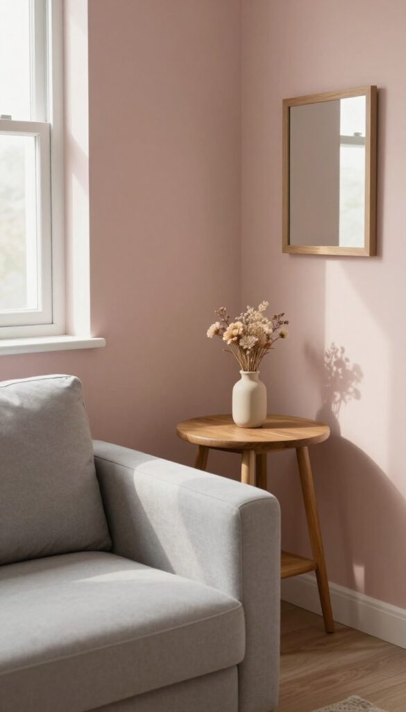
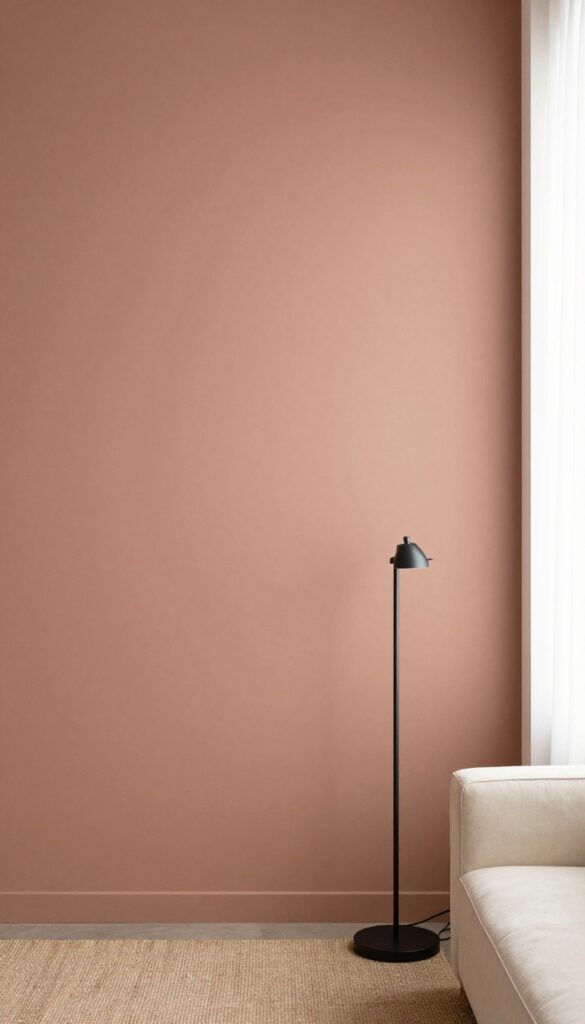
2. Warm Beige with a Rosy Undertone
Flat builder beige can feel dull, but a warm beige with a hint of rose completely changes the vibe. This soft, blushing neutral adds warmth without going pink, making your living room feel instantly cozier. It’s especially flattering in small spaces because it reflects light beautifully, giving the illusion of more square footage.
Pair it with brass accents and linen curtains, and you’ve got a room that feels both airy and intimate.
This shade works like a neutral but brings a subtle warmth that standard beige lacks. The rosy undertone catches natural light and makes the room glow, which is a game-changer for compact living areas. It’s also incredibly versatile—it complements wood tones, creamy whites, and even deeper earthy hues.
To keep the look cohesive, stick with warm metallics like brass or gold for hardware and light fixtures. Linen drapes in a similar warm tone will soften the edges and enhance the airy feel.
Best Colors To Pair
Stick with warm whites, soft creams, and muted taupes for trim and adjacent walls. Accent colors like terracotta, dusty rose, or warm olive green work beautifully in pillows or throws. Avoid cool grays or stark whites—they’ll clash with the rosy warmth.
Small-space Layout Tip
Use the same warm beige on the ceiling as well as the walls. This eliminates visual breaks and makes the room feel taller and more expansive. Add a large mirror opposite a window to bounce light around the space.
Finishing Touch
Layer in texture with a chunky knit throw in cream or blush, and choose a brass floor lamp with a linen shade. The combination of soft paint, natural fabrics, and warm metal creates a subtle glow that makes the room feel polished but lived-in.
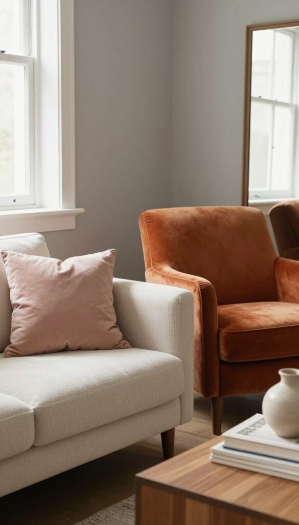
3. Dusty Rose for Gentle Romance
Dusty rose is that rare shade that feels soft without being childish. It brings a gentle warmth that makes any room feel more intimate, especially when you keep the finish matte. In a small living room, this muted pink becomes a quiet focal point that doesn't overwhelm the space.
Pair it with gray or beige furniture, and you get a look that's both romantic and grounded.
This color works because it's sophisticated but still cozy. It's not a loud pink—it's more like a whisper of color that wraps the room in a subtle glow. The matte finish is key here; it keeps the wall looking modern and prevents any glare that could cheapen the effect.
Dusty rose also plays well with natural light, shifting from a soft blush in the morning to a deeper mauve in the evening. For a small space, this means your walls feel alive without needing much else.
Best Furniture Pairings
- Stick with neutral furniture to let the wall color shine. A light gray sofa or beige armchairs create a calm backdrop that makes the dusty rose pop without clashing. Wood tones in medium oak or walnut add warmth and keep the room from feeling too cool.
- Avoid dark or bright furniture colors, which can fight with the pink and make the space feel busy.
Small-space Layout Tip
- Use dusty rose on a single accent wall behind your sofa or bed to define the seating area without closing in the room. In a small living room, this draws the eye to one spot and makes the space feel larger. Keep the other walls a soft white or light gray to maintain an open, airy feel.
- Add a mirror opposite the accent wall to reflect light and visually expand the room.
Finishing Touch
- Layer in textures like a chunky knit throw in cream or a velvet cushion in a deeper rose tone. This adds depth and keeps the look from feeling flat. A few dried pampas grass stems in a ceramic vase on the coffee table reinforce the romantic, natural vibe.
- Avoid glossy accessories—stick with matte metals and natural materials to stay cohesive.
4. Golden Ochre for Sunny Energy
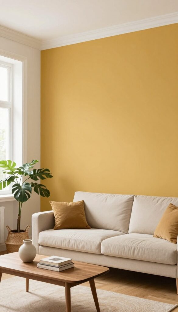
Golden ochre is one of those colors that instantly lifts your mood. It brings a cheerful, sun-drenched warmth to any room without feeling too loud or demanding. On a single accent wall, it creates a focal point that draws the eye and makes a small living room feel noticeably brighter.
The key is pairing it with neutral furnishings and letting natural light do the rest.
When you paint one wall in a warm golden ochre, you're essentially inviting the sun inside. This shade works especially well in smaller living rooms because it adds depth and energy without overwhelming the space. The trick is to keep the rest of the room calm—think beige or cream sofas, light wood floors, and soft white trim.
The contrast makes the ochre wall pop while keeping the overall vibe cozy and grounded. Add a few leafy plants and some woven textures, and you've got a space that feels both vibrant and relaxing.
Best Colors To Pair With Ochre
Stick with warm neutrals like cream, beige, and taupe for the other walls and large furniture. For a bolder look, try deep navy or forest green on a few accessories or an adjacent wall. Ochre also loves natural wood tones, so bring in a walnut coffee table or oak shelving to reinforce the warmth.
Small-space Layout Tip
Place the ochre wall behind a sofa or a console table to create a clear focal point. Keep furniture low and leggy to maintain an open feel. A mirror on the opposite wall will bounce light around and make the room feel larger.
Lighting And Texture Mix
Warm white or soft yellow light bulbs enhance ochre's golden undertones. Layer in textured throws, a chunky knit blanket, and a jute rug to add coziness. Avoid shiny finishes—matte paint and natural fabrics keep the look grounded and inviting.
5. Deep Olive Green for Cozy Sophistication
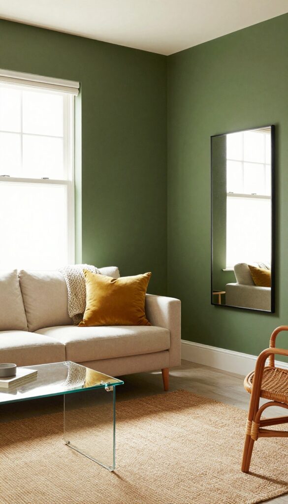
Deep olive green wraps a room in earthy elegance. It's dark but not heavy, and in a small living room, it creates a cocooning effect. Pair with warm woods and cream or mustard accents for a cohesive look.
Deep olive green is a surprisingly versatile choice for small living rooms. It grounds the space without making it feel cramped, especially when balanced with lighter furnishings and plenty of natural light. The key is to use it on all four walls for that immersive, cozy feel—like being wrapped in a soft blanket.
Finish the look with warm wood tones, creamy textiles, and touches of mustard or brass for a sophisticated yet inviting vibe.
Best Colors To Pair
Stick with warm neutrals like cream, beige, and tan to keep the room bright. Mustard yellow and burnt orange add a playful pop, while brass or gold accents bring a touch of elegance. Avoid cool grays or stark whites—they can clash with olive's warmth.
Small-space Layout Tip
In a compact living room, let the dark walls recede by keeping furniture low and light. A cream sofa with slim legs and a glass coffee table will keep the space airy. Add a large mirror opposite a window to bounce light around the room.
Texture Mix
Olive green walls crave texture to avoid feeling flat. Layer in a chunky knit throw, a velvet mustard pillow, and a jute rug. Woven wood blinds or a rattan chair add natural warmth that complements the earthy green.
6. Warm Gray with a Taupe Base
Neutrals don't have to be boring, and warm gray with a taupe base proves it. This shade sits right between gray and beige, picking up just enough brown to feel grounded and inviting. It's the kind of color that makes a room feel like a hug—without screaming for attention.
In a small living room, it works especially well because it reflects light nicely while still adding depth. You can pair it with almost any accent color, from dusty rose to deep navy, and it will quietly hold the space together. Think of it as your room's reliable best friend: always there, never overpowering, but somehow making everything look better.
Warm gray with taupe undertones is the perfect neutral for small spaces—it's cozy without being dull. It works as a backdrop for colorful art and furniture. Add textured throws and pillows for extra warmth.
Best Colors To Pair
- This taupe-based gray plays beautifully with both warm and cool tones. For a cohesive look, try pairing it with creamy whites, soft blush, or muted terracotta. If you want a bit of contrast, deep charcoal or olive green accessories will pop without clashing.
- The key is to stick with muted, earthy shades that echo the taupe undertone.
Small-space Layout Tip
- In a compact living room, use this wall color to create a seamless flow. Keep furniture low-profile and in a similar neutral palette so the walls visually recede. A large mirror opposite a window will bounce light around, making the room feel airier.
- Add a single statement piece—like a burnt orange velvet chair—to draw the eye without overwhelming the space.
Texture Mix
Since the wall color is understated, texture becomes your secret weapon. Layer a chunky knit throw over a linen sofa, add a jute rug, and incorporate velvet or faux-fur pillows. This mix keeps the room from feeling flat and adds the tactile warmth that makes a small space feel lived-in and inviting.
7. Burnt Orange for Retro Charm
Burnt orange has a way of making a room feel instantly lived-in and spirited. It’s that perfect shade between pumpkin and terracotta—warm without being loud, nostalgic without feeling dated. In a small living room, this color adds depth and personality without overwhelming the space, especially when used on a single accent wall or in a geometric pattern.
This retro hue pairs beautifully with natural materials like wood and rattan, and it plays well with neutrals such as cream, beige, and warm gray. To keep the room from feeling too heavy, balance the burnt orange with plenty of light-colored textiles and open shelving. Mid-century modern furniture—think slim legs, organic shapes—completes the look without competing for attention.
Best Colors To Pair With Burnt Orange
Stick with warm neutrals like ivory, camel, and taupe to let the orange shine. A touch of deep teal or olive green can add a sophisticated contrast if you’re feeling bold. Avoid cool grays or stark whites, which can make the orange feel harsh.
Small-space Application
In a compact living room, use burnt orange on the wall behind the sofa or as a bold stripe in a painted geometric pattern. Keep the rest of the walls light to maintain an airy feel. A large mirror opposite the accent wall will bounce light around and make the room feel bigger.
Texture Mix For Cozy Vibes
Layer in textures like a chunky knit throw, a velvet pillow, and a jute rug to soften the bold wall color. A matte finish on the paint helps the room feel more grounded and less glossy. Add a warm-toned wood coffee table or sideboard to tie the retro look together.
8. Soft Clay for a Modern Earthy Look
Soft clay is that muted, warm pinkish-brown that feels both contemporary and grounded. It's light enough to keep a small room feeling open but has enough depth to add real character. This shade works especially well in compact living rooms where you want warmth without the weight of a darker color.
Pair it with black accents and natural fibers, and you get a chic contrast that feels intentional and fresh.
Soft clay strikes a perfect balance between neutral and personality. It's not as stark as white, not as heavy as brown, and not as sweet as pink. Instead, it sits right in the middle, making any small living room feel airy but cozy.
The key is to let the wall color be the star while keeping furniture and decor simple. Think a black metal floor lamp, a jute rug, linen curtains, and a low-profile sofa in cream or taupe. The contrast between the soft clay walls and darker accents creates visual interest without clutter.
For a small space, this combination makes the room feel larger because the eye moves easily from light walls to dark details without getting stuck.
Best Colors To Pair
- Soft clay loves black, charcoal, and deep navy for contrast. It also works beautifully with warm whites like ivory or cream, and natural wood tones such as oak or walnut. Avoid pairing it with cool grays or stark white, which can make the clay look muddy.
- Instead, stick to earthy companions: terracotta, rust, olive green, and camel leather all enhance the warmth.
Small-space Layout Tip
- In a small living room, use soft clay on all four walls to create a seamless, cocooning effect. Then anchor the room with one dark piece, like a black media console or a charcoal sofa. Keep furniture low and leggy to maintain sight lines.
- A round coffee table in light wood or black metal helps the space feel less boxy and more open.
Texture Mix For Depth
Since soft clay is a flat, matte finish, bring in texture through fabrics and accessories. A chunky knit throw, a sisal rug, velvet cushions in rust or olive, and a woven basket for blankets add layers without adding color. The contrast between smooth walls and tactile materials makes the room feel richer and more inviting.
9. Rich Plum for Dramatic Warmth
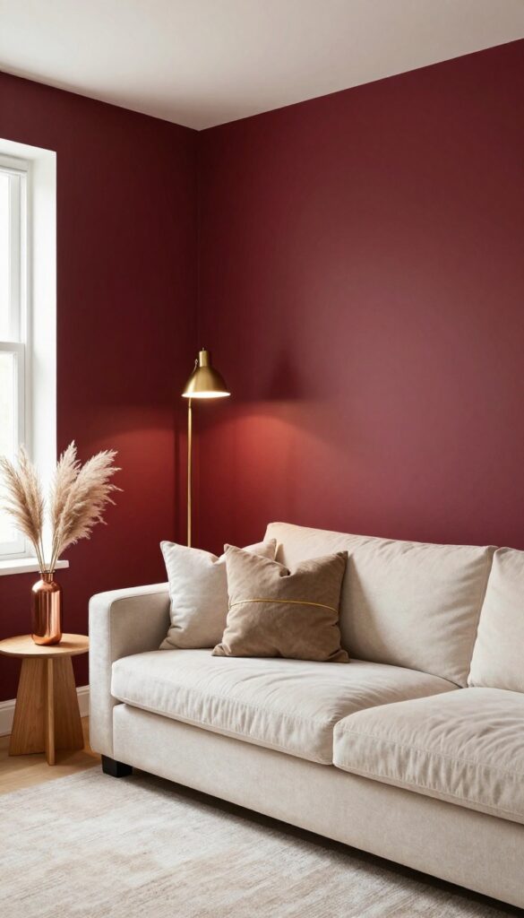
Plum isn't just a color; it's a mood. When you paint a wall this deep purple, you're adding instant drama and a layer of cozy luxury that feels both sophisticated and inviting. For a small living room, the trick is to use it sparingly—think of it as a jewel-toned accent rather than an all-over commitment.
A single feature wall behind the sofa does the job beautifully, creating a focal point that draws the eye without overwhelming the space. Pair it with light-colored furniture and a few metallic touches, and you've got a room that feels rich, warm, and perfectly balanced.
Rich plum is a bold choice that adds luxury and warmth. In a small living room, it works best on a feature wall behind the sofa. Balance with light-colored furniture and metallic accents to prevent the room from feeling too dark.
Best Colors
- Stick with a deep, warm plum that has red undertones rather than blue. Think more 'ripe fig' than 'cold grape.' This warmth keeps the room feeling cozy. Pair it with soft neutrals like cream, beige, or warm white on the other walls and larger furniture pieces.
- For a pop of contrast, add touches of gold, brass, or copper in your light fixtures, picture frames, or side table legs.
Small-space Fix
- In a compact living room, plum can make the space feel smaller if you paint all four walls. Instead, paint just one wall—ideally the one your sofa sits against. This creates a strong visual anchor and adds depth without closing in the room.
- Keep the ceiling and remaining walls a light, airy color to maintain an open feel.
Finishing Touch
Add a large mirror on the plum feature wall to bounce light around the room and prevent the dark color from feeling heavy. Choose a mirror with a slim metallic frame—gold or brass works perfectly. This simple addition reflects both natural and artificial light, making the whole space feel brighter and more spacious.
10. Creamy Butter for Soft Radiance
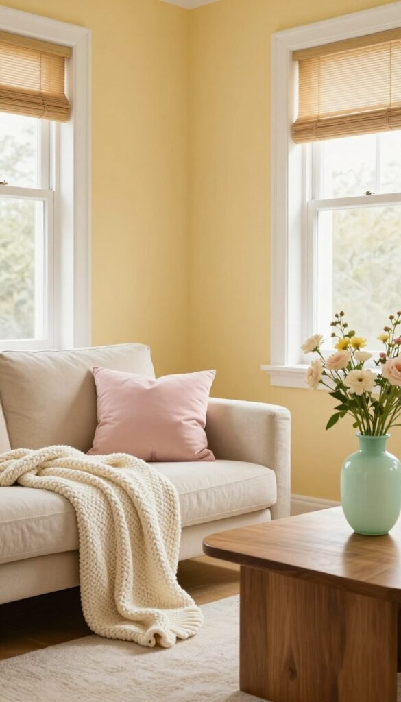
Yellow can be tricky in a small space—too bright and it feels overwhelming, too muted and it falls flat. Creamy butter finds that sweet spot: a cheerful, light yellow that fills a room with soft radiance without shouting for attention. It’s the color of morning sunlight hitting a warm croissant, and it makes even the tiniest living room feel airy and open.
Creamy butter walls work because they reflect light beautifully. In a small living room, that light-bouncing quality makes the space feel larger and more inviting. Pair the walls with crisp white trim and a few pastel accessories—like a pale pink throw or a mint green vase—to keep the look fresh and cohesive.
The warmth of the yellow prevents the room from feeling sterile, while the light tone keeps it from closing in. For a cozy touch, add a chunky knit blanket in cream or soft beige on the sofa. This color also pairs well with natural wood tones, so consider a walnut coffee table or bamboo blinds to ground the space.
Best Color Pairings
Creamy butter works beautifully with white, soft gray, and pale blush. For a bolder contrast, try navy blue accents—like a navy ottoman or throw pillows—to add depth without overwhelming the room. Stay away from harsh, cool tones like stark gray or icy blue, as they can clash with the warmth.
Small-space Fix
In a compact living room, use creamy butter on three walls and paint the fourth wall a slightly deeper shade, like warm vanilla or light honey. This creates subtle dimension and makes the room feel longer. Keep furniture light in color and low-profile to maintain an open, airy flow.
Finishing Touch
Hang sheer white curtains to let in natural light, and place a mirror opposite a window to amplify the glow. A round mirror with a thin gold frame adds a touch of elegance without taking up visual space. Finish with a few potted plants—like a snake plant or pothos—to bring in a hint of green that complements the buttery walls.
11. Warm Cocoa for a Cozy Neutral
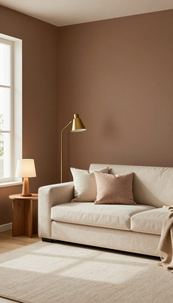
Deep brown walls might sound bold, but warm cocoa is one of those shades that instantly wraps a room in comfort. It's like your favorite chunky knit sweater—familiar, grounding, and effortlessly stylish. In a small living room, this rich neutral actually helps the space feel more intimate and cocoon-like rather than cramped.
The trick is to let it shine on all four walls for a seamless, monochromatic backdrop that makes the room feel larger and more cohesive.
Warm cocoa works especially well in living rooms that get plenty of natural light, but it's surprisingly forgiving in dimmer spaces too. The brown undertones keep it from feeling cold or flat, and it pairs beautifully with cream, ivory, and soft gold accents. If you're worried about the room feeling too dark, balance the walls with a light-colored rug and plenty of layered lighting—think floor lamps, table lamps, and maybe a warm-toned pendant.
The result is a living room that feels like a hug, perfect for unwinding after a long day.
Best Colors To Pair
- Cream and off-white are your best friends here. They provide the contrast that keeps the space from feeling too heavy. Gold and brass accents add a touch of warmth and sophistication, while soft blush or dusty rose can bring in a subtle pop of color without competing with the brown.
- Avoid stark white or cool gray—they'll clash with the cozy vibe.
Small-space Fix
Painting all walls the same warm cocoa color creates a seamless look that tricks the eye into seeing more space. To enhance the effect, use curtains that match the wall color and choose furniture with visible legs to keep the floor area open. A large mirror opposite a window will bounce light around the room and prevent the brown from feeling too enveloping.
Texture Mix
Because the walls are a solid neutral, texture becomes your secret weapon. Layer a chunky knit throw over a linen sofa, add a velvet pillow or two, and bring in a woven jute rug. The interplay of smooth, rough, and soft surfaces adds depth and keeps the room from looking flat or one-dimensional.
FAQ
What warm paint color is best for a small living room?
Soft clay, warm beige with rosy undertones, and creamy butter are excellent choices because they add warmth without overwhelming the space. They reflect light well and keep the room feeling open.
Can I use dark warm colors in a small living room?
Yes, but use them strategically. Deep olive green or rich plum work beautifully on an accent wall or in a room with good natural light. Balance with light furniture and mirrors to maintain an airy feel.
How do I make a warm paint color feel modern?
Choose muted, sophisticated shades like dusty rose or warm cocoa. Pair them with clean-lined furniture, metallic accents, and plenty of texture. A matte finish also helps keep the look contemporary.
What undertones should I look for in warm paint colors?
Look for undertones of red, yellow, or brown. Avoid colors with gray or blue undertones if you want true warmth. Test samples on your wall to see how they look in different lighting.
How can I make a small living room feel cozy with paint?
Use warm, rich colors like terracotta or warm cocoa on all walls for a cocooning effect. Add layered lighting, soft textiles, and natural elements to enhance the cozy atmosphere.
Conclusion
Warm paint colors have a way of transforming a living room into a space that feels truly inviting, even when square footage is limited. The key is choosing a shade that resonates with your personal style while keeping the room balanced and functional.
Whether you go for a soft clay or a rich plum, let your walls reflect the warmth you want to feel every day. Remember, paint is one of the easiest and most affordable ways to refresh your home—so have fun with it and trust your instincts.