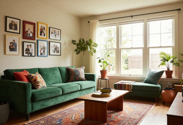
13 Living Room Painting Ideas for a Home That Feels Finished
Most living rooms don't need new furniture to feel finished. They need paint. A single can can fix a blank wall, sharpen the trim, or make a dated built-in disappear into the background.
The catch is choosing a move that fits your room and your patience level. Some of these are weekend projects. A few take a steady hand and a free afternoon.
All thirteen are doable without hiring anyone. We'll go from simple swaps to bolder statements, with notes on prep, cost, and where each idea works best. Pick one, or stack a couple, and watch the room finally pull together.
1. Paint an Accent Wall Behind the Sofa
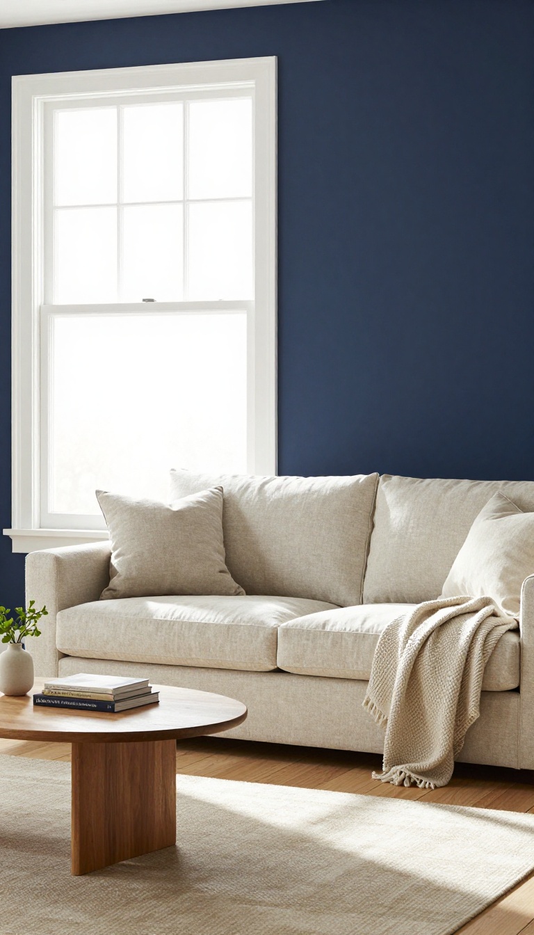
The wall behind your sofa is prime real estate. It's the backdrop for every movie night, every conversation, every lazy Sunday nap. Painting it a bold or deep color instantly anchors the seating area and gives the room a clear focal point.
Best of all, it's a project you can knock out in a weekend with minimal supplies.
An accent wall works because it creates contrast without overwhelming the space. You're not committing to a full-room color change, just one wall that does the heavy lifting. The sofa area suddenly feels intentional, like you planned it rather than just pushed furniture against a blank wall.
And because you're only painting one surface, the cost and time are refreshingly low.
Why The Wall Behind The Sofa?
That wall is naturally the visual anchor of the room. Your eye lands there when you walk in, and it frames the main seating zone. Painting it a deeper or more saturated shade draws attention exactly where you want it.
It also makes the sofa pop instead of blending into a sea of beige.
Picking The Right Color
Go two or three shades darker than your current wall color for a subtle, sophisticated look. For more drama, choose a rich jewel tone like navy, emerald, or charcoal. If your sofa is dark, try a lighter accent wall to create balance.
Test a few samples on the wall and look at them at different times of day before you commit.
Prepping And Painting Like A Pro
Clear the wall and move the sofa to the center of the room. Wipe down the wall with a damp cloth to remove dust, then tape off the trim and ceiling. Use a angled brush for edges and a roller for the main field.
Two coats usually do it, and you can remove the tape while the second coat is still slightly wet for cleaner lines.
Making It Feel Finished
Once the paint is dry, hang a large piece of art or a mirror centered above the sofa. Add a pair of wall sconces or a slim console table to ground the space. The accent wall becomes the starting point, not the whole story.
A few intentional touches turn a painted wall into a designed moment.
2. Color Drench the Entire Room
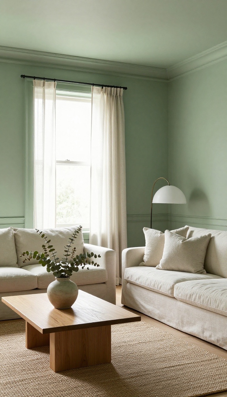
Color drenching means painting walls, trim, ceiling, and sometimes doors in the same color. The result is a room that feels wrapped and intentional, not chopped into separate zones. It’s a designer trick that makes small spaces feel bigger and big spaces feel cozier.
Most rooms have a white ceiling and white trim by default. That contrast draws lines everywhere and can make a space feel busy. When you drench, those lines disappear.
The eye reads the room as one calm volume, which instantly looks more high-end. You can go light for an airy feel or dark for drama. Either way, the finish looks deliberate.
Pick A Color That Works On Every Surface
Not every paint color looks good on trim and ceiling. Whites and off-whites are safe, but they can feel flat. Muted greens, blues, and warm grays tend to hold up well.
Test the color on all three surfaces before you commit. Sheen matters too: use flat or matte on walls and ceiling, satin or semi-gloss on trim. Same color, different sheen, keeps things from looking like a painted box.
Prep And Paint In The Right Order
Start with the ceiling, then walls, then trim. That way drips and touch-ups are easier. Tape off windows and floors, and use a quality angled brush for edges.
If you’re painting the ceiling the same color, cut in carefully where it meets the walls. Two coats are usually enough, but dark colors may need three. Let each coat dry fully before judging the color.
Make It Work In Small And Large Rooms
In a small room, a light drench can make walls feel farther apart. In a large room, a deep drench can make it feel snug and cozy. If you have low ceilings, drenching in a light color can lift them visually.
For high ceilings, a dark drench brings them down to a human scale. Either way, keep the furniture simple so the color does the talking.
3. Create a Faux Wainscoting with Paint
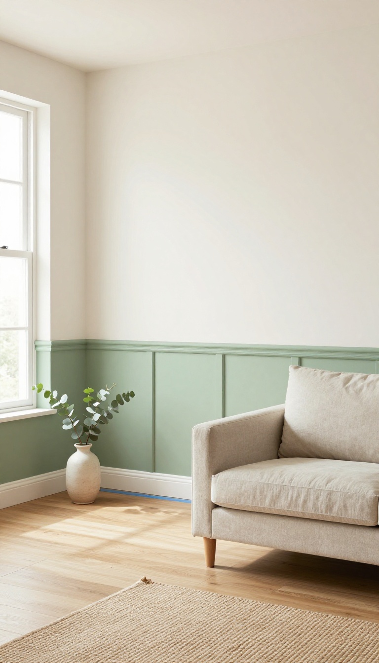
Plain drywall doesn't have to stay plain. With a roll of painter's tape and a quart of paint, you can fake the look of classic wainscoting in a single afternoon. It's the kind of upgrade that makes guests ask when you installed the paneling—and you get to say, 'Actually, that's paint. '
Faux wainscoting works because it tricks the eye. Real wainscoting adds depth and shadow lines that break up a wall. Paint can do the same if you plan the layout and use the right colors.
You'll spend a fraction of what wood would cost, and you won't need a saw or a nail gun. The only tools are tape, a level, a pencil, and a brush or small roller.
Map Out Your Layout
Start by deciding how high you want the faux paneling to go. A common height is 32 to 36 inches from the floor, but you can go higher for a more dramatic look. Use a level to draw a horizontal line across the wall.
Then mark vertical lines every 18 to 24 inches to create the panel sections. The spacing can be even or you can center a panel on the wall for symmetry. Keep the lines light with a pencil so you can erase later.
Tape And Paint The Panels
Press painter's tape along your pencil lines to create the frame and vertical dividers. Burnish the edges with a fingernail so paint doesn't bleed underneath. If you want the panels to look recessed, paint inside the tape lines with a color slightly darker than the wall.
For a raised look, paint the tape lines themselves with a contrasting trim color. Let the first coat dry, then apply a second if needed. Remove the tape while the paint is still slightly tacky to get clean edges.
Add Depth With A Shadow Line
The secret to realistic faux wainscoting is a shadow line. Once your panels are painted, use a fine brush to add a thin line of darker paint along one side of each vertical and horizontal strip. This mimics the shadow cast by real wood molding.
Keep the line consistent—about an eighth of an inch wide—and place it on the same side of every strip. It's a small detail that makes a big difference.
Choose Colors That Fit Your Room
Classic wainscoting is often white or off-white, but you can match your existing trim or go bold. A deep navy or forest green below a lighter wall color feels modern and cozy. If your walls are already a strong color, try a tone-on-tone approach with a glossier finish for the faux panels.
Just make sure the two colors have enough contrast to read as separate elements. Test a small area first to see how the light hits it.
4. Paint the Ceiling a Surprising Color
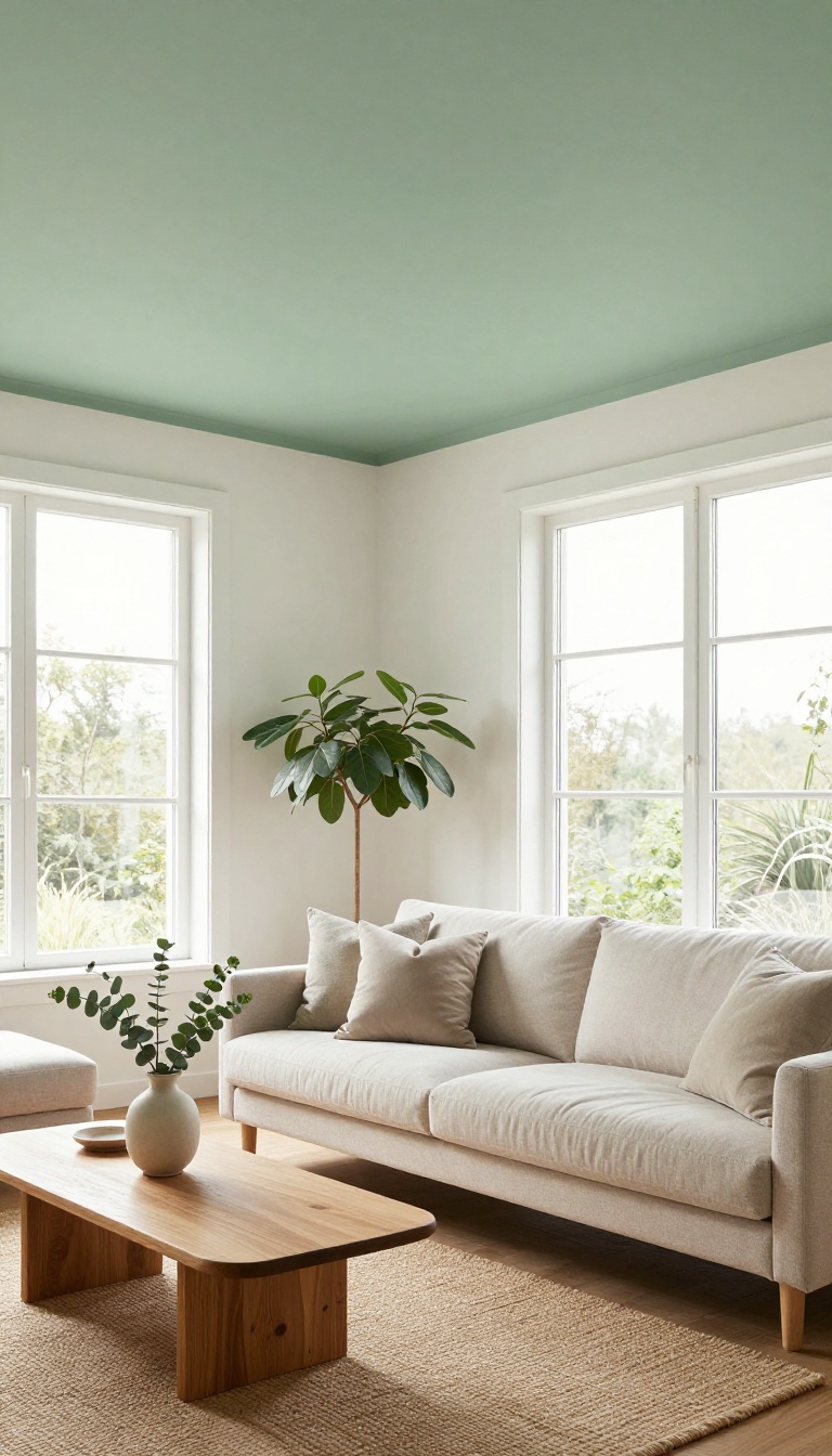
Your ceiling is the biggest blank canvas in the room, and most of us ignore it. Painting it a color—or even a soft pattern—adds instant dimension and pulls the eye upward. It’s a designer move that makes the whole space feel intentional.
And it’s easier than you think.
A white ceiling is safe, but it’s also forgettable. When you paint it a color, you create a subtle shift that makes the room feel taller, cozier, or just more interesting. The trick is picking a shade that complements your walls without fighting them.
You don’t need to go dark and dramatic. Soft blues, warm grays, and muted greens are forgiving and flattering. They reflect light gently and make the ceiling feel like part of the design, not an afterthought.
Before you commit, think about your room’s height and light. Low ceilings benefit from light, airy colors that recede. High ceilings can handle deeper tones that bring the space down to a human scale.
And if you’re nervous, start with a tint that’s just a few shades darker than your walls.
Pick A Shade That Plays Nice
The safest bet is a color already in your room—pulled from a rug, artwork, or throw pillow. That keeps things cohesive. If you want a little contrast, choose a lighter or darker version of your wall color.
For a bolder look, try a soft sky blue or pale blush. Just avoid anything too saturated unless you’re going for a jewel-box effect.
Prep And Paint Like A Pro
Ceilings are awkward to paint, so prep matters. Move furniture, cover the floor, and tape off the walls. Use a roller with an extension pole and cut in edges with a brush.
Two thin coats beat one thick one. And if you’re adding a pattern, measure and mark lightly with chalk first. It wipes away clean.
When To Skip The Paint
If your ceiling has water stains, cracks, or texture you don’t love, fix those first. Paint won’t hide major flaws. Also, if the room is already dark and small, a colored ceiling might make it feel like a cave.
In that case, stick to a barely-there tint or skip it altogether.
5. Add a Painted Arch or Geometric Shape
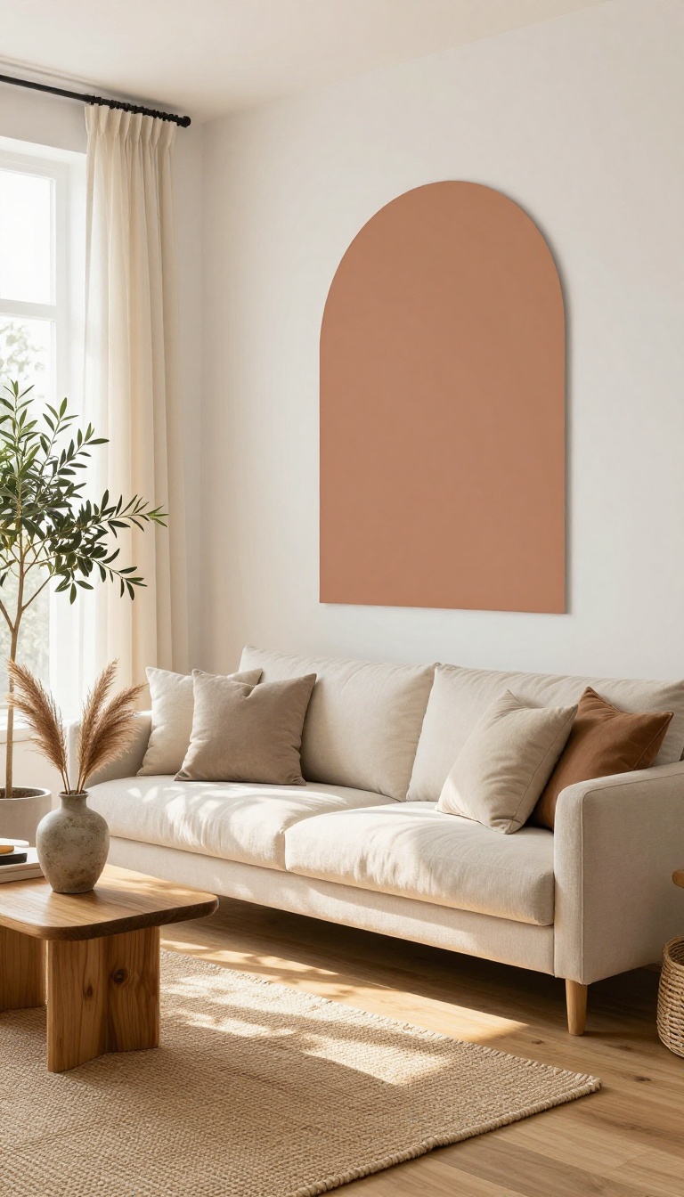
A painted arch or geometric shape turns an empty wall into a focal point without hanging a single thing. It's a playful move that suits modern, eclectic, and even traditional rooms when you pick the right colors. You can stencil it for crisp edges or go freehand for a looser, hand-painted feel.
The best part? You don't need to be an artist. A level, some painter's tape, and a free afternoon are enough to pull this off.
And if you change your mind later, a coat of primer erases the whole thing.
Choosing A Shape That Fits Your Room
Arches soften a space and draw the eye upward, which helps low ceilings feel taller. Circles and half-circles add a graphic punch and work well above furniture like a sofa or console. If you want something more organic, try a wavy blob or an abstract squiggle—just keep the scale in proportion to the wall.
A shape that's too small looks like a mistake; too large and it overwhelms the room.
Tools And Tape Tricks For Clean Lines
For an arch, trace a half-circle using a string tied to a pencil, then tape along the curve with flexible painter's tape. Geometric shapes are easier: use a level to mark straight edges and press the tape firmly to prevent bleed. Paint two thin coats rather than one thick one, and pull the tape while the paint is still slightly wet for the sharpest edge.
Freehand works too—just sketch your shape in chalk first so you can adjust before committing.
Color Pairings That Look Intentional
A tone-on-tone shape—like a slightly darker shade of your wall color—adds subtle depth without shouting. For contrast, pick a hue that already appears in your rug, art, or pillows so the shape feels connected to the room. Metallics and chalkboard paint are fun for kids' spaces or home offices, but in a living room, a matte or eggshell finish usually looks more polished.
Where This Idea Works Best
Blank walls behind a sofa, beside a fireplace, or at the end of a hallway are prime spots. It's also a smart fix for rental walls if you're allowed to paint and plan to repaint before you move. Skip it on walls with heavy texture or peeling paint—the shape will highlight every flaw instead of hiding them.
6. Refresh Built-Ins with a Contrasting Color
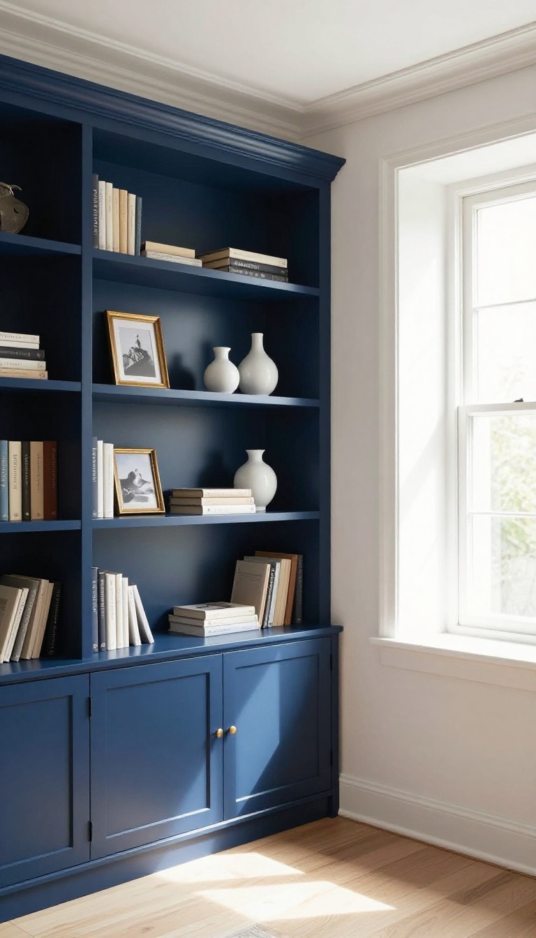
Built-ins are supposed to make a room look custom, but when they blend into the wall, they can feel like a missed opportunity. Painting them in a color that contrasts with the walls instantly turns them into a feature. It also gives your books, ceramics, and framed photos a clean backdrop to stand out against.
The best part? You don't need to rip anything out or spend a fortune. A gallon of paint and a free weekend can transform the whole wall.
Whether your built-ins are original to the house or big-box store basics, a contrasting color makes them look intentional and finished.
Contrast doesn't mean loud. It means the shelves and cabinets read as separate from the wall, so they get noticed. That could be a deep navy against soft white walls, a warm charcoal against pale gray, or even a muted green against cream.
The goal is to create a clear visual break without turning the room into a circus. Before you pick a color, think about what you're displaying. Dark shelves make light objects pop.
Light shelves make dark objects pop. If your built-ins hold a mix of everything, a mid-tone color gives you the most flexibility. Test a few swatches on the actual shelves, not just the wall, because light hits them differently.
Pick A Color That Plays Well With The Room
Pull one shade from your existing palette and go a few steps deeper or lighter. If your walls are warm white, try a soft black or olive. If your walls are cool gray, a rich navy or forest green works beautifully.
You can also match the color to your sofa or a favorite rug for a cohesive look. Just make sure the contrast is obvious enough to read from across the room.
Prep And Paint Without Losing Your Mind
Remove everything from the shelves and label where it goes back. Lightly sand glossy surfaces and wipe them down with a damp cloth. Use a bonding primer if you're painting over stained or previously painted wood.
Then apply two thin coats of a durable finish like satin or semi-gloss. A small foam roller speeds up the flat areas, and a brush gets into the corners. Let each coat dry fully before judging the color.
Style The Shelves After The Paint Dries
Once the paint cures, put back fewer items than you took out. Group books by color or turn some pages inward for a cleaner look. Add a small plant, a bowl, or a sculptural object to break up rows of spines.
Leave some empty space so the new color can breathe. The contrast will make every piece feel deliberate, like a gallery display rather than a storage dump.
7. Try a Color-Blocked Wall
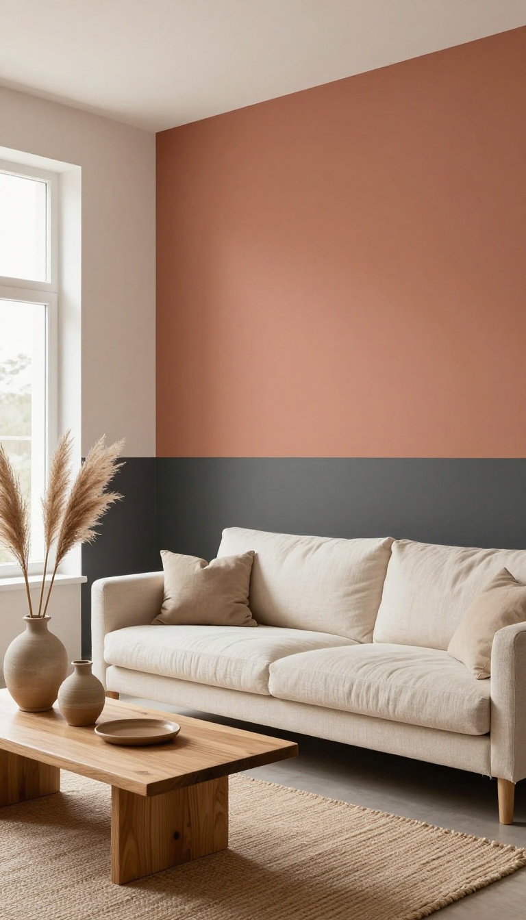
Color blocking takes a plain wall and splits it into two or more painted sections using clean horizontal or vertical lines. It's a graphic, modern approach that adds instant energy without hanging a single thing. The lines can also play with proportions, making a low ceiling feel taller or a narrow room feel wider.
The trick is to treat the wall like a canvas and the paint like shapes. You're not just covering drywall; you're composing a design. That might sound intimidating, but the actual painting is straightforward once you decide where the lines go.
Most color-blocked walls use two or three colors, and you can go subtle with tone-on-tone shades or bold with high-contrast picks.
Horizontal Vs. Vertical Lines
Horizontal bands usually make a room feel wider and can visually lower a high ceiling. Paint the top two-thirds one color and the bottom third another, or flip it for a different effect. Vertical stripes, on the other hand, draw the eye up and add height.
They work well in rooms with low ceilings or to break up a long, empty wall. Just keep the stripe widths consistent unless you're going for a deliberate irregular pattern.
Choosing Colors That Work Together
You don't need a design degree to pick a palette. Start with one color you love and choose a lighter or darker version of it for the second section. That keeps things cohesive.
If you want more contrast, pair a warm neutral with a deep jewel tone, or go graphic with black and white. Test samples on the wall first because light changes everything. And remember, the line where colors meet is the star, so make it crisp.
Getting Clean Lines
Sharp edges make or break this look. Use painter's tape designed for crisp lines, and press it down firmly with a putty knife to prevent bleed. Paint the lighter color first, let it dry, then tape over it and paint the darker color.
Pull the tape off while the paint is still slightly tacky for the cleanest edge. If you're doing a horizontal split, a level is your best friend. Mark your line lightly with a pencil before taping.
Where It Works Best
Color blocking shines on walls that are otherwise boring or awkward. Think behind a sofa, in a dining nook, or on a wall with a TV. It can also define zones in an open-plan space without adding furniture.
Skip it on walls with lots of doors, windows, or built-ins that would interrupt the lines. And if you're renting, consider peel-and-stick wallpaper in solid blocks instead of paint.
8. Paint the Trim for a Polished Look
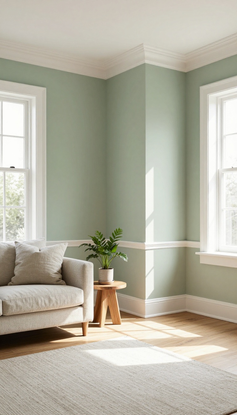
Trim is the outline of your living room. It frames windows, anchors walls, and draws a line between the floor and everything above it. When it's scuffed, yellowed, or painted the same color as the wall, the whole space can feel flat.
A fresh coat on baseboards, crown molding, and window frames sharpens every edge in the room. It's a small change with a big impact.
Painting trim is one of those projects that looks intimidating until you actually start. The prep is straightforward, the materials are cheap, and the payoff is immediate. You don't need to repaint the walls to make it work.
In fact, leaving the walls alone and focusing only on the trim can be the smartest move. It keeps the project small and the contrast bold.
Why Contrast Makes The Room
Trim painted in a contrasting color—like crisp white against a deep wall, or soft black against pale plaster—adds instant definition. It tells your eye where the room begins and ends. That visual structure is what makes a space feel designed rather than default.
Even a subtle shift, like off-white trim on cream walls, can wake things up.
Pick A Finish That Lasts
Trim takes more abuse than walls. It gets bumped by vacuums, brushed by shoes, and wiped down more often. A semi-gloss or satin finish holds up better and cleans easier than flat paint.
It also reflects a little light, which makes the trim pop. Just be sure to sand lightly and use a bonding primer if you're going over old oil-based paint.
The Tools That Save You Time
You don't need a steady hand if you use the right tools. Painter's tape along the wall and floor gives you clean lines without stress. A small angled brush gets into corners and along edges.
For long stretches of baseboard, a mini roller speeds things up. And a good drop cloth protects your floors from drips.
Where It Works Best
This idea shines in rooms with lots of architectural details—crown molding, wainscoting, thick window casings. But it also helps plain rooms by adding a frame where there wasn't one. If your trim is thin or minimal, a contrasting color can make it look more intentional.
Just avoid going too dark in small rooms with low ceilings, or the trim might feel heavy.
9. Create a Faux Brick or Stone Finish
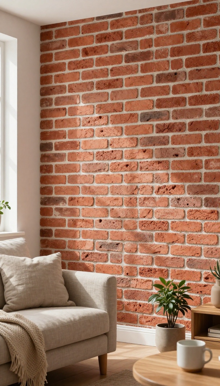
Faux brick or stone gives you the look of masonry without the mess, cost, or structural work. You're basically painting an illusion—using sponges, stencils, and a few layers of color to fake depth and texture. It's a smart move for renters or anyone who wants a rustic or industrial vibe on a budget.
The trick is layering. Real brick and stone have variation, so your paint job should too. You'll start with a base coat, add texture, then build up highlights and shadows until the wall reads as solid and dimensional.
This project takes a weekend, some patience, and a willingness to get a little messy. The payoff is a wall that looks like it's been there for decades—without a single mason in sight.
You don't need a trowel or a pallet of bricks. A few basic supplies and a steady hand will get you there. The key is working in thin layers and stepping back often to check the effect from a distance.
Start by gathering your materials. For faux brick, you'll want a base paint in mortar gray or off-white, a brick-colored paint (or several shades), a sea sponge, a stencil if you want clean lines, and a matte sealer. For faux stone, use a base in a neutral tone, then layer on grays, taupes, and browns with a sponge or rag.
Prep the wall like you would for any paint job. Clean it, fill any holes, and tape off trim. A smooth surface helps the faux finish look convincing.
If your wall is heavily textured, you might want to skim coat it first—or lean into the texture and call it aged stone.
Faux Brick: Stencil Vs. Freehand
Stencils give you consistent brick shapes and straight mortar lines. They're great for beginners and large walls, but you'll need to reposition the stencil carefully to avoid a repeating pattern that looks too perfect. Freehand painting is faster and more organic, but it requires a decent eye for spacing.
If you go freehand, lightly sketch a grid in pencil first, then fill in each brick with a sponge or brush, leaving gaps for mortar. Vary the brick colors slightly—some redder, some more brown—to mimic natural variation.
Faux Stone: Layering For Depth
Stone finishes rely on soft, blended layers. Start with a base coat in a mid-tone gray or beige. Then, use a sea sponge to dab on lighter and darker shades in irregular patches.
Don't overthink it—random is good. Once that's dry, add subtle highlights along the edges of your painted 'stones' with a small brush. A light touch of white or cream makes the stone look raised.
Finish with a matte sealer to protect the finish and keep the sheen realistic.
Where It Works Best
Faux brick shines on a single accent wall, behind a bar cart, or in a reading nook. It can also disguise a boring fireplace surround or add character to a rental kitchen. Faux stone suits entryways, around a fireplace, or on a chimney breast.
Skip it in small, dark rooms—the texture can feel heavy. And avoid using it on every wall; one feature wall is plenty to make a statement without overwhelming the space.
10. Add a Painted Border or Stencil Pattern
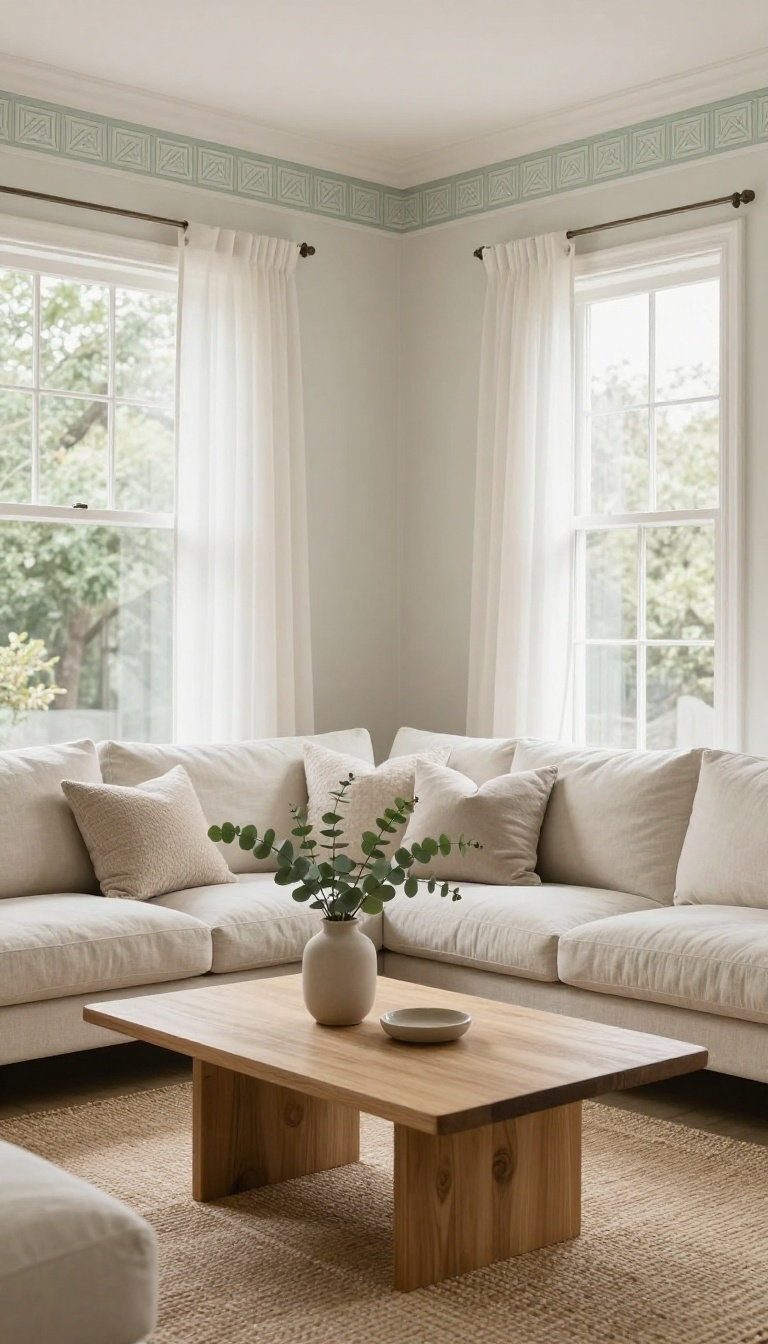
A painted border or stencil pattern gives you the charm of wallpaper without the commitment. You can run a simple stripe along the ceiling line, frame a doorway, or repeat a motif near the floor. It's a small painted detail that makes the whole room feel intentional.
Stencils are forgiving. If you mess up, you paint over it. And because you control the colors, you can match your existing palette exactly.
This is a great project for a weekend, and it costs very little. You don't need to be an artist. A steady hand, a good stencil, and a bit of patience are enough.
The result looks custom, even if it's just a simple repeating shape.
A border or stencil pattern adds a layer of decoration that paint alone can't. It draws the eye up or down, depending on where you place it. And it can make a plain room feel like it has history.
You can go subtle with a tone-on-tone border, or bold with a contrasting stencil. Either way, it's a low-risk way to test a pattern in your space. If you love it, you can expand it later.
If not, a quick coat of paint erases it.
Where To Put A Border
The most common spot is right below the ceiling, like crown molding made of paint. It adds height and frames the room. You can also run a border above the baseboard for a grounded look.
Another option is to frame a large opening or a built-in. A border around a window or door makes it feel more architectural. Just keep the lines level and the width consistent.
Stenciling Basics
Start with a simple repeating pattern. Geometric shapes and small florals are easiest to line up. Use a stencil brush and very little paint—too much causes bleeding.
Secure the stencil with painter's tape or spray adhesive. Practice on a piece of cardboard first. Work in small sections and step back often to check your alignment.
Tools And Tips
You'll need a stencil, stencil brush or small foam roller, painter's tape, and a level. A laser level helps keep things straight. For borders, a chalk line works well.
Clean your stencil between uses if the paint builds up. And always keep a damp rag nearby for quick fixes. If you're doing a border, paint it after the wall color is fully dry.
Making It Look Custom
Choose a color that's a shade or two darker than your wall for a subtle look. For contrast, pick a complementary color. Metallic paints add a little shimmer without being loud.
You can also layer stencils for a more complex pattern. Just keep the scale small so it doesn't overwhelm the room. And remember: less is often more with stencils.
11. Use a High-Gloss Finish for a Modern Vibe
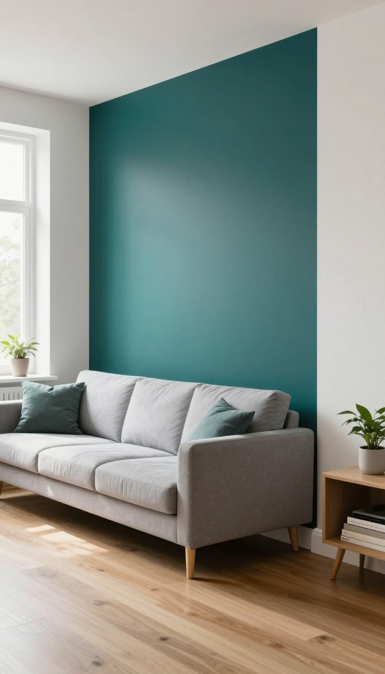
High-gloss paint is the opposite of subtle. It catches every bit of light and throws it back, so walls and trim look almost wet. That shine reads as modern, clean, and a little bit bold.
It's also tough as nails, which matters in a room where people actually live. The trade-off is prep—gloss shows every bump and brushstroke, so you have to do the work up front.
You don't have to paint an entire room in gloss to get the effect. A single accent wall, the trim, or even just the ceiling can deliver the same sleek punch without turning your living room into a funhouse. The key is knowing where gloss works and where it fights you.
Where Gloss Shines (literally)
Trim, doors, and built-ins are the safest bets. They're small surfaces, so the shine feels intentional, not overwhelming. A glossy front door or window casing looks crisp and modern against matte walls.
If you want to go bigger, try one accent wall behind a sofa or media unit. It draws the eye and makes the room feel taller. Just avoid gloss on large, imperfect walls—every dent and patch will show.
Prep Is Non-negotiable
Gloss amplifies texture. Sand smooth, fill holes, and prime with a high-quality primer. Use a foam roller for cabinets and trim, and a synthetic brush for edges.
Work in thin coats—two or three light passes beat one thick one. Let each coat dry fully before the next. If you rush, you'll see lap marks forever.
Cleaning And Care
The upside of gloss is how easy it is to wipe down. Fingerprints, scuffs, and dust come off with a damp cloth. That makes it great for high-traffic zones, kids, and pets.
Just avoid abrasive cleaners—they dull the finish over time. A little mild soap and water keeps it looking new for years.
12. Paint a Mural or Scenic Backdrop
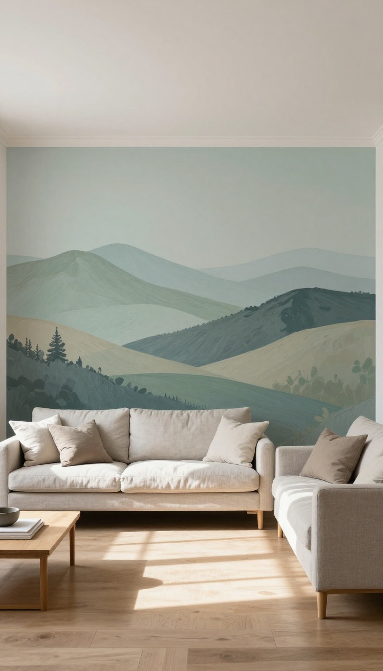
A mural turns one wall into the focal point of the whole room. It can be a soft landscape, an abstract wash, or a simple line drawing that stretches floor to ceiling. The trick is scale and placement.
A mural works best on a wall that doesn't compete with windows, doors, or heavy furniture. Give it breathing room and it will make the space feel intentional, not busy.
You don't need to be an artist to pull this off. Many murals are built from simple shapes, repeated strokes, or a projected outline you trace and fill in. The goal is atmosphere, not perfection.
Pick A Scene That Fits The Room
A living room with warm wood tones loves a muted mountain range or rolling hills. A bright, modern space can handle bold geometric shapes or a single oversized botanical. Match the mood you already have instead of fighting it.
Use A Projector Or Grid Method
Sketch your design on paper first, then project it onto the wall at night and trace the lines with a pencil. No projector? Draw a grid on your reference image and a matching grid on the wall, then copy it square by square.
Choose The Right Paint And Finish
Flat or matte paint hides brush marks and blends softly, which is ideal for landscapes. For a crisper graphic look, use satin or eggshell. Keep a small container of each color for touch-ups later.
Seal It And Style Around It
Once the mural dries, a clear matte sealer protects it from scuffs and sunlight. Then keep the rest of the wall simple. Let the mural be the star and pull furniture colors from it so the room feels tied together.
13. Update the Fireplace Surround with Paint
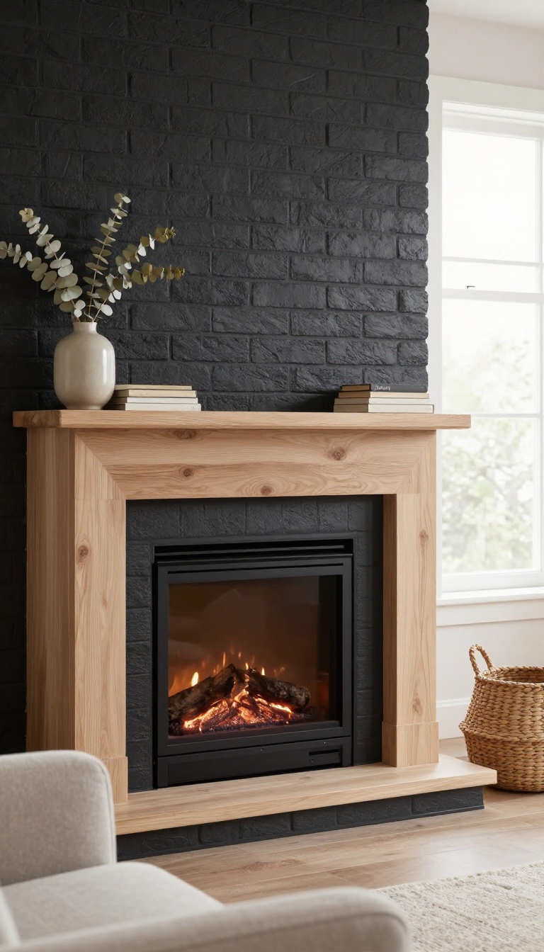
Your fireplace surround is probably the most ignored surface in the room. It sits there, holding up the mantel, collecting dust, and quietly dating everything around it. Paint changes that in a single afternoon.
Brick and tile are the usual suspects. Both take paint well once you prep them properly, and both can go from orange-red or beige to something that actually works with your walls. The fireplace stops being an eyesore and starts being the anchor.
This is also one of the cheapest ways to make a room feel cohesive. You're not moving plumbing or buying stone. You're just shifting the color story so the fireplace belongs in the space instead of fighting it.
The trick is knowing what you're painting over. Glossy tile and porous brick behave differently, and the prep work matters more than the paint brand. Get that part right and the finish will hold up to heat, ash, and the occasional stray soccer ball.
You also want to think about the mantel, the hearth, and the wall behind it. Painting the surround in isolation can look like a patch job. Painting it as part of a small color plan makes it look intentional.
And yes, you can paint a fireplace that gets used. You just need the right products and a little patience while they cure.
Prep The Brick Or Tile First
Brick is porous and often dusty. Scrub it with a stiff brush and a degreaser, then rinse and let it dry completely. Any soot near the firebox needs to come off or the paint will peel.
Tile is smoother, so it needs a different kind of help. Sand it lightly to dull the glaze, then wipe it clean. A bonding primer made for glossy surfaces is non-negotiable here.
Skip it and you'll be repainting in six months. Fill any cracks or gaps with paintable caulk before you start. It's a small step that makes the finished surround look solid instead of patched.
Pick A Color That Works With The Room
The safest move is to pull a color from your existing palette. If your walls are warm white, a soft greige or muted olive on the surround feels calm and connected. If you have a bold rug or artwork, echo one of those tones.
Going dark is a bigger commitment but can look incredible. Charcoal, deep navy, or even black makes the firebox pop and turns the fireplace into a real focal point. Just make sure the room gets enough light so it doesn't feel like a cave.
White is always an option, but choose the right white. A bright cool white can look sterile against warm walls. A warm white or cream usually blends better and feels softer.
Use The Right Paint And Let It Cure
For brick, a masonry paint or a high-quality acrylic latex in a matte or eggshell finish works well. For tile, you want a specifically formulated tile paint or an epoxy-based coating. These dry hard and resist moisture.
Apply thin coats with a brush and small roller. Thick coats look lumpy and take forever to dry. Two or three thin coats beat one heavy one every time.
Curing is the part people rush. Even if the paint feels dry to the touch, give it several days before you build a fire. Heat too soon can cause bubbling or discoloration.
Read the can and add a buffer.
Don't Forget The Mantel And Hearth
The surround is the star, but the mantel and hearth are part of the same visual unit. If the mantel is a different wood tone or a chipped white, it can make your fresh surround look unfinished. Painting the mantel the same color as the surround creates a clean, modern block.
Painting it a contrasting color adds a little character. Either way, it should feel deliberate. For the hearth, use a floor-rated paint if you're covering stone or concrete.
It needs to handle foot traffic and the occasional dropped log. A matte finish hides scuffs better than gloss.
FAQ
What is the best paint finish for a living room?
Eggshell or satin finishes are popular for living room walls because they are easy to clean and have a subtle sheen. For trim, semi-gloss or high-gloss works well for durability.
How do I choose the right color for an accent wall?
Consider the room's lighting and existing decor. Pick a color that complements your furniture and creates the mood you want—bold for energy, deep for coziness, or neutral for calm.
Can I paint over wallpaper?
Yes, but proper preparation is key. Ensure the wallpaper is firmly adhered, seams are tight, and you use a primer designed for wallpaper before painting.
How can I make a small living room feel bigger with paint?
Use light, cool colors on walls and ceiling to create an airy feel. Painting trim and ceiling the same color as walls can also make the space feel taller and more open.
Do I need to prime before painting?
Priming is recommended if you're painting over dark colors, bare drywall, or glossy surfaces. It helps the paint adhere better and ensures true color.
Conclusion
You don't need a full renovation to make your living room feel finished. A can of paint and a free weekend can transform the space more than you'd expect. Start with one idea that fits your budget and skill level.
Even a small change, like refreshing the trim or painting an accent wall, can pull the whole room together. Pick your favorite from this list and get started—your living room will thank you.